前言
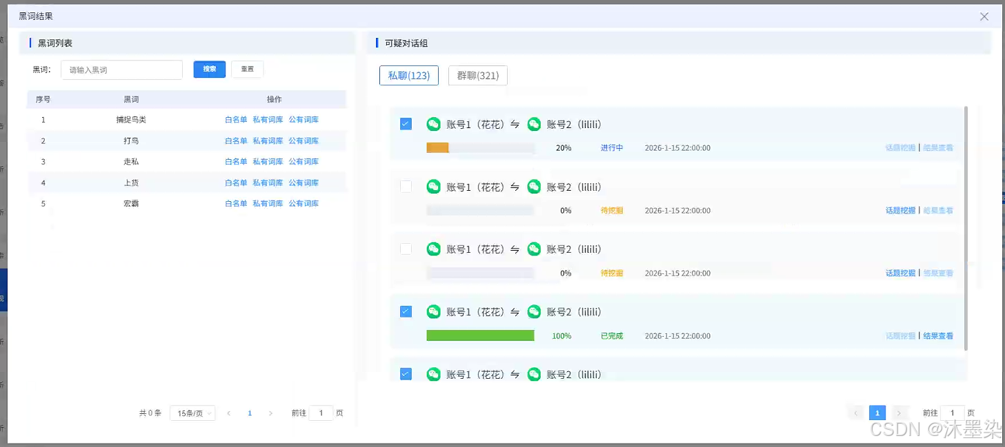
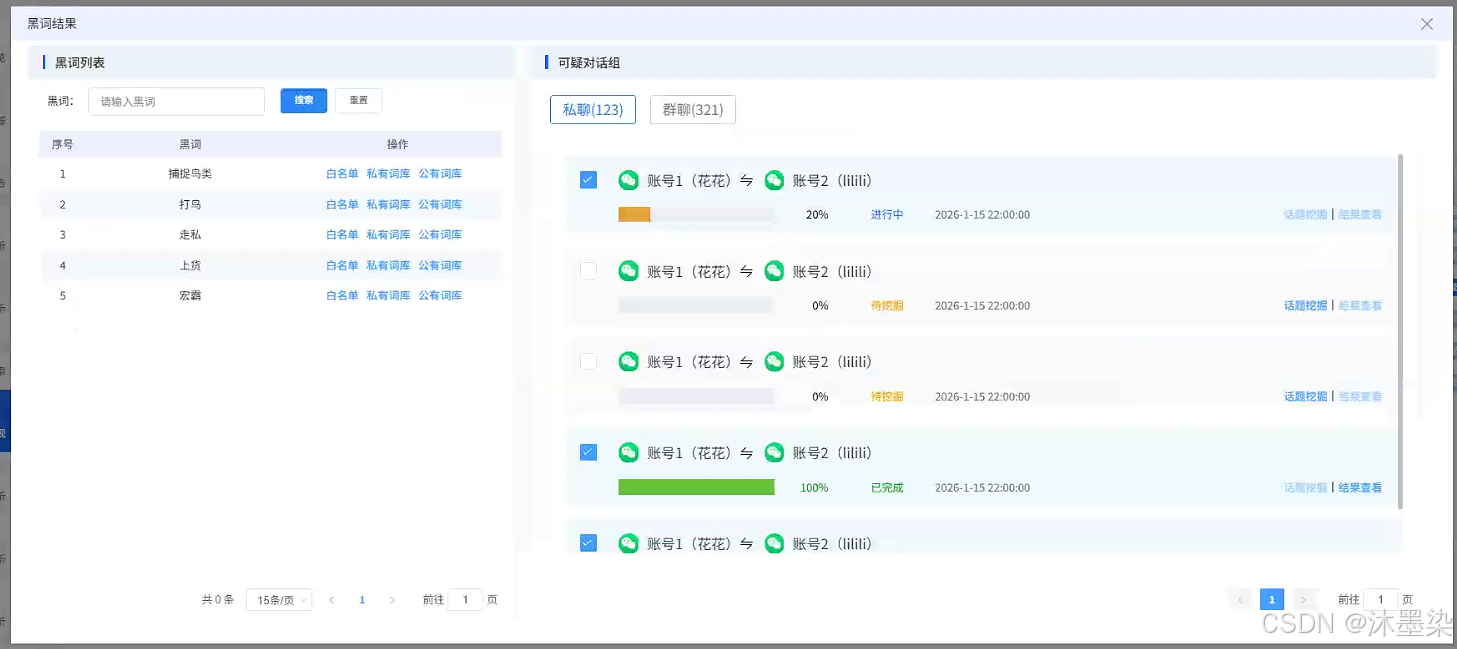
在内容安全、情报分析等领域,黑词(敏感词汇)分析是核心工作之一。本文深入解析一个企业级的黑词分析组件前端实现,该系统采用双面板交互设计、黑词进度监控和多维度分析,为安全分析人员提供高效、直观的操作界面。
一、组件概览
1.1 设计理念
并行分析:同时展示黑词列表与可疑对话组
进度反馈:进度条直观展示分析状态
智能筛选:支持关键词搜索与分页展示
任务管理:统一的任务操作与状态管理
1.2 技术栈
Vue2 + Element UI + Axios
┌────────────────────────────────────────────┐
│ 黑词分析结果对话框组件 │
├────────────────────────────────────────────┤
│ 左侧:黑词管理面板 │ 右侧:对话分析面板 │
├────────────────────────────────────────────┤
│ 搜索筛选组件 │ 进度监控组件 │
├────────────────────────────────────────────┤
│ 分页管理组件 │ 批量操作控制组件 │
└────────────────────────────────────────────┘
二、组件核心结构
2.1 模态对话框设计
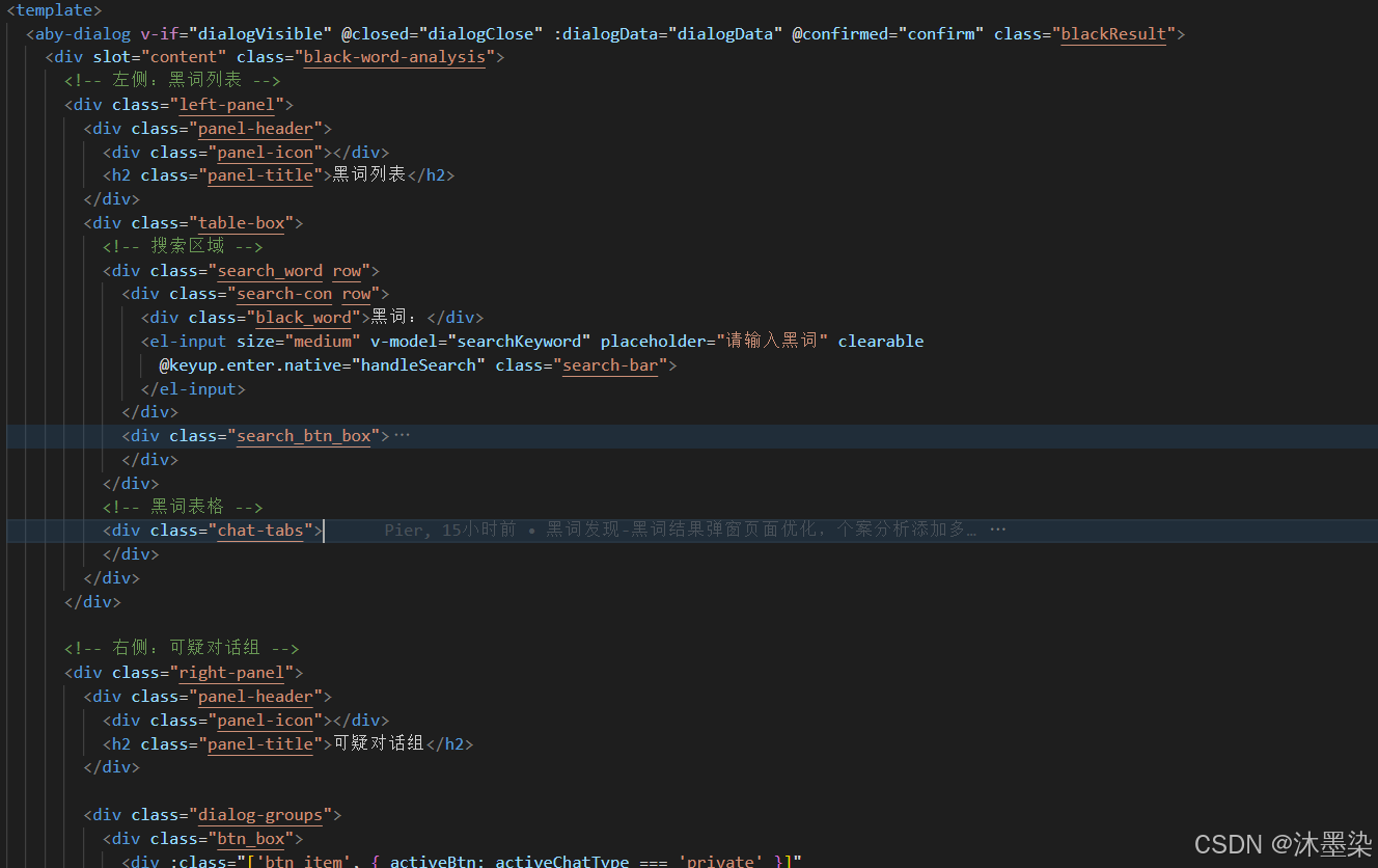
<template>
<aby-dialog v-if="dialogVisible" @closed="dialogClose" :dialogData="dialogData">
<div slot="content" class="black-word-analysis">
<!– 左侧:黑词列表 –>
<div class="left-panel">
<!– 黑词管理界面 –>
</div>
<!– 右侧:可疑对话组 –>
<div class="right-panel">
<!– 对话分析界面 –>
</div>
</div>
</aby-dialog>
</template>
对话框配置
dialogData: {
type: "confirm_book", // 弹框类型
title: "黑词结果", // 弹框标题
width: '90%', // 宽度占屏幕90%
top: '5vh', // 距离顶部5%
closeOnPressEscape: false // 禁用ESC关闭
}
三、左侧面板:黑词列表
3.1 搜索组件
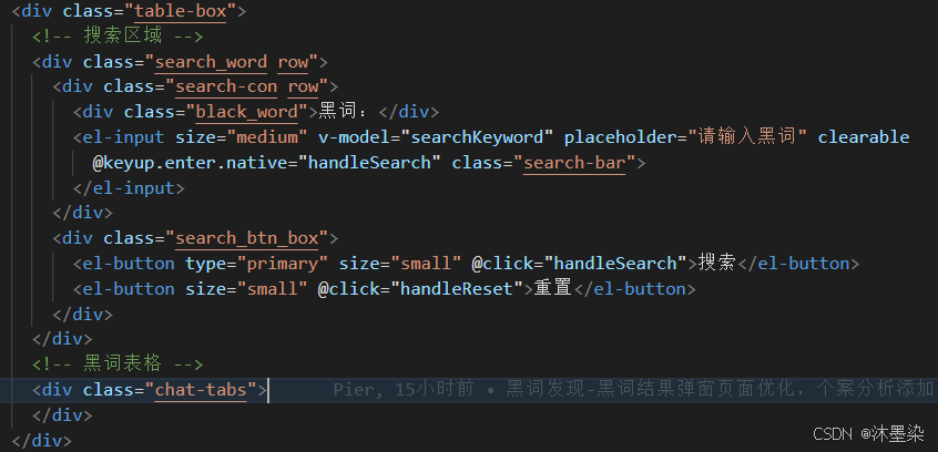
<div class="search_word row">
<!– 搜索输入框 –>
<div class="search-con row">
<div class="black_word">黑词:</div>
<el-input
v-model="searchKeyword"
placeholder="请输入黑词"
clearable
@keyup.enter.native="handleSearch"
class="search-bar"
>
</el-input>
</div>
<!– 操作按钮 –>
<div class="search_btn_box">
<el-button type="primary" size="small" @click="handleSearch">搜索</el-button>
<el-button size="small" @click="handleReset">重置</el-button>
</div>
</div>
3.2 黑词表格设计
<el-table class="list_table" :data="privateWords" stripe v-loading="tableLoading">
<!– 序号列 –>
<el-table-column prop="index" label="序号" width="60" align="center"></el-table-column>
<!– 黑词列 –>
<el-table-column prop="word" label="黑词"></el-table-column>
<!– 操作列 –>
<el-table-column label="操作" align="center">
<template #default="scope">
<div class="action-buttons">
<!– 白名单操作 –>
<el-link type="primary" size="small" @click="handleTopicMining(scope.row)">
白名单
</el-link>
<!– 私有词库操作 –>
<el-link type="primary" size="small" @click="handleResultView(scope.row)">
私有词库
</el-link>
<!– 公有词库操作 –>
<el-link type="primary" size="small" @click="handleResultView(scope.row)">
公有词库
</el-link>
</div>
</template>
</el-table-column>
</el-table>
3.3 分页管理
<div class="table_pagination">
<el-pagination
@size-change="handleSizeChange"
@current-change="handleCurrentChange"
:current-page="currentPage"
:page-sizes="[15, 20, 30, 50]"
:page-size="15"
layout="total, sizes, prev, pager, next, jumper"
:total="tableTotal">
</el-pagination>
</div>
四、右侧面板:可疑对话组分析
4.1 聊天类型切换
<div class="btn_box">
<!– 私聊选项卡 –>
<div :class="['btn_item', { activeBtn: activeChatType === 'private' }]"
@click="selectBtn('private')">
私聊(123)
</div>
<!– 群聊选项卡 –>
<div :class="['btn_item', 'btn_right', { activeBtn: activeChatType === 'group' }]"
@click="selectBtn('group')">
群聊(321)
</div>
</div>
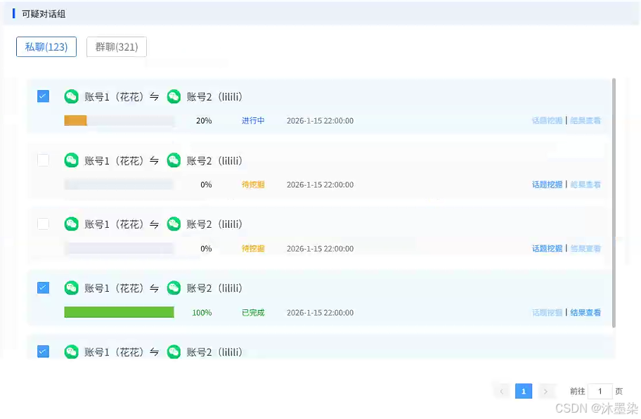
4.2 可疑对话组卡片设计
<div :class="['table_item', item.checked ? 'table_item_active' : '']"
v-for="(item, index) in privateWords" :key="index">
<!– 顶部:账号信息 –>
<div class="table_item_top">
<!– 复选框 –>
<el-checkbox v-model="item.checked" class="table_checkbox"></el-checkbox>
<!– 账号信息展示 –>
<div class="table_item_title">
<img src="../../../assets/black/微信图片.png" class="wechat_icon">
<div class="accout_name">账号1(花花)</div>
<div class="accout_icon"><i class="el-icon-sort"></i></div>
<img src="../../../assets/black/微信图片.png" class="wechat_icon">
<div class="accout_name">账号2(lilili)</div>
</div>
</div>
<!– 底部:进度与操作 –>
<div class="table_item_bottom row">
<!– 左侧:进度信息 –>
<div class="left-content row">
<!– 进度条 –>
<div class="progress-bar">
<el-progress :percentage="item.progress"
:status="getProgressStatus(item.status)"
:show-text="false"
class="progress" />
<span :class="['progress-text', getProgressTextClass(item.status)]">
{{ item.progress }}%
</span>
</div>
<!– 状态标签 –>
<div :class="['table_item_status', getStatusClass(item.status)]">
{{ item.status }}
</div>
<!– 时间显示 –>
<div class="table_item_time">{{ item.time }}</div>
</div>
<!– 右侧:操作按钮 –>
<div class="dialog-actions row">
<el-link type="primary" size="small"
:disabled="item.status !== '待挖掘'"
@click="handleTopicMiningForDialog(group)">
话题挖掘
</el-link>
<div class="line"></div>
<el-link type="primary" size="small"
:disabled="item.status !== '已完成'"
@click="handleResultViewForDialog(group)">
结果查看
</el-link>
</div>
</div>
</div>
4.3 进度状态管理组件
// 进度条状态映射
getProgressStatus(status) {
const statusMap = {
'已完成': 'success',
'进行中': 'warning',
'待挖掘': 'info'
};
return statusMap[status] || 'info';
},
// 状态文本样式类
getStatusClass(status) {
const classMap = {
'已完成': 'status-success',
'进行中': 'status-warning',
'待挖掘': 'status-info'
};
return classMap[status] || '';
},
// 进度文本样式类
getProgressTextClass(status) {
const classMap = {
'已完成': 'progress-text-success',
'进行中': 'progress-text-warning',
'待挖掘': 'progress-text-info'
};
return classMap[status] || '';
}
五、数据模拟设计(后期根据后端返回接口数据调整)
data() {
return {
// 私聊黑词列表
privateWords: [
{
index: 1,
word: '捕捉鸟类',
type: 'private',
checked: true,
progress: 20,
status: '进行中',
time: '2026-1-15 22:00:00'
},
// … 更多数据
],
// 群聊黑词列表
groupWords: [
{ index: 1, word: '捕捉鸟类', type: 'group' },
// … 更多数据
],
// 对话组数据
dialogGroups: [
{
account1: { id: 1, name: '花花' },
account2: { id: 2, name: 'lilii' },
progress: 0,
status: '待挖掘',
time: '2026-1-15 22:00:00'
},
// … 更多数据
]
}
}
5.2 分页与搜索逻辑
// 搜索处理
handleSearch() {
console.log('搜索关键词:', this.searchKeyword);
// 实际开发中可以调用API获取数据
// 前端过滤示例
if (this.searchKeyword) {
this.filteredData = this.privateWords.filter(item =>
item.word.toLowerCase().includes(this.searchKeyword.toLowerCase())
);
} else {
this.filteredData = […this.privateWords];
}
},
// 重置搜索
handleReset() {
this.searchKeyword = '';
this.filteredData = […this.privateWords];
},
// 分页处理
handleSizeChange(val) {
console.log('每页显示条数:', val);
this.pageSize = val;
this.loadTableData();
},
handleCurrentChange(val) {
console.log('当前页码:', val);
this.currentPage = val;
this.loadTableData();
}
六、交互功能实现
6.1 对话框管理
// 打开对话框
openDialog() {
this.dialogVisible = true;
// 可以在这里初始化数据
this.initDialogData();
},
// 关闭对话框
dialogClose() {
this.dialogVisible = false;
this.resetDialogState();
},
// 确认操作
confirm() {
// 获取选中的黑词
const selectedWords = this.privateWords.filter(item => item.checked);
console.log('选中的黑词:', selectedWords);
// 执行确认逻辑
this.performConfirmAction(selectedWords);
// 关闭对话框
this.dialogClose();
}
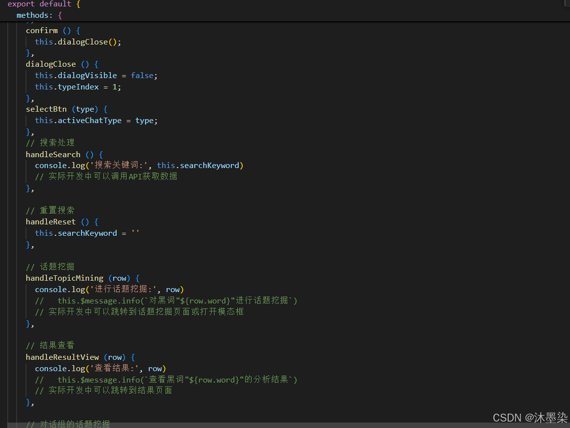
6.2 操作功能
// 话题挖掘
handleTopicMining(row) {
console.log('进行话题挖掘:', row);
// 实际开发中可以跳转到话题挖掘页面或打开模态框
this.$message.info(`对黑词"${row.word}"进行话题挖掘`);
},
// 结果查看
handleResultView(row) {
console.log('查看结果:', row);
// 实际开发中可以跳转到结果页面
this.$message.info(`查看黑词"${row.word}"的分析结果`);
},
// 对话组话题挖掘
handleTopicMiningForDialog(group) {
console.log('对话组话题挖掘:', group);
// 根据状态判断是否可操作
if (group.status !== '待挖掘') {
this.$message.warning('当前状态无法进行话题挖掘');
return;
}
// 执行话题挖掘
this.startTopicMining(group);
},
// 对话组结果查看
handleResultViewForDialog(group) {
console.log('对话组结果查看:', group);
// 根据状态判断是否可操作
if (group.status !== '已完成') {
this.$message.warning('分析未完成,无法查看结果');
return;
}
// 打开结果查看页面
this.openResultView(group);
}
七、样式设计
7.1 布局
.black-word-analysis {
display: flex;
gap: 20px; /* 左右面板间距 */
height: 100%;
overflow: hidden;
/* 左侧面板 */
.left-panel {
width: 630px; /* 固定宽度 */
background: #ffffff;
box-shadow: 0px 0px 22px 0px rgba(159, 159, 159, 0.16);
border-radius: 8px;
}
/* 右侧面板 */
.right-panel {
width: calc(100% – 630px); /* 自适应剩余宽度 */
background: #ffffff;
box-shadow: 0px 0px 22px 0px rgba(159, 159, 159, 0.16);
border-radius: 8px;
}
}
7.2 面板头部设计
.panel-header {
display: flex;
align-items: center;
height: 44px;
background: #edf1f9;
border-radius: 8px;
padding: 14px 20px;
border-bottom-left-radius: 0;
border-bottom-right-radius: 0;
.panel-title {
font-family: Adobe Heiti Std;
font-weight: 500;
font-size: 16px;
color: #333333;
}
.panel-icon {
width: 4px;
height: 18px;
background: linear-gradient(-90deg, #387bfc 0%, #0155ff 100%);
margin-right: 12px;
}
}
7.3 进度条样式
.progress-bar {
width: 268px;
height: 100%;
display: flex;
align-items: center;
.el-progress {
width: calc(100% – 82px);
}
.progress {
width: 100%;
height: 100%;
/deep/ .el-progress-bar__outer {
width: 100%;
height: 20px !important; /* 调整进度条高度 */
border-radius: 0px !important; /* 直角样式 */
}
/deep/ .el-progress-bar__inner {
border-radius: 0px !important; /* 直角样式 */
}
}
.progress-text {
width: 52px;
font-family: Adobe Heiti Std;
font-weight: normal;
font-size: 14px;
color: #333333;
margin-left: 30px;
text-align: end;
&.progress-text-success {
color: #00a510; /* 成功状态颜色 */
}
&.progress-text-warning {
color: #1c68fe; /* 进行中状态颜色 */
}
&.progress-text-info {
color: #f6a200; /* 待挖掘状态颜色 */
}
}
}
7.4 状态标签样式
.table_item_status {
font-family: Adobe Heiti Std;
font-weight: normal;
font-size: 14px;
margin-left: 54px;
&.status-success {
color: #00a510; /* 成功 */
}
&.status-warning {
color: #1c68fe; /* 进行中 */
}
&.status-info {
color: #f6a200; /* 待挖掘 */
}
}
7.5 选中状态高亮
.table_item {
display: flex;
flex-direction: column;
justify-content: space-between;
width: 100%;
border-radius: 10px;
background: #fafafa;
margin-bottom: 14px;
padding: 20px 20px 15px;
transition: background-color 0.3s ease;
/* 选中状态 */
&.table_item_active {
background: rgba(41, 133, 247, 0.06); /* 浅蓝色背景 */
border: 1px solid rgba(41, 133, 247, 0.2); /* 蓝色边框 */
}
}
最后
这个黑词分析系统前端实现展示了如何设计一个高效、直观的数据分析界面。关键设计亮点包括:
双面板并行设计:同时管理黑词和对话组,提高分析效率
进度监控:直观展示分析状态,便于任务管理
智能交互:根据状态动态控制操作权限
高度可配置:支持多维度筛选和分页管理
优秀用户体验:清晰的视觉层次和即时反馈