一颗正在跳动的心
案例思路演示
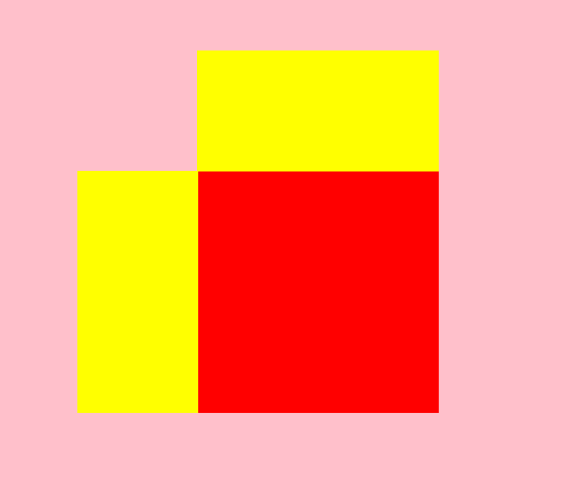
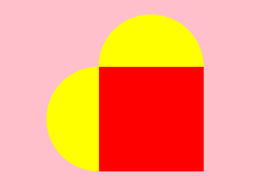
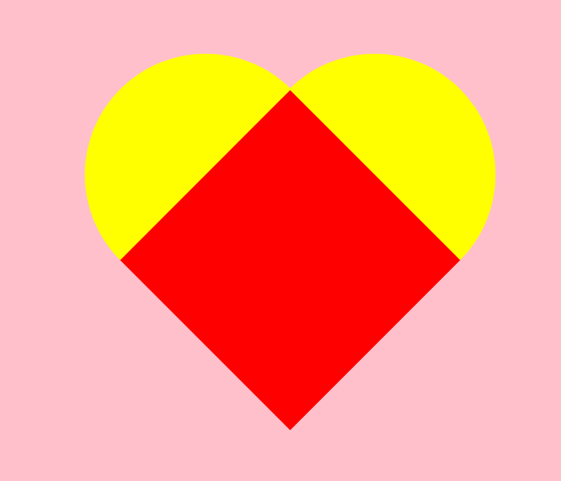
再通过添加动画效果以达到完成心形构建目的
环境构建
<!DOCTYPE html>
<html lang="zh">
<head>
<meta charset="UTF-8">
<meta name="viewport" content="width=device-width, initial-scale=1.0">
<title>跳动的心</title>
<style>
/* 初始化页面 */
html,body{
width: 100%;
height: 100%;
}
body{
background-color: pink;
/* 设置父级元素元素变成了一个弹性容器,直接子元素变成弹性子元素 */
display: flex;
/* 定义主轴为水平方向 */
flex-direction: row;
/* 子项居中对齐在容器的主轴 */
justify-content: center;
/* 子项在容器中垂直居中 */
align-items: center;
}
.heart{
width: 200px;
height: 200px;
background-color: red;
position: relative;
}
.heart .b{
content:"";
width: 200px;
height: 100px;
background-color: yellow;
position: absolute;
left: 0;
top: -100px;
}
.heart .a{
content:"";
width: 100px;
height: 200px;
background-color: yellow;
position: absolute;
left: -100px;
top: 0;
}
</style>
</head>
<body>
<div class="heart">
<div class="a"></div>
<div class="b"></div>
</div>
</body>
</html>
a 和 b 圆角化
border-radius: 100px 0 0 100px;
border-radius: 100px 100px 0 0 ;
父容器 旋转45度
transform: rotate(45deg);
动画效果
/* 让心跳动起来 */
@keyframes heartbit{
0%{
transform: rotate(45deg) scale(0.6);
}
100%{
transform: rotate(45deg) scale(1.4);
}
}
父容器 实现动画效果
animation: heartbit 1s alternate infinite;
添加阴影效果
box-shadow: 0 0 30px red;
完成后代码
<!DOCTYPE html>
<html lang="zh">
<head>
<meta charset="UTF-8">
<meta name="viewport" content="width=device-width, initial-scale=1.0">
<title>跳动的心</title>
<style>
/* 初始化页面 */
html,body{
width: 100%;
height: 100%;
}
body{
background-color: pink;
/* 设置父级元素元素变成了一个弹性容器,直接子元素变成弹性子元素 */
display: flex;
/* 定义主轴为水平方向 */
flex-direction: row;
/* 子项在容器中垂直居中 */
align-items: center;
/* 子项居中对齐在容器的主轴 */
justify-content: center;
}
.heart{
width: 200px;
height: 200px;
background-color: red;
position: relative;
transform: rotate(45deg);
animation: heartbit 1s alternate infinite;
box-shadow: 0 0 30px red;
}
.heart .b{
width: 200px;
height: 100px;
background-color: red;
position: absolute;
left: 0;
top: -99px;
border-radius: 100px 100px 0 0;
box-shadow: 0 0 30px red;
}
.heart .a{
width: 100px;
height: 200px;
background-color: red;
position: absolute;
left: -99px;
top: 0;
border-radius: 100px 0 0 100px;
box-shadow: 0 0 30px red;
}
/* 让心跳动起来 */
@keyframes heartbit{
0%{
transform: rotate(45deg) scale(0.6);
}
100%{
transform: rotate(45deg) scale(1.4);
}
}
</style>
</head>
<body>
<div class="heart">
<div class="a"></div>
<div class="b"></div>
</div>
</body>
</html>