前言
在开发时间管理类应用时,时间选择器是一个非常常见的功能。本文将通过近期接触的一个实际案例,详细讲解如何在 HarmonyOS 应用中实现一个自定义的时间选择器。我们这个案例中的选择器支持半小时为单位的时间选择,适合用于记录时间块等场景。
本教程适合 HarmonyOS 初学者阅读,你将学习到:
- 如何创建自定义对话框(CustomDialog)
- 如何使用 TextPicker 组件
- 如何管理对话框的状态
- 如何在父组件中调用对话框并获取返回值
应用场景
在本应用中,用户需要记录已经完成的时间块。当用户点击"记录时间"按钮时,会弹出一个对话框,让用户选择开始时间和结束时间。 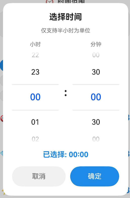
注:时间选择器支持小时和分钟的独立选择,分钟只能选择 00 或 30
核心知识点
1. CustomDialog 自定义对话框
在 HarmonyOS 中,@CustomDialog 装饰器用于创建自定义对话框。与系统提供的标准对话框不同,自定义对话框可以完全控制布局和交互逻辑。
@CustomDialog
struct TimePickerDialogContent {
controller: CustomDialogController // 对话框控制器
// … 其他属性和方法
}
2. CustomDialogController 对话框控制器
CustomDialogController 用于控制对话框的显示和关闭。在父组件中创建控制器实例,然后调用 open() 方法显示对话框。
private timePickerController: CustomDialogController | null = null
// 创建并打开对话框
this.timePickerController = new CustomDialogController({
builder: TimePickerDialogContent({ /* 参数 */ }),
autoCancel: true,
alignment: DialogAlignment.Center
})
this.timePickerController.open()
- builder:自定义弹窗内容构造器。
- autoCancel:是否允许点击遮障层退出,true表示关闭弹窗。false表示不关闭弹窗。
- alignment:弹窗在竖直方向上的对齐方式。
3. @State 状态管理
@State 装饰器用于声明组件的状态变量。当状态变量的值发生变化时,UI 会自动更新。
@State tempHour: number = 0 // 临时存储选中的小时
@State tempMinute: number = 0 // 临时存储选中的分钟
完整实现
第一步:定义对话框结构
首先,我们创建一个自定义对话框组件,定义它需要的属性:
@CustomDialog
struct TimePickerDialogContent {
controller: CustomDialogController // 对话框控制器(必需)
selectedTime: Date = new Date() // 当前选中的时间
onConfirm: (hour: number, minute: number) => void = () => {} // 确认回调
@State tempHour: number = 0 // 临时小时值
@State tempMinute: number = 0 // 临时分钟值
// 小时选项(0-23)
private hours: string[] = [
'00', '01', '02', '03', '04', '05', '06', '07', '08', '09', '10', '11',
'12', '13', '14', '15', '16', '17', '18', '19', '20', '21', '22', '23'
]
// 分钟选项(只有 00 和 30)
private minutes: string[] = ['00', '30']
// … 后续代码
}
代码说明:
- controller:对话框控制器,用于关闭对话框
- selectedTime:父组件传入的初始时间
- onConfirm:确认按钮的回调函数,将选中的时间传回父组件
- tempHour 和 tempMinute:使用 @State 装饰,当用户滑动选择器时,这些值会实时更新
- hours 和 minutes:提供给 TextPicker 的选项数组
第二步:初始化时间值
在对话框显示之前,我们需要将传入的 selectedTime 转换为小时和分钟,并调整到最近的半小时:
aboutToAppear(): void {
// 获取小时(0-23)
this.tempHour = this.selectedTime.getHours()
// 将分钟调整为最近的半小时
const minutes = this.selectedTime.getMinutes()
if (minutes < 15) {
// 0-14分钟 → 向下取整到 00
this.tempMinute = 0
} else if (minutes < 45) {
// 15-44分钟 → 向上取整到 30
this.tempMinute = 30
} else {
// 45-59分钟 → 向上取整到下一个小时的 00
this.tempHour = (this.tempHour + 1) % 24 // % 24 确保不超过 23
this.tempMinute = 0
}
}
代码说明:
- aboutToAppear() 是组件生命周期方法,在组件即将显示时调用
- 我们将任意分钟值调整为 00 或 30,这样用户看到的初始值就是半小时对齐的
- 使用 % 24 确保小时值在 0-23 范围内(例如 23 点 50 分会变成 0 点 00 分)
第三步:构建 UI 布局
接下来,我们使用 build() 方法构建对话框的 UI:
build() {
Column() {
// 标题
Text('选择时间')
.fontSize(18)
.fontWeight(FontWeight.Bold)
.fontColor($r('app.color.text_primary'))
.margin({ bottom: 12 })
// 提示文字
Text('仅支持半小时为单位')
.fontSize(12)
.fontColor($r('app.color.text_secondary'))
.margin({ bottom: 16 })
// 时间选择器区域
Row() {
// 小时选择器
Column() {
Text('小时')
.fontSize(12)
.fontColor($r('app.color.text_secondary'))
.margin({ bottom: 8 })
TextPicker({
range: this.hours, // 选项数组
selected: this.tempHour // 默认选中项的索引
})
.onChange((value: string | string[], index: number | number[]) => {
// 当用户滑动选择器时触发
if (typeof index === 'number') {
this.tempHour = index // 更新小时值
}
})
}
.layoutWeight(1) // 占据一半宽度
// 分隔符
Text(':')
.fontSize(24)
.fontWeight(FontWeight.Bold)
.fontColor($r('app.color.text_primary'))
.margin({ left: 12, right: 12 })
// 分钟选择器
Column() {
Text('分钟')
.fontSize(12)
.fontColor($r('app.color.text_secondary'))
.margin({ bottom: 8 })
TextPicker({
range: this.minutes,
selected: this.tempMinute === 0 ? 0 : 1 // 0分钟→索引0,30分钟→索引1
})
.onChange((value: string | string[], index: number | number[]) => {
if (typeof index === 'number') {
// 将索引转换为实际分钟值
this.tempMinute = index === 0 ? 0 : 30
}
})
}
.layoutWeight(1)
}
.width('100%')
.margin({ bottom: 16 })
// 显示当前选中的时间
Text(`已选择: ${this.tempHour.toString().padStart(2, '0')}:${this.tempMinute.toString().padStart(2, '0')}`)
.fontSize(16)
.fontWeight(FontWeight.Bold)
.fontColor($r('app.color.primary_color'))
.margin({ bottom: 16 })
// 按钮区域
Row() {
// 取消按钮
Button('取消')
.fontSize(15)
.fontColor($r('app.color.text_secondary'))
.backgroundColor($r('app.color.input_background'))
.borderRadius(22)
.layoutWeight(1)
.height(44)
.onClick(() => {
this.controller.close() // 关闭对话框,不返回任何值
})
// 确定按钮
Button('确定')
.fontSize(15)
.fontColor(Color.White)
.backgroundColor($r('app.color.primary_color'))
.borderRadius(22)
.layoutWeight(1)
.height(44)
.margin({ left: 10 })
.onClick(() => {
// 调用回调函数,将选中的时间传回父组件
this.onConfirm(this.tempHour, this.tempMinute)
this.controller.close() // 关闭对话框
})
}
.width('100%')
}
.width('75%') // 对话框宽度为屏幕的 75%
.padding(20)
.backgroundColor($r('app.color.card_background')) // 使用主题颜色
.borderRadius(16) // 圆角
}
代码说明:
TextPicker 组件:
- range:选项数组,可以是字符串数组
- selected:默认选中项的索引(从 0 开始)
- onChange:当用户滑动选择器时触发,参数 index 是选中项的索引
layoutWeight 属性:
- 用于在 Row 或 Column 中分配剩余空间
- 两个 Column 都设置为 1,表示平分宽度
padStart() 方法:
- 用于在字符串前面补零,例如 '5'.padStart(2, '0') 返回 '05'
- 确保时间显示为两位数格式
第四步:在父组件中使用
现在,我们在父组件中创建并打开这个时间选择器:
@Component
export struct AddTimeBlockDialog {
@State startTime: Date = new Date() // 开始时间
@State endTime: Date = new Date() // 结束时间
private startTimePickerController: CustomDialogController | null = null
// 格式化时间显示(例如:14:30)
private formatTime(date: Date): string {
const hours = date.getHours().toString().padStart(2, '0')
const minutes = date.getMinutes().toString().padStart(2, '0')
return `${hours}:${minutes}`
}
// 打开开始时间选择器
private openStartTimePicker(): void {
this.startTimePickerController = new CustomDialogController({
builder: TimePickerDialogContent({
selectedTime: this.startTime, // 传入当前时间
onConfirm: (hour: number, minute: number) => {
// 用户点击确定后,更新开始时间
const newTime = new Date(this.startTime)
newTime.setHours(hour)
newTime.setMinutes(minute)
newTime.setSeconds(0)
newTime.setMilliseconds(0)
this.startTime = newTime // 更新状态,UI 会自动刷新
}
}),
autoCancel: true, // 点击对话框外部自动关闭
alignment: DialogAlignment.Center, // 居中显示
customStyle: true // 使用自定义样式
})
this.startTimePickerController.open() // 显示对话框
}
build() {
Column() {
// 开始时间按钮
Button() {
Column() {
Text('开始')
.fontSize(11)
.fontColor($r('app.color.text_secondary'))
Text(this.formatTime(this.startTime))
.fontSize(16)
.fontWeight(FontWeight.Medium)
.fontColor($r('app.color.text_primary'))
.margin({ top: 2 })
}
}
.backgroundColor($r('app.color.input_background'))
.borderRadius(10)
.padding(12)
.onClick(() => {
this.openStartTimePicker() // 点击按钮打开选择器
})
}
}
}
代码说明:
CustomDialogController 配置:
- builder:指定对话框的内容组件
- autoCancel:是否允许点击外部关闭
- alignment:对话框在屏幕上的位置
- customStyle:是否使用自定义样式(如果为 false,会使用系统默认样式)
回调函数:
- onConfirm 是一个箭头函数,当用户点击确定时被调用
- 我们在回调中更新 startTime 状态,UI 会自动刷新显示新时间
Date 对象操作:
- 创建新的 Date 对象:new Date(this.startTime)
- 设置小时和分钟:setHours() 和 setMinutes()
- 清零秒和毫秒:确保时间精确到分钟
关键技术点详解
1. 为什么使用 CustomDialog 而不是系统对话框?
HarmonyOS 提供了 TimePickerDialog 系统对话框,但它不支持限制分钟选择(例如只能选择 00 或 30)。通过自定义对话框,我们可以:
- 完全控制 UI 样式
- 自定义选择范围
- 添加额外的提示信息
- 实现特殊的业务逻辑
2. 为什么需要 tempHour 和 tempMinute?
我们不能直接修改 selectedTime,因为:
- 用户可能会点击"取消"按钮,此时不应该修改原始时间
- 只有当用户点击"确定"时,才通过回调函数将新时间传回父组件
- 这种设计模式称为"临时状态",确保用户操作的可撤销性
3. 如何实现半小时对齐?
在 aboutToAppear() 中,我们使用了一个简单的算法:
- 0-14 分钟 → 00 分钟(向下取整)
- 15-44 分钟 → 30 分钟(向上取整)
- 45-59 分钟 → 下一个小时的 00 分钟(向上取整)
这样可以确保用户看到的初始值总是半小时对齐的,提供更好的用户体验。
扩展功能
1. 添加快捷时间按钮
你可以在对话框中添加一些快捷按钮,例如"当前时间"、"整点"等:
Row() {
Button('当前时间')
.onClick(() => {
const now = new Date()
this.tempHour = now.getHours()
this.tempMinute = now.getMinutes() < 30 ? 0 : 30
})
Button('整点')
.onClick(() => {
this.tempMinute = 0
})
}
2. 限制时间范围
如果你需要限制用户只能选择某个时间范围(例如今天之内),可以在 onConfirm 回调中添加验证:
onConfirm: (hour: number, minute: number) => {
const newTime = new Date(this.startTime)
newTime.setHours(hour)
newTime.setMinutes(minute)
// 检查是否超过当前时间
const now = new Date()
if (newTime > now) {
// 显示错误提示
promptAction.showToast({
message: '不能选择未来的时间',
duration: 2000
})
return
}
this.startTime = newTime
}
3. 支持更细粒度的时间选择
如果需要支持 15 分钟为单位,只需修改 minutes 数组:
private minutes: string[] = ['00', '15', '30', '45']
然后在 onChange 中相应调整:
onChange((value: string | string[], index: number | number[]) => {
if (typeof index === 'number') {
this.tempMinute = index * 15 // 0→0, 1→15, 2→30, 3→45
}
})
常见问题
Q1: 为什么对话框没有显示?
检查以下几点:
Q2: 如何修改对话框的背景颜色?
在 build() 方法的最外层 Column 中修改 backgroundColor 属性:
Column() {
// …
}
.backgroundColor('#FFFFFF') // 使用十六进制颜色
// 或
.backgroundColor($r('app.color.card_background')) // 使用资源颜色
总结
通过本教程,我们学习了如何在 HarmonyOS 中实现一个自定义时间选择器。核心要点包括:
这个时间选择器可以直接应用到你的项目中,也可以根据需求进行扩展和定制。希望这篇教程对你有所帮助!
参考资料
- HarmonyOS 官方文档 – CustomDialog
- HarmonyOS 官方文档 – TextPicker