文章目录
-
- 六: 图片预览实战
-
- 6.1 预览功能架构
- 6.2 单张图片预览
- 6.3 图片列表预览(核心功能)
- 6.4 预览功能说明
- 七: 边框样式实战
-
- 7.1 边框系统参数
- 7.2 实线边框
- 7.3 虚线边框
- 7.4 点状边框
- 7.5 圆形 + 边框
- 7.6 圆角 + 边框 + 背景
- 7.7 点击事件实战
- 十一: 常见问题与解决方案
-
- 11.1 图片显示问题
-
- 问题1: 图片变形
- 问题2: 圆形图片显示不完整
- 11.2 性能问题
-
- 问题3: 长列表卡顿
- 问题4: 内存占用过高
- 11.3 交互问题
-
- 问题5: 预览列表切换失败
- 11.4 开发最佳实践清单
-
- ✅ 必须遵守
- ⚠️ 建议遵守
- 🚫 禁止操作
- 附录: 快速参考
-
- A.1 常用参数速查表
- A.2 典型场景代码片段
-
- 用户头像
- 商品缩略图
- 文章配图
- 结语
接上一篇文章 地址: HarmonyOS6半年磨一剑 – RcImage组件实战案例集与应用开发指南(一)
六: 图片预览实战
6.1 预览功能架构
📦 图片预览系统
├─ 🔹 触发方式
│ ├─ 点击图片触发
│ └─ previewable: true
│
├─ 🔹 预览模式
│ ├─ 单张预览
│ └─ 列表预览(支持切换)
│
├─ 🔹 交互功能
│ ├─ 缩放控制(+ / -)
│ ├─ 图片切换(< / >)
│ └─ 关闭预览(X / 遮罩)
│
└─ 🔹 配置选项
├─ 遮罩层显示
├─ 关闭按钮显示
└─ 缩放范围设置
6.2 单张图片预览
应用场景: 文章配图、产品详情、证件展示
this.SectionTitle('点击预览(单张)')
RcImage({
imageSrc: 'https://images.unsplash.com/photo-1506905925346-21bda4d32df4?w=800',
imageWidth: 300,
imageHeight: 200,
imageShape: 'round',
imageRadius: 12,
previewable: true,
showCaption: true,
captionText: '点击可预览',
onPreviewOpen: () => {
console.log('预览打开')
},
onPreviewClose: () => {
console.log('预览关闭')
}
})
技术要点:
- previewable: true 启用预览功能
- onPreviewOpen 监听预览打开事件
- onPreviewClose 监听预览关闭事件
实战案例 – 文章配图预览:
@Builder
ArticleContent() {
Column({ space: 16 }) {
Text('HarmonyOS6 开发实战')
.fontSize(24)
.fontWeight(FontWeight.Bold)
Text('图片可点击查看大图')
.fontSize(14)
.fontColor('#909399')
// 配图1
RcImage({
imageSrc: 'https://example.com/article-image-1.jpg',
imageWidth: '100%',
imageHeight: 250,
imageShape: 'round',
imageRadius: 12,
previewable: true,
showCaption: true,
captionText: '图 1: 系统架构图'
})
Text('正文内容…')
.fontSize(16)
.lineHeight(28)
// 配图2
RcImage({
imageSrc: 'https://example.com/article-image-2.jpg',
imageWidth: '100%',
imageHeight: 250,
imageShape: 'round',
imageRadius: 12,
previewable: true,
showCaption: true,
captionText: '图 2: 运行效果图'
})
}
.width('100%')
.padding(16)
}
6.3 图片列表预览(核心功能)
应用场景: 相册、商品多图、图片库
this.SectionTitle('图片列表预览(支持左右切换)')
Text('点击任意图片预览,支持缩放和切换')
.fontSize(14)
.fontColor('#909399')
.margin({ bottom: 10 })
Row({ space: 10 }) {
ForEach(this.imageList, (item: string, index: number) => {
RcImage({
imageSrc: item,
imageWidth: 80,
imageHeight: 80,
imageShape: 'round',
imageRadius: 8,
imageFit: 'cover',
previewable: true,
previewList: this.imageList, // 图片列表
previewIndex: index, // 当前图片索引
previewOptions: {
showMask: true, // 显示遮罩
showClose: true, // 显示关闭按钮
initialScale: 1, // 初始缩放比例
minScale: 0.5, // 最小缩放比例
maxScale: 3 // 最大缩放比例
}
})
})
}
.width('100%')
.justifyContent(FlexAlign.SpaceAround)
关键参数说明:
| previewList | string[] | 预览图片列表 | 必填 |
| previewIndex | number | 当前图片索引 | 必填 |
| previewOptions | object | 预览配置对象 | 可选 |
previewOptions 配置详解:
| showMask | boolean | 显示遮罩层 | true |
| showClose | boolean | 显示关闭按钮 | true |
| initialScale | number | 初始缩放比例 | 1 |
| minScale | number | 最小缩放比例 | 0.5 |
| maxScale | number | 最大缩放比例 | 3 |
实战案例 – 商品多图预览:
@State productImages: string[] = [
'https://example.com/product-1.jpg',
'https://example.com/product-2.jpg',
'https://example.com/product-3.jpg',
'https://example.com/product-4.jpg'
]
@State currentPreviewIndex: number = 0
@Builder
ProductGallery() {
Column({ space: 12 }) {
// 主图预览
RcImage({
imageSrc: this.productImages[this.currentPreviewIndex],
imageWidth: '100%',
imageHeight: 375,
imageFit: 'contain',
bgColor: '#F5F5F5',
previewable: true,
previewList: this.productImages,
previewIndex: this.currentPreviewIndex,
previewOptions: {
showMask: true,
showClose: true,
initialScale: 1,
minScale: 0.5,
maxScale: 4 // 商品图允许更大缩放
}
})
// 缩略图列表
Row({ space: 8 }) {
ForEach(this.productImages, (item: string, index: number) => {
RcImage({
imageSrc: item,
imageWidth: 60,
imageHeight: 60,
imageShape: 'round',
imageRadius: 6,
imageFit: 'cover',
rcBorderWidth: this.currentPreviewIndex === index ? 2 : 0,
rcBorderColor: '#409EFF',
onImageClick: () => {
this.currentPreviewIndex = index
}
})
})
}
.width('100%')
.justifyContent(FlexAlign.Start)
}
.width('100%')
.padding(16)
}
6.4 预览功能说明
this.SectionTitle('预览功能说明')
Column({ space: 8 }) {
this.InfoText('• 点击图片打开预览')
this.InfoText('• 点击遮罩层或关闭按钮退出预览')
this.InfoText('• 使用 + / – 按钮缩放图片')
this.InfoText('• 使用 < / > 按钮切换图片(列表模式)')
}
.alignItems(HorizontalAlign.Start)
.width('100%')
.padding(16)
.backgroundColor('#FFF9E6')
.borderRadius(8)
交互操作总结:
| 打开预览 | 点击图片 | 进入全屏预览模式 |
| 关闭预览 | 点击遮罩/关闭按钮 | 退出预览模式 |
| 放大 | 点击 + 按钮 | 按比例放大图片 |
| 缩小 | 点击 – 按钮 | 按比例缩小图片 |
| 上一张 | 点击 < 按钮 | 切换到前一张图片 |
| 下一张 | 点击 > 按钮 | 切换到后一张图片 |
七: 边框样式实战
7.1 边框系统参数
| rcBorderWidth | number | 边框宽度 | 0 |
| rcBorderColor | string | 边框颜色 | ‘#000000’ |
| rcBorderStyle | BorderStyle | 边框样式 | Solid |
| rcPadding | number | 内边距 | 0 |
7.2 实线边框
应用场景: 商品卡片、强调展示
this.SectionTitle('带边框')
RcImage({
imageSrc: 'https://images.unsplash.com/photo-1506905925346-21bda4d32df4?w=500',
imageWidth: 300,
imageHeight: 200,
rcBorderWidth: 2,
rcBorderColor: '#409eff',
rcBorderStyle: BorderStyle.Solid
})
设计规范:
- 边框宽度: 1-3px
- 颜色选择: 品牌色或主题色
- 适合需要强调的图片
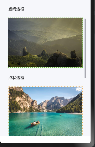
7.3 虚线边框
应用场景: 草稿、待上传状态
this.SectionTitle('虚线边框')
RcImage({
imageSrc: 'https://images.unsplash.com/photo-1469474968028-56623f02e42e?w=500',
imageWidth: 300,
imageHeight: 200,
rcBorderWidth: 2,
rcBorderColor: '#67c23a',
rcBorderStyle: BorderStyle.Dashed
})
实战案例 – 图片上传占位:
@Builder
ImageUploadPlaceholder() {
Stack() {
RcImage({
imageSrc: this.uploadedImageUrl || $r('app.media.upload_placeholder'),
imageWidth: 200,
imageHeight: 200,
rcBorderWidth: 2,
rcBorderColor: '#DCDFE6',
rcBorderStyle: BorderStyle.Dashed,
onImageClick: () => {
this.showImagePicker()
}
})
if (!this.uploadedImageUrl) {
Column({ space: 8 }) {
Text('+')
.fontSize(48)
.fontColor('#C0C4CC')
Text('点击上传')
.fontSize(14)
.fontColor('#909399')
}
}
}
}
7.4 点状边框
应用场景: 特殊设计、装饰效果
this.SectionTitle('点状边框')
RcImage({
imageSrc: 'https://images.unsplash.com/photo-1501785888041-af3ef285b470?w=500',
imageWidth: 300,
imageHeight: 200,
rcBorderWidth: 3,
rcBorderColor: '#e6a23c',
rcBorderStyle: BorderStyle.Dotted
})
7.5 圆形 + 边框
应用场景: VIP 用户头像、特殊标识
this.SectionTitle('圆形 + 边框')
RcImage({
imageSrc: 'https://images.unsplash.com/photo-1518173946687-a4c8892bbd9f?w=500',
imageWidth: 150,
imageHeight: 150,
imageShape: 'circle',
imageFit: 'cover',
rcBorderWidth: 4,
rcBorderColor: '#f56c6c',
rcBorderStyle: BorderStyle.Solid
})
实战案例 – VIP 用户头像:
@Builder
VIPAvatar(user: UserInfo) {
Stack({ alignContent: Alignment.BottomEnd }) {
RcImage({
imageSrc: user.avatarUrl,
imageWidth: 80,
imageHeight: 80,
imageShape: 'circle',
imageFit: 'cover',
rcBorderWidth: 3,
rcBorderColor: user.isVIP ? '#FFD700' : '#E0E0E0',
rcBorderStyle: BorderStyle.Solid
})
if (user.isVIP) {
Text('VIP')
.fontSize(10)
.fontColor('#FFFFFF')
.backgroundColor('#FFD700')
.padding({ left: 4, right: 4, top: 2, bottom: 2 })
.borderRadius(4)
.offset({ x: –5, y: –5 })
}
}
}
7.6 圆角 + 边框 + 背景
应用场景: 卡片设计、精致展示
this.SectionTitle('圆角 + 边框 + 背景')
RcImage({
imageSrc: 'https://images.unsplash.com/photo-1506905925346-21bda4d32df4?w=500',
imageWidth: 300,
imageHeight: 200,
imageShape: 'round',
imageRadius: 16,
bgColor: '#E8F4FF',
rcBorderWidth: 2,
rcBorderColor: '#409eff',
rcBorderStyle: BorderStyle.Solid,
rcPadding: 8
})
设计亮点:
- 使用 rcPadding 创造内边距效果
- bgColor 与 rcBorderColor 呼应
- 适合高端产品展示
7.7 点击事件实战
应用场景: 交互反馈、弹窗展示
this.SectionTitle('点击事件')
RcImage({
imageSrc: 'https://images.unsplash.com/photo-1469474968028-56623f02e42e?w=500',
imageWidth: 300,
imageHeight: 200,
imageShape: 'round',
imageRadius: 12,
showCaption: true,
captionText: '点击我试试',
onImageClick: () => {
this.getUIContext().getPromptAction().showDialog({
title: '提示',
message: '图片被点击了!',
buttons: [
{
text: '确定',
color: '#409EFF'
}
]
})
}
})
实战案例 – 图片操作菜单:
@Builder
ImageWithMenu(imageUrl: string) {
RcImage({
imageSrc: imageUrl,
imageWidth: 300,
imageHeight: 200,
imageShape: 'round',
imageRadius: 12,
onImageClick: () => {
this.getUIContext().getPromptAction().showActionMenu({
title: '图片操作',
buttons: [
{
text: '保存到相册',
color: '#409EFF'
},
{
text: '分享给好友',
color: '#67C23A'
},
{
text: '删除图片',
color: '#F56C6C'
},
{
text: '取消',
color: '#909399'
}
]
})
}
})
}
十一: 常见问题与解决方案
11.1 图片显示问题
问题1: 图片变形
原因: 填充模式选择不当
解决方案:
// ❌ 错误: 使用 fill 导致拉伸变形
RcImage({
imageSrc: userAvatar,
imageWidth: 100,
imageHeight: 100,
imageFit: 'fill'
})
// ✅ 正确: 使用 cover 保持比例
RcImage({
imageSrc: userAvatar,
imageWidth: 100,
imageHeight: 100,
imageFit: 'cover',
imageShape: 'circle'
})
问题2: 圆形图片显示不完整
原因: 未使用 cover 填充模式
解决方案:
RcImage({
imageSrc: avatar,
imageWidth: 80,
imageHeight: 80,
imageShape: 'circle',
imageFit: 'cover' // 必须设置
})
11.2 性能问题
问题3: 长列表卡顿
原因: 同时加载过多图片
解决方案:
List() {
LazyForEach(this.imageDataSource, (item: string, index: number) => {
ListItem() {
RcImage({
imageSrc: item + '?w=200', // 加载小尺寸
imageWidth: 200,
imageHeight: 200
})
}
})
}
.cachedCount(5) // 缓存5个
问题4: 内存占用过高
原因: 图片缓存未释放
解决方案:
aboutToDisappear() {
this.imageList = []
this.imageCache.clear()
}
11.3 交互问题
问题5: 预览列表切换失败
原因: previewIndex 未正确设置
解决方案:
ForEach(this.images, (item: string, index: number) => {
RcImage({
imageSrc: item,
previewable: true,
previewList: this.images,
previewIndex: index // 必须传入当前索引
})
})
11.4 开发最佳实践清单
✅ 必须遵守
| 指定尺寸 | 始终设置 imageWidth 和 imageHeight | 避免布局抖动 |
| 错误处理 | 为网络图片开启 showError | 提升用户体验 |
| 填充模式 | 根据场景选择合适的 imageFit | 避免变形 |
| 预览配置 | 列表预览必须设置 previewList | 完整功能体验 |
⚠️ 建议遵守
| 圆角使用 | 使用 8-16 圆角提升美观度 | 现代设计风格 |
| 加载状态 | 开启 showLoading 提示用户 | 减少等待焦虑 |
| 边框装饰 | 重要图片添加边框强调 | 视觉层次清晰 |
| 点击反馈 | 可交互图片提供点击事件 | 交互体验完整 |
🚫 禁止操作
| 不设置尺寸 | 导致布局错乱 | 明确指定宽高 |
| 加载超大图 | 内存溢出风险 | 使用 CDN 裁剪 |
| 滥用预览 | 影响性能 | 仅必要时启用 |
| 忽略错误 | 空白破坏体验 | 开启 showError |
附录: 快速参考
A.1 常用参数速查表
| imageSrc | string/Resource | URL / $r() | ⭐⭐⭐⭐⭐ |
| imageWidth | number/string | 200 / ‘100%’ | ⭐⭐⭐⭐⭐ |
| imageHeight | number | 200 | ⭐⭐⭐⭐⭐ |
| imageFit | string | cover / contain | ⭐⭐⭐⭐ |
| imageShape | string | square / circle / round | ⭐⭐⭐⭐ |
| imageRadius | number | 8 / 16 | ⭐⭐⭐ |
| previewable | boolean | true / false | ⭐⭐⭐ |
| showLoading | boolean | true | ⭐⭐⭐ |
| showError | boolean | true | ⭐⭐⭐ |
A.2 典型场景代码片段
用户头像
RcImage({
imageSrc: avatarUrl,
imageWidth: 48,
imageHeight: 48,
imageShape: 'circle',
imageFit: 'cover'
})
商品缩略图
RcImage({
imageSrc: productImage,
imageWidth: 120,
imageHeight: 120,
imageShape: 'round',
imageRadius: 8,
imageFit: 'cover',
previewable: true
})
文章配图
RcImage({
imageSrc: articleImage,
imageWidth: '100%',
imageHeight: 250,
imageShape: 'round',
imageRadius: 12,
previewable: true,
showCaption: true,
captionText: '图片说明'
})
结语
本实战案例集基于真实项目经验编写,涵盖了 RcImage 组件在 HarmonyOS6 开发中的 6 大核心场景, 全面的讲述RcImage的使用方法 。