前言
卡片(Card)是移动应用中最常用的模块。它将相关信息组织在一个独立的容器中,通过圆角、阴影、背景色等各种各样的视觉元素,营造出层次分明、易于浏览的界面效果。
在本文中,我们将通过健康管理应用的实际案例,展示如何在HarmonyOS应用中实现各种类型的卡片布局。从简单的数据展示卡片,到复杂的评分卡片,再到快捷入口卡片,你将学会如何设计和实现专业的卡片界面。
本文适合: 已经了解 ArkTS 基础语法的初学者
你将学到:
- 卡片的基本结构与样式设计
- 不同类型卡片的布局实现
- 响应式卡片设计技巧
- 卡片间距与对齐方式
什么是卡片布局
卡片是一个独立的容器,用于展示一组相关的信息或操作。它具有以下特点:
核心特征:
常见应用场景:
- 数据展示:统计数据、用户信息、商品信息
- 列表项:新闻列表、商品列表、消息列表
- 功能入口:快捷操作、导航菜单
- 内容卡片:文章卡片、图片卡片、视频卡片
应用中的卡片类型
在我们的健康管理应用中,使用了多种类型的卡片:
让我们逐一学习这些卡片的实现方法。
一、健康评分卡片
这是应用首页最重要的卡片,展示用户的综合健康评分。
1.1 卡片结构
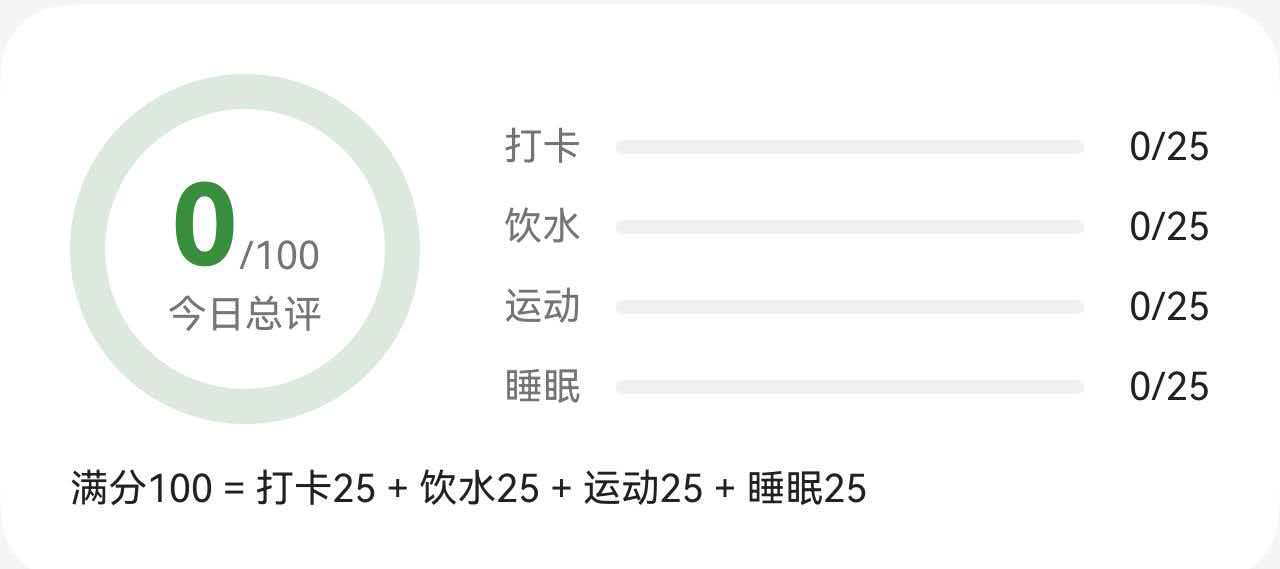
1.2 完整代码
// 健康评分卡片
Column() {
Row() {
// 左侧:评分圆环
Stack() {
// 背景圆环
Progress({ value: 100, total: 100, type: ProgressType.Ring })
.width(this.getRingSize())
.height(this.getRingSize())
.color($r('app.color.primary_surface'))
.style({ strokeWidth: this.getRingStrokeWidth() })
// 进度圆环
Progress({ value: this.healthScore.totalScore, total: 100, type: ProgressType.Ring })
.width(this.getRingSize())
.height(this.getRingSize())
.color($r('app.color.primary_color'))
.style({ strokeWidth: this.getRingStrokeWidth() })
// 中心文字
Column() {
Row() {
Text(this.healthScore.totalScore.toString())
.fontSize(36)
.fontWeight(FontWeight.Bold)
.fontColor($r('app.color.primary_dark'))
Text('/100')
.fontSize(12)
.fontColor($r('app.color.text_secondary'))
.margin({ bottom: 4 })
}
.alignItems(VerticalAlign.Bottom)
Text('今日总评')
.fontSize(12)
.fontColor($r('app.color.text_secondary'))
}
}
// 右侧:分项进度
Column() {
// 打卡进度
Row() {
Text('打卡')
.fontSize(12)
.fontColor($r('app.color.text_secondary'))
.width(32)
Progress({ value: this.healthScore.checkInScore, total: 100, type: ProgressType.Linear })
.height(8)
.color($r('app.color.primary_color'))
.backgroundColor($r('app.color.input_background'))
.layoutWeight(1)
.borderRadius(4)
Text(`${Math.round(this.healthScore.checkInScore * 0.25)}/25`)
.fontSize(12)
.fontColor($r('app.color.text_primary'))
.width(36)
.textAlign(TextAlign.End)
}
.width('100%')
.margin({ top: 10 })
// 饮水进度(类似结构)
// 运动进度(类似结构)
// 睡眠进度(类似结构)
}
.layoutWeight(1)
.padding({ left: 24 })
}
.width('100%')
// 底部说明文字
Text('满分100 = 打卡25 + 饮水25 + 运动25 + 睡眠25')
.fontSize(12)
.fontColor($r('app.color.text_primary'))
.width('100%')
.margin({ top: 12 })
}
.width('100%')
.padding(24)
.margin({ left: 16, right: 16 })
.backgroundColor($r('app.color.card_background'))
.borderRadius(20)
1.3 布局要点
左右分栏布局:
- 左侧固定宽度(圆环大小)
- 右侧使用 layoutWeight(1) 占据剩余空间
圆环叠加:
- 使用 Stack 实现多层叠加
- 底层是背景圆环(浅色)
- 上层是进度圆环(主题色)
- 最上层是中心文字
进度条布局:
- 标签固定宽度(32)
- 进度条使用 layoutWeight(1) 自适应
- 数值固定宽度(36)并右对齐
1.4 响应式设计
// 圆环大小根据屏幕调整
private getRingSize(): number {
return getValueByBreakpoint(
this.currentBreakpoint,
new BreakpointValue<number>(100, 120, 140)
);
}
// 圆环线宽根据屏幕调整
private getRingStrokeWidth(): number {
return getValueByBreakpoint(
this.currentBreakpoint,
new BreakpointValue<number>(10, 12, 14)
);
}
// 卡片内边距根据屏幕调整
private getCardPadding(): number {
return getValueByBreakpoint(
this.currentBreakpoint,
new BreakpointValue<number>(20, 24, 28)
);
}
二、数据统计卡片
这类卡片用于展示单一数据指标,简洁明了。
2.1 卡片结构
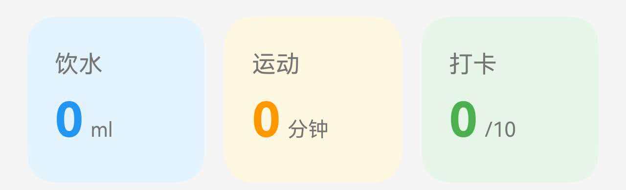
2.2 完整代码
Row() {
// 饮水卡片
Column() {
Text('饮水')
.fontSize(14)
.fontColor($r('app.color.text_secondary'))
Row() {
Text(this.waterCurrent.toString())
.fontSize(28)
.fontWeight(FontWeight.Bold)
.fontColor($r('app.color.water_blue'))
Text('ml')
.fontSize(12)
.fontColor($r('app.color.text_secondary'))
.margin({ left: 4, bottom: 4 })
}
.alignItems(VerticalAlign.Bottom)
.margin({ top: 8 })
}
.width('31%')
.padding({ top: 20, bottom: 20, left: 16, right: 16 })
.backgroundColor($r('app.color.water_surface'))
.borderRadius(16)
.alignItems(HorizontalAlign.Start)
// 运动卡片
Column() {
Text('运动')
.fontSize(14)
.fontColor($r('app.color.text_secondary'))
Row() {
Text(this.exerciseMinutes.toString())
.fontSize(28)
.fontWeight(FontWeight.Bold)
.fontColor($r('app.color.accent_color'))
Text('分钟')
.fontSize(12)
.fontColor($r('app.color.text_secondary'))
.margin({ left: 4, bottom: 4 })
}
.alignItems(VerticalAlign.Bottom)
.margin({ top: 8 })
}
.width('31%')
.padding({ top: 20, bottom: 20, left: 16, right: 16 })
.backgroundColor($r('app.color.food_surface'))
.borderRadius(16)
.alignItems(HorizontalAlign.Start)
// 打卡卡片
Column() {
Text('打卡')
.fontSize(14)
.fontColor($r('app.color.text_secondary'))
Row() {
Text(this.checkInCount.toString())
.fontSize(28)
.fontWeight(FontWeight.Bold)
.fontColor($r('app.color.primary_color'))
Text(`/${this.checkInTotal}`)
.fontSize(12)
.fontColor($r('app.color.text_secondary'))
.margin({ left: 4, bottom: 4 })
}
.alignItems(VerticalAlign.Bottom)
.margin({ top: 8 })
}
.width('31%')
.padding({ top: 20, bottom: 20, left: 16, right: 16 })
.backgroundColor($r('app.color.primary_surface'))
.borderRadius(16)
.alignItems(HorizontalAlign.Start)
}
.width('100%')
.justifyContent(FlexAlign.SpaceBetween)
.padding({ left: 16, right: 16, top: 16 })
2.3 布局要点
三等分布局:
- 每个卡片宽度 31%(留出间距)
- 使用 justifyContent(FlexAlign.SpaceBetween) 均匀分布
- 自动计算卡片间距
数值与单位对齐:
- 使用 Row 包裹数值和单位
- 数值大字号、粗体、彩色
- 单位小字号、灰色
- 使用 alignItems(VerticalAlign.Bottom) 底部对齐
颜色区分:
- 每个卡片使用不同的背景色
- 数值颜色与背景色相呼应
- 形成视觉上的分类效果
2.4 响应式宽度
// 响应式宽度配置
.width(getValueByBreakpoint(
this.currentBreakpoint,
new BreakpointValue<string>('31%', '31%', '32%')
))
在大屏上可以稍微增加宽度,减少间距。
三、快捷入口卡片
快捷入口卡片提供快速导航功能,通常使用按钮样式。
【此处插入快捷入口卡片截图】
3.1 卡片结构
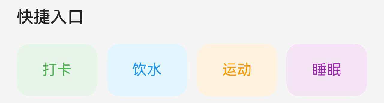
3.2 完整代码
Column() {
Text('快捷入口')
.fontSize(16)
.fontWeight(FontWeight.Medium)
.fontColor($r('app.color.text_primary'))
.width('100%')
Row() {
this.QuickBtn('打卡', $r('app.color.primary_surface'), $r('app.color.primary_color'), () => this.switchToTab(1))
this.QuickBtn('饮水', $r('app.color.water_blue_light'), $r('app.color.water_blue'), () => this.switchToTab(2))
this.QuickBtn('运动', $r('app.color.exercise_surface'), $r('app.color.accent_color'), () => this.switchToTab(3))
this.QuickBtn('睡眠', $r('app.color.sleep_surface'), $r('app.color.sleep_purple'), () => this.switchToTab(4))
}
.width('100%')
.justifyContent(FlexAlign.SpaceBetween)
.margin({ top: 16 })
}
.width('100%')
.padding({ left: 16, right: 16, top: 16 })
@Builder
QuickBtn(label: string, bgColor: ResourceColor, textColor: ResourceColor, onClick: () => void) {
Column() {
Text(label)
.fontSize(14)
.fontColor(textColor)
}
.width('23%')
.height(50)
.justifyContent(FlexAlign.Center)
.backgroundColor(bgColor)
.borderRadius(12)
.onClick(onClick)
}
3.3 布局要点
四等分布局:
- 每个按钮宽度 23%(留出间距)
- 使用 justifyContent(FlexAlign.SpaceBetween) 均匀分布
按钮样式:
- 固定高度(50)
- 圆角(12)
- 背景色与文字色搭配
- 居中对齐
@Builder 封装:
- 将重复的按钮结构封装为 @Builder
- 通过参数传递标签、颜色、点击事件
- 提高代码复用性
3.4 响应式高度
private getQuickBtnHeight(): number {
return getValueByBreakpoint(
this.currentBreakpoint,
new BreakpointValue<number>(50, 56, 64)
);
}
四、建议列表卡片
建议列表卡片用于展示多条文本信息。
4.1 卡片结构
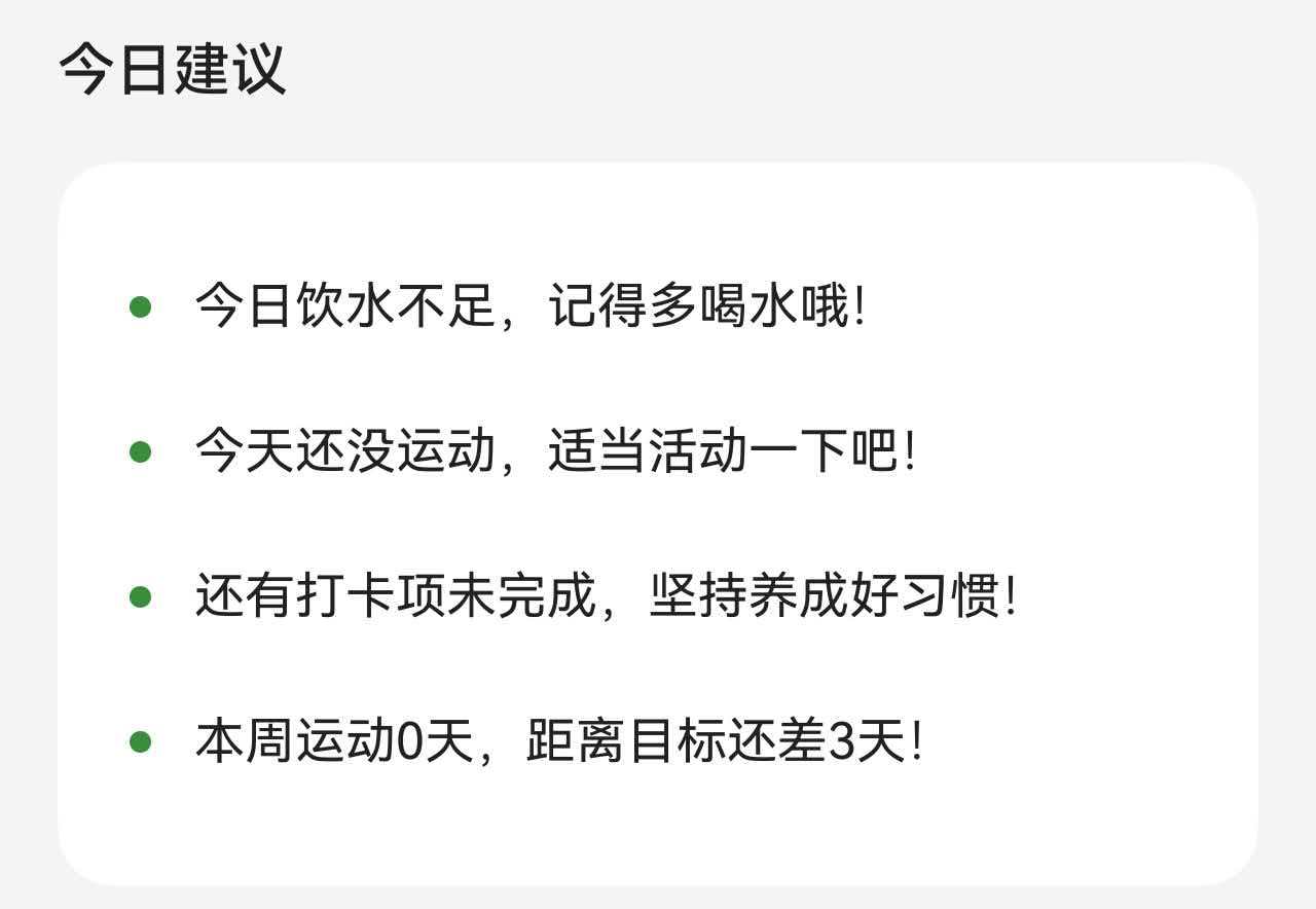
4.2 完整代码
Column() {
Text('今日建议')
.fontSize(16)
.fontWeight(FontWeight.Medium)
.fontColor($r('app.color.text_primary'))
.width('100%')
Column() {
ForEach(this.suggestions, (suggestion: string, index: number) => {
Row() {
Column()
.width(6)
.height(6)
.backgroundColor($r('app.color.primary_dark'))
.borderRadius(3)
Text(suggestion)
.fontSize(14)
.fontColor($r('app.color.text_primary'))
.margin({ left: 12 })
.layoutWeight(1)
}
.width('100%')
.padding({ top: 12, bottom: 12 })
})
}
.width('100%')
.padding(20)
.margin({ top: 16 })
.backgroundColor($r('app.color.card_background'))
.borderRadius(16)
}
.width('100%')
.padding({ left: 16, right: 16, top: 16, bottom: 16 })
4.3 布局要点
列表项结构:
- 使用 ForEach 遍历数据
- 每项包含圆点和文字
- 圆点固定宽度(6)
- 文字使用 layoutWeight(1) 自适应
圆点设计:
- 使用 Column 创建圆点
- 宽高相等(6×6)
- 圆角为宽度的一半(3)
- 使用主题色
间距设计:
- 列表项上下内边距(12)
- 圆点与文字间距(12)
- 整体卡片内边距(20)
总结
通过本文的学习,我们了解了如何在 HarmonyOS 应用中实现各种类型的卡片布局:
核心知识点:
- 卡片的基本结构:Column/Row + padding + backgroundColor + borderRadius
- 不同类型卡片的布局方式:评分卡片、数据卡片、快捷入口、列表卡片
- 响应式设计:根据屏幕尺寸调整卡片大小、内边距、圆角
卡片是构建现代移动应用界面的基础,掌握卡片布局的设计和实现,可以让你的应用界面更加专业和美观。