文章目录
-
- 🎯 先看效果
- 📚 核心知识点拆解
-
- 1. 基础架构:StatelessWidget
- 2. 颜色管理:统一主题色
- 3. 滚动优化:CustomScrollView + Sliver组件
- 4. 视觉提升:渐变与阴影
-
- 渐变背景
- 头像阴影
- 5. 组件封装:复用性提升
- 6. 交互体验:InkWell水波纹
- 7. 路由跳转:退出登录功能
- 🚀 完整代码(可直接运行)
- 📝 运行前准备
- 总结
大家好!今天给大家带来一个超实用的Flutter实战教程——从零开始打造一个视觉效果拉满的绿色系个人中心页面。这个页面包含了渐变导航栏、卡片式菜单、水波纹交互等热门UI设计元素,代码简洁易懂,新手也能轻松上手!
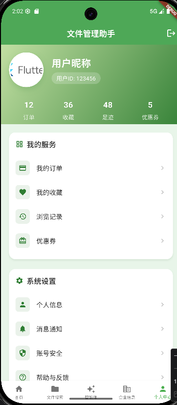
🎯 先看效果
我们最终实现的个人中心包含这些核心特性:
- 渐变背景的置顶导航栏(SliverAppBar)
- 带阴影和边框的圆形头像
- 数据统计卡片
- 主题色统一的功能菜单
- 交互友好的按钮和点击反馈
- 响应式布局适配不同设备
📚 核心知识点拆解
1. 基础架构:StatelessWidget
class ProfilePage extends StatelessWidget {
const ProfilePage({Key? key}) : super(key: key);
Widget build(BuildContext context) {
// 页面内容
return Scaffold(...);
}
}
小白解读:
- StatelessWidget 是无状态组件,适合内容不会动态变化的页面(比如个人中心)
- build 方法是Flutter构建UI的核心,所有界面元素都在这里定义
- Scaffold 是Flutter提供的基础页面骨架,包含导航栏、背景、主体内容等
2. 颜色管理:统一主题色
// 定义绿色系主色值,方便统一调整
const primaryGreen = Color(0xFF2E7D32); // 深绿主色
const lightGreen = Color(0xFF81C784); // 浅绿辅助色
const green50 = Color(0xFFE8F5E9); // 绿色背景浅色调
小白解读:
- 把颜色值定义为常量,方便后期统一修改(改一处全页面生效)
- Flutter中颜色用16进制表示,格式是0xFF + 6位颜色码(和前端的#RRGGBB对应)
- 主色+辅助色+背景色的搭配原则,让页面视觉更统一
3. 滚动优化:CustomScrollView + Sliver组件
body: CustomScrollView(
slivers: [
// 顶部导航栏
SliverAppBar(...),
// 内容区域
SliverToBoxAdapter(...),
],
)
小白解读:
- CustomScrollView 是Flutter的高级滚动组件,适合复杂的滚动场景
- Sliver 可以理解为"可滚动的碎片",不同的Sliver组件组合实现复杂效果
- SliverAppBar:支持展开/收起的导航栏,pinned: true 表示滚动时置顶
- SliverToBoxAdapter:把普通Widget包装成Sliver,实现混合布局
4. 视觉提升:渐变与阴影
渐变背景
decoration: BoxDecoration(
gradient: LinearGradient(
begin: Alignment.topLeft,
end: Alignment.bottomRight,
colors: [
Colors.lightGreen.shade200, // 浅绿渐变起始
Colors.green.shade800, // 深绿渐变结束
],
),
),
头像阴影
boxShadow: [
BoxShadow(
color: primaryGreen.withOpacity(0.2),
blurRadius: 12, // 模糊半径
offset: const Offset(0, 6), // 偏移量
),
],
小白解读:
- LinearGradient 实现线性渐变,可自定义起始/结束位置和颜色
- BoxShadow 给组件添加阴影,让UI有层次感(不是扁平的)
- withOpacity 调整颜色透明度,数值0-1之间
5. 组件封装:复用性提升
// 封装统计项组件
Widget _buildStatItem(String label, String value) {
return Column(...);
}
// 封装菜单卡片组件
Widget _buildMenuCard({
required String title,
required IconData icon,
required Color iconColor,
required List<Widget> items,
}) {
return Card(...);
}
小白解读:
- 把重复的UI元素封装成独立方法,避免代码冗余
- required 关键字表示参数是必填的
- 封装后的组件可以通过传参实现不同样式,比如统一的主题色
6. 交互体验:InkWell水波纹
InkWell(
onTap: onTap,
borderRadius: BorderRadius.circular(8),
// 点击水波纹颜色适配绿色主题
splashColor: themeColor.withOpacity(0.1),
highlightColor: themeColor.withOpacity(0.05),
child: Padding(...),
)
小白解读:
- InkWell 给任意Widget添加点击事件和水波纹效果
- splashColor 是点击时的水波纹颜色
- highlightColor 是长按/点击时的高亮颜色
- 配合borderRadius让水波纹效果更美观
7. 路由跳转:退出登录功能
onPressed: () {
// 实现登出逻辑
Navigator.of(context).pushReplacementNamed('/login');
},
小白解读:
- Navigator 是Flutter的路由管理工具
- pushReplacementNamed 表示跳转到新页面并替换当前页面(退出登录后无法返回)
- 需要提前在路由表中注册/login页面
🚀 完整代码(可直接运行)
import 'dart:ui';
import 'package:flutter/material.dart';
class ProfilePage extends StatelessWidget {
const ProfilePage({Key? key}) : super(key: key);
Widget build(BuildContext context) {
// 定义绿色系主色值,方便统一调整
const primaryGreen = Color(0xFF2E7D32); // 深绿主色
const lightGreen = Color(0xFF81C784); // 浅绿辅助色
const green50 = Color(0xFFE8F5E9); // 绿色背景浅色调
return Scaffold(
backgroundColor: green50,
body: CustomScrollView(
slivers: [
// 自定义顶部栏 – 绿色渐变
SliverAppBar(
expandedHeight: 280,
floating: false,
pinned: true,
backgroundColor: primaryGreen,
surfaceTintColor: primaryGreen,
flexibleSpace: FlexibleSpaceBar(
background: Container(
decoration: BoxDecoration(
gradient: LinearGradient(
begin: Alignment.topLeft,
end: Alignment.bottomRight,
colors: [
Colors.lightGreen.shade200,
Colors.green.shade800,
],
),
),
child: SafeArea(
child: Padding(
padding: const EdgeInsets.all(20),
child: Column(
crossAxisAlignment: CrossAxisAlignment.start,
children: [
const SizedBox(height: 20),
Row(
children: [
// 用户头像
Container(
decoration: BoxDecoration(
shape: BoxShape.circle,
border: Border.all(
color: Colors.white,
width: 3,
),
boxShadow: [
BoxShadow(
color: primaryGreen.withOpacity(0.2),
blurRadius: 12,
offset: const Offset(0, 6),
),
],
),
child: const CircleAvatar(
radius: 40,
backgroundImage: AssetImage(
'assets/images/flutter.jpg',
),
backgroundColor: lightGreen,
),
),
const SizedBox(width: 20),
// 用户信息
Expanded(
child: Column(
crossAxisAlignment: CrossAxisAlignment.start,
children: const [
Text(
'用户昵称',
style: TextStyle(
fontSize: 24,
fontWeight: FontWeight.bold,
color: Colors.white,
letterSpacing: 0.5,
),
),
SizedBox(height: 8),
UserIdTag(),
],
),
),
],
),
const SizedBox(height: 30),
// 统计数据行
Row(
mainAxisAlignment: MainAxisAlignment.spaceAround,
children: [
_buildStatItem('订单', '12'),
_buildStatItem('收藏', '36'),
_buildStatItem('足迹', '48'),
_buildStatItem('优惠券', '5'),
],
),
],
),
),
),
),
),
),
// 内容区域
SliverToBoxAdapter(
child: Padding(
padding: const EdgeInsets.all(16),
child: Column(
children: [
// 功能菜单卡片
_buildMenuCard(
title: '我的服务',
icon: Icons.grid_view,
iconColor: primaryGreen,
items: [
_buildMenuItem(Icons.payment, '我的订单', () {}, primaryGreen),
_buildMenuItem(Icons.favorite, '我的收藏', () {}, primaryGreen),
_buildMenuItem(Icons.history, '浏览记录', () {}, primaryGreen),
_buildMenuItem(Icons.card_giftcard, '优惠券', () {}, primaryGreen),
],
),
const SizedBox(height: 16),
// 设置菜单卡片
_buildMenuCard(
title: '系统设置',
icon: Icons.settings,
iconColor: primaryGreen,
items: [
_buildMenuItem(Icons.person, '个人信息', () {}, primaryGreen),
_buildMenuItem(Icons.notifications, '消息通知', () {}, primaryGreen),
_buildMenuItem(Icons.security, '账号安全', () {}, primaryGreen),
_buildMenuItem(Icons.help_outline, '帮助与反馈', () {}, primaryGreen),
_buildMenuItem(Icons.info_outline, '关于我们', () {}, primaryGreen),
],
),
const SizedBox(height: 24),
// 退出登录按钮
_buildLogoutButton(primaryGreen, context),
const SizedBox(height: 30),
],
),
),
),
],
),
);
}
// 统计项组件
Widget _buildStatItem(String label, String value) {
return Column(
children: [
Text(
value,
style: const TextStyle(
fontSize: 20,
fontWeight: FontWeight.bold,
color: Colors.white,
shadows: [
Shadow(
color: Colors.black12,
offset: Offset(0, 1),
blurRadius: 2,
)
],
),
),
const SizedBox(height: 5),
Text(
label,
style: TextStyle(
fontSize: 14,
color: Colors.white.withOpacity(0.9),
fontWeight: FontWeight.w400,
),
),
],
);
}
// 菜单卡片组件
Widget _buildMenuCard({
required String title,
required IconData icon,
required Color iconColor,
required List<Widget> items,
}) {
return Card(
elevation: 3,
shadowColor: iconColor.withOpacity(0.15),
shape: RoundedRectangleBorder(
borderRadius: BorderRadius.circular(16),
),
color: Colors.white,
child: Padding(
padding: const EdgeInsets.all(16),
child: Column(
crossAxisAlignment: CrossAxisAlignment.start,
children: [
Row(
children: [
Icon(icon, color: iconColor, size: 20),
const SizedBox(width: 8),
Text(
title,
style: TextStyle(
fontSize: 18,
fontWeight: FontWeight.bold,
color: Colors.grey[800],
letterSpacing: 0.3,
),
),
],
),
const SizedBox(height: 16),
...items,
],
),
),
);
}
// 菜单项组件
Widget _buildMenuItem(
IconData icon,
String title,
VoidCallback onTap,
Color themeColor,
) {
return InkWell(
onTap: onTap,
borderRadius: BorderRadius.circular(8),
splashColor: themeColor.withOpacity(0.1),
highlightColor: themeColor.withOpacity(0.05),
child: Padding(
padding: const EdgeInsets.symmetric(vertical: 12),
child: Row(
children: [
Container(
padding: const EdgeInsets.all(8),
decoration: BoxDecoration(
color: themeColor.withOpacity(0.1),
borderRadius: BorderRadius.circular(8),
),
child: Icon(
icon,
color: themeColor,
size: 20,
),
),
const SizedBox(width: 16),
Expanded(
child: Text(
title,
style: const TextStyle(
fontSize: 16,
color: Colors.black87,
fontWeight: FontWeight.w400,
),
),
),
Icon(
Icons.chevron_right,
color: Colors.grey[400],
size: 20,
),
],
),
),
);
}
// 退出登录按钮
Widget _buildLogoutButton(Color themeColor, BuildContext context) {
return SizedBox(
width: double.infinity,
height: 50,
child: ElevatedButton(
onPressed: () {
// 实现登出逻辑
Navigator.of(context).pushReplacementNamed('/login');
},
style: ElevatedButton.styleFrom(
backgroundColor: Colors.white,
elevation: 2,
shadowColor: themeColor.withOpacity(0.1),
shape: RoundedRectangleBorder(
borderRadius: BorderRadius.circular(25),
side: BorderSide(color: Colors.red.withOpacity(0.2), width: 1),
),
splashFactory: InkRipple.splashFactory,
),
child: const Text(
'退出登录',
style: TextStyle(
color: Colors.redAccent,
fontSize: 16,
fontWeight: FontWeight.w500,
letterSpacing: 0.5,
),
),
),
);
}
}
// 抽离用户ID标签组件
class UserIdTag extends StatelessWidget {
const UserIdTag({Key? key}) : super(key: key);
Widget build(BuildContext context) {
return Container(
padding: const EdgeInsets.symmetric(horizontal: 12, vertical: 4),
decoration: BoxDecoration(
color: Colors.white.withOpacity(0.2),
borderRadius: BorderRadius.circular(20),
),
child: BackdropFilter(
filter: ImageFilter.blur(sigmaX: 0.2, sigmaY: 0.2),
child: const Text(
'用户ID: 123456',
style: TextStyle(
fontSize: 14,
color: Colors.white,
fontWeight: FontWeight.w400,
),
),
),
);
}
}
📝 运行前准备
flutter:
assets:
– assets/images/
MaterialApp(
initialRoute: '/profile',
routes: {
'/profile': (context) => const ProfilePage(),
'/login': (context) => const LoginPage(), // 替换为你的登录页
},
);
