一.小程序中实现:悬浮提示框 / 气泡提示框
-
1.效果图
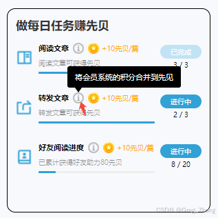
-
封装组件完整代码
Component({
properties: {
bgColor: {
type: String,
value: '#000000'
},
textColor: {
type: String,
value: '#ffffff'
},
content: {
type: String,
value: '将会员系统的积分合并到先见'
}
},data: {
show: false
},methods: {
toggleTip() {
// 显示提示框
this.setData({ show: true });// 3 秒后自动隐藏
setTimeout(() => {
this.setData({ show: false });
}, 3000);
}
}
})<view class="tip-wrapper">
<!— 你的感叹号图标 —>
<image
class="info-icon"
src="https://images.hysound.com.cn/wechat/AB/img_04.png"
mode="aspectFit"
bindtap="toggleTip"
></image><!— 提示气泡 —>
<view
class="bubble {{ show ? 'show' : 'hide' }}"
style="background:{{ bgColor }};color:{{ textColor }}"
>
{{ content }}
<!— 箭头在底部偏左 —>
<view class="arrow" style="border-top-color:{{ bgColor }}" />
</view>
</view>.tip-wrapper {
position: relative;
display: inline-block;
vertical-align: middle;
bottom: 5rpx;
}.info-icon {
width: 38rpx;
height: 38rpx;
margin-left: 6rpx;
display: block;
}.bubble {
position: absolute;
bottom: calc(38rpx + 18rpx); /* 总共上移了4rpx */
left: -16rpx;
padding: 20rpx 28rpx;
border-radius: 8rpx;
font-size: 28rpx;
white-space: nowrap;
z-index: 999;
background: #000;
color: #fff;
transition: opacity 0.3s ease, visibility 0.3s ease;
}.arrow {
position: absolute;
bottom: -18rpx;
left: 28rpx;
width: 0;
height: 0;
border-left: 12rpx solid transparent;
border-right: 12rpx solid transparent;
border-top: 18rpx solid #000;
}.bubble.show {
opacity: 1;
visibility: visible;
}
.bubble.hide {
opacity: 0;
visibility: hidden;
} -
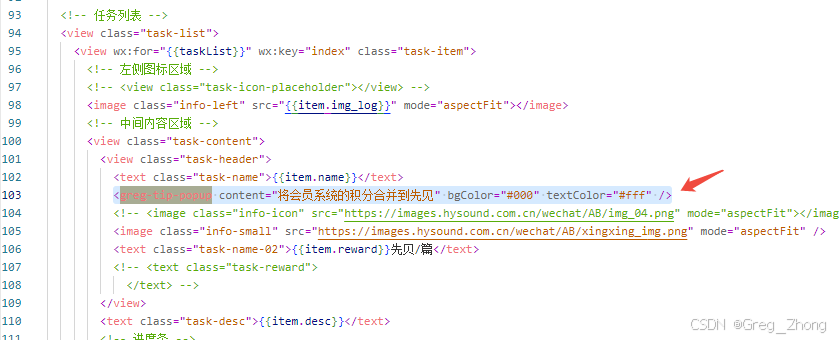
3.父组件中josn中引入,wxml中使用
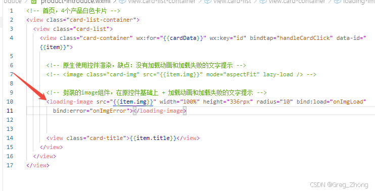
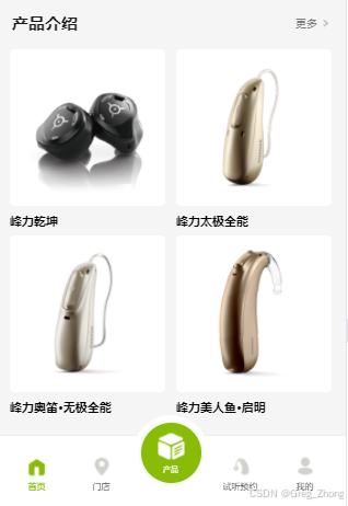
二、图片css加载动画,及图片未显示的错误处理
-
1.效果图:
-
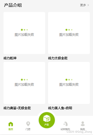
-
2.完整代码
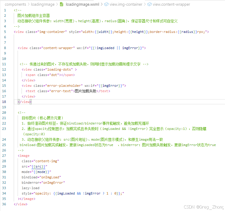
Component({
properties: {
src: {
type: String,
value: '',
observer(newVal) {
if (newVal) {
console.log('子组件:src更新', newVal); // 真机调试能看到
this.setData({
imgLoaded: false,
imgError: false
});
}
}
},
mode: {
type: String,
value: 'aspectFill' // 修复:换成aspectFill,适配固定宽高
},
width: {
type: String,
value: '300rpx'
},
height: {
type: String,
value: '200rpx'
},
radius: {
type: Number,
value: 12
}
},
data: {
imgLoaded: false,
imgError: false
},
methods: {
onImgLoad() {
console.log('子组件:图片加载成功'); // 真机日志能看到
this.setData({ imgLoaded: true });
this.triggerEvent('load', { success: true });
},
onImgError() {
console.log('子组件:图片加载失败');
this.setData({ imgError: true });
this.triggerEvent('error', { success: false });
}
}});<view class="img-container" style="width:{{width}};height:{{height}};border-radius:{{radius}}rpx;">
<view class="content-wrapper" wx:if="{{!imgLoaded || imgError}}">
<view class="loading-dots" >
<span class="dot"></span>
</view>
<view class="error-placeholder" wx:if="{{imgError}}">
<text class="error-text">图片加载失败</text>
</view>
</view>
<image
class="content-img"
src="{{src}}"
mode="{{mode}}"
bindload="onImgLoad"
binderror="onImgError"
lazy–load
style="opacity: {{imgLoaded && !imgError ? 1 : 0}};"
></image>
</view>.img-container {
position: relative;
background-color: #ffffff;
overflow: hidden;
display: flex;
align-items: center;
justify-content: center;
margin: 0 auto;
}.content-wrapper {
display: flex;
flex-direction: column;
align-items: center;
justify-content: center;
width: 100%;
height: 100%;
gap: 12rpx; /* 增大动画和文字间距,更美观 */
}/* 三点加载动画核心 – 优化版 */
.loading-dots {
display: flex;
gap: 10rpx; /* 圆点间距加宽,视觉更舒展 */
align-items: center;
justify-content: center;
}/* 三个圆点基础样式 – 调整大小+颜色深浅 */
.loading-dots .dot,
.loading-dots::before,
.loading-dots::after {
content: '';
width: 14rpx; /* 缩小圆点,更精致 */
height: 14rpx;
border-radius: 50%;
background-color: #88bc07; /* 主题绿 */
opacity: 0.8; /* 初始透明度,动画更自然 */
/* 优化动画曲线,更丝滑 */
animation: dot-flash 1.2s infinite ease-in-out both;
}/* 动画延迟调整 – 节奏更舒服 */
.loading-dots::before {
animation-delay: 0s;
}
.loading-dots .dot {
animation-delay: 0.25s;
}
.loading-dots::after {
animation-delay: 0.5s;
}/* 优化动画关键帧 – 缩放+透明度结合 */
@keyframes dot-flash {
0%, 100% {
opacity: 0.4; /* 初始/结束透明度更低 */
transform: scale(0.9); /* 缩小幅度减小,更柔和 */
}
50% {
opacity: 1; /* 高亮时完全不透明 */
transform: scale(1.3); /* 放大幅度适中,不夸张 */
}
}/* 图片样式 */
.content-img {
position: absolute;
top: 0;
left: 0;
width: 100%;
height: 100%;
object-fit: cover;
/* 图片显示过渡动画 */
transition: opacity 0.4s ease-in-out;
}/* 加载失败占位 – 优化文字样式 */
.error-placeholder {
display: flex;
align-items: center;
justify-content: center;
}.error-text {
font-size: 26rpx; /* 增大文字,更易读 */
color: #888; /* 调整文字颜色,不刺眼 */
font-weight: 400;
}父组件中使用: