项目背景:vue2,主要使用antd1.7.8
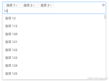
没找到合适的自带虚拟列表的下拉选择框,所以这里我基于vue-virtual-scroller和vue-select封装了一个选择框,功能样式都参考antd-select,支持多选/单选/清除/搜索功能。
技术栈:
vue2.7.14
ant design vue1.7.8
vue-select 3.20.4
vue-virtual-scroller 1.0.0-rc.1
为什么不用antd-select结合vue-virtual-scroller呢?
因为我第一次做是想在模板中option外层套虚拟列表,但是1.7.8版本不支持,要求select子元素必须是option,所以我才选了vue-select,一开始也是写在模板中的,然后有一些问题(具体什么来着有点忘了,这组件不是最近写的)。然后选择了动态挂载dom的方式来做:聚焦选择框,再挂载虚拟列表。
这里用vue-select比较麻烦就是改了许多样式来仿照antd,主要因为样式我都写完了才换的动态挂载,其实可以尝试直接用antd-select来动态挂载,我觉得应该会少些很多代码!!!
目前该组件还有一个问题待优化:把下拉列表挂载到body上,让其脱离文档流,不用影响父元素的高度。 这个后面再做一下。
2026-1-5补充:
把下拉列表挂载到body上
1.给vue-select添加属性append-to-body
2.下拉菜单被渲染到标签末尾后,不在组件的DOM结构中了,无法通过组件实例的$el来获取元素。
因此修改代码中menu的获取方式,把const menu = vs.$el.querySelector(‘.vs__dropdown-menu’) 全改为 const menu = document.querySelector(‘.vs__dropdown-menu’)
2026-1-15更新:
options代表的是原生dom选项,必须绑定空数组,如果绑定了值实际上会创建dom导致卡顿。
2026-1-16更新:
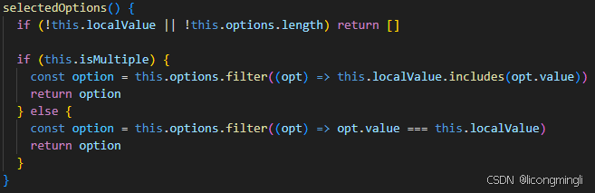
1.v-select绑定options写成 :options=“[]"修正为;options="selectedOptions"
绑定空数组会导致#selcted-option-container获取到的option是空,无法正确回显,同理#selected-option也无法争取获取到label 和searchLabel。因为这是vue-select的原生插槽,数据来源都是基于options属性。
为了解决这问题同时避免创建大量dom, options绑定已选中项。
写个计算属性计算已选中项
——2025-1-15 补充图如下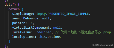
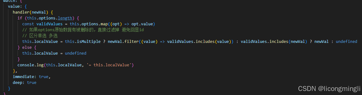
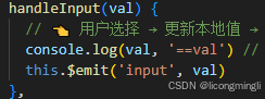
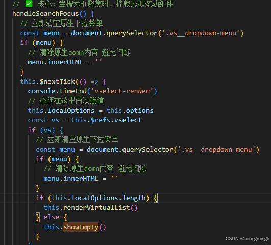
—–2026-1-16补充图如下
———————————以下是完整初版,以上是部分优化更新
使用示例
1.components中创建一个VirtualSelect.vue组件
<template>
<div class="ant-select-wrapper" :class="{ 'is-multiple': isMultiple }">
<v–select
ref="select"
class="form-item"
:value="localValue"
:options="options"
:multiple="isMultiple"
:placeholder="placeholder"
label="label"
track–by="value"
:close–on–select="isMultiple ? false : true"
:filterable="false"
:reduce="option => option.value"
:search–from–dropdown="isMultiple ? true : false"
@input="handleInput"
@on–option–selected="optionAfterSelect"
@search–blur="handleSearchBlur"
@search–focus="handleSearchFocus"
@search="handleCustomSearch"
>
<!— 自定义每个已选tag —>
<template v–if="isMultiple" #selected–option–container="{ option, deselect }">
<span class="ant-select-selection__choice" :title="option.label">
<span class="ant-select-selection__choice__content">
{{ option.label }}
</span>
<span class="ant-select-selection__choice__remove" @click.stop="deselect(option)" @mousedown.prevent>
<i class="iconfont icon-close"></i>
</span>
</span>
</template>
<!— ✅ 关键:自定义选中值样式(不换行、省略号、悬浮提示) —>
<template v–else #selected–option="{ label }">
<div class="vs_selected-value" :title="label">
{{ label }}
</div>
</template>
</v–select>
<!— 清除图标 (Ant Design 风格) —>
<span v–if="allowClear && localValue.length" class="ant-select-clear" @click.stop="clearAll" title="清除">
<a–icon type="close-circle" theme="filled" style="font-size:12px" />
</span>
</div>
</template>
import { RecycleScroller } from 'vue-virtual-scroller'
import VirtualOptions from './VirtualOptions.vue' // ✅ 模板组件
import DropdownOption from './DropdownOption.vue'
import { Empty } from 'ant-design-vue'
export default {
name: 'VirtualSelect',
inheritAttrs: false, // 确保$attrs/$props特性不会被应用到根元素上
components: {
// 注意:我们不直接在这里注册 VirtualOptions,因为要手动 $mount RecycleScroller,✅ 注册一下确保模板能识别(虽然这里没用到)
RecycleScroller,
DropdownOption
},
model: {
prop: 'value',
event: 'input'
},
props: {
value: {
type: [String, Number, Array],
default: null
},
// 原始全量数据
options: {
type: Array,
default: () => []
},
placeholder: {
type: String,
default: '请选择'
},
mode: {
type: String,
default: 'single', // 'single' | 'multiple'
validator: (val) => ['single', 'multiple'].includes(val)
},
// 清空全选项
allowClear: {
type: Boolean,
default: true
},
// 是否清空搜索框keyword
clearSearchKey: {
type: Boolean,
default: true
}
},
data() {
return {
simpleEmptyImage: Empty.PRESENTED_IMAGE_SIMPLE,
searchDebounce: null,
pointer: –1,
localOptions: […this.options], // 当前下拉框中显示的选项(搜索过滤后的)
virtualListComponent: null,
dropdownMenuEl: null,
localValue: Array.isArray(this.value) ? […this.value] : this.value !== null ? [this.value] : [] // 使用本地副本避免直接修改 prop
};
},
computed: {
isMultiple() {
return this.mode === 'multiple'
},
selectedOptions() {
return this.localValue.map(val => {
const opt = this.options.find(o => o.value === val)
return opt || { Value: val, label: String(val) }
})
}
},
watch: {
value: {
handler(newVal) {
const validValues = this.options.map(opt => opt.value)
// 如果options原始数据有被删除的,直接过滤掉 避免回显id
this.localValue = Array.isArray(newVal) ? newVal.filter((value) => validValues.includes(value)) : []
},
immediate: true,
deep: true
}
},
methods: {
handleCustomSearch(query) {
clearTimeout(this.searchDebounce)
this.searchDebounce = setTimeout(() => {
const vs = this.$refs.select
if (!vs) return
// 自定义过滤
const filtered = this.options.filter((option) => option.label.toLowerCase().includes(query.toLowerCase()))
this.localOptions = filtered
vs.typeAheadPointer = –1
if (filtered.length === 0) {
this.renderVirtualList()
} else {
const vs = this.$refs.select
if (!vs || !vs.$el) return
// 清除之前的虚拟列表内容
const menu = vs.$el.querySelector('.vs__dropdown-menu')
if (menu) {
menu.innerHTML = ''
}
// 设置固定高度(必须 定高虚拟列表)
const dropdownHeight = '150px'
menu.style.height = dropdownHeight
// 如果是空结果,渲染"暂无数据"占位符
const noDataEl = document.createElement('div')
noDataEl.className = 'vs__no-options'
// 添加svg和文字
const simpleEmptySvg = `
<svg width="64" height="41" viewBox="0 0 64 41" xmlns="http://www.w3.org/2000/svg" style="max-width: 100%; height: auto;">
<g transform="translate(0 1)">
<ellipse cx="32" cy="7" fill="#f5f5f5" rx="29" ry="15"></ellipse>
<path d="M22 11.046 20 8.954 20 20.8-2.954 20-20.825 32.846 21 10.954 12 2 8c-2.21 0-4 1.79-4 4s1.79 4 4 4zm8-2.21 0-4.1-1.38-1.12-2.5-2.5-2.5.25-2.5.25c-2.5 0-2.5 2.55-2.5 2.55 17.38 17.8 17.66 5.23 4.477 10 10 0 1.38-1.12 2.5-2.5 2.5-2.5 2.5-5 2.24-5 0-1.38-1.12-2.5-2.5-2.55 17.38 17.8 17.66 5.23 4.477 10 10 0 1.38-1.12 2.5-2.5 2.5z"></path>
</g>
</svg>
`
noDataEl.innerHTML = `
<div class="ant-empty-normal">
<div class="ant-empty-image">
${simpleEmptySvg}
</div>
<p class="ant-empty-description">暂无数据</p>
</div>
`
menu.appendChild(noDataEl)
}
}, 200)
},
handleInput(val) {
// 用户选择,更新本地值,触发 watch -> emit 给父组件 实现双向绑定 写watch导致卡死后就这样写吧
this.localValue = Array.isArray(val) ? val : val !== null ? [val] : []
this.$emit('input', val) // 现在会打印了!
console.log('input', val)
},
clearAll() {
// 清空全部选中值
this.localValue = [] // 触发 watch -> emit
this.$emit('input', this.localValue)
},
// 选中值后的回调
blurAfterSelect() {
// 单选:选中值后默认失焦
if (this.isMultiple) return
this.$nextTick(() => {
const vsEl = this.$refs.select ? this.$refs.select.$el : undefined
if (!vsEl) return
const input = vsEl.querySelector('input[type="search"]')
if (input && document.activeElement === input) {
input.blur()
}
})
},
// 搜索后,没有选择值,失焦应该清除输入项
handleSearchBlur() {
const vs = this.$refs.select
if (!vs) return
// 如果没有pendingOption(即没有高亮/准备选中的选项)
// 并且当前搜索词不为空,则清空它
if (!vs.pendingOption && vs.search.length) {
vs.search = ''
}
},
// 核心:当搜索框聚焦时,挂载虚拟滚动组件
handleSearchFocus() {
this.$nextTick(() => {
const vs = this.$refs.select
if (vs) {
// 立即清空原生下拉菜单
const menu = vs.$el.querySelector('.vs__dropdown-menu')
if (menu) {
menu.innerHTML = ''
}
setTimeout(() => {
this.renderVirtualList()
}, 50)
}
})
},
renderVirtualList() {
const vs = this.$refs.select
if (!vs) return
const menu = vs.$el.querySelector('.vs__dropdown-menu')
if (!menu) return
// 设置固定高度(必须) 定高虚拟列表
let dropdownHeight = '300px'
// 优化思路 避免数据项太短太长一拉空白
if (this.localOptions.length < 3) {
dropdownHeight = '85px'
} else if (this.localOptions.length < 6) {
dropdownHeight = '195px'
}
menu.style.height = dropdownHeight
menu.style.maxHeight = dropdownHeight
// 销毁旧实例
if (this.virtualListComponent) {
this.virtualListComponent.$destroy()
this.virtualListComponent.$el.remove()
this.virtualListComponent = null
}
// 创建新实例
const VueConstructor = this.$vue
const appInstance = new VueConstructor({
render: (h) =>
h(VirtualOptions, {
props: {
options: this.localOptions,
selectedValue: this.localValue,
pointeIndex: this.pointer,
setPointer: (index) => {
vs.typeAheadPointer = index
}
},
on: {
select: (option) => {
vs.select(option)
this.burAfterSelect()
}
}
})
}).$mount()
this.virtualListComponent = appInstance
menu.innerHTML = ''
menu.appendChild(this.virtualListComponent.$el)
}
}
}
<style scoped lang="less">
.ant–select–wrapper {
position: relative;
display: inline–block;
width: 100%;
}
.form–item {
/deep/ .vs_dropdown–toggle {
border: 1px solid #d9d9d9;
border–radius: 4px;
padding: 0 8px;
transition: all 0.3s;
min–height: 32px;
display: flex;
align–items: center;
&:hover {
border–color: #2496ff;
}
/* 多选自定义 Ant Design 风格 Tag ✨✨✨ */
.ant–select–selection__choice {
position: relative;
float: left;
max–width: 92%; // 给清空按钮留位置
margin–right: 4px;
padding: 0 10px;
color: rgba(0, 0, 0, 0.65);
background–color: #f4f4f4;
border: 1px solid #e8e8e8;
border–radius: 2px;
cursor: default;
–webkit–transition: padding 0.3s cubic–bezier(0.645, 0.045, 0.355, 1);
transition: padding 0.3s cubic–bezier(0.645, 0.045, 0.355, 1);
font–size: 14px;
height: 24px;
margin–top: 3px;
line–height: 22px;
display: flex;
justify–content: space–between;
.ant–select–selection__choice__content {
white–space: nowrap;
overflow: hidden;
text–overflow: ellipsis;
display: inline–block;
}
.ant–select–selection__choice__remove {
padding: 0 2px;
color: #bfbfbf;
cursor: pointer;
}
}
// 输入搜索 仅在多选时生效 换行
.vs_search,
.vs_search:focus {
padding: 0;
border: none;
outline: none;
box–shadow: none;
font–size: 14px;
color: rgba(0, 0, 0, 0.65);
/* 搜索输入光标自动换行 */
align–self: flex–start; /* 靠左对齐 */
width: 100%; /* 占满宽度 */
&::placeholder {
color: #bfbfbf;
margin–left: 0px;
}
}
// 单选选中值样式
.ant–select–selection–selected–value {
flex–grow: 1;
display: inline–block;
max–width: 100%;
overflow: hidden;
white–space: nowrap;
margin–left: 6px;
color: rgba(0, 0, 0, 0.65);
}
}
/deep/ .vs_open_indicator {
fill: #bfbfbf;
transform: rotate(0deg);
transition: transform 0.2s;
.vs_open & {
transform: rotate(180deg);
}
}
}
}
/* 单选多选都隐藏 vue-select 清空按钮,用了自定义 */
/deep/ .vs__clear {
display: none;
}
/* 多选时默认下拉展开图标 */
.ant–select–wrapper.is–multiple /deep/ .vs__actions {
opacity: 0;
}
/* 多选操作区 */
.ant–select–wrapper.is–multiple /deep/ .vs__selected–options {
width: 100%;
margin–left: 5px;
flex–wrap: wrap;
}
/* 单选 */
.ant–select–wrapper:not(.is–multiple) /deep/ .vs__selected–options {
width: 92%; /* 给下拉图标留位置 */
flex–wrap: nowrap; /* 单选不换行 */
}
/deep/ .vs__selected {
width: 100%;
}
// 单选选中值
.vs_selected–value {
display: inline–block;
max–width: 100%;
white–space: nowrap;
overflow: hidden;
text–overflow: ellipsis;
line–height: 1.5; /* 可选:对抗高度 */
font–size: 14px;
color: rgba(0, 0, 0, 0.65);
}
/* 清除按钮 */
.ant–select–clear {
position: absolute;
top: 8px;
right: 6px;
color: #bbb;
cursor: pointer;
font–weight: bold;
line–height: 1;
user–select: none;
opacity: 0;
&:hover {
color: #8c8c8c;
}
}
// 鼠标移入显示清除按钮
.ant–select–wrapper:hover .ant–select–clear {
opacity: 1;
cursor: pointer;
}
// 并隐藏下拉图标
.ant–select–wrapper:hover /deep/ .vs_actions {
opacity: 0;
}
/* 确保 SVG 正确显示 */
.ant–empty–image {
width: 64px;
height: 41px;
overflow: visible;
}
2.components中创建一个VirtualOptions.vue组件
这是使用虚拟列表做下拉列表
<template>
<RecycleScroller ref="scroller" class="virtual-options custom-scrollbar" :items="options" :item–size="36"
key–field="value" v–slot="{ item, index }">
<DropdownOption :option="item" :selected–value="selectedValue" :pointer="pointer" :index="index"
@set–pointer="setPointer" @select="select" />
</RecycleScroller>
</template>
<script>
import DropdownOption from './DropdownOption.vue'
export default {
name: 'VirtualOptions',
components: {
DropdownOption
},
props: {
options: { type: Array, required: true },
selectedValue: { type: [String, Number, Array], default: null },
pointer: { type: Number, default: –1 },
setPointer: { type: Function, required: true },
select: { type: Function, required: true }
}
}
</script>
<style scoped lang="less">
.virtual–options {
height: 100%;
width: 100%;
overflow: auto;
}
.custom–scrollbar {
/* 自定义下拉滚动条样式 */
&::–webkit–scrollbar {
width: 7px;
height: 7px;
}
&::–webkit–scrollbar–thumb {
cursor: pointer;
border–radius: 5px;
background: rgba(0, 0, 0, 0.15);
transition: color 0.2s ease;
}
&::–webkit–scrollbar–thumb:hover {
background: rgba(0, 0, 0, 0.3);
}
}
</style>
3.components中创建一个DropdownOption.vue组件
这是下拉选项自定义组件
<template>
<div class="vs_dropdown-option" :class="{
'vs_dropdown-option–selected': isSelected,
'vs_dropdown-option–highlighted': isHighlighted
}" @mouseover.prevent="setHover" @click="selectOption">
<div class="vs_option-content">
<span class="vs_option-label" :title="option.label">{{ option.label }}</span>
<!— 显示勾选图标(Ant Design 风格) —>
<span v–if="isSelected" class="vs_selected-indicator">
<a–icon type="check" />
</span>
</div>
</div>
</template>
<script>
export default {
name: 'DropdownOption',
props: {
option: { type: Object, required: true },
selectedValue: { type: [String, Number, Array], default: null },
pointer: { type: Number, default: –1 },
index: { type: Number, required: true },
setPointer: { type: Function, required: true },
select: { type: Function, required: true }
},
computed: {
isSelected() {
if (Array.isArray(this.selectedValue)) {
return this.selectedValue.includes(this.option.value)
}
return this.selectedValue === this.option.value
},
isHighlighted() {
return this.index === this.pointer
}
},
methods: {
selectOption() {
this.select(this.option)
},
setHover() {
this.setPointer(this.index)
}
}
}
</script>
<style scoped lang="less">
// 下拉选项样式
.vs_dropdown–option {
padding: 6px 12px;
cursor: pointer;
white–space: nowrap;
overflow: hidden;
text–overflow: ellipsis;
color: rgba(0, 0, 0, 0.65);
font–size: 14px;
&.vs_dropdown–option—highlight {
background–color: #e6f7ff;
color: #1890ff;
}
// 选中加租
&.vs_dropdown–option—selected {
background–color: #f5f5f5;
font–weight: bold;
}
&:hover {
background–color: #e6f7ff;
color: #1890ff;
}
}
.vs_option–content {
display: flex;
justify–content: space–between;
align–items: center;
// 自定义原label
.vs_option–label {
white–space: nowrap;
overflow: hidden;
text–overflow: ellipsis;
}
// 自定义勾选标记
.vs_selected–indicator {
color: #1890ff;
font–weight: bold;
margin–left: 8px;
}
}
</style>
4.在其他文件中使用该选择框
使用很简单,常规使用传入options就行,一个注意项是需要映射label value,写在示例的注释中了
<template>
<div class="demo-container">
<h3>虚拟滚动选择器示例</h3>
<virtual–select
v–model="selectedValue"
:options="largeOptions"
placeholder="请选择城市"
/>
<div class="selected-info">
已选择: {{ selectedValue ? selectedLabel : '未选择' }}
</div>
</div>
</template>
<script>
import VirtualSelect from '@/components/VirtualSelect.vue';
export default {
components: {
VirtualSelect
},
data() {
return {
selectedValue: null,
largeOptions: [] // 大量数据
};
},
computed: {
selectedLabel() {
const selectedItem = this.largeOptions.find(
item => item.value === this.selectedValue
);
return selectedItem ? selectedItem.label : '';
}
},
created() {
// 生成10000条模拟数据
this.largeOptions = Array.from({ length: 10000 }, (_, i) => ({
// 注意这里 不管你的真实数据是什么格式,都要求映射为value 和label value是值 label用于支持搜索
value: i + 1,
label: `城市 ${i + 1}`
}));
},
};
</script>
<style scoped>
.demo–container {
padding: 20px;
}
.selected–info {
margin–top: 20px;
color: #666;
}
</style>