一、概述
在HarmonyOS应用开发中,进度条(Progress)是最常用的UI组件之一,用于向用户直观展示任务完成的进度状态。HarmonyOS的ArkUI框架提供了功能完善的Progress组件,支持多种内置样式,同时允许开发者通过自定义绘制实现更加丰富多样的进度展示效果。
Progress组件从API version 7开始支持,从API version 9起支持在ArkTS卡片中使用。在API 8及以上版本中,建议使用type属性指定样式,原有的style参数已在API 8起废弃。
二、Progress组件基础API
2.1 创建进度条
通过调用Progress接口创建进度条,基本语法如下:
typescript
Progress({ value: number, total?: number, type?: ProgressType })
参数说明:
-
value:当前进度值,当value < 0时置为0,当value > total时置为total
-
total:进度总长度,默认值为100
-
type:进度条样式类型,默认为ProgressType.Linear
2.2 核心属性
| value | number | 当前进度值 |
| total | number | 进度总值 |
| type | ProgressType | 进度条样式类型 |
| color | ResourceColor | 进度条前景色 |
| backgroundColor | ResourceColor | 进度条背景色 |
| style | ProgressStyleOptions | 样式配置(刻度数、线宽等) |
需要注意的是,直接对Progress组件设置backgroundColor改变的是进度条本身的背景色。如果要设置整个Progress组件区域的背景色,需要在外层容器上应用。
三、五种内置样式详解
Progress组件提供了五种内置样式,通过ProgressType枚举指定:
3.1 线性进度条(ProgressType.Linear)
样式特征:以直线的形式展示进度,是最常见的进度条样式。
显示逻辑:从API version 9开始,当组件高度大于宽度时,自动垂直显示(进度从下到上填充);当高度等于宽度时,保持水平显示(进度从左到右填充)。
适用场景:文件下载、应用安装、视频缓冲、任务进度等常规进度提示场景。
源码示例:
typescript
// 水平线性进度条
Progress({ value: 65, total: 100, type: ProgressType.Linear })
.width('90%')
.height(18)
.color("#0066CC")
.backgroundColor("#E5E5E5")
.animation({ duration: 500, curve: Curve.EaseInOut });
// 垂直线性进度条(高度大于宽度时自动垂直)
Progress({ value: 65, total: 100, type: ProgressType.Linear })
.width(50)
.height(200)
.color("#0066CC");
3.2 环形无刻度进度条(ProgressType.Ring)
样式特征:以空心圆环形式展示进度,无刻度标记,圆环从左侧开始逐渐填充至右侧。默认前景色为蓝色渐变,默认strokeWidth为2.0vp。
适用场景:音乐播放器进度、健康数据追踪、应用安装、系统更新等需要简洁环形展示的场景。
源码示例:
typescript
// 基础环形进度条
Progress({ value: 78, total: 100, type: ProgressType.Ring })
.width(80)
.height(80)
.color("#009966");
// 自定义环形宽度
Progress({ value: 40, total: 150, type: ProgressType.Ring })
.width(100)
.height(100)
.color(Color.Grey)
.style({ strokeWidth: 15 }); // 设置环宽为15vp
3.3 环形有刻度进度条(ProgressType.ScaleRing)
样式特征:在环形无刻度基础上增加刻度标记(类似时钟刻度),更直观地展示进度细节。头尾两端圆弧处的进度展示效果与Eclipse样式相同,中段为矩形状长条。
智能适配:从API version 9开始,若刻度外圈因尺寸过小发生重叠,会自动转换为环形无刻度样式。
适用场景:需要精确展示进度的场景,如健身时长统计、烹饪倒计时、分阶段任务进度等。
源码示例:
typescript
// 带刻度的环形进度条
Progress({ value: 8, total: 12, type: ProgressType.ScaleRing })
.width(100)
.height(100)
.color("#FF6600")
.style({
scaleCount: 20, // 总刻度数
scaleWidth: 5 // 刻度宽度
});
// 自定义环宽和刻度
Progress({ value: 20, total: 150, type: ProgressType.ScaleRing })
.width(100)
.height(100)
.backgroundColor(Color.Black)
.style({
strokeWidth: 15, // 环宽
scaleCount: 20, // 总刻度数
scaleWidth: 3 // 刻度宽度
});
3.4 椭圆形进度条(ProgressType.Eclipse)
样式特征:以实心圆形为基础,显示类似"月圆月缺"的进度效果,从月牙状逐渐填充至满月。
适用场景:电池电量显示、健康数据进度、天气应用降水概率、冥想APP专注时长等需要柔和自然进度展示的场景。
源码示例:
typescript
Progress({ value: 45, total: 100, type: ProgressType.Eclipse })
.width(80)
.height(80)
.color("#FF6B6B");
3.5 胶囊进度条(ProgressType.Capsule)
样式特征:结合了线性与圆形的特点——头尾两端为圆弧(类似胶囊形状),中段为线性填充。头尾两端圆弧处的进度展示效果与Eclipse样式相同,中段与Linear样式相同。
显示逻辑:高度大于宽度时自动垂直显示(圆弧在上、下两端);高度等于宽度时水平显示(圆弧在左、右两端)。
适用场景:任务完成进度、会员等级成长、视频播放进度等需要兼顾线性直观性与形状美感的场景。
源码示例:
typescript
// 水平胶囊进度条
Progress({ value: 80, total: 100, type: ProgressType.Capsule })
.width(200)
.height(40)
.color("#4ECDC4")
.backgroundColor("#E8E8E8");
// 垂直胶囊进度条(高度大于宽度时自动垂直)
Progress({ value: 50, total: 150, type: ProgressType.Capsule })
.width(50)
.height(150)
.color(Color.Blue)
.backgroundColor(Color.Black);
四、综合DEMO:五种样式完整示例
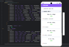
以下是一个完整的页面示例,展示了五种Progress样式的综合应用:
typescript
// ProgressStyleDemo.ets
import { Curve } from '@ohos.arkui.UIContext';
@Entry
@Component
struct ProgressStyleDemo {
@State linearProgress: number = 65;
@State ringProgress: number = 78;
@State scaleRingProgress: number = 8;
@State eclipseProgress: number = 45;
@State capsuleProgress: number = 80;
build() {
Column({ space: 25 }) {
// 页面标题
Text('Progress进度条样式大全')
.fontSize(22)
.fontWeight(FontWeight.Bold)
.width('100%')
.textAlign(TextAlign.Center)
.margin({ top: 10, bottom: 5 });
// 1. 线性进度条
this.buildProgressCard(
'线性进度条 (Linear)',
'适用于文件下载、任务进度等场景',
() => {
Progress({ value: this.linearProgress, total: 100, type: ProgressType.Linear })
.width('90%')
.height(18)
.color("#0066CC")
.backgroundColor("#E5E5E5")
.animation({ duration: 500, curve: Curve.EaseInOut });
},
() => {
Row({ space: 15 }) {
Button('-10%').onClick(() => {
this.linearProgress = Math.max(0, this.linearProgress – 10);
});
Text(`${this.linearProgress}%`).fontSize(14).fontColor("#666");
Button('+10%').onClick(() => {
this.linearProgress = Math.min(100, this.linearProgress + 10);
});
}
}
);
// 2. 环形无刻度进度条
this.buildProgressCard(
'环形无刻度 (Ring)',
'适用于音乐播放、健康数据等场景',
() => {
Progress({ value: this.ringProgress, total: 100, type: ProgressType.Ring })
.width(80)
.height(80)
.color("#009966");
},
() => {
Row({ space: 15 }) {
Button('-10%').onClick(() => {
this.ringProgress = Math.max(0, this.ringProgress – 10);
});
Text(`${this.ringProgress}%`).fontSize(14).fontColor("#666");
Button('+10%').onClick(() => {
this.ringProgress = Math.min(100, this.ringProgress + 10);
});
}
}
);
// 3. 环形有刻度进度条
this.buildProgressCard(
'环形有刻度 (ScaleRing)',
'适用于倒计时、分阶段任务等场景',
() => {
Progress({ value: this.scaleRingProgress, total: 12, type: ProgressType.ScaleRing })
.width(100)
.height(100)
.color("#FF6600")
.style({ scaleCount: 12, scaleWidth: 4 });
},
() => {
Row({ space: 15 }) {
Button('-1期').onClick(() => {
this.scaleRingProgress = Math.max(0, this.scaleRingProgress – 1);
});
Text(`${this.scaleRingProgress}/12期`).fontSize(14).fontColor("#666");
Button('+1期').onClick(() => {
this.scaleRingProgress = Math.min(12, this.scaleRingProgress + 1);
});
}
}
);
// 4. 椭圆形进度条
this.buildProgressCard(
'椭圆形 (Eclipse)',
'适用于电池电量、月相变化等场景',
() => {
Progress({ value: this.eclipseProgress, total: 100, type: ProgressType.Eclipse })
.width(80)
.height(80)
.color("#FF6B6B");
},
() => {
Row({ space: 15 }) {
Button('-10%').onClick(() => {
this.eclipseProgress = Math.max(0, this.eclipseProgress – 10);
});
Text(`${this.eclipseProgress}%`).fontSize(14).fontColor("#666");
Button('+10%').onClick(() => {
this.eclipseProgress = Math.min(100, this.eclipseProgress + 10);
});
}
}
);
// 5. 胶囊进度条
this.buildProgressCard(
'胶囊进度条 (Capsule)',
'适用于会员等级、任务完成等场景',
() => {
Progress({ value: this.capsuleProgress, total: 100, type: ProgressType.Capsule })
.width('90%')
.height(40)
.color("#4ECDC4")
.backgroundColor("#E8E8E8");
},
() => {
Row({ space: 15 }) {
Button('-10%').onClick(() => {
this.capsuleProgress = Math.max(0, this.capsuleProgress – 10);
});
Text(`${this.capsuleProgress}%`).fontSize(14).fontColor("#666");
Button('+10%').onClick(() => {
this.capsuleProgress = Math.min(100, this.capsuleProgress + 10);
});
}
}
);
}
.width('100%')
.height('100%')
.padding(16)
.backgroundColor("#F5F6FA");
}
@Builder
buildProgressCard(
title: string,
desc: string,
progressBuilder: () => void,
controlBuilder: () => void
) {
Column({ space: 10 }) {
// 标题行
Row() {
Text(title)
.fontSize(16)
.fontWeight(FontWeight.Medium)
.fontColor("#1A1A1A");
Text(desc)
.fontSize(12)
.fontColor("#999")
.margin({ left: 10 });
}
.width('100%')
.justifyContent(FlexAlign.Start);
// 进度条
Row() {
progressBuilder();
}
.width('100%')
.justifyContent(FlexAlign.Center)
.padding({ top: 5, bottom: 5 });
// 控制按钮
controlBuilder();
}
.width('100%')
.padding(16)
.backgroundColor(Color.White)
.borderRadius(12)
.shadow({ radius: 4, color: 'rgba(0,0,0,0.05)' });
}
}
五、自定义进度条实现
当内置样式无法满足设计需求时,开发者可以通过多种方式实现自定义进度条。
5.1 通过组合组件实现自定义
最基础的自定义方式是将Progress组件与Text、Column等组件组合,实现带百分比显示的进度条。
typescript
// 带百分比显示的进度条
@Component
struct ProgressWithLabel {
@Prop value: number = 0;
@Prop total: number = 100;
@Prop color: string = "#007DFF";
build() {
Column({ space: 6 }) {
Row() {
Text('进度')
.fontSize(14)
.fontColor("#666");
Text(`${Math.round(this.value / this.total * 100)}%`)
.fontSize(14)
.fontWeight(FontWeight.Bold)
.fontColor(this.color);
}
.width('100%')
.justifyContent(FlexAlign.SpaceBetween);
Progress({ value: this.value, total: this.total, type: ProgressType.Linear })
.width('100%')
.height(8)
.color(this.color)
.backgroundColor("#EEEEEE")
.borderRadius(4);
}
.width('100%');
}
}
5.2 使用绘制组件实现自定义进度条
HarmonyOS提供了Circle、Path等绘制组件,可用于实现更复杂的自定义进度效果。
示例:水位进度条(圆形填充进度)
typescript
// WaterLevelProgress.ets
import { Constants } from './Constants';
@Component
export struct WaterLevelProgress {
@Prop progress: number = 0; // 0-100
@Prop color: string = "#FF6B6B";
@Prop size: number = 120;
private diameter: number = this.size;
private radius: number = this.size / 2;
// 根据进度计算水位线纵坐标:y = (1 – progress/100) * 2r[reference:40]
getOrdinate(progressPercent: number): number {
return (1 – progressPercent / 100) * (this.radius * 2);
}
// 计算Path命令,绘制闭合曲线[reference:41]
getPathCommands(progress: number): string {
const r = this.radius;
const y = this.getOrdinate(progress);
// 使用Path绘制水位线效果
return `M0 ${y} A${r} ${r} 0 0 0 ${this.diameter} ${y} L${this.diameter} ${this.diameter} L0 ${this.diameter} Z`;
}
build() {
Stack() {
// 外框圆环[reference:42]
Circle({ width: this.diameter, height: this.diameter })
.fill('transparent')
.stroke('#E0E0E0')
.strokeWidth(6);
// 进度填充区域[reference:43]
if (progress >= 100) {
// 100%时填充整个圆形
Circle({ width: this.diameter – 12, height: this.diameter – 12 })
.fill(this.color);
} else {
// 不足100%时使用Path绘制闭合曲线[reference:44]
Path()
.width(this.diameter – 12)
.height(this.diameter – 12)
.commands(this.getPathCommands(this.progress))
.fill(this.color)
.antiAlias(true);
}
// 进度百分比文本
Text(`${this.progress}%`)
.fontSize(24)
.fontWeight(FontWeight.Bold)
.fontColor('#333');
}
.width(this.diameter)
.height(this.diameter);
}
}
5.3 使用Canvas实现自定义进度条
对于更复杂的绘制需求,可以使用Canvas组件配合CanvasRenderingContext2D API实现。
示例:带刻度和起始点的环形进度条
typescript
// CanvasRingProgress.ets
import animator, { AnimatorOptions, AnimatorResult } from '@ohos.animator';
@Component
export struct CanvasRingProgress {
@Prop progress: number = 0;
@Prop color: string = '#3DB7FE';
@Prop bgColor: string = '#803DB7FE';
@Prop size: number = 150;
@Prop arcWidth: number = 12;
@Prop showAnimation: boolean = true;
@Prop duration: number = 800;
private settings: RenderingContextSettings = new RenderingContextSettings(true);
private context: CanvasRenderingContext2D = new CanvasRenderingContext2D(this.settings);
private anim: AnimatorResult | null = null;
@State animatedProgress: number = 0;
aboutToAppear() {
if (this.showAnimation) {
this.startAnimation();
} else {
this.animatedProgress = this.progress;
}
}
aboutToUpdate() {
if (this.showAnimation) {
this.startAnimation();
} else {
this.animatedProgress = this.progress;
}
}
aboutToDisappear() {
this.anim?.cancel();
this.anim = null;
}
startAnimation() {
this.anim?.cancel();
const options: AnimatorOptions = {
duration: this.duration,
easing: "ease-out",
delay: 0,
fill: "forwards",
direction: "normal",
iterations: 1,
begin: 0,
end: this.progress / 100
};
this.anim = animator.create(options);
this.anim.onframe = (value: number) => {
this.animatedProgress = value * 100;
this.drawProgress(this.animatedProgress);
};
this.anim.play();
}
drawProgress(progress: number) {
const ctx = this.context;
const width = this.size;
const height = this.size;
ctx.clearRect(0, 0, width, height);
const centerX = width / 2;
const centerY = height / 2;
const radius = Math.min(centerX, centerY) – this.arcWidth;
const progressAngle = (progress / 100) * Math.PI * 2;
const startAngle = -Math.PI / 2;
// 绘制进度条背景[reference:47]
ctx.beginPath();
ctx.arc(centerX, centerY, radius, 0, Math.PI * 2);
ctx.lineWidth = this.arcWidth;
ctx.strokeStyle = this.bgColor;
ctx.stroke();
// 绘制刻度线[reference:48]
ctx.beginPath();
ctx.arc(centerX, centerY, radius, 0, Math.PI * 2);
ctx.setLineDash([1, 8]);
ctx.lineWidth = this.arcWidth;
ctx.strokeStyle = '#4D3DB7FE';
ctx.stroke();
ctx.setLineDash([]);
// 绘制进度条[reference:49]
ctx.beginPath();
ctx.arc(centerX, centerY, radius, startAngle, startAngle + progressAngle);
ctx.lineWidth = this.arcWidth;
ctx.strokeStyle = this.color;
ctx.lineCap = 'round';
ctx.stroke();
// 绘制起始点圆点
if (progress > 0) {
const dotAngle = startAngle + progressAngle;
const dotX = centerX + radius * Math.cos(dotAngle);
const dotY = centerY + radius * Math.sin(dotAngle);
ctx.beginPath();
ctx.arc(dotX, dotY, this.arcWidth / 2, 0, Math.PI * 2);
ctx.fillStyle = this.color;
ctx.fill();
}
}
build() {
Column() {
Canvas(this.context)
.width(this.size)
.height(this.size)
.onReady(() => {
this.drawProgress(this.animatedProgress || this.progress);
});
Text(`${Math.round(this.animatedProgress || this.progress)}%`)
.fontSize(18)
.fontWeight(FontWeight.Medium)
.fontColor('#333')
.margin({ top: 8 });
}
.alignItems(HorizontalAlign.Center);
}
}
六、进度条动画效果实现
6.1 使用animation属性实现过渡动画
Progress组件支持直接通过.animation()方法添加进度变化的过渡动画。
typescript
@State progressValue: number = 0;
// 触发进度变化时自动播放动画
Progress({ value: this.progressValue, total: 100, type: ProgressType.Linear })
.width('90%')
.height(18)
.color("#007DFF")
.backgroundColor("#E8E8E8")
.animation({
duration: 600,
curve: Curve.EaseInOut
});
// 更新进度
Button('更新进度').onClick(() => {
this.progressValue = 75; // 动画自动过渡到75
});
6.2 使用Animator实现精细动画控制
对于Canvas自定义绘制,可以使用@ohos.animator实现精细的动画控制。
typescript
import animator, { AnimatorOptions, AnimatorResult } from '@ohos.animator';
private anim: AnimatorResult | null = null;
startProgressAnimation(targetProgress: number) {
this.anim?.cancel();
const options: AnimatorOptions = {
duration: 1000,
easing: "ease-out",
delay: 0,
fill: "forwards",
direction: "normal",
iterations: 1,
begin: this.currentProgress / 100,
end: targetProgress / 100
};
this.anim = animator.create(options);
this.anim.onframe = (value: number) => {
this.currentProgress = value * 100;
// 更新UI
};
this.anim.play();
}
6.3 使用定时器实现进度自动增长
typescript
@State progress: number = 0;
private timer: number = -1;
startAutoProgress() {
this.timer = setInterval(() => {
if (this.progress < 100) {
this.progress += 1;
} else {
clearInterval(this.timer);
}
}, 50);
}
aboutToDisappear() {
if (this.timer !== -1) {
clearInterval(this.timer);
}
}
七、高级进阶:健身三环效果
通过Stack布局组合三个环形进度条,可以实现类似健身记录的"三环"效果。
typescript
// ThreeRingProgress.ets
@Component
struct ThreeRingProgress {
@Prop ring1Progress: number = 80;
@Prop ring2Progress: number = 60;
@Prop ring3Progress: number = 40;
@Prop size: number = 200;
build() {
Stack() {
// 最外环 – 红色(活动热量)
Progress({ value: this.ring1Progress, total: 100, type: ProgressType.Ring })
.width(this.size)
.height(this.size)
.color("#FF3B30")
.style({ strokeWidth: 12 });
// 中间环 – 绿色(锻炼时长)
Progress({ value: this.ring2Progress, total: 100, type: ProgressType.Ring })
.width(this.size * 0.78)
.height(this.size * 0.78)
.color("#34C759")
.style({ strokeWidth: 12 });
// 最内环 – 蓝色(活动小时数)
Progress({ value: this.ring3Progress, total: 100, type: ProgressType.Ring })
.width(this.size * 0.56)
.height(this.size * 0.56)
.color("#007AFF")
.style({ strokeWidth: 12 });
// 中心数据展示
Column({ space: 2 }) {
Text('680')
.fontSize(28)
.fontWeight(FontWeight.Bold)
.fontColor("#1A1A1A");
Text('千卡')
.fontSize(12)
.fontColor("#999");
}
}
.width(this.size)
.height(this.size)
.alignContent(Alignment.Center);
}
}
八、最佳实践与注意事项
8.1 样式选择建议
根据场景需求选择合适的进度条样式:
| 常规进度展示 | Linear(默认) |
| 简洁环形展示 | Ring |
| 精确进度展示 | ScaleRing |
| 柔和自然效果 | Eclipse |
| 圆润美观效果 | Capsule |
8.2 性能优化建议
Canvas绘制优化:频繁重绘时注意使用clearRect清除画布,避免内存泄漏
动画性能:使用animator代替setInterval实现动画,性能更优
状态管理:使用@State管理进度值,实现数据驱动的UI自动更新
8.3 常见问题
进度条不更新:确认使用@State或@Prop装饰器标记进度变量
样式不生效:确认使用type属性而非已废弃的style属性
刻度重叠:ScaleRing在尺寸过小时会自动转为Ring,这是正常行为
背景色设置:Progress的backgroundColor仅作用于进度条底色,整个组件背景需在外层容器设置
8.4 版本兼容性
-
API 7:Progress组件首次支持
-
API 8:style参数废弃,改用type
-
API 9:支持ArkTS卡片;Linear和Capsule支持自适应垂直显示
-
API 10+:ProgressType与样式映射逐步增强
九、总结
HarmonyOS的Progress组件提供了五种内置样式(Linear、Ring、ScaleRing、Eclipse、Capsule),覆盖了绝大多数进度展示场景。通过type属性可以轻松切换样式,通过color、backgroundColor、style等属性可以灵活定制外观。
当内置样式无法满足需求时,开发者可以通过组合组件、使用绘制组件(Circle/Path)或Canvas API实现完全自定义的进度条效果。结合动画API(.animation()或animator),可以打造流畅、生动的进度交互体验。