matplotlib 画图,seaborn 画变量关系
seaborn 本质上是在 matplotlib 的画布上画图
安装 Seaborn
使用 pip 安装:
pip install seaborn
在 Python 中导入 Seaborn 库
导入并取别名为 sns:
import seaborn as sns
加载 Seaborn 内置数据集
Seaborn 拥有内置数据集,可以直接加载,返回 DataFrame 类型的数据集
1. 查看内置数据集
import seaborn as sns
dataset_names = sns.get_dataset_names()
print(dataset_names)
返回如下结果:
['anagrams', 'anscombe', 'attention', 'brain_networks', 'car_crashes', 'diamonds', 'dots', 'dowjones', 'exercise', 'flights', 'fmri', 'geyser', 'glue', 'healthexp', 'iris', 'mpg', 'penguins', 'planets', 'seaice', 'taxis', 'tips', 'titanic']
2. 加载数据集
返回的是 pandas 的 DataFrame 数据类型
import seaborn as sns
# 例如加载 iris 数据集
df = sns.load_dataset('iris') # 返回 DataFrame 数据类型
# 查看前五条记录
print(df.head())
结果如下:
sepal_length sepal_width petal_length petal_width species
0 5.1 3.5 1.4 0.2 setosa
1 4.9 3.0 1.4 0.2 setosa
2 4.7 3.2 1.3 0.2 setosa
3 4.6 3.1 1.5 0.2 setosa
4 5.0 3.6 1.4 0.2 setosa
散点图绘制 sns.scatterplot
每条记录对应一个点
seaborn 的 sns.scatterplot 相比 matplotlib 的 plt.scatter 多了三个关键统计语义:
示例
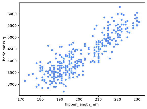
绘制 penguins 数据集中企鹅的鳍长(flipper_length_mm)关于体重(body_mass_g)的散点图。首先加载数据集:
import seaborn as sns
# 加载数据集
df = sns.load_dataset("penguins")
df.head()
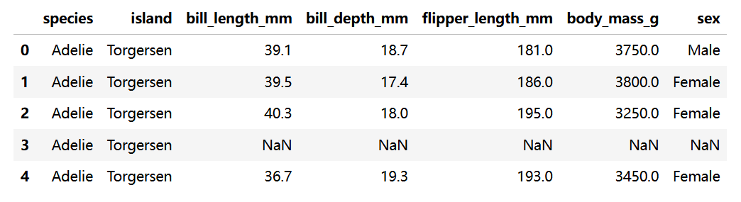
peguins 数据集形如:
1. 绘制一个普通的散点图
# 绘制散点图
sns.scatterplot(data=df, x='flipper_length_mm', y='body_mass_g')
# seaborn 会自动忽略含有 NaN 的行,不会报错
plt.show() # 使用 mpl 来显示图片 -> sns 在 mpl 的画布上画图,由 mpl 来显示图片
绘图结果如下:
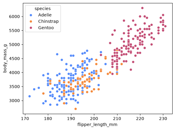
2. 加入参数 hue,对指定特征不同的记录在画图时映射不同的颜色
# 加入分类变量 hue
sns.scatterplot(
data=df,
x='flipper_length_mm',
y='body_mass_g',
hue='species' # 将对每个点根据其 species 标注不同颜色
)
# 根据 hue 映射颜色
# seaborn 会自动生成 legend
plt.show()
绘图结果如下:
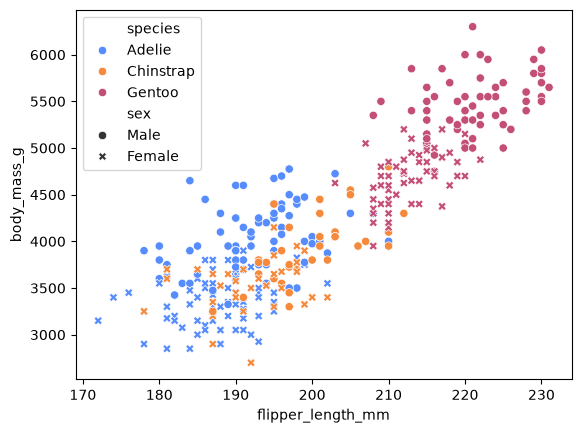
3. 加入参数 style,对指定特征不同的记录在画图时使用不同的点的样式
# 再加入点的样式 style
sns.scatterplot(
data=df,
x='flipper_length_mm',
y='body_mass_g',
hue='species', # 将对每个点根据其 species 标注不同颜色
style='sex' # 将对每个点根据其 sex 选择不同的点的样式
)
# 根据 style 选择不同标记
# 适合在 hue 的基础上进行二次分类的情形
plt.show()
绘图结果如下:
使用 Axes 对象精细化控制
Seaborn 的大部分绘图函数都会返回一个 matplotlib.axes.Axes 对象,因此不需要显示创建画布就可以拿到绘图后的 Axes,并通过这个 Axes 对绘制的图形进行精细化控制。
Axes 对象有关方法
| ax.set_title('标题') | 标题 |
|
ax.set_xlabel('x轴标签') ax.set_ylabel('y轴标签') |
坐标轴标签 |
|
ax.set_xlim(left=?, right=?) ax.set_ylim(bottom=?, top=?) |
坐标轴范围 |
|
ax.set_xticks(x值的序列) ax.set_yticks(y值的序列) |
刻度 |
|
ax.legend(title='图例标题', loc='upper right') loc 表示图例的位置,还可为 : 1. 最佳位置:'best',自动选最不挡数据的位置 2. 四个角与四条边中间:'upper', 'lower', 'center' 与 'left', 'right', 'center' 的组合(中间用空格隔开),例如 'upper center' 表示上方居中 3. 坐标系正中间:'center',容易挡住数据 |
图例 |
|
ax.grid(True) # x、y轴网格线 ax.grid(True, axis=‘x') # 仅 x 轴网格线 ax.grid(True, axis='y') # 仅 y 轴网格线 |
网格 |
|
ax.axhline() ax.axvline() |
参考线 |
|
ax.text() ax.annotate() |
文本 |
|
ax.spines[] # 用字典形式对某边框进行操作 包括边框显示与隐藏、粗细、颜色等 # 隐藏上、右边框 for spine in ['top', 'right']: ax.spines[spine].set_visible(False) |
边框 |
1. 示例
import seaborn as sns
import matplotlib as mpl
import matplotlib.pyplot as plt
df = sns.load_dataset("penguins")
df.head()
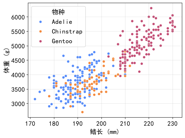
mpl.rcParams['font.family'] = 'SimHei'
mpl.rcParams['font.size'] = 15
# 这里将返回的 Axes 对象存变量 ax
ax = sns.scatterplot(
data=df,
x='flipper_length_mm',
y='body_mass_g',
hue='species'
)
# 添加 x、y 轴标签
ax.set_xlabel('鳍长 (mm)')
ax.set_ylabel('体重 (g)')
ax.legend(title='物种') # 修改图例标题
ax.grid(True) # 网格线
plt.show()
绘图结果如下:
2. 图例外置
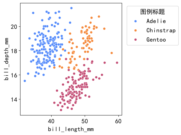
若图例在图中会遮挡数据,可以使用 ax.legend() 方法将其放在图的外面
要配合 plt.tight_layout() 使用,否则图例可能会跑出画布
ax.legend(
title='图例标题',
bbox_to_anchor=(x坐标, y坐标), # 对齐坐标,(0, 0) 表示 ax 的左下角,(1, 1) 表示 ax 的右上角
loc='对齐方式' # 指定图例的哪个角或边中点与该坐标对齐
)
例如:
将图例放在图的右侧常用写法:
ax.legend(
title='图例标题',
bbox_to_anchor=(1.02, 1), # 对齐坐标,(1.02, 1),表示图的右上角往右0.02距离的点
loc='upper left' # 指定图例的左上角与 (1.02, 1) 点对齐
)
结果形如:
散点图练习
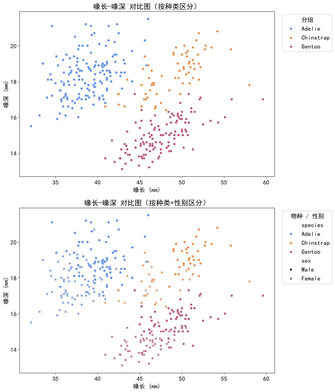
1. 使用 penguins 数据集,x 轴为喙长(bill_length_mm),y 轴为喙深(bill_depth_mm)并且按 species 映射颜色画出散点图,加上合适的标题和轴标签,画在子图1
2. 在 1 的基础上用 sex 区分性别,画在子图2
(图例均放在图的右侧)
# 本人思路,仅供参考
import seaborn as sns
import matplotlib as mpl
import matplotlib.pyplot as plt
df = sns.load_dataset("penguins")
df.head()
mpl.rcParams['font.family'] = 'SimHei'
mpl.rcParams['font.size'] = 15
# 使用 2×1 的垂直布局,便于对比“仅按种类着色”与“按种类+性别区分”的差异
fig, (ax1, ax2) = plt.subplots(2, 1, figsize=(12, 14), dpi=100) # 同时获得画布 fig 与两幅子图 ax1, ax2
# 子图1
sns.scatterplot(
data=df,
x='bill_length_mm',
y='bill_depth_mm',
hue='species',
ax=ax1
)
ax1.set_title('喙长-喙深 对比图')
ax1.set_xlabel('喙长 (mm)')
ax1.set_ylabel('喙深 (mm)')
# 将图例放到图的右侧
ax1.legend(
title='分组',
loc='upper left', # 图例的左上角
bbox_to_anchor=(1.02, 1) # 对齐到 ax1 的右侧
)
# 子图2
sns.scatterplot(
data=df,
x='bill_length_mm',
y='bill_depth_mm',
hue='species',
style='sex',
ax=ax2
)
ax2.set_title('喙长-喙深 对比图')
ax2.set_xlabel('喙长 (mm)')
ax2.set_ylabel('喙深 (mm)')
# 将图例放到图的右侧
ax2.legend(
title='物种 / 性别',
loc='upper left', # 图例的左上角
bbox_to_anchor=(1.02, 1) # 对齐到 ax2 的右侧
)
plt.tight_layout()
plt.show()
绘图结果如下: