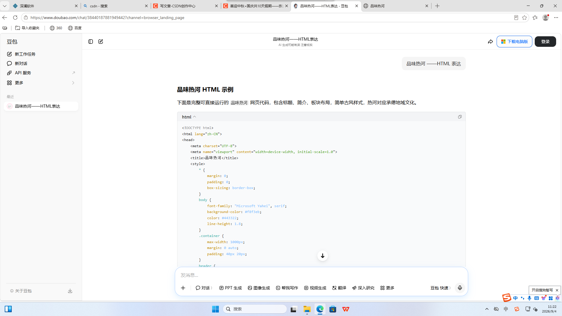
1.提示词
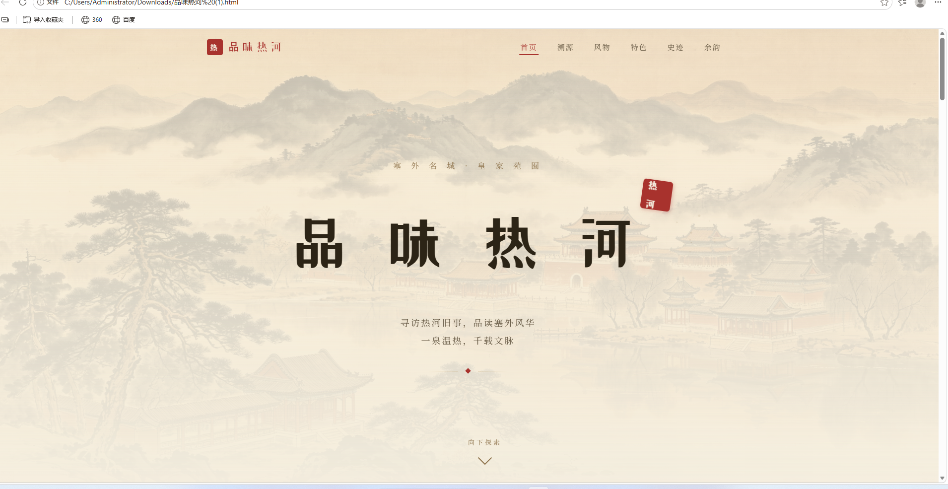
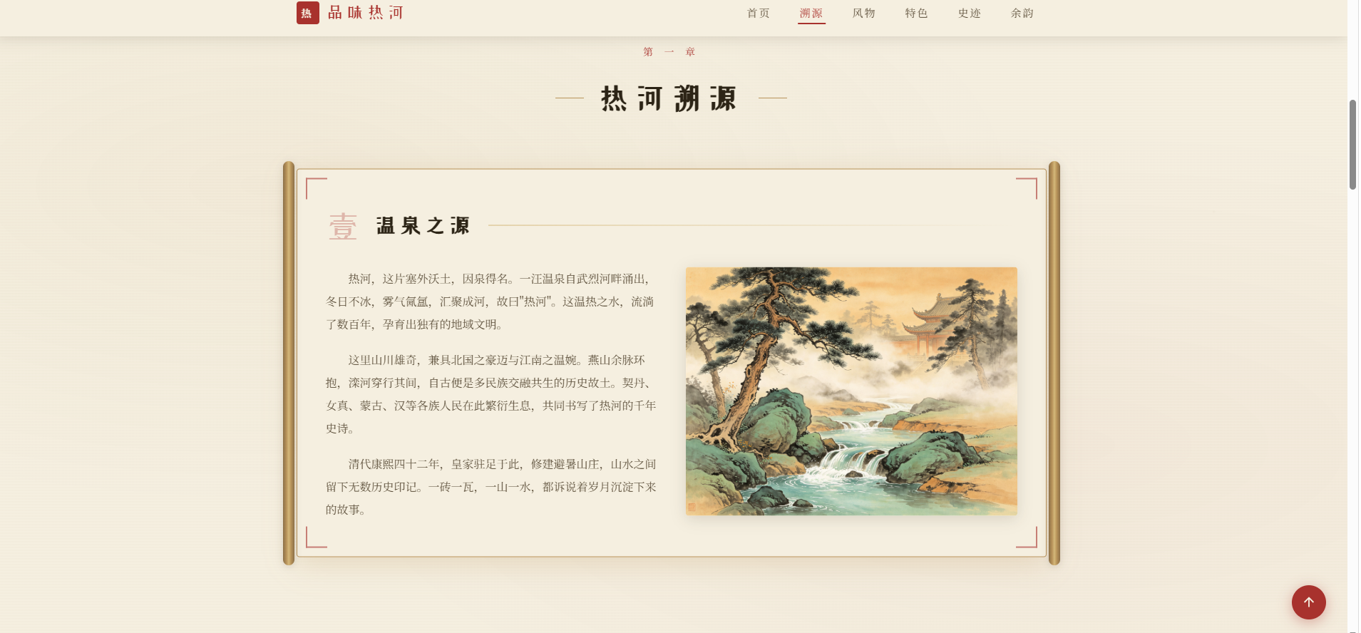
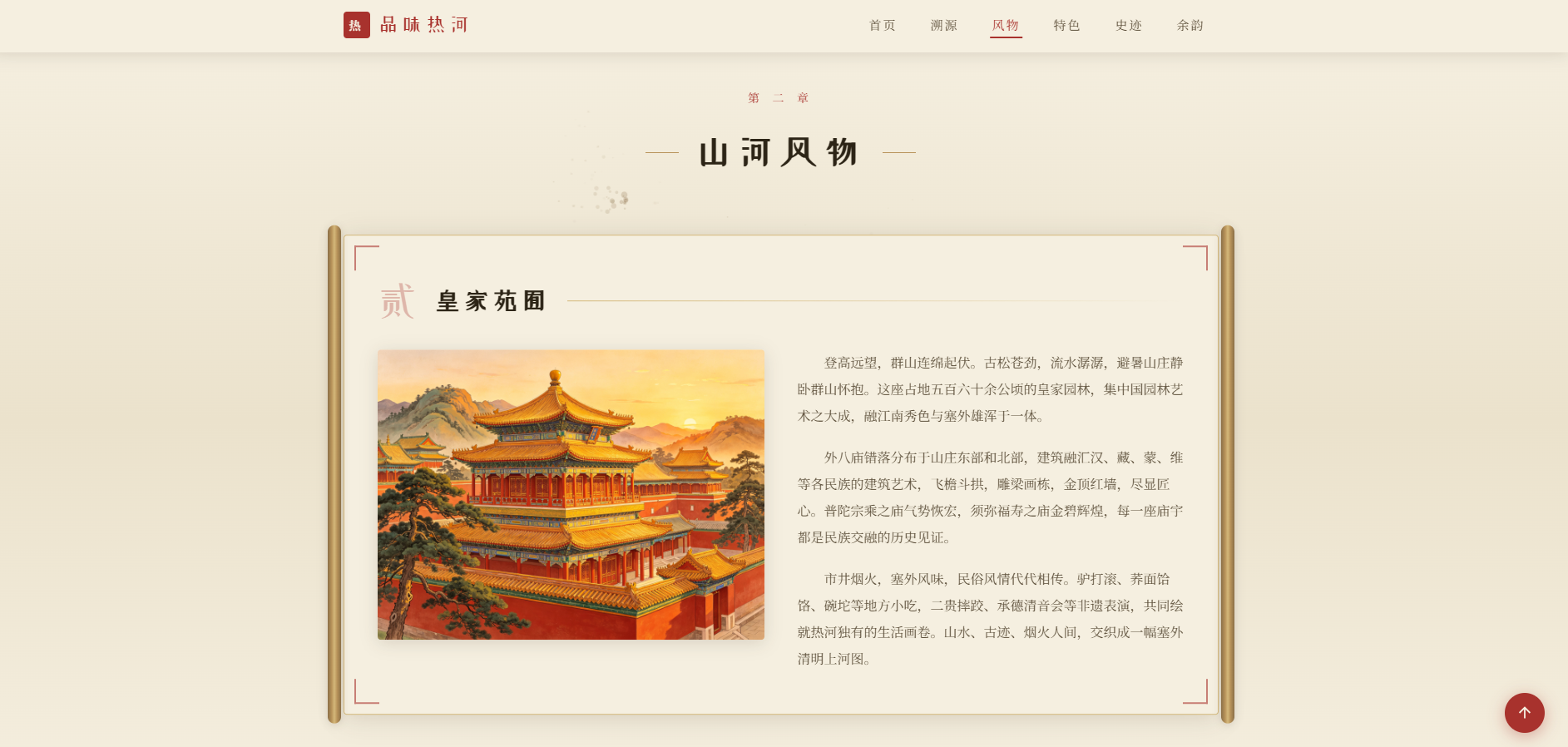
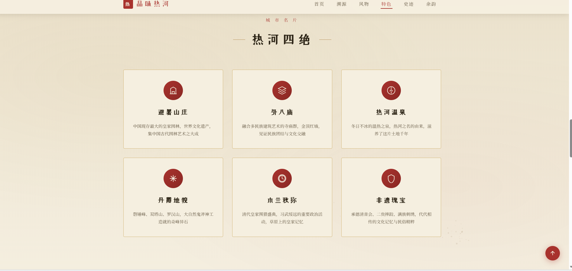
品味热河 ——HTML 表达,返回代码
返回代码:
<!DOCTYPE html>
<html lang="zh-CN">
<head>
<meta charset="UTF-8">
<meta name="viewport" content="width=device-width, initial-scale=1.0">
<title>品味热河</title>
<link rel="stylesheet" href="https://miaoda.feishu.cn/fonts/css2?family=Noto+Serif+SC:wght@400;600;700;900&family=ZCOOL+XiaoWei&display=swap">
<style>
/* ========== 全局变量与重置 ========== */
:root {
–paper: #f5efe0;
–paper-dark: #ebe2cc;
–ink: #2c2416;
–ink-light: #5a4d38;
–cinnabar: #a8322d;
–cinnabar-dark: #8a2824;
–gold: #b8935a;
–gold-light: #d4b87a;
–dai: #3d5a6c;
–brown: #8b6f47;
–shadow: rgba(44, 36, 22, 0.15);
}
* {
margin: 0;
padding: 0;
box-sizing: border-box;
}
html {
scroll-behavior: smooth;
}
body {
font-family: "Noto Serif SC", "Songti SC", "STSong", serif;
background-color: var(–paper);
color: var(–ink);
line-height: 1.9;
overflow-x: hidden;
position: relative;
}
/* 宣纸纹理背景 */
body::before {
content: "";
position: fixed;
top: 0;
left: 0;
width: 100%;
height: 100%;
background-image:
radial-gradient(ellipse at 20% 30%, rgba(184, 147, 90, 0.06) 0%, transparent 50%),
radial-gradient(ellipse at 80% 70%, rgba(168, 50, 45, 0.04) 0%, transparent 50%),
repeating-linear-gradient(0deg, transparent, transparent 2px, rgba(139, 111, 71, 0.015) 2px, rgba(139, 111, 71, 0.015) 4px);
pointer-events: none;
z-index: 0;
}
/* 水墨粒子画布 */
#inkCanvas {
position: fixed;
top: 0;
left: 0;
width: 100%;
height: 100%;
pointer-events: none;
z-index: 1;
}
.container {
max-width: 1100px;
margin: 0 auto;
padding: 0 24px;
position: relative;
z-index: 2;
}
/* ========== 加载动画 ========== */
#loader {
position: fixed;
top: 0;
left: 0;
width: 100%;
height: 100%;
background: var(–paper);
display: flex;
flex-direction: column;
align-items: center;
justify-content: center;
z-index: 9999;
transition: opacity 0.8s ease, visibility 0.8s ease;
}
#loader.hidden {
opacity: 0;
visibility: hidden;
}
.loader-scroll {
width: 200px;
height: 4px;
background: var(–paper-dark);
border-radius: 2px;
overflow: hidden;
margin-top: 30px;
}
.loader-scroll-bar {
height: 100%;
width: 0;
background: linear-gradient(90deg, var(–cinnabar), var(–gold));
border-radius: 2px;
animation: loadProgress 1.8s ease forwards;
}
@keyframes loadProgress {
0% { width: 0; }
100% { width: 100%; }
}
.loader-title {
font-family: "ZCOOL XiaoWei", "Noto Serif SC", serif;
font-size: 42px;
color: var(–cinnabar);
letter-spacing: 12px;
animation: loaderPulse 1.5s ease-in-out infinite;
}
@keyframes loaderPulse {
0%, 100% { opacity: 0.6; }
50% { opacity: 1; }
}
/* ========== 顶部导航 ========== */
.navbar {
position: fixed;
top: 0;
left: 0;
width: 100%;
z-index: 100;
padding: 14px 0;
transition: all 0.4s ease;
background: transparent;
}
.navbar.scrolled {
background: rgba(245, 239, 224, 0.95);
backdrop-filter: blur(10px);
box-shadow: 0 2px 20px var(–shadow);
padding: 10px 0;
}
.navbar-inner {
max-width: 1100px;
margin: 0 auto;
padding: 0 24px;
display: flex;
align-items: center;
justify-content: space-between;
}
.nav-logo {
font-family: "ZCOOL XiaoWei", serif;
font-size: 24px;
color: var(–cinnabar);
letter-spacing: 4px;
display: flex;
align-items: center;
gap: 10px;
cursor: pointer;
}
.nav-logo-seal {
width: 32px;
height: 32px;
background: var(–cinnabar);
border-radius: 4px;
display: flex;
align-items: center;
justify-content: center;
color: var(–paper);
font-size: 14px;
font-family: "Noto Serif SC", serif;
font-weight: 700;
transition: transform 0.4s ease;
}
.nav-logo:hover .nav-logo-seal {
transform: rotate(15deg) scale(1.1);
}
.nav-links {
display: flex;
gap: 8px;
list-style: none;
}
.nav-links a {
text-decoration: none;
color: var(–ink-light);
font-size: 15px;
padding: 8px 16px;
border-radius: 4px;
transition: all 0.3s ease;
position: relative;
letter-spacing: 2px;
}
.nav-links a::after {
content: "";
position: absolute;
bottom: 2px;
left: 50%;
width: 0;
height: 2px;
background: var(–cinnabar);
transition: all 0.3s ease;
transform: translateX(-50%);
}
.nav-links a:hover,
.nav-links a.active {
color: var(–cinnabar);
}
.nav-links a:hover::after,
.nav-links a.active::after {
width: 60%;
}
.nav-toggle {
display: none;
flex-direction: column;
gap: 5px;
cursor: pointer;
padding: 8px;
}
.nav-toggle span {
width: 24px;
height: 2px;
background: var(–ink);
transition: all 0.3s ease;
}
/* ========== Hero 区域 ========== */
.hero {
position: relative;
min-height: 100vh;
display: flex;
align-items: center;
justify-content: center;
overflow: hidden;
padding-top: 80px;
}
.hero-bg {
position: absolute;
top: 0;
left: 0;
width: 100%;
height: 100%;
object-fit: cover;
opacity: 0.35;
filter: sepia(20%) contrast(1.05);
}
.hero-overlay {
position: absolute;
top: 0;
left: 0;
width: 100%;
height: 100%;
background: linear-gradient(180deg,
rgba(245, 239, 224, 0.3) 0%,
rgba(245, 239, 224, 0.6) 50%,
rgba(245, 239, 224, 0.95) 100%);
}
.hero-content {
position: relative;
z-index: 3;
text-align: center;
padding: 40px 20px;
}
.hero-subtitle-top {
font-size: 16px;
color: var(–brown);
letter-spacing: 8px;
margin-bottom: 24px;
opacity: 0;
animation: fadeInDown 1s ease 0.5s forwards;
}
.hero-title {
font-family: "ZCOOL XiaoWei", "Noto Serif SC", serif;
font-size: clamp(56px, 10vw, 120px);
color: var(–ink);
letter-spacing: 20px;
margin-bottom: 30px;
position: relative;
display: inline-block;
}
.hero-title .char {
display: inline-block;
opacity: 0;
animation: charReveal 0.8s ease forwards;
}
.hero-title .char:nth-child(1) { animation-delay: 0.8s; }
.hero-title .char:nth-child(2) { animation-delay: 1.0s; }
.hero-title .char:nth-child(3) { animation-delay: 1.2s; }
.hero-title .char:nth-child(4) { animation-delay: 1.4s; }
@keyframes charReveal {
0% {
opacity: 0;
transform: translateY(30px) rotateX(-40deg);
filter: blur(8px);
}
100% {
opacity: 1;
transform: translateY(0) rotateX(0);
filter: blur(0);
}
}
@keyframes fadeInDown {
from { opacity: 0; transform: translateY(-20px); }
to { opacity: 1; transform: translateY(0); }
}
.hero-seal {
position: absolute;
top: -10px;
right: -50px;
width: 60px;
height: 60px;
background: var(–cinnabar);
border-radius: 6px;
display: flex;
align-items: center;
justify-content: center;
color: var(–paper);
font-size: 20px;
font-weight: 700;
transform: rotate(8deg);
opacity: 0;
animation: sealStamp 0.6s ease 1.8s forwards;
box-shadow: 2px 2px 8px rgba(168, 50, 45, 0.3);
cursor: pointer;
transition: transform 0.4s ease;
}
.hero-seal:hover {
transform: rotate(8deg) scale(1.15);
}
@keyframes sealStamp {
0% { opacity: 0; transform: rotate(8deg) scale(2); }
60% { opacity: 1; transform: rotate(8deg) scale(0.9); }
100% { opacity: 1; transform: rotate(8deg) scale(1); }
}
.hero-desc {
font-size: 18px;
color: var(–ink-light);
max-width: 600px;
margin: 0 auto 40px;
line-height: 2;
letter-spacing: 3px;
opacity: 0;
animation: fadeInUp 1s ease 2s forwards;
}
@keyframes fadeInUp {
from { opacity: 0; transform: translateY(20px); }
to { opacity: 1; transform: translateY(0); }
}
.hero-divider {
display: flex;
align-items: center;
justify-content: center;
gap: 16px;
margin-bottom: 40px;
opacity: 0;
animation: fadeInUp 1s ease 2.2s forwards;
}
.hero-divider-line {
width: 60px;
height: 1px;
background: linear-gradient(90deg, transparent, var(–gold));
}
.hero-divider-line:last-child {
background: linear-gradient(90deg, var(–gold), transparent);
}
.hero-divider-diamond {
width: 8px;
height: 8px;
background: var(–cinnabar);
transform: rotate(45deg);
}
.scroll-hint {
position: absolute;
bottom: 40px;
left: 50%;
transform: translateX(-50%);
display: flex;
flex-direction: column;
align-items: center;
gap: 8px;
color: var(–brown);
font-size: 13px;
letter-spacing: 4px;
opacity: 0;
animation: fadeInUp 1s ease 2.5s forwards;
cursor: pointer;
z-index: 5;
}
.scroll-hint-arrow {
width: 20px;
height: 20px;
border-right: 2px solid var(–brown);
border-bottom: 2px solid var(–brown);
transform: rotate(45deg);
animation: scrollBounce 2s ease-in-out infinite;
}
@keyframes scrollBounce {
0%, 100% { transform: rotate(45deg) translate(0, 0); }
50% { transform: rotate(45deg) translate(4px, 4px); }
}
/* ========== 水墨山峦分隔 ========== */
.mountain-divider {
width: 100%;
height: 80px;
position: relative;
overflow: hidden;
}
.mountain-divider svg {
width: 100%;
height: 100%;
}
/* ========== 章节通用样式 ========== */
.section {
padding: 80px 0;
position: relative;
}
.section-header {
text-align: center;
margin-bottom: 60px;
}
.section-label {
font-size: 14px;
color: var(–cinnabar);
letter-spacing: 6px;
margin-bottom: 12px;
text-transform: uppercase;
}
.section-title {
font-family: "ZCOOL XiaoWei", "Noto Serif SC", serif;
font-size: 42px;
color: var(–ink);
letter-spacing: 8px;
position: relative;
display: inline-block;
}
.section-title::before,
.section-title::after {
content: "";
position: absolute;
top: 50%;
width: 40px;
height: 1px;
background: var(–gold);
}
.section-title::before {
left: -60px;
}
.section-title::after {
right: -60px;
}
/* 滚动揭示动画 */
.reveal {
opacity: 0;
transform: translateY(40px);
transition: opacity 0.8s ease, transform 0.8s ease;
}
.reveal.visible {
opacity: 1;
transform: translateY(0);
}
.reveal-delay-1 { transition-delay: 0.15s; }
.reveal-delay-2 { transition-delay: 0.3s; }
.reveal-delay-3 { transition-delay: 0.45s; }
/* ========== 卷轴卡片 ========== */
.scroll-card {
position: relative;
background: var(–paper);
border: 1px solid var(–gold-light);
border-radius: 4px;
padding: 50px 40px;
margin-bottom: 50px;
box-shadow: 0 4px 30px var(–shadow);
transition: all 0.4s ease;
}
.scroll-card:hover {
transform: translateY(-4px);
box-shadow: 0 8px 40px rgba(184, 147, 90, 0.25);
border-color: var(–gold);
}
/* 卷轴轴头 */
.scroll-card::before,
.scroll-card::after {
content: "";
position: absolute;
top: 50%;
transform: translateY(-50%);
width: 16px;
height: calc(100% + 24px);
background: linear-gradient(90deg,
var(–brown) 0%,
var(–gold) 30%,
var(–gold-light) 50%,
var(–gold) 70%,
var(–brown) 100%);
border-radius: 8px;
box-shadow: 0 2px 10px var(–shadow);
}
.scroll-card::before {
left: -20px;
}
.scroll-card::after {
right: -20px;
}
/* 卡片角花装饰 */
.corner-ornament {
position: absolute;
width: 30px;
height: 30px;
border: 2px solid var(–cinnabar);
opacity: 0.6;
}
.corner-ornament.tl {
top: 12px;
left: 12px;
border-right: none;
border-bottom: none;
}
.corner-ornament.tr {
top: 12px;
right: 12px;
border-left: none;
border-bottom: none;
}
.corner-ornament.bl {
bottom: 12px;
left: 12px;
border-right: none;
border-top: none;
}
.corner-ornament.br {
bottom: 12px;
right: 12px;
border-left: none;
border-top: none;
}
.card-title-row {
display: flex;
align-items: center;
gap: 20px;
margin-bottom: 30px;
}
.card-number {
font-family: "ZCOOL XiaoWei", serif;
font-size: 48px;
color: var(–cinnabar);
opacity: 0.3;
line-height: 1;
}
.card-title {
font-family: "ZCOOL XiaoWei", "Noto Serif SC", serif;
font-size: 30px;
color: var(–ink);
letter-spacing: 4px;
}
.card-title-line {
flex: 1;
height: 1px;
background: linear-gradient(90deg, var(–gold-light), transparent);
}
.card-body {
display: grid;
grid-template-columns: 1fr 1fr;
gap: 40px;
align-items: start;
}
.card-text p {
font-size: 16px;
color: var(–ink-light);
text-indent: 2em;
margin-bottom: 18px;
line-height: 2;
}
.card-text p:last-child {
margin-bottom: 0;
}
/* 图片容器 */
.image-frame {
position: relative;
cursor: pointer;
border-radius: 4px;
overflow: hidden;
box-shadow: 0 4px 20px var(–shadow);
transition: all 0.4s ease;
}
.image-frame:hover {
transform: scale(1.02);
box-shadow: 0 8px 30px rgba(184, 147, 90, 0.35);
}
.image-frame img {
width: 100%;
height: auto;
display: block;
transition: transform 0.6s ease;
}
.image-frame:hover img {
transform: scale(1.05);
}
.image-frame-overlay {
position: absolute;
bottom: 0;
left: 0;
width: 100%;
padding: 30px 16px 12px;
background: linear-gradient(transparent, rgba(44, 36, 22, 0.7));
color: var(–paper);
font-size: 14px;
letter-spacing: 2px;
opacity: 0;
transition: opacity 0.3s ease;
}
.image-frame:hover .image-frame-overlay {
opacity: 1;
}
.image-frame-zoom {
position: absolute;
top: 12px;
right: 12px;
width: 36px;
height: 36px;
background: rgba(245, 239, 224, 0.9);
border-radius: 50%;
display: flex;
align-items: center;
justify-content: center;
opacity: 0;
transition: all 0.3s ease;
}
.image-frame:hover .image-frame-zoom {
opacity: 1;
}
.image-frame-zoom svg {
width: 18px;
height: 18px;
stroke: var(–cinnabar);
}
/* ========== 图片灯箱 ========== */
.lightbox {
position: fixed;
top: 0;
left: 0;
width: 100%;
height: 100%;
background: rgba(20, 16, 10, 0.92);
display: flex;
align-items: center;
justify-content: center;
z-index: 1000;
opacity: 0;
visibility: hidden;
transition: all 0.4s ease;
}
.lightbox.active {
opacity: 1;
visibility: visible;
}
.lightbox-content {
max-width: 90%;
max-height: 85vh;
position: relative;
transform: scale(0.9);
transition: transform 0.4s ease;
}
.lightbox.active .lightbox-content {
transform: scale(1);
}
.lightbox-content img {
max-width: 100%;
max-height: 85vh;
border-radius: 4px;
box-shadow: 0 10px 60px rgba(0, 0, 0, 0.5);
}
.lightbox-close {
position: absolute;
top: -40px;
right: 0;
width: 36px;
height: 36px;
cursor: pointer;
display: flex;
align-items: center;
justify-content: center;
transition: transform 0.3s ease;
}
.lightbox-close:hover {
transform: rotate(90deg);
}
.lightbox-close svg {
width: 28px;
height: 28px;
stroke: var(–paper);
}
.lightbox-caption {
text-align: center;
color: var(–paper);
margin-top: 16px;
font-size: 15px;
letter-spacing: 3px;
}
/* ========== 特色亮点区 ========== */
.highlights {
background: linear-gradient(180deg, var(–paper-dark) 0%, var(–paper) 100%);
padding: 80px 0;
}
.highlights-grid {
display: grid;
grid-template-columns: repeat(3, 1fr);
gap: 30px;
margin-top: 50px;
}
.highlight-card {
background: var(–paper);
border: 1px solid var(–gold-light);
border-radius: 4px;
padding: 36px 28px;
text-align: center;
position: relative;
overflow: hidden;
transition: all 0.4s ease;
cursor: pointer;
}
.highlight-card::before {
content: "";
position: absolute;
top: 0;
left: 0;
width: 100%;
height: 3px;
background: linear-gradient(90deg, var(–cinnabar), var(–gold));
transform: scaleX(0);
transition: transform 0.4s ease;
}
.highlight-card:hover {
transform: translateY(-6px);
box-shadow: 0 10px 30px var(–shadow);
border-color: var(–gold);
}
.highlight-card:hover::before {
transform: scaleX(1);
}
.highlight-icon {
width: 64px;
height: 64px;
margin: 0 auto 20px;
background: linear-gradient(135deg, var(–cinnabar), var(–cinnabar-dark));
border-radius: 50%;
display: flex;
align-items: center;
justify-content: center;
transition: all 0.4s ease;
}
.highlight-card:hover .highlight-icon {
transform: rotateY(180deg);
background: linear-gradient(135deg, var(–gold), var(–brown));
}
.highlight-icon svg {
width: 30px;
height: 30px;
stroke: var(–paper);
fill: none;
stroke-width: 1.5;
}
.highlight-title {
font-family: "ZCOOL XiaoWei", serif;
font-size: 22px;
color: var(–ink);
margin-bottom: 12px;
letter-spacing: 3px;
}
.highlight-desc {
font-size: 14px;
color: var(–ink-light);
line-height: 1.8;
}
/* ========== 时间线 ========== */
.timeline-section {
padding: 80px 0;
}
.timeline {
position: relative;
max-width: 800px;
margin: 50px auto 0;
padding: 20px 0;
}
.timeline::before {
content: "";
position: absolute;
top: 0;
left: 50%;
transform: translateX(-50%);
width: 2px;
height: 100%;
background: linear-gradient(180deg, transparent, var(–gold) 10%, var(–gold) 90%, transparent);
}
.timeline-item {
position: relative;
width: 50%;
padding: 20px 40px;
margin-bottom: 30px;
}
.timeline-item:nth-child(odd) {
left: 0;
text-align: right;
}
.timeline-item:nth-child(even) {
left: 50%;
text-align: left;
}
.timeline-dot {
position: absolute;
top: 30px;
width: 16px;
height: 16px;
background: var(–cinnabar);
border: 3px solid var(–paper);
border-radius: 50%;
box-shadow: 0 0 0 2px var(–cinnabar);
transition: all 0.3s ease;
z-index: 2;
}
.timeline-item:nth-child(odd) .timeline-dot {
right: -8px;
}
.timeline-item:nth-child(even) .timeline-dot {
left: -8px;
}
.timeline-item:hover .timeline-dot {
transform: scale(1.3);
box-shadow: 0 0 0 4px rgba(168, 50, 45, 0.3);
}
.timeline-year {
font-family: "ZCOOL XiaoWei", serif;
font-size: 24px;
color: var(–cinnabar);
margin-bottom: 8px;
letter-spacing: 2px;
}
.timeline-event {
font-size: 16px;
color: var(–ink);
font-weight: 600;
margin-bottom: 6px;
}
.timeline-desc {
font-size: 14px;
color: var(–ink-light);
line-height: 1.7;
}
/* ========== 诗词引用区 ========== */
.poem-section {
position: relative;
padding: 100px 0;
text-align: center;
overflow: hidden;
}
.poem-bg {
position: absolute;
top: 0;
left: 0;
width: 100%;
height: 100%;
background: linear-gradient(135deg, rgba(168, 50, 45, 0.05), rgba(184, 147, 90, 0.08));
}
.poem-content {
position: relative;
z-index: 2;
}
.poem-text {
font-family: "ZCOOL XiaoWei", "Noto Serif SC", serif;
font-size: clamp(24px, 4vw, 36px);
color: var(–ink);
line-height: 2.2;
letter-spacing: 6px;
margin-bottom: 24px;
}
.poem-author {
font-size: 16px;
color: var(–brown);
letter-spacing: 4px;
}
.poem-seal {
display: inline-block;
margin-top: 30px;
padding: 8px 16px;
background: var(–cinnabar);
color: var(–paper);
font-size: 14px;
letter-spacing: 4px;
border-radius: 4px;
transform: rotate(-3deg);
cursor: pointer;
transition: all 0.3s ease;
}
.poem-seal:hover {
transform: rotate(-3deg) scale(1.1);
}
/* ========== 页脚 ========== */
footer {
position: relative;
padding: 60px 0 40px;
background: var(–ink);
color: var(–paper-dark);
text-align: center;
}
.footer-mountain {
position: absolute;
top: -1px;
left: 0;
width: 100%;
height: 60px;
overflow: hidden;
}
.footer-mountain svg {
width: 100%;
height: 100%;
}
.footer-content {
position: relative;
z-index: 2;
}
.footer-title {
font-family: "ZCOOL XiaoWei", serif;
font-size: 28px;
color: var(–gold-light);
letter-spacing: 8px;
margin-bottom: 16px;
}
.footer-desc {
font-size: 14px;
color: rgba(245, 239, 224, 0.6);
letter-spacing: 3px;
margin-bottom: 30px;
}
.footer-divider {
width: 100px;
height: 1px;
background: var(–gold);
margin: 0 auto 24px;
opacity: 0.5;
}
.footer-copyright {
font-size: 13px;
color: rgba(245, 239, 224, 0.4);
letter-spacing: 2px;
}
/* ========== 回到顶部 ========== */
.back-to-top {
position: fixed;
bottom: 30px;
right: 30px;
width: 48px;
height: 48px;
background: var(–cinnabar);
border-radius: 50%;
display: flex;
align-items: center;
justify-content: center;
cursor: pointer;
z-index: 99;
opacity: 0;
visibility: hidden;
transform: translateY(20px);
transition: all 0.4s ease;
box-shadow: 0 4px 20px rgba(168, 50, 45, 0.4);
}
.back-to-top.visible {
opacity: 1;
visibility: visible;
transform: translateY(0);
}
.back-to-top:hover {
transform: translateY(-4px);
box-shadow: 0 6px 25px rgba(168, 50, 45, 0.5);
}
.back-to-top svg {
width: 22px;
height: 22px;
stroke: var(–paper);
fill: none;
stroke-width: 2;
}
/* ========== 竹叶装饰 ========== */
.bamboo-decor {
position: absolute;
opacity: 0.08;
pointer-events: none;
z-index: 0;
}
.bamboo-decor.left {
left: -20px;
top: 20%;
transform: rotate(-15deg);
}
.bamboo-decor.right {
right: -20px;
top: 50%;
transform: rotate(15deg) scaleX(-1);
}
/* ========== 响应式 ========== */
@media (max-width: 900px) {
.card-body {
grid-template-columns: 1fr;
gap: 30px;
}
.highlights-grid {
grid-template-columns: 1fr;
gap: 20px;
}
.scroll-card {
padding: 36px 24px;
}
.scroll-card::before,
.scroll-card::after {
display: none;
}
.section-title {
font-size: 32px;
}
.section-title::before,
.section-title::after {
display: none;
}
.nav-links {
display: none;
position: absolute;
top: 100%;
left: 0;
width: 100%;
background: rgba(245, 239, 224, 0.98);
flex-direction: column;
padding: 20px;
gap: 4px;
box-shadow: 0 4px 20px var(–shadow);
}
.nav-links.open {
display: flex;
}
.nav-toggle {
display: flex;
}
.timeline::before {
left: 20px;
}
.timeline-item {
width: 100%;
left: 0 !important;
text-align: left !important;
padding-left: 50px;
padding-right: 10px;
}
.timeline-item .timeline-dot {
left: 12px !important;
right: auto !important;
}
.hero-seal {
right: -10px;
width: 48px;
height: 48px;
font-size: 16px;
}
}
@media (max-width: 600px) {
.section {
padding: 50px 0;
}
.hero-title {
letter-spacing: 12px;
}
.card-title {
font-size: 24px;
}
.card-number {
font-size: 36px;
}
.back-to-top {
bottom: 20px;
right: 20px;
width: 42px;
height: 42px;
}
}
/* 减少动画偏好 */
@media (prefers-reduced-motion: reduce) {
*,
*::before,
*::after {
animation-duration: 0.01ms !important;
animation-iteration-count: 1 !important;
transition-duration: 0.01ms !important;
}
}
</style>
</head>
<body>
<!– 加载动画 –>
<div id="loader">
<div class="loader-title">品味热河</div>
<div class="loader-scroll">
<div class="loader-scroll-bar"></div>
</div>
</div>
<!– 水墨粒子画布 –>
<canvas id="inkCanvas"></canvas>
<!– 顶部导航 –>
<nav class="navbar" id="navbar">
<div class="navbar-inner">
<div class="nav-logo" onclick="scrollToSection('hero')">
<div class="nav-logo-seal">热</div>
<span>品味热河</span>
</div>
<div class="nav-toggle" id="navToggle" onclick="toggleNav()">
<span></span>
<span></span>
<span></span>
</div>
<ul class="nav-links" id="navLinks">
<li><a href="#hero" class="active" onclick="navClick(event, 'hero')">首页</a></li>
<li><a href="#origin" onclick="navClick(event, 'origin')">溯源</a></li>
<li><a href="#scenery" onclick="navClick(event, 'scenery')">风物</a></li>
<li><a href="#highlights" onclick="navClick(event, 'highlights')">特色</a></li>
<li><a href="#timeline" onclick="navClick(event, 'timeline')">史迹</a></li>
<li><a href="#poem" onclick="navClick(event, 'poem')">余韵</a></li>
</ul>
</div>
</nav>
<!– Hero 区域 –>
<section class="hero" id="hero">
<img class="hero-bg" src="https://aka.doubaocdn.com/s/fkqpOZzMJz" alt="热河山水全景">
<div class="hero-overlay"></div>
<div class="hero-content">
<div class="hero-subtitle-top">塞 外 名 城 · 皇 家 苑 囿</div>
<h1 class="hero-title">
<span class="char">品</span>
<span class="char">味</span>
<span class="char">热</span>
<span class="char">河</span>
<div class="hero-seal" title="热河之印">热河</div>
</h1>
<p class="hero-desc">寻访热河旧事,品读塞外风华<br>一泉温热,千载文脉</p>
<div class="hero-divider">
<div class="hero-divider-line"></div>
<div class="hero-divider-diamond"></div>
<div class="hero-divider-line"></div>
</div>
</div>
<div class="scroll-hint" onclick="scrollToSection('origin')">
<span>向下探索</span>
<div class="scroll-hint-arrow"></div>
</div>
</section>
<!– 水墨山峦分隔 –>
<div class="mountain-divider">
<svg viewBox="0 0 1200 80" preserveAspectRatio="none">
<path d="M0,80 L0,50 Q100,20 200,40 T400,35 T600,45 T800,30 T1000,40 T1200,35 L1200,80 Z" fill="#ebe2cc" opacity="0.6"/>
<path d="M0,80 L0,60 Q150,35 300,50 T600,55 T900,45 T1200,50 L1200,80 Z" fill="#d4c9b0" opacity="0.4"/>
</svg>
</div>
<!– 第一章:热河溯源 –>
<section class="section" id="origin">
<div class="container">
<div class="section-header reveal">
<div class="section-label">第 一 章</div>
<h2 class="section-title">热河溯源</h2>
</div>
<div class="scroll-card reveal reveal-delay-1">
<div class="corner-ornament tl"></div>
<div class="corner-ornament tr"></div>
<div class="corner-ornament bl"></div>
<div class="corner-ornament br"></div>
<div class="card-title-row">
<div class="card-number">壹</div>
<h3 class="card-title">温泉之源</h3>
<div class="card-title-line"></div>
</div>
<div class="card-body">
<div class="card-text">
<p>热河,这片塞外沃土,因泉得名。一汪温泉自武烈河畔涌出,冬日不冰,雾气氤氲,汇聚成河,故曰"热河"。这温热之水,流淌了数百年,孕育出独有的地域文明。</p>
<p>这里山川雄奇,兼具北国之豪迈与江南之温婉。燕山余脉环抱,滦河穿行其间,自古便是多民族交融共生的历史故土。契丹、女真、蒙古、汉等各族人民在此繁衍生息,共同书写了热河的千年史诗。</p>
<p>清代康熙四十二年,皇家驻足于此,修建避暑山庄,山水之间留下无数历史印记。一砖一瓦,一山一水,都诉说着岁月沉淀下来的故事。</p>
</div>
<div class="image-frame" onclick="openLightbox('https://aka.doubaocdn.com/s/S537eDejXd', '热河温泉源头')">
<img src="https://aka.doubaocdn.com/s/S537eDejXd" alt="热河温泉源头">
<div class="image-frame-zoom">
<svg viewBox="0 0 24 24" fill="none" stroke-width="2">
<circle cx="11" cy="11" r="8"/>
<path d="M21 21l-4.35-4.35M11 8v6M8 11h6"/>
</svg>
</div>
<div class="image-frame-overlay">热河温泉源头 · 点击放大</div>
</div>
</div>
</div>
</div>
</section>
<!– 第二章:山河风物 –>
<section class="section" id="scenery" style="background: linear-gradient(180deg, var(–paper) 0%, var(–paper-dark) 50%, var(–paper) 100%);">
<div class="container">
<div class="section-header reveal">
<div class="section-label">第 二 章</div>
<h2 class="section-title">山河风物</h2>
</div>
<div class="scroll-card reveal reveal-delay-1">
<div class="corner-ornament tl"></div>
<div class="corner-ornament tr"></div>
<div class="corner-ornament bl"></div>
<div class="corner-ornament br"></div>
<div class="card-title-row">
<div class="card-number">贰</div>
<h3 class="card-title">皇家苑囿</h3>
<div class="card-title-line"></div>
</div>
<div class="card-body">
<div class="image-frame" onclick="openLightbox('https://aka.doubaocdn.com/s/3VA9eQGFNQ', '避暑山庄古建筑群')">
<img src="https://aka.doubaocdn.com/s/3VA9eQGFNQ" alt="避暑山庄古建筑群">
<div class="image-frame-zoom">
<svg viewBox="0 0 24 24" fill="none" stroke-width="2">
<circle cx="11" cy="11" r="8"/>
<path d="M21 21l-4.35-4.35M11 8v6M8 11h6"/>
</svg>
</div>
<div class="image-frame-overlay">避暑山庄古建筑群 · 点击放大</div>
</div>
<div class="card-text">
<p>登高远望,群山连绵起伏。古松苍劲,流水潺潺,避暑山庄静卧群山怀抱。这座占地五百六十余公顷的皇家园林,集中国园林艺术之大成,融江南秀色与塞外雄浑于一体。</p>
<p>外八庙错落分布于山庄东部和北部,建筑融汇汉、藏、蒙、维等各民族的建筑艺术,飞檐斗拱,雕梁画栋,金顶红墙,尽显匠心。普陀宗乘之庙气势恢宏,须弥福寿之庙金碧辉煌,每一座庙宇都是民族交融的历史见证。</p>
<p>市井烟火,塞外风味,民俗风情代代相传。驴打滚、荞面饸饹、碗坨等地方小吃,二贵摔跤、承德清音会等非遗表演,共同绘就热河独有的生活画卷。山水、古迹、烟火人间,交织成一幅塞外清明上河图。</p>
</div>
</div>
</div>
</div>
</section>
<!– 特色亮点区 –>
<section class="highlights" id="highlights">
<div class="container">
<div class="section-header reveal">
<div class="section-label">城 市 名 片</div>
<h2 class="section-title">热河四绝</h2>
</div>
<div class="highlights-grid">
<div class="highlight-card reveal reveal-delay-1">
<div class="highlight-icon">
<svg viewBox="0 0 24 24">
<path d="M3 21h18M5 21V7l7-4 7 4v14M9 21v-6h6v6M9 11h.01M15 11h.01"/>
</svg>
</div>
<h3 class="highlight-title">避暑山庄</h3>
<p class="highlight-desc">中国现存最大的皇家园林,世界文化遗产,集中国古代园林艺术之大成</p>
</div>
<div class="highlight-card reveal reveal-delay-2">
<div class="highlight-icon">
<svg viewBox="0 0 24 24">
<path d="M12 2L2 7l10 5 10-5-10-5zM2 17l10 5 10-5M2 12l10 5 10-5"/>
</svg>
</div>
<h3 class="highlight-title">外八庙</h3>
<p class="highlight-desc">融合多民族建筑艺术的寺庙群,金顶红墙,见证民族团结与文化交融</p>
</div>
<div class="highlight-card reveal reveal-delay-3">
<div class="highlight-icon">
<svg viewBox="0 0 24 24">
<path d="M12 2C6.48 2 2 6.48 2 12s4.48 10 10 10 10-4.48 10-10S17.52 2 12 2zM12 20v-6M8 14l4-4 4 4M12 8V4"/>
</svg>
</div>
<h3 class="highlight-title">热河温泉</h3>
<p class="highlight-desc">冬日不冰的温热之泉,热河之名的由来,滋养了这片土地千年</p>
</div>
<div class="highlight-card reveal reveal-delay-1">
<div class="highlight-icon">
<svg viewBox="0 0 24 24">
<path d="M12 3v18M3 12h18M5.6 5.6l12.8 12.8M18.4 5.6L5.6 18.4"/>
</svg>
</div>
<h3 class="highlight-title">丹霞地貌</h3>
<p class="highlight-desc">磬锤峰、双塔山、罗汉山,大自然鬼斧神工造就的奇峰异石</p>
</div>
<div class="highlight-card reveal reveal-delay-2">
<div class="highlight-icon">
<svg viewBox="0 0 24 24">
<path d="M12 2a10 10 0 1 0 10 10A10 10 0 0 0 12 2zm0 18a8 8 0 1 1 8-8 8 8 0 0 1-8 8z"/>
<path d="M12 6v6l4 2"/>
</svg>
</div>
<h3 class="highlight-title">木兰秋狝</h3>
<p class="highlight-desc">清代皇家围猎盛典,习武绥远的重要政治活动,草原上的皇家记忆</p>
</div>
<div class="highlight-card reveal reveal-delay-3">
<div class="highlight-icon">
<svg viewBox="0 0 24 24">
<path d="M12 2L4 6v6c0 5.55 3.84 10.74 8 12 4.16-1.26 8-6.45 8-12V6l-8-4z"/>
</svg>
</div>
<h3 class="highlight-title">非遗瑰宝</h3>
<p class="highlight-desc">承德清音会、二贵摔跤、满族刺绣,代代相传的文化记忆与民俗精粹</p>
</div>
</div>
</div>
</section>
<!– 史迹时间线 –>
<section class="timeline-section" id="timeline">
<div class="container">
<div class="section-header reveal">
<div class="section-label">历 史 长 河</div>
<h2 class="section-title">热河史迹</h2>
</div>
<div class="timeline">
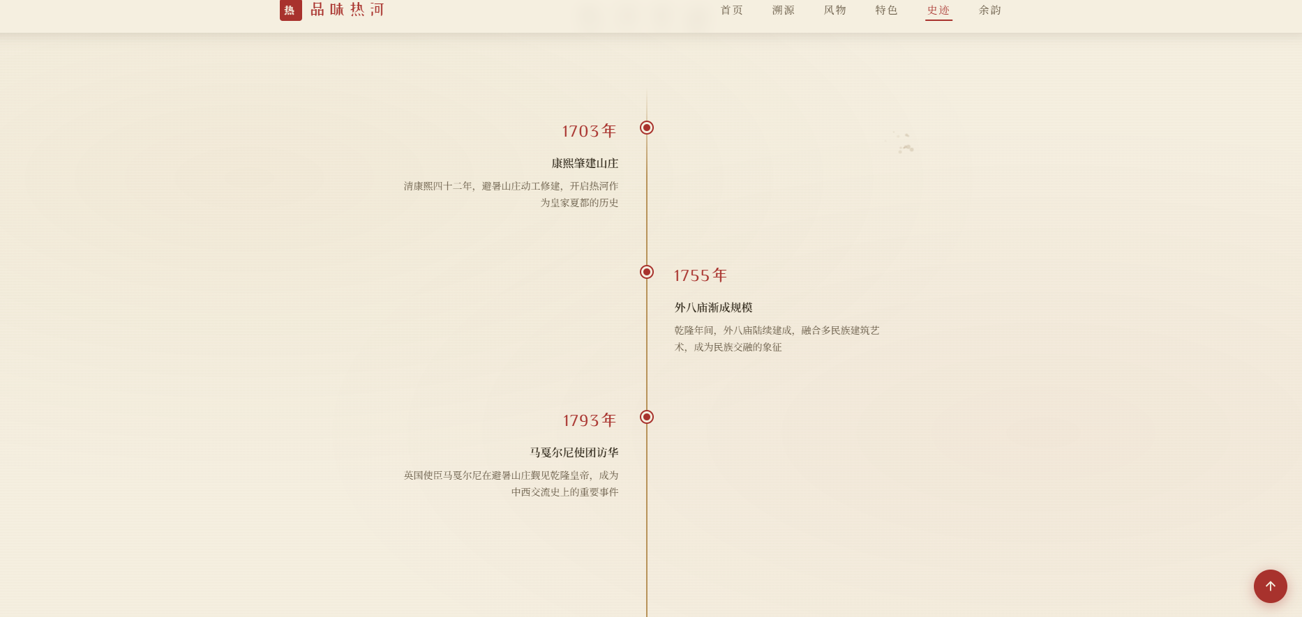
<div class="timeline-item reveal">
<div class="timeline-dot"></div>
<div class="timeline-year">1703年</div>
<div class="timeline-event">康熙肇建山庄</div>
<div class="timeline-desc">清康熙四十二年,避暑山庄动工修建,开启热河作为皇家夏都的历史</div>
</div>
<div class="timeline-item reveal reveal-delay-1">
<div class="timeline-dot"></div>
<div class="timeline-year">1755年</div>
<div class="timeline-event">外八庙渐成规模</div>
<div class="timeline-desc">乾隆年间,外八庙陆续建成,融合多民族建筑艺术,成为民族交融的象征</div>
</div>
<div class="timeline-item reveal reveal-delay-2">
<div class="timeline-dot"></div>
<div class="timeline-year">1793年</div>
<div class="timeline-event">马戛尔尼使团访华</div>
<div class="timeline-desc">英国使臣马戛尔尼在避暑山庄觐见乾隆皇帝,成为中西交流史上的重要事件</div>
</div>
<div class="timeline-item reveal reveal-delay-3">
<div class="timeline-dot"></div>
<div class="timeline-year">1820年</div>
<div class="timeline-event">嘉庆帝驾崩山庄</div>
<div class="timeline-desc">嘉庆二十五年,嘉庆帝颙琰在避暑山庄驾崩,此后皇家渐少北巡</div>
</div>
<div class="timeline-item reveal">
<div class="timeline-dot"></div>
<div class="timeline-year">1929年</div>
<div class="timeline-event">热河省正式设立</div>
<div class="timeline-desc">民国十八年,热河省政府成立,省会驻承德,热河成为正式行政区划名称</div>
</div>
<div class="timeline-item reveal reveal-delay-1">
<div class="timeline-dot"></div>
<div class="timeline-year">1994年</div>
<div class="timeline-event">列入世界遗产名录</div>
<div class="timeline-desc">避暑山庄及周围寺庙被联合国教科文组织列入世界文化遗产名录</div>
</div>
</div>
</div>
</section>
<!– 诗词余韵 –>
<section class="poem-section" id="poem">
<div class="poem-bg"></div>
<div class="container">
<div class="poem-content reveal">
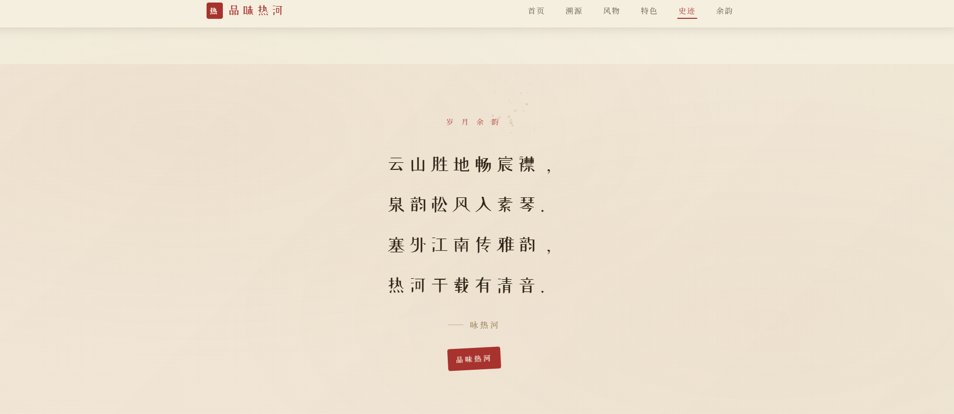
<div class="section-label" style="margin-bottom: 30px;">岁 月 余 韵</div>
<div class="poem-text">
云山胜地畅宸襟,<br>
泉韵松风入素琴。<br>
塞外江南传雅韵,<br>
热河千载有清音。
</div>
<div class="poem-author">—— 咏热河</div>
<div class="poem-seal" onclick="this.style.transform='rotate(-3deg) scale(1.2)'; setTimeout(()=>this.style.transform='rotate(-3deg) scale(1)', 300)">品味热河</div>
</div>
</div>
</section>
<!– 页脚 –>
<footer>
<div class="footer-mountain">
<svg viewBox="0 0 1200 60" preserveAspectRatio="none">
<path d="M0,60 L0,30 Q100,5 200,20 T400,15 T600,25 T800,10 T1000,20 T1200,15 L1200,60 Z" fill="#f5efe0"/>
</svg>
</div>
<div class="footer-content">
<div class="footer-title">品味热河</div>
<div class="footer-desc">寻访热河旧事 · 品读塞外风华</div>
<div class="footer-divider"></div>
<div class="footer-copyright">悠悠热河 · 山河依旧 · 文脉绵长</div>
</div>
</footer>
<!– 图片灯箱 –>
<div class="lightbox" id="lightbox" onclick="closeLightbox(event)">
<div class="lightbox-content" onclick="event.stopPropagation()">
<div class="lightbox-close" onclick="closeLightbox()">
<svg viewBox="0 0 24 24" fill="none" stroke-width="2">
<path d="M18 6L6 18M6 6l12 12"/>
</svg>
</div>
<img id="lightboxImg" src="" alt="">
<div class="lightbox-caption" id="lightboxCaption"></div>
</div>
</div>
<!– 回到顶部 –>
<div class="back-to-top" id="backToTop" onclick="scrollToTop()">
<svg viewBox="0 0 24 24">
<path d="M12 19V5M5 12l7-7 7 7"/>
</svg>
</div>
<script>
/* ========== 加载动画 ========== */
window.addEventListener('load', function() {
setTimeout(function() {
document.getElementById('loader').classList.add('hidden');
}, 2000);
});
/* ========== 导航栏滚动效果 ========== */
var navbar = document.getElementById('navbar');
var backToTop = document.getElementById('backToTop');
window.addEventListener('scroll', function() {
var scrollY = window.scrollY || window.pageYOffset;
if (scrollY > 50) {
navbar.classList.add('scrolled');
} else {
navbar.classList.remove('scrolled');
}
if (scrollY > 400) {
backToTop.classList.add('visible');
} else {
backToTop.classList.remove('visible');
}
updateActiveNav();
});
/* ========== 移动端导航 ========== */
function toggleNav() {
document.getElementById('navLinks').classList.toggle('open');
}
function navClick(event, id) {
event.preventDefault();
document.getElementById('navLinks').classList.remove('open');
scrollToSection(id);
}
/* ========== 平滑滚动 ========== */
function scrollToSection(id) {
var element = document.getElementById(id);
if (element) {
var offset = 70;
var top = element.getBoundingClientRect().top + window.scrollY – offset;
window.scrollTo({ top: top, behavior: 'smooth' });
}
}
function scrollToTop() {
window.scrollTo({ top: 0, behavior: 'smooth' });
}
/* ========== 当前导航高亮 ========== */
function updateActiveNav() {
var sections = ['hero', 'origin', 'scenery', 'highlights', 'timeline', 'poem'];
var scrollY = window.scrollY || window.pageYOffset;
var current = 'hero';
for (var i = 0; i < sections.length; i++) {
var section = document.getElementById(sections[i]);
if (section) {
var top = section.offsetTop – 120;
if (scrollY >= top) {
current = sections[i];
}
}
}
var links = document.querySelectorAll('.nav-links a');
for (var j = 0; j < links.length; j++) {
links[j].classList.remove('active');
if (links[j].getAttribute('href') === '#' + current) {
links[j].classList.add('active');
}
}
}
/* ========== 滚动揭示动画 ========== */
var revealElements = document.querySelectorAll('.reveal');
function checkReveal() {
var windowHeight = window.innerHeight;
var revealPoint = 100;
for (var i = 0; i < revealElements.length; i++) {
var elementTop = revealElements[i].getBoundingClientRect().top;
if (elementTop < windowHeight – revealPoint) {
revealElements[i].classList.add('visible');
}
}
}
window.addEventListener('scroll', checkReveal);
window.addEventListener('load', checkReveal);
/* ========== 图片灯箱 ========== */
function openLightbox(src, caption) {
document.getElementById('lightboxImg').src = src;
document.getElementById('lightboxCaption').textContent = caption || '';
document.getElementById('lightbox').classList.add('active');
document.body.style.overflow = 'hidden';
}
function closeLightbox(event) {
if (event && event.target !== event.currentTarget) return;
document.getElementById('lightbox').classList.remove('active');
document.body.style.overflow = '';
}
// ESC 关闭灯箱
document.addEventListener('keydown', function(e) {
if (e.key === 'Escape') {
document.getElementById('lightbox').classList.remove('active');
document.body.style.overflow = '';
}
});
/* ========== 水墨粒子跟随效果 ========== */
var canvas = document.getElementById('inkCanvas');
var ctx = canvas.getContext('2d');
var particles = [];
var mouseX = -100;
var mouseY = -100;
function resizeCanvas() {
canvas.width = window.innerWidth;
canvas.height = window.innerHeight;
}
resizeCanvas();
window.addEventListener('resize', resizeCanvas);
// 粒子类
function InkParticle(x, y) {
this.x = x;
this.y = y;
this.size = Math.random() * 3 + 1;
this.speedX = (Math.random() – 0.5) * 0.8;
this.speedY = (Math.random() – 0.5) * 0.8 – 0.3;
this.opacity = Math.random() * 0.3 + 0.1;
this.life = 1;
this.decay = Math.random() * 0.008 + 0.004;
}
InkParticle.prototype.update = function() {
this.x += this.speedX;
this.y += this.speedY;
this.life -= this.decay;
this.opacity = this.life * 0.25;
this.size *= 0.995;
};
InkParticle.prototype.draw = function() {
ctx.beginPath();
ctx.arc(this.x, this.y, this.size, 0, Math.PI * 2);
ctx.fillStyle = 'rgba(139, 111, 71, ' + this.opacity + ')';
ctx.fill();
};
var lastParticleTime = 0;
document.addEventListener('mousemove', function(e) {
mouseX = e.clientX;
mouseY = e.clientY;
var now = Date.now();
if (now – lastParticleTime > 30) {
for (var i = 0; i < 2; i++) {
particles.push(new InkParticle(
mouseX + (Math.random() – 0.5) * 10,
mouseY + (Math.random() – 0.5) * 10
));
}
lastParticleTime = now;
}
});
// 触摸支持
document.addEventListener('touchmove', function(e) {
if (e.touches.length > 0) {
mouseX = e.touches[0].clientX;
mouseY = e.touches[0].clientY;
for (var i = 0; i < 2; i++) {
particles.push(new InkParticle(mouseX, mouseY));
}
}
}, { passive: true });
function animateParticles() {
ctx.clearRect(0, 0, canvas.width, canvas.height);
for (var i = particles.length – 1; i >= 0; i–) {
particles[i].update();
particles[i].draw();
if (particles[i].life <= 0) {
particles.splice(i, 1);
}
}
// 限制粒子数量
if (particles.length > 150) {
particles.splice(0, particles.length – 150);
}
requestAnimationFrame(animateParticles);
}
animateParticles();
/* ========== 卡片视差效果 ========== */
var scrollCards = document.querySelectorAll('.scroll-card');
window.addEventListener('scroll', function() {
var scrollY = window.scrollY || window.pageYOffset;
for (var i = 0; i < scrollCards.length; i++) {
var rect = scrollCards[i].getBoundingClientRect();
if (rect.top < window.innerHeight && rect.bottom > 0) {
var progress = (window.innerHeight – rect.top) / (window.innerHeight + rect.height);
var offset = (progress – 0.5) * 10;
scrollCards[i].style.transform = 'translateY(' + offset + 'px)';
}
}
});
/* ========== 印章点击涟漪 ========== */
document.querySelectorAll('.hero-seal, .poem-seal').forEach(function(seal) {
seal.addEventListener('click', function(e) {
var ripple = document.createElement('span');
ripple.style.cssText = 'position:absolute;border-radius:50%;background:rgba(168,50,45,0.3);transform:scale(0);animation:rippleAnim 0.6s ease-out;pointer-events:none;';
var rect = this.getBoundingClientRect();
var size = Math.max(rect.width, rect.height);
ripple.style.width = ripple.style.height = size + 'px';
ripple.style.left = (e.clientX – rect.left – size / 2) + 'px';
ripple.style.top = (e.clientY – rect.top – size / 2) + 'px';
this.style.position = 'relative';
this.style.overflow = 'hidden';
this.appendChild(ripple);
setTimeout(function() { ripple.remove(); }, 600);
});
});
// 涟漪动画
var rippleStyle = document.createElement('style');
rippleStyle.textContent = '@keyframes rippleAnim { to { transform: scale(2.5); opacity: 0; } }';
document.head.appendChild(rippleStyle);
</script>
</body>
</html>
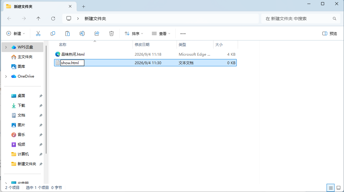
2.展示效果
创建文本文档
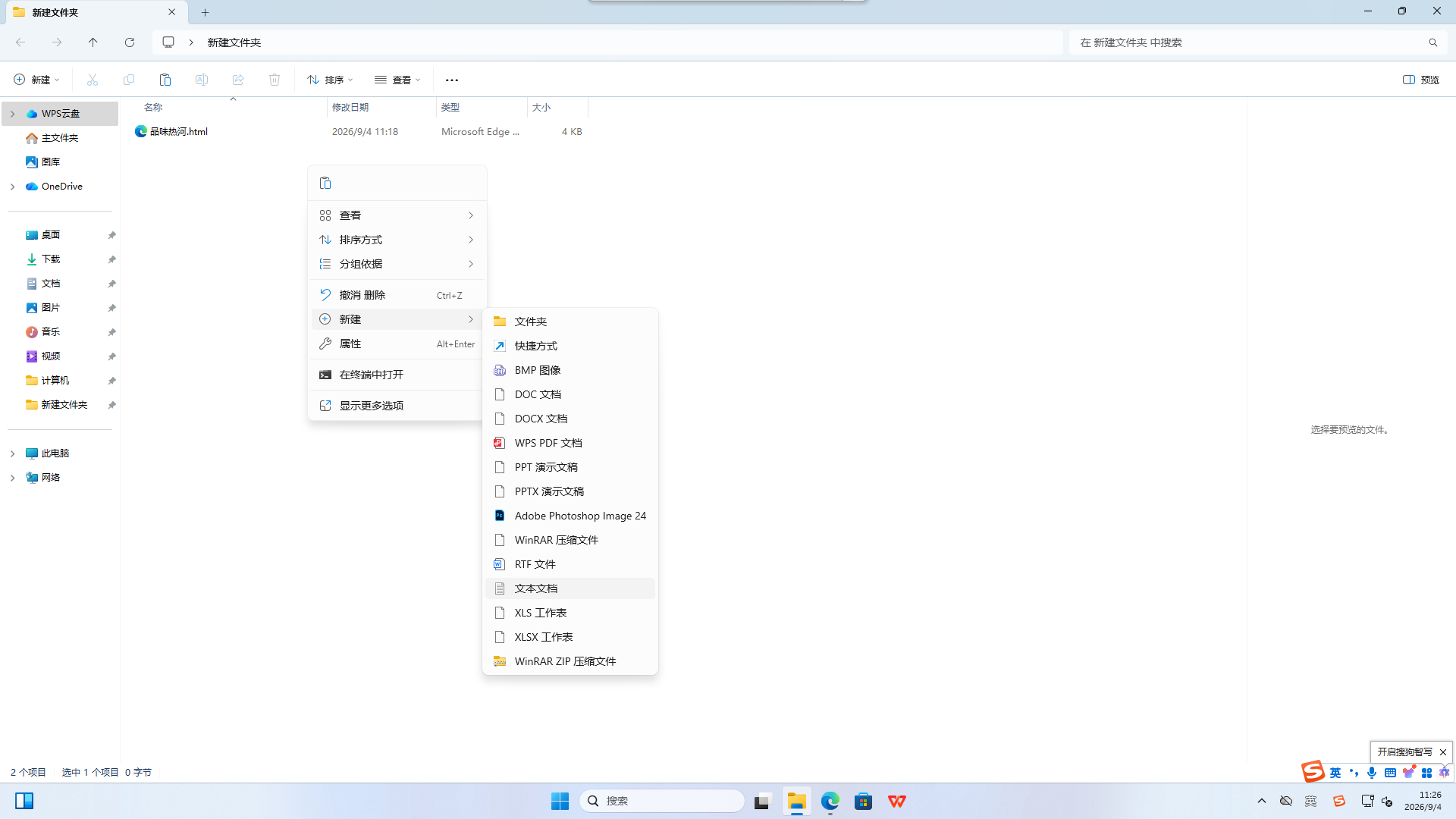
显示文件扩展名
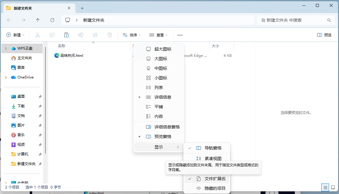
修改扩展名