🔥
个人主页:
杨利杰YJlio
❄️
个人专栏:
《Sysinternals实战教程》
《Windows PowerShell 实战》
《WINDOWS教程》
《IOS教程》
《微信助手》
《锤子助手》
《Python》
《Kali Linux》
《那些年未解决的Windows疑难杂症》
🌟
让复杂的事情更简单,让重复的工作自动化


《超简单:用 Python 让 Excel 飞起来》读书笔记:第8章 案例03 制作散点图判断两组数据的相关性
- 1. 问题背景:为什么要用散点图判断相关性
- 2. 适用场景:哪些数据适合做散点图
- 3. 核心原理:散点图到底在表达什么
- 4. 基础代码:用 plt.scatter() 创建第一张散点图
- 5. 散点图样式定制:颜色、大小、形状
- 6. 颜色映射:让散点图承载更多数据维度
- 7. 加入回归线:从看分布升级到判断趋势
- 8. 效果验证:如何判断这张散点图有没有用
- 9. 常见问题与踩坑记录
-
- 9.1 中文标题显示乱码
- 9.2 Excel 数据里有空值
- 9.3 点太多导致图像混乱
- 9.4 相关不等于因果
- 10. 总结提升:散点图不是画图技巧,而是分析入口

1. 问题背景:为什么要用散点图判断相关性
在 Excel 数据分析和 Python 自动化报表中,很多人习惯先看表格、再看平均值、最后凭感觉判断两个字段有没有关系。比如:广告投入越高,网站访问量是不是越高?工单数量越多,处理时长是不是越长?设备使用年限越久,故障次数是不是越多?
这些问题不能只靠肉眼扫表格。因为表格里的数字是分散的,读者很难快速看出整体趋势。这个时候,散点图的价值就是把两组数据放到同一个坐标系里,用每一个点表示一条记录,从而观察变量之间是否存在趋势、聚集、离散或异常点。
这张图展示了散点图的基础用途:通过点的分布观察两个变量之间的关系。
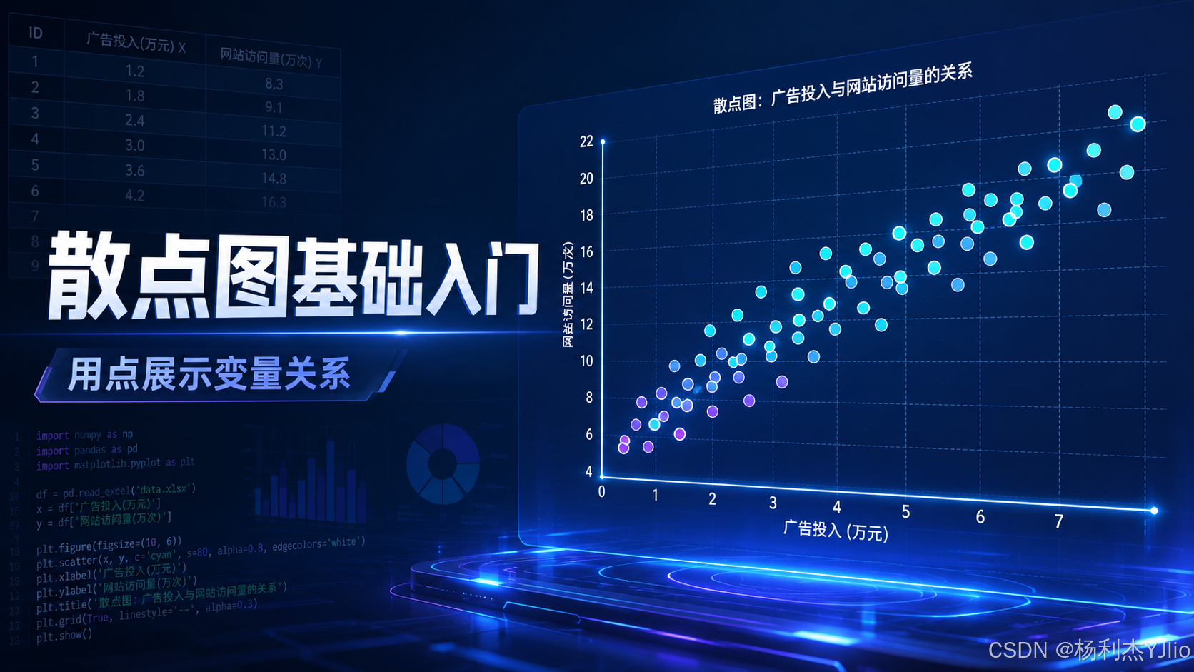
从这张图中可以看出,散点图并不是为了“画得好看”,而是为了让数据关系直接暴露出来。如果点大致沿着某个方向分布,就说明两个变量之间可能存在相关性;如果点完全散乱,就说明关系可能不明显。
这里要注意:散点图只能帮助我们观察关系,不等于直接证明因果关系。 比如广告投入和访问量同时上升,只能说明它们可能相关,不能直接断定“广告投入一定导致访问量增加”。这一步判断如果偷懒,很容易把相关性误判成因果性。

2. 适用场景:哪些数据适合做散点图
散点图最适合分析两个连续变量之间的关系。简单说,就是 x 轴和 y 轴都应该是可以度量、可以排序、可以比较大小的数据。
常见场景包括:
- 广告投入 vs 网站访问量
- 学习时长 vs 考试成绩
- 设备年限 vs 故障次数
- CPU 使用率 vs 程序响应时间
- 销售额 vs 客户数量
- 工单数量 vs 平均处理时长
推荐做法是:先用散点图观察数据关系,再决定是否继续做相关系数、回归分析或异常值排查。 不要一上来就套公式,因为公式的结果如果脱离图形,很容易让人误判。
我自己的习惯是:凡是要判断两个字段有没有关系,先画散点图;图上看不出趋势,再看相关系数;图上有明显趋势,再考虑加回归线。

3. 核心原理:散点图到底在表达什么
散点图的本质很简单:一行数据对应一个点。x 轴放一个变量,y 轴放另一个变量。每个点的位置由这两个变量共同决定。
比如下面这组数据:
| 1.2 | 8.3 |
| 1.8 | 9.1 |
| 2.4 | 11.2 |
| 3.0 | 13.0 |
| 3.6 | 14.8 |
如果把“广告投入”放在 x 轴,把“网站访问量”放在 y 轴,那么每一行都会变成图上的一个点。点越靠右,代表投入越高;点越靠上,代表访问量越高。
#mermaid-svg-rQlkib0lbIdUhFwu{font-family:\”trebuchet ms\”,verdana,arial,sans-serif;font-size:16px;fill:#333;}@keyframes edge-animation-frame{from{stroke-dashoffset:0;}}@keyframes dash{to{stroke-dashoffset:0;}}#mermaid-svg-rQlkib0lbIdUhFwu .edge-animation-slow{stroke-dasharray:9,5!important;stroke-dashoffset:900;animation:dash 50s linear infinite;stroke-linecap:round;}#mermaid-svg-rQlkib0lbIdUhFwu .edge-animation-fast{stroke-dasharray:9,5!important;stroke-dashoffset:900;animation:dash 20s linear infinite;stroke-linecap:round;}#mermaid-svg-rQlkib0lbIdUhFwu .error-icon{fill:#552222;}#mermaid-svg-rQlkib0lbIdUhFwu .error-text{fill:#552222;stroke:#552222;}#mermaid-svg-rQlkib0lbIdUhFwu .edge-thickness-normal{stroke-width:1px;}#mermaid-svg-rQlkib0lbIdUhFwu .edge-thickness-thick{stroke-width:3.5px;}#mermaid-svg-rQlkib0lbIdUhFwu .edge-pattern-solid{stroke-dasharray:0;}#mermaid-svg-rQlkib0lbIdUhFwu .edge-thickness-invisible{stroke-width:0;fill:none;}#mermaid-svg-rQlkib0lbIdUhFwu .edge-pattern-dashed{stroke-dasharray:3;}#mermaid-svg-rQlkib0lbIdUhFwu .edge-pattern-dotted{stroke-dasharray:2;}#mermaid-svg-rQlkib0lbIdUhFwu .marker{fill:#333333;stroke:#333333;}#mermaid-svg-rQlkib0lbIdUhFwu .marker.cross{stroke:#333333;}#mermaid-svg-rQlkib0lbIdUhFwu svg{font-family:\”trebuchet ms\”,verdana,arial,sans-serif;font-size:16px;}#mermaid-svg-rQlkib0lbIdUhFwu p{margin:0;}#mermaid-svg-rQlkib0lbIdUhFwu .label{font-family:\”trebuchet ms\”,verdana,arial,sans-serif;color:#333;}#mermaid-svg-rQlkib0lbIdUhFwu .cluster-label text{fill:#333;}#mermaid-svg-rQlkib0lbIdUhFwu .cluster-label span{color:#333;}#mermaid-svg-rQlkib0lbIdUhFwu .cluster-label span p{background-color:transparent;}#mermaid-svg-rQlkib0lbIdUhFwu .label text,#mermaid-svg-rQlkib0lbIdUhFwu span{fill:#333;color:#333;}#mermaid-svg-rQlkib0lbIdUhFwu .node rect,#mermaid-svg-rQlkib0lbIdUhFwu .node circle,#mermaid-svg-rQlkib0lbIdUhFwu .node ellipse,#mermaid-svg-rQlkib0lbIdUhFwu .node polygon,#mermaid-svg-rQlkib0lbIdUhFwu .node path{fill:#ECECFF;stroke:#9370DB;stroke-width:1px;}#mermaid-svg-rQlkib0lbIdUhFwu .rough-node .label text,#mermaid-svg-rQlkib0lbIdUhFwu .node .label text,#mermaid-svg-rQlkib0lbIdUhFwu .image-shape .label,#mermaid-svg-rQlkib0lbIdUhFwu .icon-shape .label{text-anchor:middle;}#mermaid-svg-rQlkib0lbIdUhFwu .node .katex path{fill:#000;stroke:#000;stroke-width:1px;}#mermaid-svg-rQlkib0lbIdUhFwu .rough-node .label,#mermaid-svg-rQlkib0lbIdUhFwu .node .label,#mermaid-svg-rQlkib0lbIdUhFwu .image-shape .label,#mermaid-svg-rQlkib0lbIdUhFwu .icon-shape .label{text-align:center;}#mermaid-svg-rQlkib0lbIdUhFwu .node.clickable{cursor:pointer;}#mermaid-svg-rQlkib0lbIdUhFwu .root .anchor path{fill:#333333!important;stroke-width:0;stroke:#333333;}#mermaid-svg-rQlkib0lbIdUhFwu .arrowheadPath{fill:#333333;}#mermaid-svg-rQlkib0lbIdUhFwu .edgePath .path{stroke:#333333;stroke-width:2.0px;}#mermaid-svg-rQlkib0lbIdUhFwu .flowchart-link{stroke:#333333;fill:none;}#mermaid-svg-rQlkib0lbIdUhFwu .edgeLabel{background-color:rgba(232,232,232, 0.8);text-align:center;}#mermaid-svg-rQlkib0lbIdUhFwu .edgeLabel p{background-color:rgba(232,232,232, 0.8);}#mermaid-svg-rQlkib0lbIdUhFwu .edgeLabel rect{opacity:0.5;background-color:rgba(232,232,232, 0.8);fill:rgba(232,232,232, 0.8);}#mermaid-svg-rQlkib0lbIdUhFwu .labelBkg{background-color:rgba(232, 232, 232, 0.5);}#mermaid-svg-rQlkib0lbIdUhFwu .cluster rect{fill:#ffffde;stroke:#aaaa33;stroke-width:1px;}#mermaid-svg-rQlkib0lbIdUhFwu .cluster text{fill:#333;}#mermaid-svg-rQlkib0lbIdUhFwu .cluster span{color:#333;}#mermaid-svg-rQlkib0lbIdUhFwu div.mermaidTooltip{position:absolute;text-align:center;max-width:200px;padding:2px;font-family:\”trebuchet ms\”,verdana,arial,sans-serif;font-size:12px;background:hsl(80, 100%, 96.2745098039%);border:1px solid #aaaa33;border-radius:2px;pointer-events:none;z-index:100;}#mermaid-svg-rQlkib0lbIdUhFwu .flowchartTitleText{text-anchor:middle;font-size:18px;fill:#333;}#mermaid-svg-rQlkib0lbIdUhFwu rect.text{fill:none;stroke-width:0;}#mermaid-svg-rQlkib0lbIdUhFwu .icon-shape,#mermaid-svg-rQlkib0lbIdUhFwu .image-shape{background-color:rgba(232,232,232, 0.8);text-align:center;}#mermaid-svg-rQlkib0lbIdUhFwu .icon-shape p,#mermaid-svg-rQlkib0lbIdUhFwu .image-shape p{background-color:rgba(232,232,232, 0.8);padding:2px;}#mermaid-svg-rQlkib0lbIdUhFwu .icon-shape .label rect,#mermaid-svg-rQlkib0lbIdUhFwu .image-shape .label rect{opacity:0.5;background-color:rgba(232,232,232, 0.8);fill:rgba(232,232,232, 0.8);}#mermaid-svg-rQlkib0lbIdUhFwu .label-icon{display:inline-block;height:1em;overflow:visible;vertical-align:-0.125em;}#mermaid-svg-rQlkib0lbIdUhFwu .node .label-icon path{fill:currentColor;stroke:revert;stroke-width:revert;}#mermaid-svg-rQlkib0lbIdUhFwu :root{–mermaid-font-family:\”trebuchet ms\”,verdana,arial,sans-serif;}
Excel原始数据
读取x列和y列
每一行数据转换成一个点
绘制散点图
观察趋势/聚集/异常点
判断是否继续做相关分析
散点图不是直接给答案,而是把数据关系可视化,让我们先看到问题。 这一步很关键,因为很多数据问题不是算错了,而是根本没有先看数据形态。

4. 基础代码:用 plt.scatter() 创建第一张散点图
在 Python 中,制作散点图最常用的是 Matplotlib 的 `plt.scatter()`。它的基础用法很直接,只要准备两组长度相同的数据即可。
import matplotlib.pyplot as plt
x = [1, 2, 3, 4, 5, 6]
y = [3, 4, 6, 8, 9, 10]
plt.figure(figsize=(8, 6))
plt.scatter(x, y)
plt.title("散点图:X与Y的关系")
plt.xlabel("X轴")
plt.ylabel("Y轴")
plt.tight_layout()
plt.show()
这段代码里,`x` 控制点在横轴的位置,`y` 控制点在纵轴的位置。`plt.scatter(x, y)` 就是把这两组数据变成图上的点。
这里最常见的错误是 x 和 y 长度不一致。 如果 x 有 10 个值,y 只有 9 个值,图就无法正确生成。所以在实际读取 Excel 数据时,要先清理空值,保证两列数据能够一一对应。

5. 散点图样式定制:颜色、大小、形状
基础散点图能展示变量关系,但在实际写报告或做博客时,经常还需要进一步增强可读性。Matplotlib 支持通过颜色、点大小、透明度和形状来表达更多信息。
这张图展示了散点图样式定制的几个关键维度:颜色、大小和形状。
从这张图中可以看出,散点图的点不一定只能是默认圆点。点的大小可以强调权重,颜色可以表示类别或数值,形状可以区分不同对象。这样一张图就不只是二维关系,还可以扩展出第三个甚至第四个维度。
示例代码如下:
import matplotlib.pyplot as plt
x = [1, 2, 3, 4, 5, 6]
y = [3, 4, 6, 8, 9, 10]
sizes = [50, 80, 120, 160, 220, 300]
colors = [1, 2, 3, 4, 5, 6]
plt.figure(figsize=(8, 6))
plt.scatter(
x,
y,
s=sizes,
c=colors,
cmap="viridis",
alpha=0.7,
marker="o"
)
plt.title("散点图样式定制")
plt.xlabel("X轴")
plt.ylabel("Y轴")
plt.colorbar(label="颜色映射值")
plt.tight_layout()
plt.show()
几个参数要记住:
- s:控制点的大小
- c:控制点的颜色数据
- cmap:控制颜色映射方案
- alpha:控制透明度
- marker:控制点的形状
推荐做法:当点比较多时,适当降低 alpha 透明度,可以减少点重叠造成的视觉干扰。

6. 颜色映射:让散点图承载更多数据维度
散点图最基础的两个维度是 x 和 y。如果我们还想表达第三个变量,就可以使用颜色映射。比如 x 表示广告投入,y 表示销售额,颜色表示客户等级或转化率。
这张图展示了颜色映射在散点图中的作用:不同颜色代表不同数值区间。

从这张图中可以看出,颜色不是简单的装饰,而是一种数据编码方式。颜色越接近高值区域,说明对应的数据维度越强;颜色越接近低值区域,说明对应指标越弱。
颜色映射的典型代码如下:
import numpy as np
import matplotlib.pyplot as plt
x = np.random.rand(100)
y = np.random.rand(100)
score = np.random.rand(100)
plt.figure(figsize=(8, 6))
plt.scatter(
x,
y,
c=score,
cmap="coolwarm",
alpha=0.7
)
plt.title("散点图:颜色映射表示第三个变量")
plt.xlabel("X轴")
plt.ylabel("Y轴")
plt.colorbar(label="评分")
plt.tight_layout()
plt.show()
颜色映射适合表达连续数值,不太适合表达太多离散类别。 如果类别特别多,建议用分组绘图或单独图例,不要让颜色变成“彩色噪音”。

7. 加入回归线:从看分布升级到判断趋势
散点图能告诉我们“数据大概怎么分布”,但如果想进一步判断趋势,就可以加入回归线。回归线的作用是用一条直线概括两组数据之间的整体方向。
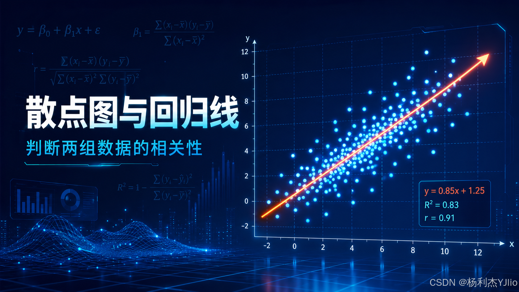
这张图展示了散点图与回归线结合后的效果。

从这张图中可以看出,散点整体沿着回归线向右上方分布,说明两个变量之间可能存在较强的正相关关系。回归线越贴近点的整体分布,说明线性趋势越明显。
可以使用 `sklearn.linear_model.LinearRegression` 添加回归线:
import numpy as np
import matplotlib.pyplot as plt
from sklearn.linear_model import LinearRegression
# 构造示例数据
x = np.random.rand(100, 1) * 10
y = 0.85 * x + 1.25 + np.random.randn(100, 1)
# 训练线性回归模型
model = LinearRegression()
model.fit(x, y)
# 生成预测值
y_pred = model.predict(x)
plt.figure(figsize=(8, 6))
plt.scatter(x, y, alpha=0.7, label="数据点")
plt.plot(x, y_pred, linewidth=2, label="回归线")
plt.title("散点图与回归线")
plt.xlabel("X")
plt.ylabel("Y")
plt.legend()
plt.grid(axis="both", linestyle="–", alpha=0.4)
plt.tight_layout()
plt.show()
注意:回归线只能说明趋势拟合,不代表因果关系成立。 如果业务上没有合理解释,单靠回归线不能直接写出“因为 A 导致 B”的结论。

8. 效果验证:如何判断这张散点图有没有用
一张散点图是否有价值,不是看它颜色多漂亮,而是看它能不能帮助我们做判断。我的验证标准一般有三条:
这张图展示了从散点图观察,到相关性分析,再到业务判断的完整链路。

从这张图中可以看出,散点图真正有价值的地方不只是“画出点”,而是把数据探索、相关分析和业务判断串成一条线。比如广告投放和销售额呈现较强正相关,就可以作为预算调整的参考依据。
推荐在正式报告里同时保留散点图、相关系数和业务解释。 这样结论更完整,也更容易被读者理解。

9. 常见问题与踩坑记录
9.1 中文标题显示乱码
Matplotlib 默认字体可能不支持中文,导致标题和坐标轴显示为方块。可以添加下面两行配置:
import matplotlib.pyplot as plt
plt.rcParams["font.sans-serif"] = ["SimHei"]
plt.rcParams["axes.unicode_minus"] = False
如果系统里没有 `SimHei`,可以换成 `Microsoft YaHei`。在 Windows 环境下,微软雅黑通常更稳。
9.2 Excel 数据里有空值
读取 Excel 后,如果 x 或 y 存在空值,散点图可能显示异常。建议先做清洗:
import pandas as pd
df = pd.read_excel("data.xlsx")
df["广告投入"] = pd.to_numeric(df["广告投入"], errors="coerce")
df["网站访问量"] = pd.to_numeric(df["网站访问量"], errors="coerce")
df = df.dropna(subset=["广告投入", "网站访问量"])
不要把空值强行填成 0,除非业务上 0 真的代表有效数值。 否则会制造假数据点,影响趋势判断。
9.3 点太多导致图像混乱
如果数据点很多,可以通过透明度降低重叠影响:
plt.scatter(x, y, alpha=0.4)
如果点非常密集,散点图可能不再适合单独分析,可以考虑热力图、hexbin 图或抽样展示。
9.4 相关不等于因果
这是散点图最容易被误用的地方。两个变量一起变化,只说明它们可能有关系,但不代表其中一个一定导致另一个。
真正要判断因果关系,还需要业务机制、实验设计、控制变量或更多统计方法支持。

10. 总结提升:散点图不是画图技巧,而是分析入口
这一节的核心不是记住 `plt.scatter()` 这个函数,而是理解散点图在数据分析流程里的位置。
我的理解是:散点图是判断两组数据关系的第一道观察窗口。 它能帮助我们先看清楚数据形态,再决定是否继续做相关系数、回归分析、异常值定位或业务解释。
这篇内容可以归纳成一条实战流程:
#mermaid-svg-WpfJ5PoNNcNEHRw8{font-family:\”trebuchet ms\”,verdana,arial,sans-serif;font-size:16px;fill:#333;}@keyframes edge-animation-frame{from{stroke-dashoffset:0;}}@keyframes dash{to{stroke-dashoffset:0;}}#mermaid-svg-WpfJ5PoNNcNEHRw8 .edge-animation-slow{stroke-dasharray:9,5!important;stroke-dashoffset:900;animation:dash 50s linear infinite;stroke-linecap:round;}#mermaid-svg-WpfJ5PoNNcNEHRw8 .edge-animation-fast{stroke-dasharray:9,5!important;stroke-dashoffset:900;animation:dash 20s linear infinite;stroke-linecap:round;}#mermaid-svg-WpfJ5PoNNcNEHRw8 .error-icon{fill:#552222;}#mermaid-svg-WpfJ5PoNNcNEHRw8 .error-text{fill:#552222;stroke:#552222;}#mermaid-svg-WpfJ5PoNNcNEHRw8 .edge-thickness-normal{stroke-width:1px;}#mermaid-svg-WpfJ5PoNNcNEHRw8 .edge-thickness-thick{stroke-width:3.5px;}#mermaid-svg-WpfJ5PoNNcNEHRw8 .edge-pattern-solid{stroke-dasharray:0;}#mermaid-svg-WpfJ5PoNNcNEHRw8 .edge-thickness-invisible{stroke-width:0;fill:none;}#mermaid-svg-WpfJ5PoNNcNEHRw8 .edge-pattern-dashed{stroke-dasharray:3;}#mermaid-svg-WpfJ5PoNNcNEHRw8 .edge-pattern-dotted{stroke-dasharray:2;}#mermaid-svg-WpfJ5PoNNcNEHRw8 .marker{fill:#333333;stroke:#333333;}#mermaid-svg-WpfJ5PoNNcNEHRw8 .marker.cross{stroke:#333333;}#mermaid-svg-WpfJ5PoNNcNEHRw8 svg{font-family:\”trebuchet ms\”,verdana,arial,sans-serif;font-size:16px;}#mermaid-svg-WpfJ5PoNNcNEHRw8 p{margin:0;}#mermaid-svg-WpfJ5PoNNcNEHRw8 .label{font-family:\”trebuchet ms\”,verdana,arial,sans-serif;color:#333;}#mermaid-svg-WpfJ5PoNNcNEHRw8 .cluster-label text{fill:#333;}#mermaid-svg-WpfJ5PoNNcNEHRw8 .cluster-label span{color:#333;}#mermaid-svg-WpfJ5PoNNcNEHRw8 .cluster-label span p{background-color:transparent;}#mermaid-svg-WpfJ5PoNNcNEHRw8 .label text,#mermaid-svg-WpfJ5PoNNcNEHRw8 span{fill:#333;color:#333;}#mermaid-svg-WpfJ5PoNNcNEHRw8 .node rect,#mermaid-svg-WpfJ5PoNNcNEHRw8 .node circle,#mermaid-svg-WpfJ5PoNNcNEHRw8 .node ellipse,#mermaid-svg-WpfJ5PoNNcNEHRw8 .node polygon,#mermaid-svg-WpfJ5PoNNcNEHRw8 .node path{fill:#ECECFF;stroke:#9370DB;stroke-width:1px;}#mermaid-svg-WpfJ5PoNNcNEHRw8 .rough-node .label text,#mermaid-svg-WpfJ5PoNNcNEHRw8 .node .label text,#mermaid-svg-WpfJ5PoNNcNEHRw8 .image-shape .label,#mermaid-svg-WpfJ5PoNNcNEHRw8 .icon-shape .label{text-anchor:middle;}#mermaid-svg-WpfJ5PoNNcNEHRw8 .node .katex path{fill:#000;stroke:#000;stroke-width:1px;}#mermaid-svg-WpfJ5PoNNcNEHRw8 .rough-node .label,#mermaid-svg-WpfJ5PoNNcNEHRw8 .node .label,#mermaid-svg-WpfJ5PoNNcNEHRw8 .image-shape .label,#mermaid-svg-WpfJ5PoNNcNEHRw8 .icon-shape .label{text-align:center;}#mermaid-svg-WpfJ5PoNNcNEHRw8 .node.clickable{cursor:pointer;}#mermaid-svg-WpfJ5PoNNcNEHRw8 .root .anchor path{fill:#333333!important;stroke-width:0;stroke:#333333;}#mermaid-svg-WpfJ5PoNNcNEHRw8 .arrowheadPath{fill:#333333;}#mermaid-svg-WpfJ5PoNNcNEHRw8 .edgePath .path{stroke:#333333;stroke-width:2.0px;}#mermaid-svg-WpfJ5PoNNcNEHRw8 .flowchart-link{stroke:#333333;fill:none;}#mermaid-svg-WpfJ5PoNNcNEHRw8 .edgeLabel{background-color:rgba(232,232,232, 0.8);text-align:center;}#mermaid-svg-WpfJ5PoNNcNEHRw8 .edgeLabel p{background-color:rgba(232,232,232, 0.8);}#mermaid-svg-WpfJ5PoNNcNEHRw8 .edgeLabel rect{opacity:0.5;background-color:rgba(232,232,232, 0.8);fill:rgba(232,232,232, 0.8);}#mermaid-svg-WpfJ5PoNNcNEHRw8 .labelBkg{background-color:rgba(232, 232, 232, 0.5);}#mermaid-svg-WpfJ5PoNNcNEHRw8 .cluster rect{fill:#ffffde;stroke:#aaaa33;stroke-width:1px;}#mermaid-svg-WpfJ5PoNNcNEHRw8 .cluster text{fill:#333;}#mermaid-svg-WpfJ5PoNNcNEHRw8 .cluster span{color:#333;}#mermaid-svg-WpfJ5PoNNcNEHRw8 div.mermaidTooltip{position:absolute;text-align:center;max-width:200px;padding:2px;font-family:\”trebuchet ms\”,verdana,arial,sans-serif;font-size:12px;background:hsl(80, 100%, 96.2745098039%);border:1px solid #aaaa33;border-radius:2px;pointer-events:none;z-index:100;}#mermaid-svg-WpfJ5PoNNcNEHRw8 .flowchartTitleText{text-anchor:middle;font-size:18px;fill:#333;}#mermaid-svg-WpfJ5PoNNcNEHRw8 rect.text{fill:none;stroke-width:0;}#mermaid-svg-WpfJ5PoNNcNEHRw8 .icon-shape,#mermaid-svg-WpfJ5PoNNcNEHRw8 .image-shape{background-color:rgba(232,232,232, 0.8);text-align:center;}#mermaid-svg-WpfJ5PoNNcNEHRw8 .icon-shape p,#mermaid-svg-WpfJ5PoNNcNEHRw8 .image-shape p{background-color:rgba(232,232,232, 0.8);padding:2px;}#mermaid-svg-WpfJ5PoNNcNEHRw8 .icon-shape .label rect,#mermaid-svg-WpfJ5PoNNcNEHRw8 .image-shape .label rect{opacity:0.5;background-color:rgba(232,232,232, 0.8);fill:rgba(232,232,232, 0.8);}#mermaid-svg-WpfJ5PoNNcNEHRw8 .label-icon{display:inline-block;height:1em;overflow:visible;vertical-align:-0.125em;}#mermaid-svg-WpfJ5PoNNcNEHRw8 .node .label-icon path{fill:currentColor;stroke:revert;stroke-width:revert;}#mermaid-svg-WpfJ5PoNNcNEHRw8 :root{–mermaid-font-family:\”trebuchet ms\”,verdana,arial,sans-serif;}
有
没有
准备两组变量
清理空值和异常格式
绘制基础散点图
是否存在明显趋势
计算相关系数/添加回归线
检查分组/异常点/数据口径
结合业务解释
输出结论
我建议把散点图当成数据分析前置动作,而不是最后的装饰图。 先看图,再算数,最后才写结论,这样文章和报告都会更稳。
如果只会画图,但不会解释图,那图表只是截图;如果能从图中发现关系、异常和业务信号,图表才真正变成分析工具。
返回顶部