前言
Flutter是Google开发的开源UI工具包,支持用一套代码构建iOS、Android、Web、Windows、macOS和Linux六大平台应用,实现"一次编写,多处运行"。
OpenHarmony是由开放原子开源基金会运营的分布式操作系统,为全场景智能设备提供统一底座,具有多设备支持、模块化设计、分布式能力和开源开放等特性。
Flutter for OpenHarmony技术方案使开发者能够:
本文详细解析了一个完整的 Flutter 瀑布流布局应用的开发过程。这个应用展示了如何实现一个具有动态背景动画、渐变商品卡片和流畅交互的 列表demo,包含智能列分配算法、商品卡片动画、悬停效果。功能 组件化设计,代码结构清晰,易于维护和扩展。
先看效果
Flutte实现的 web端实时预览 完整效果 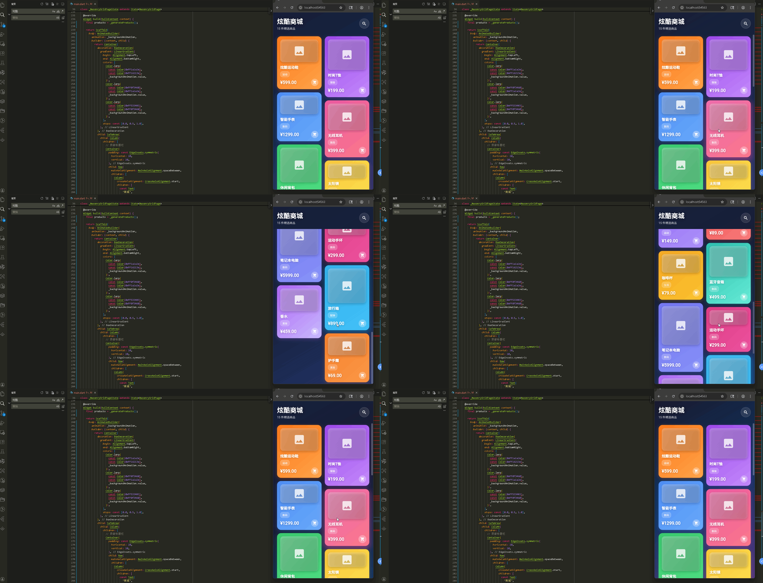
打包成功 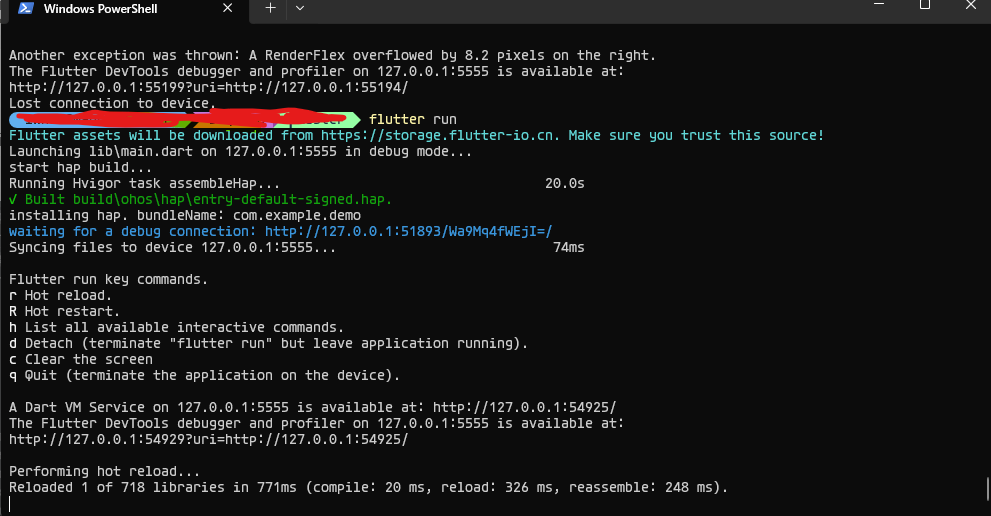
在meta70 pro 真机模拟器上成功运行后的效果

📁 项目结构说明
文件目录结构
lib/
├── main.dart # 应用入口文件
├── models/ # 数据模型目录
│ └── product.dart # 商品数据模型(Product、ProductColor)
└── widgets/ # 组件目录
├── masonry_grid.dart # 瀑布流布局组件
└── product_card.dart # 商品卡片组件
文件说明
入口文件
lib/main.dart
- 应用入口点,包含 main() 函数
- 定义 MyApp 类,配置应用主题
- 定义 MasonryGridPage 主页面,包含:
- 背景动画控制器
- 商品数据生成逻辑
- 页面布局结构(标题栏 + 瀑布流)
数据模型
lib/models/product.dart
- Product 类:商品数据模型
- 包含商品的基本信息(id、name、price、category 等)
- height 属性用于瀑布流布局
- gradientColors 用于卡片渐变色
- ProductColor 类:颜色数据模型
- 存储 RGB 颜色值
- 提供转换为 Flutter Color 的方法
组件文件
lib/widgets/masonry_grid.dart
- MasonryGrid 组件:瀑布流布局核心组件
- 实现智能列分配算法
- 自动将商品分配到最短的列
- 支持自定义列数、列间距、行间距
lib/widgets/product_card.dart
- ProductCard 组件:商品卡片展示组件
- 渐变背景和玻璃态效果
- 点击缩放和旋转动画
- 悬停阴影和图标放大效果
- 显示商品信息(名称、分类、价格)
组件依赖关系
main.dart
├── models/product.dart (导入数据模型)
└── widgets/masonry_grid.dart (导入瀑布流组件)
├── models/product.dart (导入数据模型)
└── widgets/product_card.dart (导入卡片组件)
└── models/product.dart (导入数据模型)
数据流向
应用入口
- main() 函数
- MyApp 类 – 主题配置
主页面 (MasonryGridPage)
- 类定义和状态管理
- 商品数据生成
- 背景动画
- 页面布局
数据模型 (Product)
-
Product 类
-
ProductColor 类
MasonryGrid 组件
- 类定义和属性
- 瀑布流布局算法
- 列构建
ProductCard 组件
- 类定义和动画
- 手势处理
- 卡片布局
- 悬停效果
应用入口
1. main() 函数
import 'package:flutter/material.dart';
import 'models/product.dart';
import 'widgets/masonry_grid.dart';
void main() {
runApp(const MyApp());
}
应用入口,导入数据模型和瀑布流组件。
2. MyApp 类 – 主题配置
class MyApp extends StatelessWidget {
const MyApp({super.key});
Widget build(BuildContext context) {
return MaterialApp(
title: '瀑布流演示',
debugShowCheckedModeBanner: false,
theme: ThemeData(
useMaterial3: true,
colorScheme: ColorScheme.fromSeed(
seedColor: Colors.deepPurple,
brightness: Brightness.dark, // 深色模式
),
),
home: const MasonryGridPage(),
);
}
}
配置深色主题,使用紫色作为种子颜色。
主页面 (MasonryGridPage)
1. 类定义和状态管理
class MasonryGridPage extends StatefulWidget {
const MasonryGridPage({super.key});
State<MasonryGridPage> createState() => _MasonryGridPageState();
}
class _MasonryGridPageState extends State<MasonryGridPage>
with TickerProviderStateMixin {
late AnimationController _backgroundAnimationController; // 背景动画控制器
late Animation<double> _backgroundAnimation; // 背景动画
final ScrollController _scrollController = ScrollController(); // 滚动控制器
TickerProviderStateMixin 提供动画控制器所需的 vsync。ScrollController 控制滚动行为。
2. 商品数据生成
List<Product> _generateProducts() {
final List<Map<String, dynamic>> productData = [
{
'name': '运动鞋',
'price': 599.00,
'category': '运动',
'height': 280.0, // 卡片高度,用于瀑布流布局
'colors': [
ProductColor(255, 106, 0), // RGB 颜色
ProductColor(255, 159, 64),
],
},
// … 更多商品数据
];
return productData.asMap().entries.map((entry) {
final index = entry.key;
final data = entry.value;
return Product(
id: 'product_$index',
name: data['name'],
imageUrl: '',
price: data['price'],
category: data['category'],
height: data['height'], // 每个商品的高度不同
gradientColors: data['colors'], // 渐变色数组
);
}).toList();
}
生成演示数据。每个商品有不同的高度,这是瀑布流的关键。asMap().entries.map() 将数据转换为 Product 对象列表。
3. 背景动画
void initState() {
super.initState();
_backgroundAnimationController = AnimationController(
vsync: this,
duration: const Duration(seconds: 10), // 10 秒循环
)..repeat(); // 循环播放
_backgroundAnimation = Tween<double>(begin: 0.0, end: 1.0).animate(
CurvedAnimation(
parent: _backgroundAnimationController,
curve: Curves.linear, // 线性动画
),
);
}
void dispose() {
_backgroundAnimationController.dispose();
_scrollController.dispose();
super.dispose();
}
背景动画控制器循环播放,实现渐变背景的动态变化。
4. 页面布局
Widget build(BuildContext context) {
final products = _generateProducts();
return Scaffold(
body: AnimatedBuilder(
animation: _backgroundAnimation,
builder: (context, child) {
return Container(
decoration: BoxDecoration(
gradient: LinearGradient(
begin: Alignment.topLeft,
end: Alignment.bottomRight,
colors: [
// 使用 Color.lerp 实现颜色渐变动画
Color.lerp(
const Color(0xFF1a1a2e),
const Color(0xFF16213e),
_backgroundAnimation.value,
)!,
Color.lerp(
const Color(0xFF0f3460),
const Color(0xFF1a1a2e),
_backgroundAnimation.value,
)!,
Color.lerp(
const Color(0xFF533483),
const Color(0xFF0f3460),
_backgroundAnimation.value,
)!,
],
stops: const [0.0, 0.5, 1.0],
),
),
child: SafeArea(
child: Column(
children: [
// 顶部标题栏
Container(
padding: const EdgeInsets.symmetric(horizontal: 20, vertical: 20),
child: Row(
mainAxisAlignment: MainAxisAlignment.spaceBetween,
children: [
Column(
crossAxisAlignment: CrossAxisAlignment.start,
children: [
const Text(
'商城',
style: TextStyle(
fontSize: 32,
fontWeight: FontWeight.bold,
color: Colors.white,
shadows: [
Shadow(
color: Colors.black54,
blurRadius: 10,
offset: Offset(0, 2),
),
],
),
),
const SizedBox(height: 4),
Text(
'${products.length} 件精选商品',
style: TextStyle(
fontSize: 14,
color: Colors.white.withOpacity(0.7),
),
),
],
),
Container(
padding: const EdgeInsets.all(12),
decoration: BoxDecoration(
color: Colors.white.withOpacity(0.1),
shape: BoxShape.circle,
border: Border.all(
color: Colors.white.withOpacity(0.2),
width: 1,
),
),
child: const Icon(Icons.search, color: Colors.white, size: 24),
),
],
),
),
// 瀑布流内容
Expanded(
child: SingleChildScrollView(
controller: _scrollController,
physics: const BouncingScrollPhysics(), // 弹性滚动
padding: const EdgeInsets.symmetric(horizontal: 12),
child: MasonryGrid(
products: products,
crossAxisCount: 2, // 2 列
crossAxisSpacing: 8.0, // 列间距
mainAxisSpacing: 8.0, // 行间距
),
),
),
],
),
),
);
},
),
);
}
AnimatedBuilder 监听背景动画,使用 Color.lerp() 实现颜色渐变。顶部显示标题和商品数量,底部是瀑布流内容。BouncingScrollPhysics 提供弹性滚动效果。
数据模型 (Product)
1. Product 类
class Product {
final String id; // 商品 ID
final String name; // 商品名称
final String imageUrl; // 图片 URL
final double price; // 价格
final String category; // 分类
final double height; // 卡片高度(瀑布流关键)
final List<ProductColor> gradientColors; // 渐变色数组
Product({
required this.id,
required this.name,
required this.imageUrl,
required this.price,
required this.category,
required this.height,
required this.gradientColors,
});
}
height 是瀑布流的关键属性,每个商品高度不同,形成瀑布流效果。
2. ProductColor 类
class ProductColor {
final int r; // 红色分量
final int g; // 绿色分量
final int b; // 蓝色分量
ProductColor(this.r, this.g, this.b);
// 转换为 Flutter Color
Color toFlutterColor() {
return Color.fromARGB(255, r, g, b); // 255 是完全不透明
}
}
简化的颜色类,存储 RGB 值并转换为 Flutter 的 Color。
MasonryGrid 组件
1. 类定义和属性
class MasonryGrid extends StatelessWidget {
final List<Product> products; // 商品列表
final int crossAxisCount; // 列数(默认 2)
final double crossAxisSpacing; // 列间距
final double mainAxisSpacing; // 行间距
const MasonryGrid({
super.key,
required this.products,
this.crossAxisCount = 2,
this.crossAxisSpacing = 8.0,
this.mainAxisSpacing = 8.0,
});
瀑布流组件,接收商品列表和布局参数。
2. 瀑布流布局算法
Widget build(BuildContext context) {
// 创建列列表来存储每列的子元素
List<List<Widget>> columns = List.generate(
crossAxisCount,
(_) => <Widget>[], // 每列初始化为空列表
);
// 记录每列的当前高度
List<double> columnHeights = List.filled(crossAxisCount, 0.0);
// 将商品分配到最短的列
for (var product in products) {
int shortestColumnIndex = 0;
double shortestHeight = columnHeights[0];
// 找到最短的列
for (int i = 1; i < crossAxisCount; i++) {
if (columnHeights[i] < shortestHeight) {
shortestHeight = columnHeights[i];
shortestColumnIndex = i;
}
}
// 创建商品卡片
final card = SizedBox(
height: product.height, // 使用商品的高度
child: ProductCard(
product: product,
onTap: () {
ScaffoldMessenger.of(context).showSnackBar(
SnackBar(
content: Text('点击了 ${product.name}'),
duration: const Duration(seconds: 1),
backgroundColor: Colors.black87,
behavior: SnackBarBehavior.floating,
shape: RoundedRectangleBorder(
borderRadius: BorderRadius.circular(10),
),
),
);
},
),
);
// 将卡片添加到最短的列
columns[shortestColumnIndex].add(card);
// 更新该列的高度(加上卡片高度和间距)
columnHeights[shortestColumnIndex] += product.height + mainAxisSpacing;
}
这是瀑布流的核心算法:
这样确保每列高度尽量平衡。
3. 列构建
// 构建列布局
return Row(
crossAxisAlignment: CrossAxisAlignment.start, // 顶部对齐
children: List.generate(
crossAxisCount,
(index) => Expanded( // 每列平均分配宽度
child: Column(
children: columns[index], // 该列的所有商品
),
),
),
);
使用 Row 水平排列列,每列用 Expanded 平均分配宽度。Column 垂直排列该列的商品。
ProductCard 组件
1. 类定义和动画
class ProductCard extends StatefulWidget {
final Product product;
final VoidCallback? onTap;
const ProductCard({
super.key,
required this.product,
this.onTap,
});
State<ProductCard> createState() => _ProductCardState();
}
class _ProductCardState extends State<ProductCard>
with SingleTickerProviderStateMixin {
bool _isPressed = false; // 是否按下
bool _isHovered = false; // 是否悬停
late AnimationController _animationController;
late Animation<double> _scaleAnimation; // 缩放动画
late Animation<double> _rotationAnimation; // 旋转动画
void initState() {
super.initState();
_animationController = AnimationController(
vsync: this,
duration: const Duration(milliseconds: 200), // 快速响应
);
_scaleAnimation = Tween<double>(begin: 1.0, end: 0.95).animate(
CurvedAnimation(parent: _animationController, curve: Curves.easeInOut),
);
_rotationAnimation = Tween<double>(begin: 0.0, end: 0.02).animate(
CurvedAnimation(parent: _animationController, curve: Curves.easeInOut),
);
}
_scaleAnimation 实现按下时缩小,_rotationAnimation 实现轻微旋转,增加交互感。
2. 手势处理
void _handleTapDown(TapDownDetails details) {
setState(() => _isPressed = true);
_animationController.forward(); // 播放动画
}
void _handleTapUp(TapUpDetails details) {
setState(() => _isPressed = false);
_animationController.reverse(); // 恢复动画
widget.onTap?.call(); // 执行回调
}
void _handleTapCancel() {
setState(() => _isPressed = false);
_animationController.reverse();
}
处理点击手势:按下时播放动画,松开时恢复并执行回调。
3. 卡片布局
Widget build(BuildContext context) {
final colors = widget.product.gradientColors;
final color1 = colors[0].toFlutterColor();
final color2 = colors.length > 1
? colors[1].toFlutterColor()
: color1; // 如果只有一个颜色,使用相同颜色
return AnimatedBuilder(
animation: _animationController,
builder: (context, child) {
return Transform.scale(
scale: _scaleAnimation.value, // 缩放
child: Transform.rotate(
angle: _isPressed ? _rotationAnimation.value : 0.0, // 旋转
child: GestureDetector(
onTapDown: _handleTapDown,
onTapUp: _handleTapUp,
onTapCancel: _handleTapCancel,
child: MouseRegion(
onEnter: (_) => setState(() => _isHovered = true),
onExit: (_) => setState(() => _isHovered = false),
child: TweenAnimationBuilder<double>(
duration: const Duration(milliseconds: 300),
tween: Tween(begin: 0.0, end: _isHovered ? 1.0 : 0.0),
builder: (context, value, child) {
return Container(
margin: const EdgeInsets.all(8),
decoration: BoxDecoration(
borderRadius: BorderRadius.circular(20),
boxShadow: [
BoxShadow(
color: color1.withOpacity(0.3 + value * 0.2), // 悬停时阴影更明显
blurRadius: 15 + value * 10,
spreadRadius: value * 5,
offset: Offset(0, 5 + value * 5),
),
],
),
Transform.scale 和 Transform.rotate 实现缩放和旋转。MouseRegion 检测鼠标悬停。TweenAnimationBuilder 实现悬停时的阴影动画。
4. 悬停效果
child: ClipRRect(
borderRadius: BorderRadius.circular(20),
child: Container(
decoration: BoxDecoration(
gradient: LinearGradient(
begin: Alignment.topLeft,
end: Alignment.bottomRight,
colors: [color1, color2],
),
),
child: Stack(
children: [
// 玻璃态效果层
Positioned.fill(
child: Container(
decoration: BoxDecoration(
gradient: LinearGradient(
begin: Alignment.topLeft,
end: Alignment.bottomRight,
colors: [
Colors.white.withOpacity(0.1 + value * 0.1), // 悬停时更亮
Colors.white.withOpacity(0.05),
],
),
),
),
),
// 内容
Padding(
padding: const EdgeInsets.all(16),
child: Column(
crossAxisAlignment: CrossAxisAlignment.start,
children: [
// 图片占位符
Expanded(
flex: 3,
child: Container(
width: double.infinity,
decoration: BoxDecoration(
borderRadius: BorderRadius.circular(15),
gradient: LinearGradient(
colors: [
Colors.white.withOpacity(0.3),
Colors.white.withOpacity(0.1),
],
),
boxShadow: [
BoxShadow(
color: Colors.black.withOpacity(0.2),
blurRadius: 10,
offset: const Offset(0, 5),
),
],
),
child: Center(
child: Icon(
Icons.image,
size: 60,
color: Colors.white.withOpacity(0.8),
),
),
),
),
const SizedBox(height: 12),
// 商品名称
Text(
widget.product.name,
style: const TextStyle(
color: Colors.white,
fontSize: 18,
fontWeight: FontWeight.bold,
shadows: [
Shadow(
color: Colors.black26,
blurRadius: 4,
offset: Offset(0, 2),
),
],
),
maxLines: 2,
overflow: TextOverflow.ellipsis,
),
const SizedBox(height: 8),
// 分类标签
Container(
padding: const EdgeInsets.symmetric(horizontal: 10, vertical: 5),
decoration: BoxDecoration(
color: Colors.white.withOpacity(0.2),
borderRadius: BorderRadius.circular(12),
border: Border.all(
color: Colors.white.withOpacity(0.3),
width: 1,
),
),
child: Text(
widget.product.category,
style: TextStyle(
color: Colors.white.withOpacity(0.9),
fontSize: 12,
fontWeight: FontWeight.w500,
),
),
),
const SizedBox(height: 8),
// 价格和购物车
Row(
mainAxisAlignment: MainAxisAlignment.spaceBetween,
children: [
Flexible(
child: Text(
'¥${widget.product.price.toStringAsFixed(2)}',
style: const TextStyle(
color: Colors.white,
fontSize: 22,
fontWeight: FontWeight.bold,
shadows: [
Shadow(
color: Colors.black26,
blurRadius: 4,
offset: Offset(0, 2),
),
],
),
overflow: TextOverflow.ellipsis,
maxLines: 1,
),
),
const SizedBox(width: 8),
Transform.scale(
scale: 1.0 + value * 0.1, // 悬停时放大
child: Container(
padding: const EdgeInsets.all(8),
decoration: BoxDecoration(
color: Colors.white.withOpacity(0.3),
shape: BoxShape.circle,
),
child: const Icon(
Icons.shopping_cart,
color: Colors.white,
size: 20,
),
),
),
],
),
],
),
),
],
),
),
),
卡片使用渐变背景和玻璃态效果层。Positioned.fill 让玻璃层覆盖整个卡片。悬停时,玻璃层更亮,购物车图标放大。Expanded(flex: 3) 让图片区域占据大部分空间。
使用示例
在页面中使用瀑布流
class MyPage extends StatelessWidget {
Widget build(BuildContext context) {
final products = [
Product(
id: '1',
name: '商品名称',
imageUrl: '',
price: 99.00,
category: '分类',
height: 300.0, // 设置高度
gradientColors: [
ProductColor(255, 106, 0),
ProductColor(255, 159, 64),
],
),
// … 更多商品
];
return Scaffold(
body: SingleChildScrollView(
padding: const EdgeInsets.symmetric(horizontal: 12),
child: MasonryGrid(
products: products,
crossAxisCount: 2, // 2 列布局
crossAxisSpacing: 8.0, // 列间距 8 像素
mainAxisSpacing: 8.0, // 行间距 8 像素
),
),
);
}
}
使用:
欢迎加入开源鸿蒙跨平台社区: https://openharmonycrossplatform.csdn.net