Qt QSS样式表详解
- 一、Qt QSS样式表详解
-
- 1、QSS 概述
- 2、 基本语法结构
- 3、常用属性类别
- 4、子控件和伪状态
- 5、应用 QSS 样式表的方法
- 6、示例:定制 QPushButton
- 7、注意事项
- 二、代码示例
一、Qt QSS样式表详解
1、QSS 概述
QSS 是 Qt 提供的、类似于 CSS (Cascading Style Sheets) 的机制,用于定制 Qt 应用程序中部件 (Widget) 的外观。它允许开发者通过声明式的文本文件或字符串,灵活地设置部件的颜色、字体、边框、背景、边距、大小等视觉属性,实现应用程序界面的个性化定制,而无需修改部件的 C++ 源代码。
2、 基本语法结构
QSS 语法结构与 CSS 高度相似,主要由 选择器 (Selector) 和 声明块 (Declaration Block) 组成:
选择器 {
属性1: 值1;
属性2: 值2;
/* 注释 */
}
- 选择器: 指定样式规则应用于哪些部件。
- 通用选择器: * (匹配所有部件)
- 类型选择器: QPushButton (匹配所有 QPushButton 及其子类)
- 类选择器: .QPushButton (严格匹配 QPushButton 类,不匹配子类)
- ID 选择器: #myButton (匹配设置了 objectName 为 "myButton" 的部件)
- 子控件选择器: QComboBox::drop-down (匹配 QComboBox 的下拉箭头按钮)
- 伪状态选择器: QPushButton:hover (匹配鼠标悬停状态的 QPushButton)
- 后代选择器: QDialog QPushButton (匹配所有位于 QDialog 内部的 QPushButton)
- 声明块: 包含在大括号 {} 内,由一组 属性: 值; 对组成。
- 属性: 如 color, background-color, font, border 等。
- 值: 根据属性不同而变化,如颜色名称 (red)、十六进制值 (#ff0000)、RGB 值 (rgb(255, 0, 0))、尺寸 (10px)、URL (url(:/images/icon.png)) 等。
3、常用属性类别
- 盒模型 (Box Model):
- width, height: 尺寸。
- min-width, min-height, max-width, max-height: 最小最大尺寸。
- margin, margin-top, margin-right, margin-bottom, margin-left: 外边距。
- padding, padding-top, padding-right, padding-bottom, padding-left: 内边距。
- border, border-width, border-style, border-color: 边框 (可分别设置各边)。
- border-radius: 边框圆角半径。
- outline, outline-offset: 轮廓 (通常用于焦点指示)。
- 颜色和背景:
- color: 前景色 (文本颜色)。
- background-color: 背景色。
- background-image: 背景图片。
- background-repeat: 背景图片重复方式 (repeat, repeat-x, repeat-y, no-repeat)。
- background-position: 背景图片位置 (top, bottom, left, right, center)。
- background-origin: 背景图片定位起点 (margin, border, padding, content)。
- background-clip: 背景绘制区域 (margin, border, padding, content)。
- background: 简写属性 (可包含 color, image, position, repeat 等)。
- 字体:
- font: 简写属性 (font-style font-variant font-weight font-size/line-height font-family)。
- font-family: 字体族。
- font-size: 字号 (pt, px 等)。
- font-weight: 字重 (normal, bold, 100 到 900)。
- font-style: 字体样式 (normal, italic, oblique)。
- 文本:
- text-align: 文本水平对齐 (left, center, right, justify)。
- vertical-align: 垂直对齐 (top, center, bottom, baseline)。
- text-decoration: 文本装饰 (none, underline, overline, line-through)。
- 其他:
- spacing: 子控件间距 (如 QCheckBox 文本和指示器之间)。
- alternate-background-color: 交替行背景色 (如 QAbstractItemView)。
- selection-color, selection-background-color: 选中项的前景色和背景色。
- qproperty-*: 用于设置部件的特定 Qt 属性 (如 qproperty-iconSize)。
4、子控件和伪状态
- 子控件 (Sub-controls): 复杂部件由多个子部件组成。QSS 允许针对这些子部件设置样式。
- 语法: 主控件::子控件
- 示例:
- QCheckBox::indicator: 复选框的指示器方块。
- QComboBox::drop-down: 组合框的下拉按钮。
- QSpinBox::up-button, QSpinBox::down-button: 旋转框的上/下按钮。
- QScrollBar::handle: 滚动条的滑块。
- 注意: 并非所有部件都有子控件。
- 伪状态 (Pseudo-states): 描述部件的特定状态。
- 语法: 选择器:伪状态 或 选择器::子控件:伪状态
- 常用伪状态:
- :hover: 鼠标悬停。
- :pressed: 鼠标按下。
- :checked: 被选中 (如复选框、单选按钮)。
- :disabled: 部件被禁用。
- :enabled: 部件被启用 (默认状态)。
- :focus: 拥有键盘焦点。
- :indeterminate: 不确定状态 (如三态复选框)。
- :open (如 QComboBox 下拉列表打开), :closed, :on, :off 等。
- 可以组合使用: QPushButton:hover:!pressed (悬停但未按下)。
5、应用 QSS 样式表的方法
- 全局应用 (整个应用程序):QApplication app(argc, argv);
// 从文件加载
QFile file(":/qss/style.qss");
file.open(QFile::ReadOnly);
QString styleSheet = QLatin1String(file.readAll());
app.setStyleSheet(styleSheet);
// 或直接设置字符串
app.setStyleSheet("QPushButton { color: red; }"); - 局部应用 (特定部件):QPushButton *button = new QPushButton("Click Me");
button->setStyleSheet("background-color: blue; color: white;"); - 使用 Qt Designer: 在 Qt Designer 的属性编辑器中,可以直接为部件设置 styleSheet 属性。
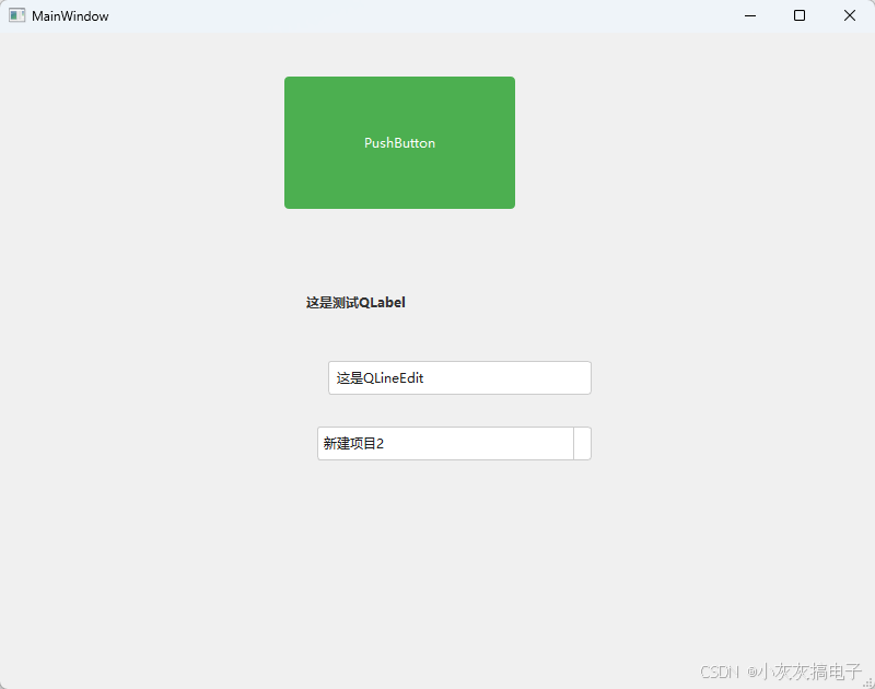
6、示例:定制 QPushButton
/* 基础样式 */
QPushButton {
background-color: #4CAF50; /* 绿色背景 */
color: white; /* 白色文字 */
border: none; /* 无边框 */
border-radius: 4px; /* 圆角 */
padding: 8px 16px; /* 内边距 */
font: bold 12pt "Arial"; /* 字体 */
}
/* 悬停状态 */
QPushButton:hover {
background-color: #45a049; /* 稍深绿色 */
}
/* 按下状态 */
QPushButton:pressed {
background-color: #3e8e41; /* 更深绿色 */
padding-top: 9px; /* 轻微下沉效果 */
padding-bottom: 7px;
}
/* 禁用状态 */
QPushButton:disabled {
background-color: #cccccc; /* 灰色 */
color: #666666;
}
7、注意事项
- 优先级: 样式规则遵循 CSS 的级联和优先级规则。更具体的选择器 (如 ID 选择器、带伪状态的选择器) 优先级高于通用选择器。后定义的规则覆盖先定义的规则 (同优先级)。
- 继承: 大多数属性 (如 font, color) 会从父部件继承给子部件。但 background-*, border-* 等通常不会自动继承。
- 性能: 过度使用复杂的 QSS 可能影响界面渲染性能,尤其是动态变化的样式。
- 局限性: QSS 主要用于改变外观,无法改变部件的布局行为或添加新功能。某些特定部件或属性可能不受 QSS 支持或行为特殊。
- 调试: 可以使用 qApp->styleSheet() 查看当前应用的全局样式表。注意局部样式表 (widget->setStyleSheet()) 会覆盖全局样式表。
二、代码示例
/* 主窗口背景 */
QMainWindow {
background-color: #f0f0f0;
}
/* 按钮基础样式 */
QPushButton {
background-color: #4CAF50;
border: none;
color: white;
padding: 8px 16px;
border-radius: 4px;
}
/* 按钮悬停效果 */
QPushButton:hover {
background-color: #45a049;
}
/* 按钮按下效果 */
QPushButton:pressed {
background-color: #3d8b40;
}
/* 禁用状态按钮 */
QPushButton:disabled {
background-color: #cccccc;
}
/* 标签样式 */
QLabel {
color: #333333;
font: bold 12px "Microsoft YaHei";
}
/* 文本框样式 */
QLineEdit {
border: 1px solid #cccccc;
border-radius: 3px;
padding: 5px;
background-color: white;
}
/* 文本框聚焦效果 */
QLineEdit:focus {
border: 1px solid #4CAF50;
}
/* 下拉框样式 */
QComboBox {
border: 1px solid #cccccc;
border-radius: 3px;
padding: 5px;
background-color: white;
}
/* 下拉框下拉箭头 */
QComboBox::drop-down {
subcontrol-origin: padding;
subcontrol-position: top right;
width: 15px;
border-left: 1px solid #cccccc;
}
/* 复选框样式 */
QCheckBox {
spacing: 5px; /* 文本与框间距 */
}
/* 复选框选中标记 */
QCheckBox::indicator:checked {
image: url(:/images/checkbox_checked.png);
}
效果说明:
运行展示