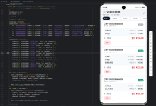
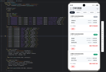
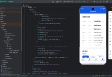
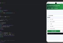
训练页面是用户规划每周训练目标、追踪完成进度的入口。这篇我们从 UI 设计的角度,看看这个页面是如何组织的。


一、页面整体结构
训练页面同样使用 SectionedPage 包裹,内容区域根据是否有计划分为三种状态:
class _TrainingPlansView extends StatelessWidget {
Widget build(BuildContext context) {
final controller = context.watch<TrainingPlansController>();
final isLoading = controller.isInitializing && !controller.isInitialized;
final plans = controller.plans;
final selectedPlan = controller.selectedPlan;
return Stack(
children: [
SectionedPage(
title: '训练计划',
subtitle: const Text('规划每周目标,追踪完成进度'),
child: isLoading
? const Center(child: CircularProgressIndicator())
: plans.isEmpty
? _TrainingPlanEmptyState(onCreate: () => _openPlanEditor(context))
: LayoutBuilder(
builder: (context, constraints) {
final isWide = constraints.maxWidth >= 900;
final content = isWide
? Row(
children: [
Expanded(
flex: 5,
child: _PlanGrid(plans: plans, selectedPlanId: selectedPlan?.id, preferGrid: true),
),
const SizedBox(width: 24),
Expanded(
flex: 4,
child: _PlanDetailPane(plan: selectedPlan, onEdit: ...),
),
],
)
: Column(
children: [
_PlanGrid(plans: plans, selectedPlanId: selectedPlan?.id),
const SizedBox(height: 24),
_PlanDetailPane(plan: selectedPlan, onEdit: ...),
],
);
// …
},
),
),
GripAwareNewFab(
tooltip: '新建计划',
icon: Icons.add,
onPressed: () => _openPlanEditor(context),
),
],
);
}
}
三种状态:
二、响应式布局
训练页面的布局根据屏幕宽度自适应:
LayoutBuilder(
builder: (context, constraints) {
final isWide = constraints.maxWidth >= 900;
final content = isWide
? Row(
children: [
Expanded(
flex: 5,
child: _PlanGrid(plans: plans, selectedPlanId: selectedPlan?.id, preferGrid: true),
),
const SizedBox(width: 24),
Expanded(
flex: 4,
child: _PlanDetailPane(plan: selectedPlan, onEdit: ...),
),
],
)
: Column(
children: [
_PlanGrid(plans: plans, selectedPlanId: selectedPlan?.id),
const SizedBox(height: 24),
_PlanDetailPane(plan: selectedPlan, onEdit: ...),
],
);
// …
},
)
- 宽屏(>= 900dp):左右分栏,5:4 比例。左侧计划网格,右侧详情面板。
- 窄屏(< 900dp):上下排列。上方计划横向滚动列表,下方详情面板。
这种布局在鸿蒙平板或折叠屏上尤其有用——展开时自动切换为分栏模式,合上时回到竖屏模式。
三、计划卡片网格
_PlanGrid 根据屏幕宽度选择不同的展示方式:
class _PlanGrid extends StatelessWidget {
Widget build(BuildContext context) {
return LayoutBuilder(
builder: (context, constraints) {
final maxWidth = constraints.maxWidth;
if (!preferGrid && maxWidth < 900) {
// 手机:横向滚动卡片
return SizedBox(
height: 165,
child: ListView.separated(
scrollDirection: Axis.horizontal,
// …
),
);
}
// 宽屏:网格布局
final crossAxisCount = maxWidth >= 900
? 3
: maxWidth >= 600
? 2
: 1;
final childAspectRatio = maxWidth >= 600 ? 1.7 : 1.9;
return GridView.builder(
shrinkWrap: true,
physics: const NeverScrollableScrollPhysics(),
gridDelegate: SliverGridDelegateWithFixedCrossAxisCount(
crossAxisCount: crossAxisCount,
crossAxisSpacing: 16,
mainAxisSpacing: 16,
childAspectRatio: childAspectRatio,
),
// …
);
},
);
}
}
3.1 手机模式:横向滚动
SizedBox(
height: 165,
child: ListView.separated(
scrollDirection: Axis.horizontal,
padding: const EdgeInsets.symmetric(horizontal: 4),
itemCount: plans.length,
separatorBuilder: (_, __) => const SizedBox(width: 12),
itemBuilder: (context, index) {
final plan = plans[index];
return Align(
alignment: Alignment.topCenter,
child: SizedBox(
width: cardWidth, // 200~320dp
child: _PlanCard(
plan: plan,
isSelected: plan.id == selectedPlanId,
onTap: () => controller.selectPlan(plan.id),
onEdit: () => _openPlanEditor(context, plan: plan),
onMore: () => _showPlanActions(context, plan),
),
),
);
},
),
)
卡片宽度限制在 200~320dp 之间,横向滚动浏览。
3.2 宽屏模式:网格布局
GridView.builder(
shrinkWrap: true,
physics: const NeverScrollableScrollPhysics(),
gridDelegate: SliverGridDelegateWithFixedCrossAxisCount(
crossAxisCount: crossAxisCount, // 1/2/3 列
crossAxisSpacing: 16,
mainAxisSpacing: 16,
childAspectRatio: childAspectRatio, // 1.7 或 1.9
),
// …
)
列数根据宽度自动调整:
-
= 900dp:3 列
-
= 600dp:2 列
- < 600dp:1 列
四、计划卡片设计
_PlanCard 是单个训练计划的卡片组件:
class _PlanCard extends StatelessWidget {
Widget build(BuildContext context) {
final theme = Theme.of(context);
final colorScheme = theme.colorScheme;
final accentColor = Color(plan.colorValue);
final totalSessions =
plan.dayGoals.fold<int>(0, (sum, day) => sum + day.sessions.length);
final statusChip = plan.isExpired
? _PlanStatusChip(label: '已过期', color: theme.colorScheme.error)
: plan.isUpcoming
? _PlanStatusChip(label: '未开始', color: theme.colorScheme.tertiary)
: null;
return InkWell(
onTap: onTap,
borderRadius: BorderRadius.circular(24),
child: _SurfaceCard(
borderRadius: 24,
padding: const EdgeInsets.symmetric(horizontal: 18, vertical: 10),
borderColor: isSelected ? accentColor : colorScheme.outlineVariant,
backgroundColor:
isSelected ? accentColor.withOpacity(0.08) : colorScheme.surface,
child: Column(
crossAxisAlignment: CrossAxisAlignment.start,
mainAxisAlignment: MainAxisAlignment.spaceBetween,
children: [
// 第一行:色点 + 名称 + 状态标签 + 操作按钮
Row(...),
// 第二行:备注
Text(plan.note.isEmpty ? '暂无备注' : plan.note, ...),
// 第三行:日期范围
Text(plan.hasDateRange ? _formatDateRange(plan) : '未设定周期', ...),
// 第四行:天数 + 目标数
Row(
mainAxisAlignment: MainAxisAlignment.spaceBetween,
children: [
Text('覆盖 ${plan.dayGoals.length} 天', ...),
Text('共 $totalSessions 个目标', ...),
],
),
],
),
),
);
}
}
4.1 选中状态
选中时卡片有明显的视觉区分:
borderColor: isSelected ? accentColor : colorScheme.outlineVariant,
backgroundColor: isSelected ? accentColor.withOpacity(0.08) : colorScheme.surface,
- 边框颜色变为计划的主题色。
- 背景叠加 8% 透明度的主题色。
4.2 状态标签
final statusChip = plan.isExpired
? _PlanStatusChip(label: '已过期', color: theme.colorScheme.error)
: plan.isUpcoming
? _PlanStatusChip(label: '未开始', color: theme.colorScheme.tertiary)
: null;
计划有三种状态:
- 已过期:红色标签。
- 未开始:第三色标签。
- 进行中:不显示标签。
4.3 状态标签组件
class _PlanStatusChip extends StatelessWidget {
Widget build(BuildContext context) {
return Container(
padding: const EdgeInsets.symmetric(horizontal: 8, vertical: 4),
decoration: BoxDecoration(
borderRadius: BorderRadius.circular(999),
color: color.withOpacity(0.15),
border: Border.all(color: color.withOpacity(0.3)),
),
child: Text(
label,
style: Theme.of(context).textTheme.labelSmall?.copyWith(
color: color,
fontWeight: FontWeight.w600,
),
),
);
}
}
胶囊形状,背景色为状态色 15% 透明度,边框为状态色 30% 透明度。
4.4 色点标识
Container(
width: 8,
height: 8,
decoration: BoxDecoration(
color: accentColor,
shape: BoxShape.circle,
),
),
每个计划有一个主题色,在卡片标题前用小圆点标识。
五、通用卡片组件
_SurfaceCard 是一个通用的卡片组件,在训练页面多处使用:
class _SurfaceCard extends StatelessWidget {
const _SurfaceCard({
required this.child,
this.padding = const EdgeInsets.all(20),
this.borderRadius = 24,
this.borderColor,
this.backgroundColor,
});
final Widget child;
final EdgeInsetsGeometry padding;
final double borderRadius;
final Color? borderColor;
final Color? backgroundColor;
Widget build(BuildContext context) {
final colorScheme = Theme.of(context).colorScheme;
return Container(
padding: padding,
decoration: BoxDecoration(
borderRadius: BorderRadius.circular(borderRadius),
color: backgroundColor ?? colorScheme.surface,
border: Border.all(color: borderColor ?? colorScheme.outlineVariant),
boxShadow: [
BoxShadow(
color: Colors.black.withOpacity(0.04),
blurRadius: 20,
offset: const Offset(0, 8),
),
],
),
child: child,
);
}
}
特点:
- 可自定义圆角、内边距、边框色、背景色。
- 默认使用 colorScheme.surface 和 colorScheme.outlineVariant。
- 统一的阴影效果(4% 黑色,模糊 20,偏移 8)。
六、计划详情面板
选中计划后,下方(窄屏)或右侧(宽屏)显示详情面板:
class _PlanDetailPane extends StatelessWidget {
Widget build(BuildContext context) {
final theme = Theme.of(context);
if (plan == null) {
return _DetailPlaceholder(theme: theme);
}
final sessionsCount =
plan!.dayGoals.fold<int>(0, (sum, day) => sum + day.sessions.length);
return _SurfaceCard(
borderRadius: 28,
padding: const EdgeInsets.all(24),
child: Column(
crossAxisAlignment: CrossAxisAlignment.start,
children: [
Text(
'共 ${plan!.dayGoals.length} 天 · $sessionsCount 个训练目标',
style: theme.textTheme.titleSmall?.copyWith(fontWeight: FontWeight.w600),
),
const SizedBox(height: 16),
if (plan!.dayGoals.isEmpty)
_EmptyDayGoals(theme: theme)
else
_DayGoalsList(dayGoals: plan!.dayGoals),
],
),
);
}
}
6.1 每日目标列表
class _DayGoalsList extends StatelessWidget {
Widget build(BuildContext context) {
final sorted = [...dayGoals]..sort((a, b) => a.weekday.compareTo(b.weekday));
return Column(
crossAxisAlignment: CrossAxisAlignment.start,
children: [
for (var i = 0; i < sorted.length; i++) ...[
_DayGoalTile(goal: sorted[i]),
if (i != sorted.length – 1) const Divider(height: 20),
],
],
);
}
}
按星期排序,每天之间用分隔线隔开。
6.2 单日目标
class _DayGoalTile extends StatelessWidget {
Widget build(BuildContext context) {
final theme = Theme.of(context);
final weekdayLabel = _weekdayLabel(goal.weekday);
return Column(
crossAxisAlignment: CrossAxisAlignment.start,
children: [
Text(
weekdayLabel,
style: theme.textTheme.titleSmall?.copyWith(fontWeight: FontWeight.w700),
),
if (goal.sessions.isEmpty)
Padding(
padding: const EdgeInsets.only(top: 6),
child: Text('尚未设置训练目标', ...),
)
else ...[
const SizedBox(height: 6),
Column(
children: goal.sessions
.map(
(session) => ListTile(
contentPadding: EdgeInsets.zero,
dense: true,
leading: _SessionEventBadge(label: session.event.shortName),
title: Text(session.title, style: theme.textTheme.titleSmall),
subtitle: Text(
'目标 ${session.targetCount} 次${session.expectedAverageDuration != null ? ' · 预期 ${_formatDuration(session.expectedAverageDuration!)}' : ''}',
),
),
)
.toList(),
),
],
],
);
}
}
6.3 项目徽章
每个训练目标前有一个圆形徽章,显示项目缩写:
class _SessionEventBadge extends StatelessWidget {
Widget build(BuildContext context) {
final theme = Theme.of(context);
return CircleAvatar(
radius: 16,
backgroundColor: theme.colorScheme.primary.withOpacity(0.12),
child: Padding(
padding: const EdgeInsets.symmetric(horizontal: 4),
child: FittedBox(
fit: BoxFit.scaleDown,
child: Text(
label,
maxLines: 1,
overflow: TextOverflow.ellipsis,
style: theme.textTheme.labelSmall?.copyWith(
fontWeight: FontWeight.w700,
color: theme.colorScheme.primary,
),
),
),
),
);
}
}
使用 CircleAvatar + FittedBox,确保文字不溢出。
七、空状态设计
没有训练计划时,显示空状态引导:
class _TrainingPlanEmptyState extends StatelessWidget {
Widget build(BuildContext context) {
final theme = Theme.of(context);
return Center(
child: _SurfaceCard(
borderRadius: 28,
padding: const EdgeInsets.symmetric(horizontal: 32, vertical: 28),
child: Column(
mainAxisSize: MainAxisSize.min,
children: [
Icon(Icons.timeline_outlined, size: 64, color: theme.colorScheme.primary),
const SizedBox(height: 16),
Text('还没有训练计划', style: theme.textTheme.headlineSmall),
const SizedBox(height: 8),
Text(
'新建一个周计划,规划每日训练目标并在计时页快速切换。',
textAlign: TextAlign.center,
style: theme.textTheme.bodyMedium?.copyWith(
color: theme.textTheme.bodyMedium?.color?.withOpacity(0.8),
),
),
const SizedBox(height: 24),
FilledButton.icon(
onPressed: onCreate,
icon: const Icon(Icons.add_circle_outline),
label: const Text('新建计划'),
),
],
),
),
);
}
}
空状态使用 _SurfaceCard 包裹,与页面其他卡片风格统一。
八、总结
这篇我们从 UI 设计的角度,梳理了训练页面的整体结构:
训练页面的设计,核心是让用户快速浏览和选择计划,同时在不同屏幕尺寸下保持良好的使用体验。