AI 驱动的自适应布局:基于视口与内容的智能断点选择
一、1200px 作为平板断点——这条规则毁了多少 iPad 体验
"小于 768 是手机,768-1200 是平板,大于 1200 是桌面"——这条断点规则被前端社区奉为标准,在无数 Bootcamp 教程中代代相传。事实是:iPad Pro 12.9" 的分辨率是 2048×2732(CSS 像素 1024×1366),恰好落在"平板断点"内——但它的屏幕物理尺寸比 13" MacBook 还大,用户在横屏模式下期望的是桌面级体验,而非被压缩的平板布局。
基于固定像素的断点选择是设备尺寸盲区。AI 驱动的自适应布局不做"选断点"这件事,而是根据视口特性和内容需求动态计算布局方案。
二、从固定断点到内容感知布局
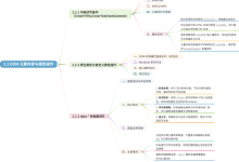
flowchart TD
A[页面加载] –> B[视口信息采集]
B –> B1[CSS 像素宽度]
B –> B2[设备像素比 DPR]
B –> B3[实际物理尺寸估算]
A –> C[内容分析]
C –> C1[文字密度]
C –> C2[图片尺寸分布]
C –> C3[组件复杂度]
B1 –> D[布局决策引擎]
B2 –> D
B3 –> D
C1 –> D
C2 –> D
C3 –> D
D –> E{布局方案选择}
E –> F1[单列:窄屏 + 长内容]
E –> F2[双列:中屏 + 图文混排]
E –> F3[多列 + 侧栏:宽屏]
E –> F4[全宽沉浸:超大屏]
F1 –> G[生成 CSS Grid 配置]
F2 –> G
F3 –> G
F4 –> G
三、自适应布局的 AI 引擎
// adaptive-layout/adaptive-layout-engine.ts
// 基于视口与内容的智能布局决策引擎
interface ViewportInfo {
cssWidth: number; // CSS 像素宽度
cssHeight: number;
devicePixelRatio: number;
estimatedPhysicalWidth: number; // 估算物理宽度 (mm)
orientation: 'portrait' | 'landscape';
}
interface ContentInfo {
/**
* 内容密度系数 0~1:
* 0 = 全是短文本 + 图标(如设置页)
* 1 = 全是长文本 + 大表格(如数据报表)
*/
density: number;
/** 图片宽度分布:{ small: 30%, medium: 50%, large: 20% } */
imageDistribution: Record<'small' | 'medium' | 'large', number>;
/**
* 组件复杂度 0~1:
* 0 = 简单卡片列表
* 1 = 复杂表单 + 图表 + 弹窗
*/
componentComplexity: number;
/** 内容最小宽度需求 (px) */
minContentWidth: number;
}
interface LayoutSolution {
/** 列数 */
columns: number;
/** 每列宽度比例 */
columnRatios: number[];
/** 是否显示侧边栏 */
showSidebar: boolean;
/** 是否合并导航 */
collapseNavigation: boolean;
/** 建议的 font-size 缩放系数 */
fontSizeScale: number;
/** 建议的 spacing 缩放系数 */
spacingScale: number;
/** 生成方案的置信度 */
confidence: number;
}
/**
* 自适应布局决策引擎
*
* 设计意图:不依赖预定义的像素断点,
* 而是综合分析视口特性 + 内容特征来决定最优布局
*/
class AdaptiveLayoutEngine {
/**
* 主决策函数
*
* @returns 推荐的布局方案
*/
async decideLayout(
viewport: ViewportInfo,
content: ContentInfo
): Promise<LayoutSolution> {
// —- 维度 1:物理尺寸判断(而非 CSS 像素) —-
// 小物理尺寸(< 7 英寸)→ 手机
const isSmallPhysical = viewport.estimatedPhysicalWidth < 160;
// 中物理尺寸(7~11 英寸)→ 平板
const isMediumPhysical = viewport.estimatedPhysicalWidth >= 160 &&
viewport.estimatedPhysicalWidth < 260;
// 大物理尺寸(> 11 英寸)→ 笔记本/桌面
const isLargePhysical = viewport.estimatedPhysicalWidth >= 260;
// —- 维度 2:CSS 像素判断(有效空间) —-
// 窄屏:CSS 宽度 < 640px
const isNarrow = viewport.cssWidth < 640;
// 中屏:640~1024px
const isWide = viewport.cssWidth >= 1024;
// —- 维度 3:方向判断 —-
const isPortrait = viewport.orientation === 'portrait';
// —- 维度 4:内容密度判断 —-
const isDenseContent = content.density > 0.7;
const hasComplexComponents = content.componentComplexity > 0.6;
// —- 综合决策矩阵 —-
let solution: LayoutSolution;
if (isSmallPhysical || (isNarrow && isPortrait)) {
// 场景 A:手机(物理小 or 窄屏竖屏)
solution = {
columns: 1,
columnRatios: [1],
showSidebar: false,
collapseNavigation: true,
fontSizeScale: 1.0,
spacingScale: 0.75, // 手机上减小间距
confidence: 0.95
};
// 如果是横屏手机且内容不复杂 → 可以考虑双列
if (!isPortrait && !hasComplexComponents && !isDenseContent) {
solution.columns = 2;
solution.columnRatios = [1, 1];
solution.confidence = 0.8;
}
} else if (isMediumPhysical && isPortrait) {
// 场景 B:平板竖屏
solution = {
columns: 2,
columnRatios: [1, 1],
showSidebar: false,
collapseNavigation: true,
fontSizeScale: 1.05,
spacingScale: 0.85,
confidence: 0.85
};
} else if (isMediumPhysical && !isPortrait) {
// 场景 C:平板横屏
solution = {
columns: isDenseContent ? 2 : 3,
columnRatios: isDenseContent ? [1, 1] : [1, 1, 1],
showSidebar: false,
collapseNavigation: false,
fontSizeScale: 1.05,
spacingScale: 0.9,
confidence: 0.8
};
} else {
// 场景 D:桌面/笔记本
solution = {
columns: isDenseContent ? 2 : hasComplexComponents ? 3 : 4,
columnRatios: this.calculateColumnRatios(content),
showSidebar: true,
collapseNavigation: false,
fontSizeScale: 1.0,
spacingScale: 1.0,
confidence: 0.9
};
}
// —- AI 微调:将解决方案作为初始值,让 AI 做局部优化 —-
// return this.aiRefine(solution, viewport, content);
return solution;
}
/**
* 根据内容特征计算列宽比例
*
* 原则:内容重的一端(如主内容区)给更多空间,
* 辅助内容(如侧栏)给较少空间
*/
private calculateColumnRatios(content: ContentInfo): number[] {
const hasLargeImages = (content.imageDistribution.large || 0) > 0.3;
if (hasLargeImages) {
// 大图内容:主内容区占更多比例
return [0.7, 0.3];
}
if (content.density > 0.7) {
// 密集内容:主内容区占主要空间
return [0.65, 0.35];
}
// 默认均匀分布
return [1, 1, 1, 1, 1]; // 5 列均匀分布
}
}
/**
* 视口信息采集
*
* 关键:通过 DPR 和 CSS 像素反推物理尺寸
* 这是区分"高 DPI 小屏幕"和"低 DPI 大屏幕"的核心手段
*/
function collectViewportInfo(): ViewportInfo {
const cssWidth = window.innerWidth;
const cssHeight = window.innerHeight;
const dpr = window.devicePixelRatio || 1;
// 估算物理宽度
// 1 CSS inch = 96 CSS pixels
// 物理宽度(mm) = cssWidth / 96 * 25.4
const estimatedPhysicalWidth = (cssWidth / 96) * 25.4;
// 优化:通过 screen.width 和 screen.height 获取更准确的尺寸
// const physicalWidth = screen.width / dpr;
// const physicalWidthMM = physicalWidth / 96 * 25.4;
return {
cssWidth,
cssHeight,
devicePixelRatio: dpr,
estimatedPhysicalWidth,
orientation: cssWidth > cssHeight ? 'landscape' : 'portrait'
};
}
/**
* 内容特征分析
*
* 通过 DOM 分析提取内容的结构化特征
*/
function analyzeContent(): ContentInfo {
// 分析页面中的文本量
const textLength = document.body.textContent?.length || 0;
const visibleArea = window.innerWidth * window.innerHeight;
// 文本密度 = 字符数 / 可见面积
// 归一化到 0~1 范围(经验阈值:8000 字符/百万像素为"密集")
const rawDensity = textLength / (visibleArea / 1e6);
const density = Math.min(1, rawDensity / 8000);
// 分析图片尺寸
const images = Array.from(document.querySelectorAll('img'));
const imageDistribution = {
small: 0,
medium: 0,
large: 0
};
const totalImages = images.length || 1;
images.forEach((img) => {
const width = img.naturalWidth || img.clientWidth || 0;
if (width < 200) imageDistribution.small++;
else if (width < 600) imageDistribution.medium++;
else imageDistribution.large++;
});
imageDistribution.small /= totalImages;
imageDistribution.medium /= totalImages;
imageDistribution.large /= totalImages;
// 组件复杂度:表单数量 + 图表数量 + 弹窗数量
const formCount = document.querySelectorAll('form').length;
const canvasCount = document.querySelectorAll('canvas').length;
const dialogCount = document.querySelectorAll('[role="dialog"], .modal').length;
const componentComplexity = Math.min(
1,
(formCount * 0.3 + canvasCount * 0.5 + dialogCount * 0.2) / 5
);
// 内容最小宽度:对所有子元素取最大的 scrollWidth
let minContentWidth = 320;
document.querySelectorAll('body *').forEach((el) => {
const htmlEl = el as HTMLElement;
if (htmlEl.scrollWidth > minContentWidth) {
minContentWidth = htmlEl.scrollWidth;
}
});
return {
density,
imageDistribution,
componentComplexity,
minContentWidth
};
}
/*
* ==========================================
* 生成的自适应 CSS Grid 布局
* ==========================================
*
* 传统做法(固定断点):
* @media (max-width: 768px) { … }
* @media (min-width: 769px) and (max-width: 1200px) { … }
* @media (min-width: 1201px) { … }
*
* AI 驱动做法(内容感知 + 视口特征):
* 通过 JS 动态设置 CSS 变量,CSS 只负责消费变量
*/
/* 基础 Grid 容器 */
.adaptive-grid {
display: grid;
/*
* 列数和列宽比例由 JS 动态设定
* –grid-columns: 由 LayoutSolution.columns 决定
* –grid-column-ratios: 由 LayoutSolution.columnRatios 决定
*/
grid-template-columns: var(–grid-column-ratios);
gap: calc(var(–grid-spacing) * var(–spacing-scale));
/* 使用 clamp 让间距有弹性 */
–grid-spacing: clamp(12px, 2vw, 24px);
transition: grid-template-columns 400ms ease-in-out;
}
/* 侧边栏 */
.adaptive-sidebar {
display: var(–sidebar-display, block);
width: var(–sidebar-width, 280px);
transition: width 300ms ease-in-out;
}
/* 导航栏 */
.adaptive-navigation {
/* collapsed 模式下导航变为汉堡菜单 */
flex-direction: var(–nav-direction, row);
}
四、自适应布局的降级策略
JS 执行前的一闪而过(FOUC)。页面加载时,布局决策引擎需要读取 DOM 后才能做决策。在 JS 执行前的极短窗口内,页面会使用默认布局(如 grid-template-columns: 1fr)。解决方案:在 <head> 中内联一个极简的"关键 CSS + 初始布局猜测",根据 screen.width 做粗粒度预设。
内容变化后重新决策。用户展开/收起侧栏、调整浏览器窗口大小、横竖屏切换时,需要重新跑布局决策。这是"实时自适应"的核心场景。但注意:不是每次 resize 都跑(性能浪费),而是 debounce 300ms + 仅在跨越决策阈值时执行。
非标准布局的 AI 误判。一些创意布局(如杂志式不规则 Grid、瀑布流)不适用标准的"列数 + 比例"模型。AI 在面对非标准布局时应该不决策而非乱决策——识别出"这个布局不属于我能处理的类型"并回退到原布局。
五、总结
AI 驱动的自适应布局不是"更聪明的 @media 查询",而是从固定断点到内容感知的范式转换:
最终效果:同一个页面,在 iPad 12.9" 横屏上展示为桌面级 4 列布局,在 iPad mini 竖屏上展示为 2 列紧凑布局,在 iPhone 上展示为单列——不是因为"屏幕宽度到了某个数字",而是因为"在这个屏幕上、这段内容用这个列数看起来最舒服"。