原生前端复刻中秋盛景:沉浸式赏月烟花可视化网页开发实录
✨ 博客前言
在前端开发中,除了常规的业务系统开发,创意可视化开发是极具趣味性和表现力的方向。依托原生 HTML、CSS、JavaScript,无需任何框架、第三方插件,就能将传统节日的美学意象数字化,打造高颜值、沉浸式的动态视觉页面。
中秋节作为我国四大传统节日,拥有圆月、星空、桂花、烟花等极具国风美感的视觉元素,非常适合用于前端动画与粒子特效实战开发。今天这篇博客,我将完整复盘一款轻量化、高性能、全原生的中秋沉浸式赏月网页开发全过程。
本文将从项目设计思路、布局样式开发、核心动画原理、Canvas烟花粒子实现、性能优化、踩坑复盘等维度全方位讲解,附带完整可直接运行的源码,适合前端新手学习动画开发、Canvas粒子编程,也可直接作为中秋节日贺卡、个人创意作品集使用。
技术栈:HTML5 + CSS3 原生动画 + JavaScript + Canvas 2D 粒子系统
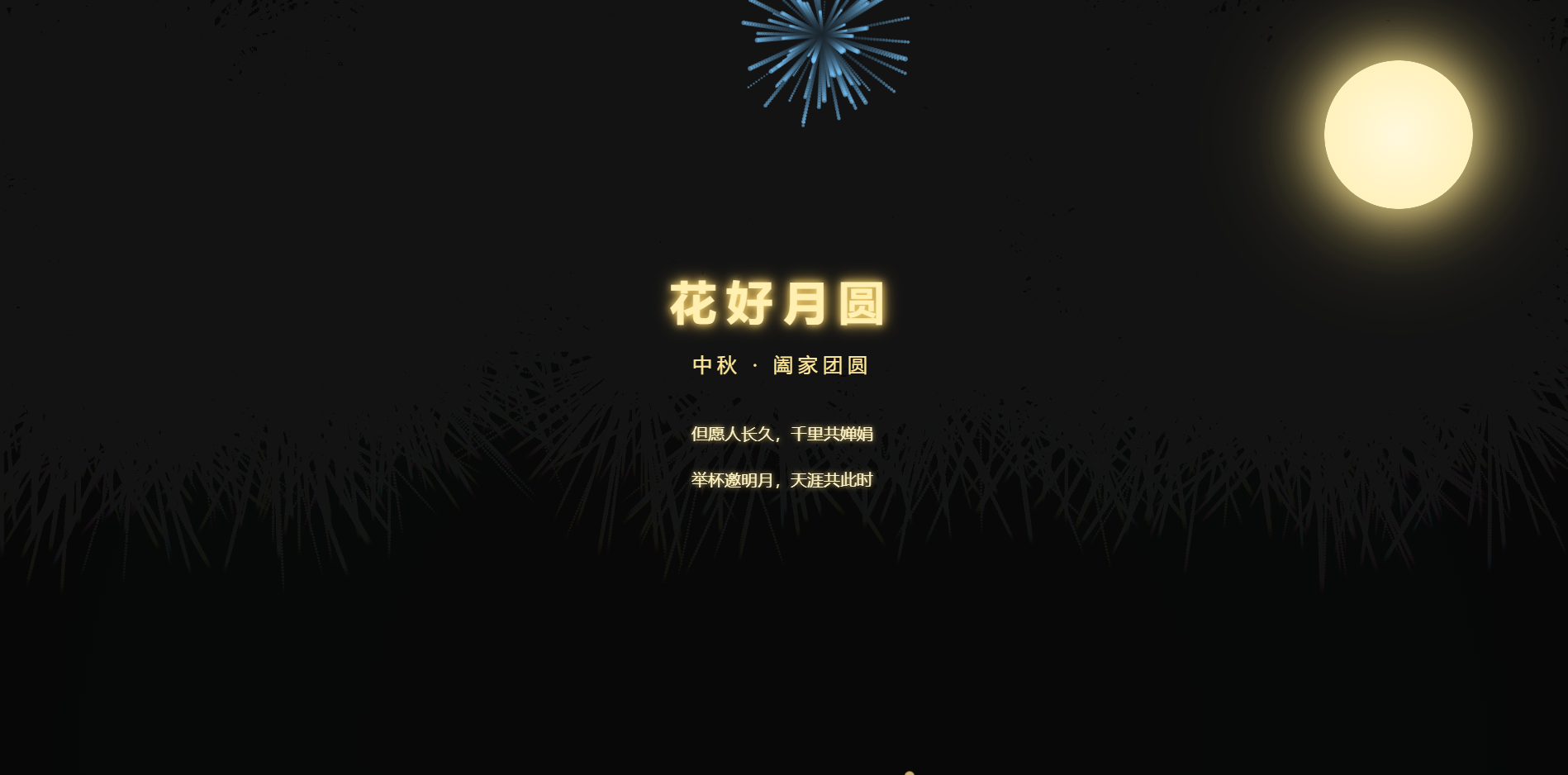
最终实现效果:深空渐变夜景、月亮呼吸发光特效、漫天桂花飘落动画、全屏多彩烟花绽放、诗词文字渐显动效、全屏幕自适应适配、无卡顿高性能运行
一、项目整体设计理念与视觉层级规划
很多创意特效页面容易出现一个问题:特效堆砌杂乱、画面没有主次、视觉体验极差。因此在开发前,我先确立了清晰的视觉层级和开发原则,保证页面美观度与性能平衡。
1.1 三层视觉层级设计
采用远景、中景、近景分层架构,画面层次分明,氛围感拉满:
-
远景层(基底):深空径向渐变背景,模拟真实夜晚星空底色,奠定高级静谧的中秋氛围
-
中景层(动态特效):CSS桂花飘落粒子、Canvas全屏烟花动态效果,烘托节日热闹氛围
-
近景层(核心主体):发光圆月、中秋主题标题、古风诗词,突出页面核心主题
1.2 核心开发原则
全程遵循 原生开发、轻量化、高性能、高兼容 四大原则:无框架依赖、无冗余代码、自动销毁无效粒子、全设备屏幕适配,保证在PC、移动端均可流畅运行。
二、页面基础布局与全局样式开发
基础布局是页面视觉的根基,我们首先完成样式重置、背景渲染、全局字体适配,打造沉浸式全屏页面基底。
2.1 全局样式重置与夜景背景实现
重置浏览器默认边距与盒模型,隐藏滚动条、禁止页面滚动,通过径向渐变实现深邃夜空效果,相比纯色背景更具立体层次感。
* {
margin: 0;
padding: 0;
box-sizing: border-box;
}
body {
min-height: 100vh;
/* 禁止滚动,沉浸式全屏 */
overflow: hidden;
/* 深空径向渐变夜景背景 */
background: radial-gradient(ellipse at bottom, #1b2735 0%, #090a0f 100%);
font-family: "Microsoft YaHei", SimHei, sans-serif;
color: #fff;
}
2.2 页面结构HTML骨架
页面结构极简清晰,分为烟花画布层、月亮视觉层、文字主题层三大模块,结构解耦,方便后续维护修改。
<!DOCTYPE html>
<html lang="zh-CN">
<head>
<meta charset="UTF-8">
<meta name="viewport" content="width=device-width, initial-scale=1.0">
<title>花好月圆 · 中秋佳节</title>
<!– 后续CSS样式、动画代码嵌入此处 –>
</head>
<body>
<!– 烟花画布底层 –>
<canvas id="fireworkCanvas"></canvas>
<!– 月亮视觉主体 –>
<div class="moon"></div>
<!– 文字主题内容 –>
<div class="container">
<h1 class="title">花好月圆</h1>
<div class="subtitle">中秋 · 阖家团圆</div>
<div class="poem">
但愿人长久,千里共婵娟<br/>
举杯邀明月,天涯共此时
</div>
</div>
<!– 特效JS逻辑 –>
<script></script>
</body>
</html>
三、核心视觉特效:静态元素动画实现
本章节实现页面核心静态视觉元素,包括月亮呼吸发光动画和文字渐显动画,用纯CSS实现细腻光影效果,无JS冗余开销。
3.1 月亮呼吸发光特效
月亮是中秋页面的核心标识,我通过径向渐变底色 + 多层光晕阴影 + 交替帧动画,模拟月亮自然呼吸、光影明暗变化的真实质感,避免静态圆形的呆板效果。
/* 圆月核心样式 */
.moon {
position: absolute;
top: 80px;
right: 120px;
width: 180px;
height: 180px;
border-radius: 50%;
/* 暖黄色月亮渐变底色 */
background: radial-gradient(circle, #fff8dc 0%, #ffefb0 100%);
/* 多层光晕叠加,增强光影层次 */
box-shadow:
0 0 60px #ffeb99,
0 0 120px #ffdd77,
0 0 180px #ffcc55;
/* 呼吸动画循环 */
animation: moonGlow 4s ease-in-out infinite alternate;
}
/* 月亮明暗呼吸动画关键帧 */
@keyframes moonGlow {
from {
box-shadow: 0 0 60px #ffeb99, 0 0 120px #ffdd77;
}
to {
box-shadow: 0 0 80px #fff1b8, 0 0 160px #ffdd88, 0 0 220px #ffcc66;
}
}
3.2 文字循序渐显动画
为主题标题、副标题、古风诗词设置差异化延时渐显动画,结合位移动效,替代生硬的瞬间加载,营造循序渐进的诗意氛围,同时搭配微光文字阴影,贴合夜空光影风格。
/* 主标题样式 */
.title {
font-size: 56px;
letter-spacing: 12px;
color: #ffefb0;
text-shadow: 0 0 10px #ffdd77, 0 0 20px #ffcc55;
margin-bottom: 24px;
animation: fadeIn 2s ease forwards;
}
/* 副标题样式 */
.subtitle {
font-size: 24px;
letter-spacing: 6px;
color: #ffe897;
margin-bottom: 40px;
animation: fadeIn 3s ease forwards;
}
/* 古风诗词样式 */
.poem {
font-size: 20px;
line-height: 2.8;
text-align: center;
color: #fff6cc;
text-shadow: 0 0 6px #ffdd77;
animation: fadeIn 4s ease forwards;
}
/* 文字渐入+上浮动画 */
@keyframes fadeIn {
0% {
opacity: 0;
transform: translateY(30px);
}
100% {
opacity: 1;
transform: translateY(0);
}
}
/* 内容居中容器 */
.container {
width: 100%;
height: 100vh;
display: flex;
flex-direction: column;
justify-content: center;
align-items: center;
position: relative;
z-index: 2;
}
四、动态特效开发:桂花粒子飘落动画
桂花是中秋标志性意象,本次采用 JS动态生成DOM粒子 + CSS固定动画 的方案,实现漫天桂花飘落效果,同时通过粒子生命周期销毁机制,彻底解决DOM堆积卡顿问题。
4.1 桂花粒子CSS动画样式
用圆形小圆点模拟桂花形态,搭配旋转、下落、透明度渐变动画,参数柔和自然,避免机械重复感。
.petal {
position: absolute;
width: 12px;
height: 12px;
background-color: #ffdd88;
border-radius: 50%;
opacity: 0.7;
animation: fall linear infinite;
z-index: 1;
}
/* 花瓣下落旋转淡出动画 */
@keyframes fall {
0% {
transform: translateY(-20px) rotate(0deg);
opacity: 0.8;
}
100% {
transform: translateY(100vh) rotate(360deg);
opacity: 0;
}
}
4.2 JS动态生成与性能优化逻辑
定时随机生成花瓣粒子,随机适配屏幕宽度、随机下落时长,动画结束后自动销毁DOM节点,杜绝内存泄漏。
// 创建桂花飘落粒子
function createPetal() {
const petal = document.createElement('div');
petal.classList.add('petal');
// 随机横坐标,铺满全屏
petal.style.left = Math.random() * window.innerWidth + 'px';
// 随机下落时长6-14s,效果更自然
const fallTime = 6 + Math.random() * 8;
petal.style.animationDuration = fallTime + 's';
document.body.appendChild(petal);
// 动画结束自动销毁DOM,优化性能
setTimeout(()=>{
petal.remove();
}, fallTime * 1000);
}
// 每300ms生成一个花瓣,密度适中
setInterval(createPetal, 300);
五、核心难点:Canvas 2D烟花粒子系统开发
烟花特效是页面的视觉核心,相比DOM动画,Canvas粒子动画性能更高、视觉层次感更强。我采用面向对象编程思想封装粒子系统,实现烟花随机绽放、拖尾渐变、自动消散效果。
5.1 画布初始化与自适应适配
初始化全屏Canvas画布,监听窗口大小变化,实时重置画布尺寸,保证全设备无拉伸、无留白、全屏适配。
5.2 面向对象粒子封装
封装Particle粒子类,统一管理粒子坐标、速度、透明度、颜色等属性,实现粒子扩散、淡出、绘制全逻辑。
5.3 烟花生成与动画循环渲染
定时随机生成烟花爆炸点,批量生成粒子模拟炸开效果,通过半透明画布覆盖实现烟花拖尾特效,销毁透明粒子释放内存。
// 初始化画布
const canvas = document.getElementById('fireworkCanvas');
const ctx = canvas.getContext('2d');
canvas.width = window.innerWidth;
canvas.height = window.innerHeight;
// 窗口自适应重置画布
window.addEventListener('resize', ()=>{
canvas.width = window.innerWidth;
canvas.height = window.innerHeight;
});
// 粒子类 – 面向对象封装
class Particle {
constructor(x,y,color){
this.x = x;
this.y = y;
// 随机扩散角度与速度
const angle = Math.random() * Math.PI * 2;
const speed = Math.random()*3 + 1;
this.vx = Math.cos(angle)*speed;
this.vy = Math.sin(angle)*speed;
this.alpha = 1;
this.color = color;
this.radius = Math.random()*2+1;
}
// 更新粒子位置与透明度
update(){
this.x += this.vx;
this.y += this.vy;
this.alpha -= 0.015;
}
// 绘制单个粒子
draw(){
ctx.beginPath();
ctx.arc(this.x,this.y,this.radius,0,Math.PI*2);
ctx.fillStyle = this.color.replace('1)', `${this.alpha})`);
ctx.fill();
}
}
// 粒子数组 & 中秋专属配色
let particles = [];
const colors = [
'rgba(255,220,80,1)',
'rgba(255,150,80,1)',
'rgba(255,100,150,1)',
'rgba(120,200,255,1)',
'rgba(180,255,180,1)'
];
// 生成烟花爆炸效果
function fireWork(){
// 随机爆炸位置(上半屏幕)
const x = Math.random()*canvas.width;
const y = Math.random()*canvas.height*0.5;
const color = colors[Math.floor(Math.random()*colors.length)];
// 单次烟花生成80个粒子
for(let i=0;i<80;i++){
particles.push(new Particle(x,y,color));
}
}
// 1.8秒绽放一次烟花
setInterval(fireWork,1800);
// 全局动画循环
function animate(){
// 半透明画布覆盖,实现烟花拖尾效果
ctx.fillStyle = 'rgba(9,10,15,0.08)';
ctx.fillRect(0,0,canvas.width,canvas.height);
// 遍历更新、绘制、销毁粒子
for(let i=particles.length–1;i>=0;i—){
const p = particles[i];
p.update();
p.draw();
// 透明度为0时销毁粒子,释放内存
if(p.alpha <= 0){
particles.splice(i,1);
}
}
requestAnimationFrame(animate);
}
// 启动动画
animate();
核心优化点:放弃传统clearRect清屏方式,采用半透明背景覆盖画布,实现自然拖尾效果,视觉更丝滑,同时大幅降低动画性能损耗。
六、项目性能优化与开发踩坑复盘
创意特效项目极易出现卡顿、内存泄漏、适配错位等问题,本次开发针对性解决各类痛点,总结通用优化方案:
6.1 内存泄漏优化
初期版本未做粒子销毁,DOM节点和Canvas粒子无限堆积,长时间运行页面掉帧严重。优化后:桂花粒子动画结束自动移除DOM,Canvas透明粒子及时从数组剔除,内存始终保持稳定。
6.2 动画卡顿优化
合理控制粒子生成频率,避免定时器高频渲染;通过CSS硬件加速、减少重排重绘,保证动画60帧稳定运行,低配设备也可流畅展示。
6.3 屏幕适配优化
通过resize监听实时更新画布尺寸和粒子生成范围,解决移动端屏幕适配错位、特效拉伸、粒子溢出屏幕等问题。
6.4 视觉层级优化
规范z-index层级:烟花画布底层、桂花粒子中层、文字月亮顶层,避免特效遮挡核心内容,画面主次分明、观感舒适。
七、项目二次开发与拓展思路
本项目为轻量化基础模板,可快速拓展更多功能,适合二次开发迭代:
-
交互升级:新增鼠标点击任意位置绽放烟花、触摸触发特效功能,提升页面交互趣味性
-
功能拓展:添加中秋倒计时、自定义祝福语输入、一键复制祝福文案功能,改造为专属节日贺卡工具
-
视觉升级:新增星空闪烁、流云飘动、玉兔蹦跳等动画元素,丰富页面视觉层次
-
体验优化:适配移动端横竖屏,动态调整文字大小、粒子密度,优化移动端视觉体验
八、完整可运行源码
以下是整合后的完整无报错源码,可直接复制保存为html文件,浏览器打开即可查看全部特效,开箱即用、无需配置:
<!DOCTYPE html>
<html lang="zh-CN">
<head>
<meta charset="UTF-8">
<meta name="viewport" content="width=device-width, initial-scale=1.0">
<title>花好月圆 · 中秋佳节</title>
<style>
* {
margin: 0;
padding: 0;
box-sizing: border-box;
}
body {
min-height: 100vh;
overflow: hidden;
background: radial-gradient(ellipse at bottom, #1b2735 0%, #090a0f 100%);
font-family: "Microsoft YaHei", SimHei, sans-serif;
color: #fff;
}
.moon {
position: absolute;
top: 80px;
right: 120px;
width: 180px;
height: 180px;
border-radius: 50%;
background: radial-gradient(circle, #fff8dc 0%, #ffefb0 100%);
box-shadow:
0 0 60px #ffeb99,
0 0 120px #ffdd77,
0 0 180px #ffcc55;
animation: moonGlow 4s ease-in-out infinite alternate;
}
@keyframes moonGlow {
from {
box-shadow:
0 0 60px #ffeb99,
0 0 120px #ffdd77;
}
to {
box-shadow:
0 0 80px #fff1b8,
0 0 160px #ffdd88,
0 0 220px #ffcc66;
}
}
.container {
width: 100%;
height: 100vh;
display: flex;
flex-direction: column;
justify-content: center;
align-items: center;
position: relative;
z-index: 2;
}
.title {
font-size: 56px;
letter-spacing: 12px;
color: #ffefb0;
text-shadow: 0 0 10px #ffdd77, 0 0 20px #ffcc55;
margin-bottom: 24px;
animation: fadeIn 2s ease forwards;
}
.subtitle {
font-size: 24px;
letter-spacing: 6px;
color: #ffe897;
margin-bottom: 40px;
animation: fadeIn 3s ease forwards;
}
.poem {
font-size: 20px;
line-height: 2.8;
text-align: center;
color: #fff6cc;
text-shadow: 0 0 6px #ffdd77;
animation: fadeIn 4s ease forwards;
}
@keyframes fadeIn {
0% {
opacity: 0;
transform: translateY(30px);
}
100% {
opacity: 1;
transform: translateY(0);
}
}
.petal {
position: absolute;
width: 12px;
height: 12px;
background-color: #ffdd88;
border-radius: 50%;
opacity: 0.7;
animation: fall linear infinite;
z-index: 1;
}
@keyframes fall {
0% {
transform: translateY(-20px) rotate(0deg);
opacity: 0.8;
}
100% {
transform: translateY(100vh) rotate(360deg);
opacity: 0;
}
}
#fireworkCanvas {
position: fixed;
top: 0;
left: 0;
width: 100%;
height: 100%;
z-index: 0;
pointer-events: none;
}
</style>
</head>
<body>
<canvas id="fireworkCanvas"></canvas>
<div class="moon"></div>
<div class="container">
<h1 class="title">花好月圆</h1>
<div class="subtitle">中秋 · 阖家团圆</div>
<div class="poem">
但愿人长久,千里共婵娟<br/>
举杯邀明月,天涯共此时
</div>
</div>
<script>
// 桂花飘落特效
function createPetal() {
const petal = document.createElement('div');
petal.classList.add('petal');
petal.style.left = Math.random() * window.innerWidth + 'px';
const fallTime = 6 + Math.random() * 8;
petal.style.animationDuration = fallTime + 's';
document.body.appendChild(petal);
setTimeout(()=>{
petal.remove();
}, fallTime * 1000);
}
setInterval(createPetal, 300);
// 烟花粒子特效
const canvas = document.getElementById('fireworkCanvas');
const ctx = canvas.getContext('2d');
canvas.width = window.innerWidth;
canvas.height = window.innerHeight;
window.addEventListener('resize', ()=>{
canvas.width = window.innerWidth;
canvas.height = window.innerHeight;
});
class Particle {
constructor(x,y,color){
this.x = x;
this.y = y;
const angle = Math.random() * Math.PI * 2;
const speed = Math.random()*3 + 1;
this.vx = Math.cos(angle)*speed;
this.vy = Math.sin(angle)*speed;
this.alpha = 1;
this.color = color;
this.radius = Math.random()*2+1;
}
update(){
this.x += this.vx;
this.y += this.vy;
this.alpha -= 0.015;
}
draw(){
ctx.beginPath();
ctx.arc(this.x,this.y,this.radius,0,Math.PI*2);
ctx.fillStyle = this.color.replace('1)', `${this.alpha})`);
ctx.fill();
}
}
let particles = [];
const colors = [
'rgba(255,220,80,1)',
'rgba(255,150,80,1)',
'rgba(255,100,150,1)',
'rgba(120,200,255,1)',
'rgba(180,255,180,1)'
];
function fireWork(){
const x = Math.random()*canvas.width;
const y = Math.random()*canvas.height*0.5;
const color = colors[Math.floor(Math.random()*colors.length)];
for(let i=0;i<80;i++){
particles.push(new Particle(x,y,color));
}
}
setInterval(fireWork,1800);
function animate(){
ctx.fillStyle = 'rgba(9,10,15,0.08)';
ctx.fillRect(0,0,canvas.width,canvas.height);
for(let i=particles.length–1;i>=0;i—){
const p = particles[i];
p.update();
p.draw();
if(p.alpha <= 0){
particles.splice(i,1);
}
}
requestAnimationFrame(animate);
}
animate();
</script>
</body>
</html>
九、开发总结与感悟
本次中秋可视化网页开发,是一次前端技术与传统国风文化的完美融合实践。全程基于原生前端技术开发,没有依赖任何第三方框架和插件,却实现了媲美商业级的动态视觉效果,让我深刻感受到原生CSS、JavaScript和Canvas的强大表现力。
相比于枯燥的业务功能开发,创意可视化开发更考验开发者的审美能力、动画逻辑思维、性能优化意识。从月亮光影的细腻调试、桂花粒子的自然效果打磨,到Canvas烟花粒子系统的逻辑封装、内存性能优化,每一个细节都需要反复调试打磨。
更重要的是,这次开发让我感受到技术的温度。我们通过代码将中秋圆月、桂花、烟花等千年国风意象数字化,用年轻化、可视化的方式传承传统节日文化。在数字化时代,前端开发者不仅是功能的实现者,更是文化的传播者,用代码复刻国风之美,让传统节日以全新的形式被年轻人喜爱和接纳。
本项目代码轻量化、逻辑清晰、注释完整,非常适合前端入门开发者学习动画开发、Canvas粒子编程、前端性能优化,同时也可直接用于个人作品集、节日贺卡、校园作业等场景,实用性极强。