ArkTS 自定义组件封装实战:动画水杯组件
前言
在 HarmonyOS 应用开发中,自定义组件是提高代码复用性和可维护性的重要手段。本文将通过一个实际案例——动画水杯组件,带你深入理解 ArkTS 声明式 UI 中的组件封装技术。
本文适合已经了解 ArkTS 基础语法的初学者阅读。通过学习本文,你将掌握:
- 如何使用 @Component 装饰器创建自定义组件
- @Prop 装饰器的作用与使用场景
- 如何实现组件的动画效果
- 组件样式设计与布局技巧
- 组件的复用与组合
- 声明式 UI 的响应式更新机制
- 组件性能优化的基本思路
什么是自定义组件
在开始编写代码之前,我们需要理解自定义组件的本质。在 ArkTS 中,组件是构建用户界面的基本单元。系统提供了许多内置组件,如 Text、Button、Column 等,但这些基础组件往往无法直接满足复杂的业务需求。
自定义组件允许我们将多个基础组件组合在一起,封装成一个具有特定功能的新组件。这样做的好处包括:
例如,如果我们在多个页面都需要显示饮水进度,与其在每个页面重复编写相同的代码,不如封装成一个 WaterCup 组件,然后在需要的地方直接使用。
案例背景
我们要实现一个饮水管理应用中的水杯组件,它需要具备以下功能:
最终效果如下图所示: 无水: 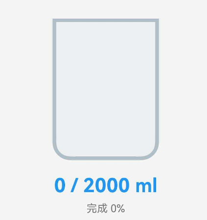 有水:
有水: 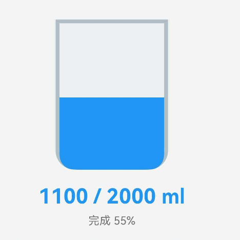
完整代码
首先,让我们看一下完整的组件代码:
/**
* 饮水杯动画组件
*/
@Component
export struct WaterCup {
@Prop current: number = 0;
@Prop target: number = 2000;
cupWidth: number = 100;
cupHeight: number = 140;
private getWaterHeight(): number {
const ratio = Math.min(this.current / this.target, 1);
return ratio * (this.cupHeight – 20); // 留出杯口空间
}
private getWaterColor(): string {
const ratio = this.current / this.target;
if (ratio >= 1) return '#2196F3';
if (ratio >= 0.7) return '#42A5F5';
if (ratio >= 0.4) return '#64B5F6';
return '#90CAF9';
}
build() {
Column() {
Stack({ alignContent: Alignment.Bottom }) {
// 杯子外框
Column()
.width(this.cupWidth)
.height(this.cupHeight)
.borderRadius({ bottomLeft: 16, bottomRight: 16 })
.border({
width: 3,
color: $r('app.color.water_cup_border')
})
.backgroundColor($r('app.color.water_cup_background'))
// 水
Column()
.width(this.cupWidth – 6)
.height(this.getWaterHeight())
.borderRadius({ bottomLeft: 13, bottomRight: 13 })
.backgroundColor(this.getWaterColor())
.animation({
duration: 300,
curve: Curve.EaseInOut
})
}
// 显示数值
Text(`${this.current}ml`)
.fontSize(18)
.fontWeight(FontWeight.Bold)
.fontColor($r('app.color.water_blue'))
.margin({ top: 12 } as Padding)
Text(`目标: ${this.target}ml`)
.fontSize(12)
.fontColor($r('app.color.text_secondary'))
.margin({ top: 4 } as Padding)
}
.alignItems(HorizontalAlign.Center)
}
}
逐步解析
1. 组件声明与导出
@Component
export struct WaterCup {
// 组件内容
}
知识点详解:
@Component 装饰器:
这是 ArkTS 中最重要的装饰器之一。当你在 struct 前面加上 @Component,就告诉编译器这是一个可复用的 UI 组件。编译器会为这个组件生成必要的代码,使其能够参与到 UI 的构建和更新流程中。
没有 @Component 装饰器的 struct 只是一个普通的数据结构,无法作为组件使用。
export 关键字:
export 使得这个组件可以被其他文件导入。如果不加 export,组件只能在当前文件内使用。
导入方式:
import { WaterCup } from '../components/WaterCup';
struct 关键字:
ArkTS 使用 struct(结构体)来定义组件,这与 TypeScript 中的 class 不同。struct 是值类型,在性能上比引用类型的 class 更高效。这是 ArkTS 针对 UI 渲染性能做的优化设计。
命名规范:
组件名称必须以大写字母开头,这是 ArkTS 的强制要求。推荐使用 PascalCase(帕斯卡命名法),如 WaterCup、UserProfile、NavigationBar 等。
2. 组件属性定义
@Prop current: number = 0;
@Prop target: number = 2000;
cupWidth: number = 100;
cupHeight: number = 140;
知识点详解:
@Prop 装饰器的作用:
@Prop 是用于父子组件通信的关键装饰器。它的工作机制如下:
为什么需要默认值?
考虑以下场景:
// 场景1:传入完整参数
WaterCup({ current: 1500, target: 2000 })
// 场景2:只传入部分参数
WaterCup({ current: 1500 }) // target 使用默认值 2000
// 场景3:不传入任何参数
WaterCup() // current 和 target 都使用默认值
默认值保证了组件的健壮性,即使父组件忘记传参,组件也能正常显示。
@Prop 的类型支持:
@Prop 支持多种数据类型:
- 基本类型:number、string、boolean
- 枚举类型:enum
- 对象类型:自定义的 interface 或 class
普通属性(无装饰器):
cupWidth 和 cupHeight 没有使用任何装饰器,它们是组件的内部配置。这些属性:
- 不参与响应式更新
- 不能从父组件传入
- 在组件生命周期内保持不变
何时使用普通属性?
当某个值满足以下条件时,使用普通属性:
例如,水杯的宽高在这个组件中是固定的,所以使用普通属性。如果未来需要支持不同尺寸的水杯,可以将它们改为 @Prop。
使用示例:
// 在父组件中使用
@Entry
@Component
struct MyPage {
@State waterAmount: number = 1500;
build() {
Column() {
// 传入响应式数据
WaterCup({
current: this.waterAmount, // 绑定到 @State 变量
target: 2000
})
Button('喝水')
.onClick(() => {
this.waterAmount += 200; // 修改数据
// WaterCup 会自动更新显示
})
}
}
}
数据流向:
父组件 @State waterAmount
↓ (单向数据流)
子组件 @Prop current
↓ (触发重新渲染)
UI 更新(水位上升)
3. 计算水位高度
private getWaterHeight(): number {
const ratio = Math.min(this.current / this.target, 1);
return ratio * (this.cupHeight – 20); // 留出杯口空间
}
实现逻辑详解:
第一步:计算完成比例
const ratio = Math.min(this.current / this.target, 1);
这行代码包含两个关键操作:
除法运算:this.current / this.target 计算当前饮水量占目标量的比例
- 如果 current = 1000,target = 2000,则 ratio = 0.5(50%)
- 如果 current = 2000,target = 2000,则 ratio = 1.0(100%)
- 如果 current = 3000,target = 2000,则 ratio = 1.5(150%)
限制最大值:Math.min(ratio, 1) 确保比例不超过 1
- 这是为了防止用户喝水超标时,水溢出杯子
- 即使 current 大于 target,水位也只会显示到杯口
为什么要限制最大值?
从视觉角度考虑,水杯是一个有限的容器,水不可能溢出杯子。如果不限制,当用户喝水超过目标量时,水位高度会超过杯子高度,导致显示异常。
第二步:计算实际像素高度
return ratio * (this.cupHeight – 20);
这里有两个细节:
减去 20 像素:为杯口预留空间
- 杯子总高度是 140 像素
- 可用于显示水的高度是 120 像素(140 – 20)
- 这样即使水位达到 100%,也不会完全填满杯子,保持视觉美观
比例乘以可用高度:将 0-1 的比例转换为实际像素值
- ratio = 0.5 时,height = 0.5 × 120 = 60 像素
- ratio = 1.0 时,height = 1.0 × 120 = 120 像素
完整计算示例:
假设 cupHeight = 140,可用高度 = 120
场景1:刚开始喝水
– current = 0, target = 2000
– ratio = 0 / 2000 = 0
– height = 0 × 120 = 0 像素
– 显示:空杯子
场景2:喝了一半
– current = 1000, target = 2000
– ratio = 1000 / 2000 = 0.5
– height = 0.5 × 120 = 60 像素
– 显示:水位在杯子中间
场景3:达到目标
– current = 2000, target = 2000
– ratio = 2000 / 2000 = 1.0
– height = 1.0 × 120 = 120 像素
– 显示:水位接近杯口(留 20 像素空间)
场景4:超过目标
– current = 3000, target = 2000
– ratio = Math.min(3000 / 2000, 1) = Math.min(1.5, 1) = 1.0
– height = 1.0 × 120 = 120 像素
– 显示:水位仍然在杯口(不会溢出)
方法设计的优点:
性能考虑:
这个方法会在每次组件渲染时被调用。由于计算非常简单(只有一次除法和一次乘法),性能开销可以忽略不计。如果计算逻辑很复杂,可以考虑使用缓存优化。
4. 动态水位颜色
private getWaterColor(): string {
const ratio = this.current / this.target;
if (ratio >= 1) return '#2196F3'; // 深蓝(已达标)
if (ratio >= 0.7) return '#42A5F5'; // 中蓝(接近目标)
if (ratio >= 0.4) return '#64B5F6'; // 浅蓝(进行中)
return '#90CAF9'; // 很浅蓝(刚开始)
}
设计思路详解:
颜色选择的心理学依据:
颜色不仅仅是装饰,它能传递信息和情感。在这个组件中,我们使用蓝色系来表示水,这是因为:
阶梯式颜色设计:
我们将完成度分为四个档次,每个档次对应一个颜色:
100% 及以上 → #2196F3 深蓝色 "太棒了,目标达成!"
70% – 99% → #42A5F5 中蓝色 "快要达标了,加油!"
40% – 69% → #64B5F6 浅蓝色 "进展不错,继续保持"
0% – 39% → #90CAF9 很浅蓝 "刚开始,还需努力"
为什么使用阶梯式而不是渐变?
颜色值的选择:
这些颜色值来自 Material Design 的蓝色色板:
- #2196F3:Blue 500(标准蓝)
- #42A5F5:Blue 400(稍浅)
- #64B5F6:Blue 300(更浅)
- #90CAF9:Blue 200(最浅)
使用标准色板的好处:
判断逻辑的顺序:
if (ratio >= 1) return '#2196F3'; // 先判断最高档
if (ratio >= 0.7) return '#42A5F5'; // 再判断次高档
if (ratio >= 0.4) return '#64B5F6'; // 然后判断中档
return '#90CAF9'; // 最后返回最低档
这个顺序很重要。如果颠倒顺序,逻辑会出错:
// ❌ 错误示例
if (ratio >= 0.4) return '#64B5F6'; // 当 ratio = 1 时,这里就返回了
if (ratio >= 0.7) return '#42A5F5'; // 永远不会执行到这里
if (ratio >= 1) return '#2196F3'; // 永远不会执行到这里
扩展思考:
如果你想实现更细腻的颜色变化,可以使用线性插值:
private getWaterColorGradient(): string {
const ratio = Math.min(this.current / this.target, 1);
// 从浅蓝 (144, 202, 249) 到深蓝 (33, 150, 243)
const r = Math.round(144 – (144 – 33) * ratio);
const g = Math.round(202 – (202 – 150) * ratio);
const b = Math.round(249 – (249 – 243) * ratio);
return `rgb(${r}, ${g}, ${b})`;
}
但这会增加计算复杂度,对于大多数场景,阶梯式颜色已经足够。
颜色与动画的配合:
注意,颜色变化和高度变化是同步的。当用户添加饮水记录时:
这种同步变化增强了视觉反馈的连贯性。
5. 布局结构
组件的布局采用三层结构:
Column(垂直布局)
├── Stack(堆叠布局)
│ ├── Column(杯子外框)
│ └── Column(水)
├── Text(当前饮水量)
└── Text(目标量)
布局设计的思路:
第一层:Column 垂直布局
最外层使用 Column 将水杯和文字垂直排列。这是最常见的布局方式,适合从上到下展示内容。
Column() {
// 水杯部分
Stack() { … }
// 文字部分
Text() { … }
Text() { … }
}
.alignItems(HorizontalAlign.Center) // 子元素水平居中
第二层:Stack 堆叠布局
Stack 是实现水杯效果的关键。它允许多个组件重叠显示,就像一摞纸叠在一起。
Stack({ alignContent: Alignment.Bottom }) {
// 底层:杯子外框
Column() { … }
// 顶层:水
Column() { … }
}
为什么使用 Stack?
如果不用 Stack,而是用 Column 或 Row,水和杯子会并排或上下排列,无法重叠。只有 Stack 能让水"填充"在杯子里面。
alignContent: Alignment.Bottom 的作用:
这个参数让 Stack 中的所有子组件从底部对齐。如果不设置对齐,将会默认居中,水会在中间,设置了底部对齐以后,水就会在底部。
底部对齐符合物理直觉:水总是从容器底部开始填充。
第三层:杯子和水的实现
杯子外框:
Column()
.width(this.cupWidth) // 宽度 100
.height(this.cupHeight) // 高度 140
.borderRadius({
bottomLeft: 16,
bottomRight: 16
}) // 只设置底部圆角
.border({
width: 3,
color: $r('app.color.water_cup_border')
}) // 3像素边框
.backgroundColor($r('app.color.water_cup_background'))
为什么只设置底部圆角?
真实的杯子通常是上宽下窄,底部有圆角。只设置底部圆角能更好地模拟杯子的形状。如果四个角都设置圆角,看起来更像一个胶囊,而不是杯子。
边框的作用:
3 像素的边框形成杯子的轮廓。如果没有边框,杯子和背景会融为一体,视觉效果不清晰。
水的实现:
Column()
.width(this.cupWidth – 6) // 比杯子窄 6 像素
.height(this.getWaterHeight()) // 动态高度
.borderRadius({
bottomLeft: 13,
bottomRight: 13
}) // 圆角比杯子小
.backgroundColor(this.getWaterColor()) // 动态颜色
.animation({
duration: 300,
curve: Curve.EaseInOut
})
为什么水的宽度要减 6 像素?
杯子的边框宽度是 3 像素,左右各 3 像素,总共 6 像素。如果水的宽度和杯子一样,水会覆盖边框,看起来像是溢出了。减去 6 像素后,水正好在边框内部。
杯子宽度 100:
├─ 3px 边框
├─ 94px 内部空间(水的宽度)
└─ 3px 边框
为什么水的圆角是 13 而不是 16?
杯子的圆角是 16,但这是外圆角。水在杯子内部,需要使用内圆角。内圆角 = 外圆角 – 边框宽度 = 16 – 3 = 13。
这样水的边缘才能完美贴合杯子的内壁。
视觉层次:
Z轴方向(从下到上):
1. 背景色(杯子内部的浅色)
2. 杯子边框(3px 的线条)
3. 水(蓝色,高度动态变化)
这种层次设计让水杯看起来有深度感。
响应式考虑:
虽然当前的宽高是固定的,但如果需要支持不同尺寸,可以这样改造:
@Prop cupWidth: number = 100;
@Prop cupHeight: number = 140;
// 使用时
WaterCup({
current: 1500,
target: 2000,
cupWidth: 120, // 自定义宽度
cupHeight: 160 // 自定义高度
})
所有相关的计算(如水的宽度、圆角大小)都会自动适配。
6. 动画效果
.animation({
duration: 300,
curve: Curve.EaseInOut
})
动画参数详解:
duration(持续时间):
duration: 300 表示动画持续 300 毫秒(0.3 秒)。这个时长的选择有讲究:
- 太短(< 200ms):动画过快,用户可能注意不到变化
- 太长(> 500ms):动画拖沓,影响操作流畅性
- 300ms:恰到好处,既能让用户感知到变化,又不会觉得慢
这个时长符合 Material Design 的动画规范,是经过大量用户测试验证的最佳值。
curve(缓动曲线):
Curve.EaseInOut 是一种缓动函数,它控制动画的速度变化:
速度
↑
│ ╱‾‾‾╲ ← EaseInOut:两端慢,中间快
│ ╱ ╲
│ ╱ ╲
│ ╱ ╲
└─────────────→ 时间
开始 结束
ArkTS 提供了多种缓动曲线:
Curve.Linear:匀速运动,速度恒定
- 适用场景:进度条、加载动画
- 缺点:看起来机械,不够自然
Curve.EaseIn:慢速开始,逐渐加速
- 适用场景:元素消失、收起动画
- 特点:给人一种"被吸走"的感觉
Curve.EaseOut:快速开始,逐渐减速
- 适用场景:元素出现、展开动画
- 特点:给人一种"弹出"的感觉
Curve.EaseInOut:慢速开始和结束,中间快速
- 适用场景:大多数过渡动画
- 特点:最自然,符合物理直觉
我们选择 EaseInOut 是因为水位上升是一个连续的过程,需要平滑自然的过渡。
触发机制详解:
动画的触发是自动的,不需要手动调用任何方法。工作流程如下:
1. 用户点击"喝水"按钮
↓
2. 父组件修改 @State waterAmount
↓
3. ArkTS 检测到状态变化
↓
4. 触发 WaterCup 组件重新渲染
↓
5. getWaterHeight() 返回新的高度值
↓
6. .height() 属性从旧值变为新值
↓
7. 由于设置了 .animation(),产生平滑过渡
↓
8. 用户看到水位平滑上升
关键点:动画作用于哪些属性?
.animation() 会对该组件的所有可动画属性生效,包括:
- 尺寸:width、height
- 位置:position、offset
- 透明度:opacity
- 颜色:backgroundColor、fontColor
- 变换:rotate、scale、translate
在我们的水杯组件中,.animation() 设置在水的 Column 上,所以:
- height 变化会产生动画(水位上升/下降)
- backgroundColor 变化也会产生动画(颜色渐变)
性能优化:
ArkTS 的动画是硬件加速的,运行在 GPU 上,不会阻塞主线程。但仍需注意:
调试技巧:
如果动画不生效,检查以下几点:
扩展:自定义动画曲线
如果内置的缓动曲线不满足需求,可以使用贝塞尔曲线自定义:
.animation({
duration: 300,
curve: Curve.cubicBezier(0.25, 0.1, 0.25, 1) // 自定义曲线
})
贝塞尔曲线的四个参数控制曲线形状,可以在 cubic-bezier.com 上可视化调试。
7. 文本显示
Text(`${this.current}ml`)
.fontSize(18)
.fontWeight(FontWeight.Bold)
.fontColor($r('app.color.water_blue'))
.margin({ top: 12 } as Padding)
Text(`目标: ${this.target}ml`)
.fontSize(12)
.fontColor($r('app.color.text_secondary'))
.margin({ top: 4 } as Padding)
知识点:
- 使用模板字符串 `${变量}` 动态显示数值
- 链式调用设置样式属性
- $r('app.color.xxx') 引用资源文件中的颜色
组件使用示例
基础使用
@Entry
@Component
struct WaterPage {
@State currentWater: number = 1500;
@State targetWater: number = 2000;
build() {
Column() {
WaterCup({
current: this.currentWater,
target: this.targetWater
})
Button('喝水 +200ml')
.onClick(() => {
this.currentWater += 200;
})
}
}
}
代码解析:
@State 装饰器:
@State currentWater: number = 1500;
@State 是状态管理的核心装饰器。它的作用是:
数据绑定:
WaterCup({
current: this.currentWater, // 父组件的 @State
target: this.targetWater // 绑定到子组件的 @Prop
})
这里建立了父子组件之间的数据连接。当 this.currentWater 变化时,WaterCup 组件会自动接收到新值并重新渲染。
事件处理:
Button('喝水 +200ml')
.onClick(() => {
this.currentWater += 200; // 修改状态
})
点击按钮时,currentWater 增加 200。由于它是 @State 变量,这个改变会触发:
运行效果: 初始状态: 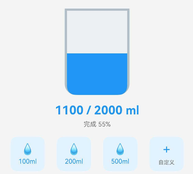 点击按钮后:
 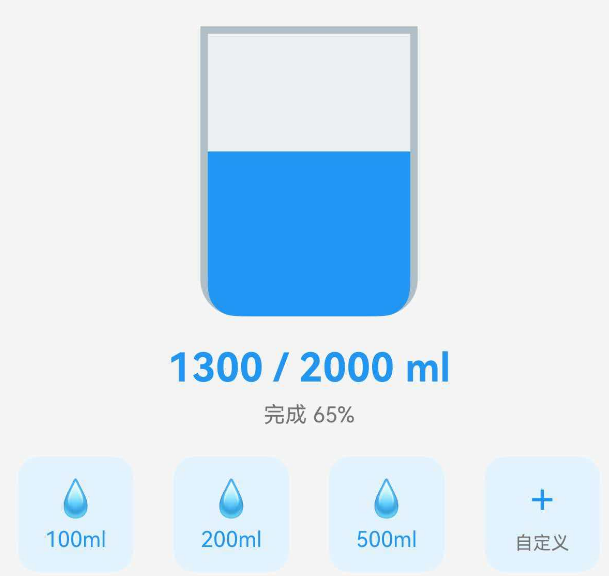 水位会平滑上升。
多个水杯实例
Row() {
WaterCup({ current: 800, target: 2000 })
WaterCup({ current: 1500, target: 2000 })
WaterCup({ current: 2000, target: 2000 })
}
.justifyContent(FlexAlign.SpaceAround)
每个水杯是独立的实例,拥有自己的状态和显示效果。这展示了组件的复用性:同一个组件可以在页面上多次使用,互不干扰。
实际应用场景:
完整的饮水管理页面
@Entry
@Component
struct WaterManagementPage {
@State currentWater: number = 0;
@State targetWater: number = 2000;
@State records: WaterRecord[] = [];
addWater(amount: number): void {
this.currentWater += amount;
this.records.push({
id: Date.now(),
amount: amount,
time: this.getCurrentTime()
});
}
getCurrentTime(): string {
const now = new Date();
return `${now.getHours()}:${now.getMinutes()}`;
}
build() {
Column() {
// 标题
Text('今日饮水')
.fontSize(24)
.fontWeight(FontWeight.Bold)
.margin({ top: 20, bottom: 20 })
// 水杯展示
WaterCup({
current: this.currentWater,
target: this.targetWater
})
.margin({ top: 20, bottom: 20 })
// 快捷按钮
Row() {
QuickWaterButton({
amount: 100,
onTap: () => this.addWater(100)
})
QuickWaterButton({
amount: 200,
onTap: () => this.addWater(200)
})
QuickWaterButton({
amount: 500,
onTap: () => this.addWater(500)
})
}
.width('100%')
.justifyContent(FlexAlign.SpaceAround)
.margin({ top: 20, bottom: 20 })
// 今日记录
Text('今日记录')
.fontSize(18)
.fontWeight(FontWeight.Medium)
.alignSelf(ItemAlign.Start)
.margin({ left: 20, top: 20, bottom: 10 })
List() {
ForEach(this.records, (record: WaterRecord) => {
ListItem() {
Row() {
Text(`${record.time}`)
.fontSize(14)
.fontColor('#666666')
Text(`+${record.amount}ml`)
.fontSize(16)
.fontWeight(FontWeight.Medium)
.fontColor('#2196F3')
}
.width('90%')
.justifyContent(FlexAlign.SpaceBetween)
.padding(15)
.backgroundColor('#F5F5F5')
.borderRadius(8)
.margin({ bottom: 10 })
}
})
}
.width('100%')
.layoutWeight(1)
}
.width('100%')
.height('100%')
.padding(20)
}
}
interface WaterRecord {
id: number;
amount: number;
time: string;
}
功能说明:
状态管理:
- currentWater:当前饮水总量
- targetWater:目标饮水量
- records:饮水记录数组
添加记录:
- 点击快捷按钮调用 addWater()
- 更新总量并添加记录
- 记录包含时间戳和饮水量
记录展示:
- 使用 List 和 ForEach 显示所有记录
- 每条记录显示时间和饮水量
- 最新的记录在最上面
用户体验优化:
每个水杯独立显示不同的数据,互不影响。
扩展:快捷按钮组件
在实际应用中,我们还需要快捷添加饮水量的按钮。下面是配套的按钮组件:
@Component
export struct QuickWaterButton {
amount: number = 200;
onTap: () => void = () => {};
build() {
Column() {
Text('💧')
.fontSize(24)
Text(`${this.amount}ml`)
.fontSize(14)
.fontWeight(FontWeight.Medium)
.fontColor($r('app.color.water_blue'))
.margin({ top: 4 } as Padding)
}
.width(70)
.height(70)
.justifyContent(FlexAlign.Center)
.backgroundColor($r('app.color.water_surface'))
.borderRadius(12)
.onClick(() => {
this.onTap();
})
}
}
使用示例:
Row() {
QuickWaterButton({
amount: 100,
onTap: () => { this.currentWater += 100; }
})
QuickWaterButton({
amount: 200,
onTap: () => { this.currentWater += 200; }
})
QuickWaterButton({
amount: 500,
onTap: () => { this.currentWater += 500; }
})
}
实现效果类似: 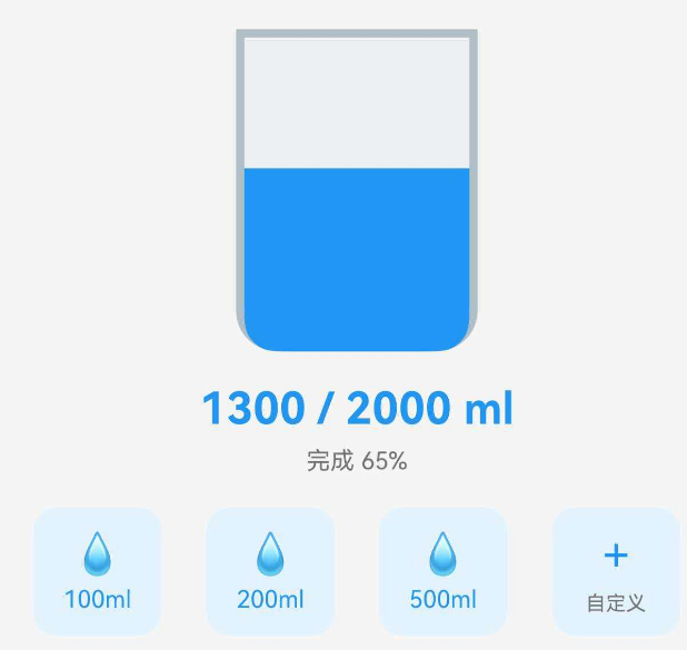
组件封装的最佳实践
1. 单一职责原则
每个组件只负责一个功能:
- WaterCup 只负责显示水杯状态
- QuickWaterButton 只负责快捷操作
- 数据管理由父组件负责
为什么要遵循单一职责?
假设我们把所有功能都塞进一个组件:
// ❌ 不好的设计:一个组件做太多事情
@Component
struct WaterManagement {
@State currentWater: number = 0;
@State records: WaterRecord[] = [];
build() {
Column() {
// 显示水杯
// 快捷按钮
// 记录列表
// 统计图表
// 设置面板
// … 几百行代码
}
}
}
这样做的问题:
正确的做法:拆分成多个小组件
// ✅ 好的设计:每个组件职责清晰
@Component
struct WaterManagementPage {
@State currentWater: number = 0;
@State records: WaterRecord[] = [];
build() {
Column() {
WaterCup({ current: this.currentWater, target: 2000 })
QuickButtonGroup({ onAdd: (amount) => this.addWater(amount) })
RecordList({ records: this.records })
StatisticsChart({ data: this.getWeeklyData() })
}
}
}
这样每个组件都可以独立开发、测试和复用。
2. 属性设计
使用 @Prop 的场景:
- 需要从父组件传入的数据
- 数据变化时需要更新 UI
使用普通属性的场景:
- 组件内部的常量配置
- 不需要响应式更新的数据
属性命名规范:
// ✅ 好的命名:清晰、语义化
@Prop current: number = 0; // 当前值
@Prop target: number = 2000; // 目标值
@Prop maxValue: number = 5000; // 最大值
@Prop showLabel: boolean = true; // 是否显示标签
// ❌ 不好的命名:含糊不清
@Prop val: number = 0; // val 是什么?
@Prop num: number = 2000; // num 代表什么?
@Prop flag: boolean = true; // flag 控制什么?
属性的默认值设计:
默认值应该是最常用的值,让大多数场景下不需要传参:
@Prop cupWidth: number = 100; // 默认宽度适合大多数场景
@Prop cupHeight: number = 140; // 默认高度比例协调
@Prop animationDuration: number = 300; // 默认动画时长适中
可选属性 vs 必需属性:
在 ArkTS 中,所有 @Prop 都必须有默认值,所以都是可选的。但在设计时要考虑:
// 核心属性:虽然有默认值,但通常需要传入
@Prop current: number = 0; // 几乎总是需要传入实际值
@Prop target: number = 2000; // 可能使用默认值
// 配置属性:大多数情况使用默认值
@Prop cupWidth: number = 100; // 很少需要修改
@Prop showPercentage: boolean = true; // 很少需要修改
3. 方法封装
将复杂的计算逻辑封装成私有方法:
- getWaterHeight():计算水位高度
- getWaterColor():计算水位颜色
好处:
- 代码更清晰
- 便于测试和维护
- 可以在多处复用
方法的访问控制:
// private:只在组件内部使用
private getWaterHeight(): number { … }
private getWaterColor(): string { … }
// public:可以被外部调用(很少使用)
public reset(): void {
this.current = 0;
}
大多数情况下,组件的方法都应该是 private,因为组件应该通过属性来控制,而不是通过方法调用。
方法的命名规范:
// ✅ 好的命名:动词开头,表达意图
private getWaterHeight(): number { … } // 获取高度
private calculateRatio(): number { … } // 计算比例
private formatDisplayText(): string { … } // 格式化文本
// ❌ 不好的命名:名词或含糊不清
private height(): number { … } // 不清楚是获取还是设置
private water(): string { … } // 不知道返回什么
private process(): void { … } // 处理什么?
方法的职责划分:
每个方法应该只做一件事:
// ✅ 好的设计:职责单一
private getWaterHeight(): number {
const ratio = this.calculateRatio();
return ratio * (this.cupHeight – 20);
}
private calculateRatio(): number {
return Math.min(this.current / this.target, 1);
}
// ❌ 不好的设计:一个方法做太多事
private getWaterHeightAndColorAndText(): any {
const ratio = Math.min(this.current / this.target, 1);
const height = ratio * (this.cupHeight – 20);
const color = ratio >= 1 ? '#2196F3' : '#90CAF9';
const text = `${this.current}ml / ${this.target}ml`;
return { height, color, text };
}
4. 样式管理
推荐做法:
.backgroundColor($r('app.color.water_blue')) // 使用资源引用
不推荐:
.backgroundColor('#2196F3') // 硬编码颜色
使用资源文件的好处:
- 统一管理主题色
- 支持深色模式切换
- 便于批量修改
资源文件的组织:
在 resources/base/element/color.json 中定义颜色:
{
"color": [
{
"name": "water_blue",
"value": "#2196F3"
},
{
"name": "water_blue_light",
"value": "#90CAF9"
},
{
"name": "water_cup_border",
"value": "#BDBDBD"
},
{
"name": "water_cup_background",
"value": "#F5F5F5"
}
]
}
深色模式支持:
在 resources/dark/element/color.json 中定义深色版本:
{
"color": [
{
"name": "water_blue",
"value": "#64B5F6"
},
{
"name": "water_cup_border",
"value": "#424242"
},
{
"name": "water_cup_background",
"value": "#1E1E1E"
}
]
}
系统会根据当前主题自动选择对应的颜色值。
样式的复用:
如果多个组件使用相同的样式,可以定义样式函数:
// 在单独的文件中定义
export function cardStyle() {
return {
backgroundColor: $r('app.color.card_background'),
borderRadius: 12,
padding: 16,
shadow: {
radius: 8,
color: $r('app.color.shadow_color'),
offsetY: 2
}
};
}
// 在组件中使用
Column()
.backgroundColor(cardStyle().backgroundColor)
.borderRadius(cardStyle().borderRadius)
// …
但要注意,ArkTS 不支持直接展开对象,需要逐个设置属性。
5. 性能优化
避免不必要的计算:
// ❌ 不好:每次渲染都创建新对象
build() {
Column()
.margin({ top: 12, bottom: 12, left: 16, right: 16 }) // 每次都创建新对象
}
// ✅ 好:使用常量
private readonly MARGIN = { top: 12, bottom: 12, left: 16, right: 16 };
build() {
Column()
.margin(this.MARGIN) // 复用同一个对象
}
避免在 build() 中进行复杂计算:
// ❌ 不好:在 build() 中计算
build() {
Column() {
Text(`${this.calculateComplexValue()}`) // 每次渲染都计算
}
}
// ✅ 好:使用计算属性或缓存
@State cachedValue: number = 0;
aboutToAppear() {
this.cachedValue = this.calculateComplexValue();
}
build() {
Column() {
Text(`${this.cachedValue}`) // 使用缓存值
}
}
合理使用动画:
动画虽然提升用户体验,但也消耗性能。对于不重要的动画,可以考虑禁用:
@Prop enableAnimation: boolean = true; // 允许外部控制是否启用动画
build() {
Column()
.height(this.getWaterHeight())
.animation(this.enableAnimation ? {
duration: 300,
curve: Curve.EaseInOut
} : undefined) // 根据配置决定是否启用动画
}
6. 组件的可测试性
设计易于测试的组件:
// ✅ 好的设计:计算逻辑独立,易于测试
private calculateRatio(): number {
return Math.min(this.current / this.target, 1);
}
// 可以单独测试这个方法
// 输入:current = 1000, target = 2000
// 期望输出:0.5
避免在组件中直接访问全局状态:
// ❌ 不好:依赖全局状态,难以测试
build() {
Text(`${globalStore.waterAmount}ml`) // 依赖全局变量
}
// ✅ 好:通过属性传入,易于测试
@Prop current: number = 0;
build() {
Text(`${this.current}ml`) // 只依赖属性
}
7. 文档和注释
为组件编写清晰的注释:
/**
* 饮水杯动画组件
*
* 功能:
* – 根据当前饮水量和目标量显示水位
* – 水位高度和颜色动态变化
* – 支持平滑动画效果
*
* 使用示例:
* ```
* WaterCup({ current: 1500, target: 2000 })
* ```
*
* @param current 当前饮水量(毫升)
* @param target 目标饮水量(毫升)
*/
@Component
export struct WaterCup {
@Prop current: number = 0;
@Prop target: number = 2000;
// …
}
好的文档能帮助其他开发者(包括未来的你)快速理解组件的用途和用法。
常见问题与解决方案
Q1: 为什么水位不更新?
症状: 点击按钮后,水位没有变化,或者变化后没有动画效果。
可能的原因和解决方案:
原因1:父组件没有使用 @State
// ❌ 错误示例
struct WaterPage {
currentWater: number = 1500; // 没有 @State
build() {
Column() {
WaterCup({ current: this.currentWater })
Button('喝水')
.onClick(() => {
this.currentWater += 200; // 修改了,但不会触发更新
})
}
}
}
解决方案:
// ✅ 正确示例
struct WaterPage {
@State currentWater: number = 1500; // 添加 @State
build() {
Column() {
WaterCup({ current: this.currentWater })
Button('喝水')
.onClick(() => {
this.currentWater += 200; // 现在会触发更新
})
}
}
}
原因2:子组件没有使用 @Prop
// ❌ 错误示例
@Component
export struct WaterCup {
current: number = 0; // 没有 @Prop
// …
}
解决方案:
// ✅ 正确示例
@Component
export struct WaterCup {
@Prop current: number = 0; // 添加 @Prop
// …
}
原因3:直接修改了 @Prop 属性
// ❌ 错误示例
@Component
export struct WaterCup {
@Prop current: number = 0;
addWater() {
this.current += 200; // 不允许!@Prop 是只读的
}
}
@Prop 属性是单向数据流,子组件不能直接修改。如果需要修改,应该通过回调函数通知父组件:
// ✅ 正确示例
@Component
export struct WaterCup {
@Prop current: number = 0;
onAdd: (amount: number) => void = () => {};
build() {
Column() {
// 显示水杯
Button('喝水')
.onClick(() => {
this.onAdd(200); // 通知父组件
})
}
}
}
// 父组件
struct WaterPage {
@State currentWater: number = 0;
build() {
WaterCup({
current: this.currentWater,
onAdd: (amount) => {
this.currentWater += amount; // 在父组件中修改
}
})
}
}
Q2: 动画不流畅怎么办?
症状: 水位上升时有卡顿,或者动画不连贯。
可能的原因和解决方案:
原因1:动画设置在错误的组件上
// ❌ 错误示例
Stack() {
Column() // 杯子
Column() // 水
}
.animation({ // 动画设置在 Stack 上,不会生效
duration: 300,
curve: Curve.EaseInOut
})
解决方案:
// ✅ 正确示例
Stack() {
Column() // 杯子
Column() // 水
.height(this.getWaterHeight())
.animation({ // 动画设置在水的 Column 上
duration: 300,
curve: Curve.EaseInOut
})
}
原因2:频繁更新数据
如果在短时间内多次修改数据,动画可能来不及完成就被打断:
// ❌ 不好的做法
Button('快速喝水')
.onClick(() => {
for (let i = 0; i < 10; i++) {
this.currentWater += 20; // 连续修改 10 次
}
})
解决方案:
// ✅ 好的做法
Button('快速喝水')
.onClick(() => {
this.currentWater += 200; // 一次性修改
})
原因3:动画时长设置不当
// 太短,看不清动画
.animation({ duration: 50, curve: Curve.EaseInOut })
// 太长,感觉拖沓
.animation({ duration: 2000, curve: Curve.EaseInOut })
// ✅ 合适的时长
.animation({ duration: 300, curve: Curve.EaseInOut })
原因4:页面上动画元素过多
如果同时有很多组件在动画,可能导致性能问题:
// ❌ 可能卡顿
Row() {
ForEach(this.waterCups, (cup) => {
WaterCup({ current: cup.amount }) // 100 个水杯同时动画
})
}
解决方案:
- 减少同时动画的元素数量
- 使用虚拟滚动(LazyForEach)
- 考虑禁用不重要的动画
Q3: 如何自定义杯子尺寸?
方法 1:修改组件内部的默认值
直接修改 WaterCup.ets 文件:
@Component
export struct WaterCup {
@Prop current: number = 0;
@Prop target: number = 2000;
cupWidth: number = 120; // 改为 120
cupHeight: number = 160; // 改为 160
// …
}
这种方法简单,但会影响所有使用该组件的地方。
方法 2:将尺寸改为 @Prop,从外部传入
修改组件定义:
@Component
export struct WaterCup {
@Prop current: number = 0;
@Prop target: number = 2000;
@Prop cupWidth: number = 100; // 改为 @Prop
@Prop cupHeight: number = 140; // 改为 @Prop
// …
}
使用时可以自定义尺寸:
// 使用默认尺寸
WaterCup({ current: 1500, target: 2000 })
// 自定义尺寸
WaterCup({
current: 1500,
target: 2000,
cupWidth: 120,
cupHeight: 160
})
这种方法更灵活,推荐使用。
方法 3:创建不同尺寸的变体组件
// 小号水杯
@Component
export struct SmallWaterCup {
@Prop current: number = 0;
@Prop target: number = 2000;
build() {
WaterCup({
current: this.current,
target: this.target,
cupWidth: 80,
cupHeight: 110
})
}
}
// 大号水杯
@Component
export struct LargeWaterCup {
@Prop current: number = 0;
@Prop target: number = 2000;
build() {
WaterCup({
current: this.current,
target: this.target,
cupWidth: 140,
cupHeight: 180
})
}
}
这种方法适合有固定的几种尺寸规格的场景。
Q4: 如何添加点击事件?
需求: 点击水杯时显示详细信息或执行某个操作。
解决方案:
方法 1:在组件内部添加点击事件
修改 WaterCup 组件:
@Component
export struct WaterCup {
@Prop current: number = 0;
@Prop target: number = 2000;
onTap: () => void = () => {}; // 添加回调函数
build() {
Column() {
Stack() {
// 水杯内容
}
Text(`${this.current}ml`)
Text(`目标: ${this.target}ml`)
}
.onClick(() => {
this.onTap(); // 触发回调
})
}
}
使用时传入回调:
WaterCup({
current: 1500,
target: 2000,
onTap: () => {
console.log('水杯被点击了');
// 显示详情弹窗等
}
})
方法 2:在父组件中包装
Column() {
WaterCup({ current: 1500, target: 2000 })
}
.onClick(() => {
console.log('水杯被点击了');
})
这种方法不需要修改组件,但点击区域可能不够精确。
Q5: 如何支持横向水杯?
需求: 水杯横向显示,水从左向右填充。
解决方案:
创建一个新的 HorizontalWaterCup 组件:
@Component
export struct HorizontalWaterCup {
@Prop current: number = 0;
@Prop target: number = 2000;
cupWidth: number = 140;
cupHeight: number = 100;
private getWaterWidth(): number {
const ratio = Math.min(this.current / this.target, 1);
return ratio * (this.cupWidth – 20); // 留出右侧空间
}
private getWaterColor(): string {
const ratio = this.current / this.target;
if (ratio >= 1) return '#2196F3';
if (ratio >= 0.7) return '#42A5F5';
if (ratio >= 0.4) return '#64B5F6';
return '#90CAF9';
}
build() {
Column() {
Stack({ alignContent: Alignment.Start }) { // 改为左对齐
// 杯子外框
Row() // 改为 Row
.width(this.cupWidth)
.height(this.cupHeight)
.borderRadius({ topRight: 16, bottomRight: 16 }) // 右侧圆角
.border({ width: 3, color: $r('app.color.water_cup_border') })
.backgroundColor($r('app.color.water_cup_background'))
// 水
Row() // 改为 Row
.width(this.getWaterWidth()) // 宽度动态变化
.height(this.cupHeight – 6)
.borderRadius({ topRight: 13, bottomRight: 13 })
.backgroundColor(this.getWaterColor())
.animation({
duration: 300,
curve: Curve.EaseInOut
})
}
Text(`${this.current}ml`)
.fontSize(18)
.fontWeight(FontWeight.Bold)
.fontColor($r('app.color.water_blue'))
.margin({ top: 12 })
}
.alignItems(HorizontalAlign.Center)
}
}
主要改动:
Q6: 如何添加刻度线?
需求: 在杯子上显示刻度,标注不同的容量。
解决方案:
在 Stack 中添加刻度线层:
Stack({ alignContent: Alignment.Bottom }) {
// 杯子外框
Column() { … }
// 水
Column() { … }
// 刻度线(新增)
Column() {
ForEach([2000, 1500, 1000, 500], (value: number) => {
Row() {
Line()
.width(20)
.height(1)
.backgroundColor('#999999')
Text(`${value}ml`)
.fontSize(10)
.fontColor('#999999')
.margin({ left: 4 })
}
.width('100%')
.justifyContent(FlexAlign.Start)
.margin({ bottom: this.getScalePosition(value) })
})
}
.width(this.cupWidth)
.height(this.cupHeight)
.justifyContent(FlexAlign.End)
}
private getScalePosition(value: number): number {
const ratio = value / this.target;
return ratio * (this.cupHeight – 20);
}
这样就能在杯子上显示 500ml、1000ml、1500ml、2000ml 的刻度线。
总结
通过本文,我们学习了:
自定义组件是 ArkTS 开发的核心技能,掌握组件封装能够大幅提升开发效率和代码质量。建议你在实际项目中多加练习,尝试封装更多实用组件。
练习建议
希望本文对你有所帮助!