一、整体设计思路
1. 设计目标
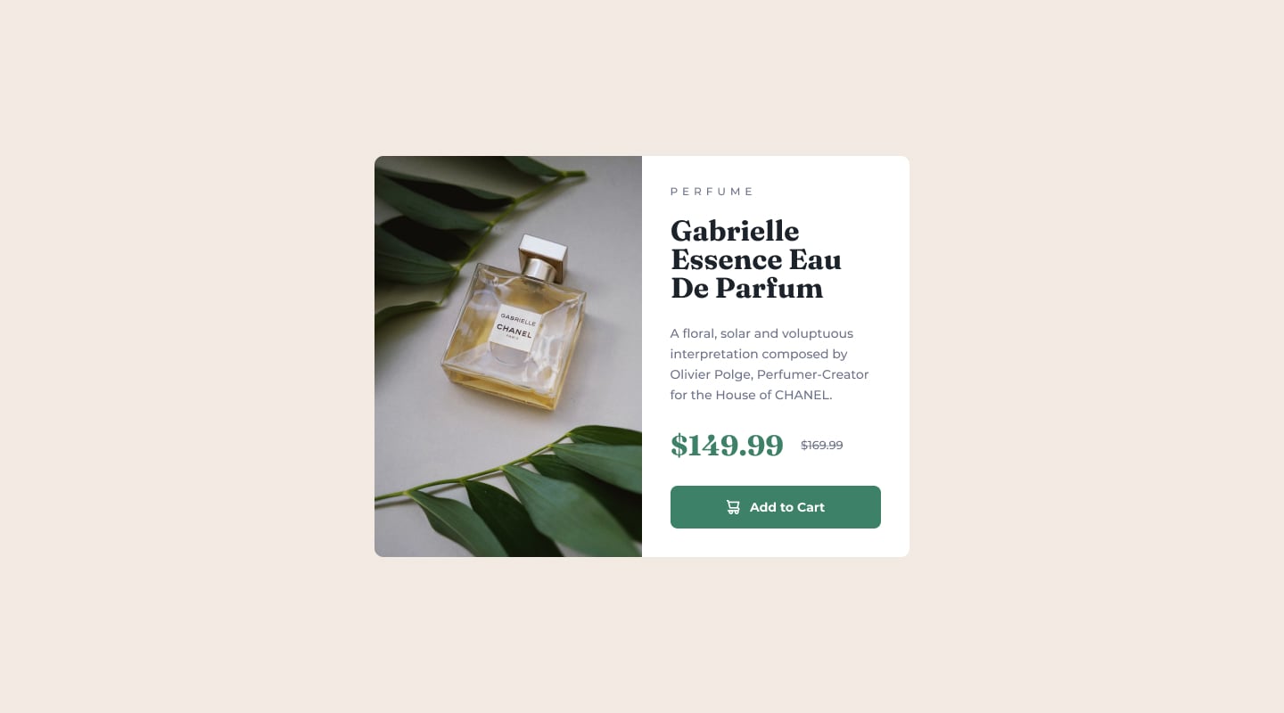
创建一个左右分栏的产品卡片
左侧为产品图片,右侧为产品信息
符合现代电商网站的设计风格
2. 视觉层次
从上到下依次是:
品牌/类别(小字、大写)
产品名称(大号衬线字体)
产品描述(中等字号、灰色)
价格(现价突出)
购买按钮(深色、圆角、悬停效果)
二、代码模块详细讲解
模块1:全局样式与布局
* {
margin: 0;
padding: 0;
box-sizing: border-box;
}
作用:
margin: 0; padding: 0;:清除所有元素的默认边距
box-sizing: border-box;:让元素的宽高包含内边距和边框,布局更容易控制
body {
background-color: #f3ede3;
display: flex;
justify-content: center;
align-items: center;
min-height: 100vh;
margin: 0;
font-family: system-ui, sans-serif;
}
作用:
背景色:温暖的米色背景
Flexbox:让卡片在页面完美居中
min-height: 100vh:占满整个视口高度
字体:使用系统默认字体
模块2:卡片容器
.box {
display: flex;
width: 600px;
background-color: #fff;
border-radius: 10px;
overflow: hidden;
}
作用:
display: flex:创建左右并排布局
width: 600px:固定卡片宽度
background-color: #fff:白色背景
border-radius: 10px:圆角效果
overflow: hidden:防止图片溢出破坏圆角
模块3:左侧图片区域
.left {
width: 300px;
}
.left img {
width: 100%;
height: 100%;
display: block;
object-fit: cover;
}
难点解析:
为什么图片要设置宽高100%?
让图片填满左侧容器
object-fit: cover 的作用?
图片按比例缩放,填满整个容器,可能会裁剪部分内容,但不会变形
display: block 的作用?
消除图片底部默认的3px空隙
模块4:右侧内容区域
.right {
width: 300px;
padding: 32px;
background-color: #fff;
box-sizing: border-box;
}
作用:
width: 300px:与左侧等宽
padding: 32px:内容与边框留白
box-sizing: border-box:让padding包含在300px内,防止内容溢出
.right div {
margin-bottom: 20px;
}
作用:为右侧所有直接子元素添加底部间距,形成垂直节奏
模块5:各个内容块详解
r1 – 品牌/类别
.r1 {
color: #8a8f99;
text-transform: uppercase;
letter-spacing: 4px;
font-size: 12px;
}
设计意图:
灰色文字,视觉上不抢眼
大写字母,增加正式感
大间距字母,体现高端感
小字号,作为次要信息
r2 – 产品名称
.r2 {
font-family: 'Times New Roman', serif;
font-size: 28px;
font-weight: bold;
line-height: 1.1;
}
设计意图:
衬线字体,增加优雅感
大号加粗,突出显示
紧凑行高,适合多行标题
r3 – 产品描述
.r3 {
color: #8a8f99;
font-size: 14px;
line-height: 1.6;
}
设计意图:
灰色文字,视觉层次靠后
适中的字号和行高,提高可读性
r4 – 价格区域(难点)
.r4 span:first-child {
font-size: 28px;
font-weight: bold;
color: #3c8067;
margin-right: 20px;
}
.r4 span:last-child {
color: #8a8f99;
text-decoration: line-through;
font-size: 14px;
}
难点解析:
为什么用 :first-child 和 :last-child?
精确选择两个span,不需要添加额外的类名
设计意图:
现价:大号、绿色、加粗,突出显示
原价:小号、灰色、删除线,表示折扣
间距:margin-right 让两个价格分开
r5 – 按钮
.r5 {
background-color: #1f4b3e;
color: white;
padding: 15px;
text-align: center;
border-radius: 8px;
font-weight: bold;
cursor: pointer;
}
.r5:hover {
background-color: #0f3a2e;
}
难点解析:
为什么不用设置宽高?
宽度:块级元素自动占满父容器
高度:由 padding: 15px + 内容高度自动计算
这是响应式设计的常用技巧
cursor: pointer 的作用?
鼠标悬停时显示手型,提示可点击
颜色变深,提供视觉反馈,提升用户体验
三、技术难点总结
难点1:布局控制
使用Flexbox实现左右分栏
两侧固定等宽300px
难点在于确保内容不溢出
难点2:图片适配
object-fit: cover 的使用
图片可能被裁剪,需要确保关键内容在可视区域内
难点3:价格区域的精确选择
使用 :first-child 和 :last-child 选择器
不需要添加额外的类名,代码更简洁
需要理解子元素的选择逻辑
难点4:按钮的自适应
不设置固定宽高,让内容决定大小
使用 padding 控制内边距
响应式设计的最佳实践
难点5:颜色搭配
主色调:深绿 (#1f4b3e) 和 深绿悬停 (#0f3a2e)
强调色:现价绿色 (#3c8067)
辅助色:灰色 (#8a8f99) 用于次要信息
背景色:米色 (#f3ede3) 营造温暖氛围
完整代码:
<!DOCTYPE html>
<html lang="en">
<head>
<meta charset="UTF-8">
<meta name="viewport" content="width=device-width, initial-scale=1.0">
<link rel="icon" type="image/png" sizes="32×32" href="./images/favicon-32×32.png">
<title>Frontend Mentor | Product preview card component</title>
<style>
* {
margin: 0;
padding: 0;
box-sizing: border-box;
}
body{
background-color: #f3ede3;
display: flex;
justify-content: center;
align-items: center;
min-height: 100vh;
margin: 0;
font-family: system-ui, sans-serif;
}
.box{
display: flex;
width: 600px;
background-color: #fff;
border-radius: 10px;
overflow: hidden;
}
.left{
width: 300px;
}
.left img{
width: 100%;
height: 100%;
display: block;
object-fit: cover;
}
.right{
width: 300px;
padding: 32px;
background-color: #fff;
box-sizing: border-box;
}
/* 修改点:类名更清晰,但保留原有结构 */
.right div {
margin-bottom: 20px;
}
.r1 {
color: #8a8f99;
text-transform: uppercase;
letter-spacing: 4px;
font-size: 12px;
}
.r2 {
font-family: 'Times New Roman', serif;
font-size: 28px;
font-weight: bold;
line-height: 1.1;
}
.r3 {
color: #8a8f99;
font-size: 14px;
line-height: 1.6;
}
.r4 span:first-child {
font-size: 28px;
font-weight: bold;
color: #3c8067;
margin-right: 20px;
}
.r4 span:last-child {
color: #8a8f99;
text-decoration: line-through;
font-size: 14px;
}
.r5 {
background-color: #1f4b3e;
color: white;
padding: 15px;
text-align: center;
border-radius: 8px;
font-weight: bold;
cursor: pointer;
}
.r5:hover {
background-color: #0f3a2e;
}
</style>
</head>
<body>
<div class="box">
<div class="left">
<img src="./images/image-product-desktop.jpg" alt="">
</div>
<div class="right">
<div class="r1">Perfume</div>
<div class="r2">Gabrielle <br> Essence Eau <br> De Parfum</div>
<div class="r3">A floral, solar and voluptuous <br> interpretation composed by <br> Olivier Polge, Perfumer-Creator <br> for the House of CHANEL.</div>
<div class="r4">
<span>$149.99</span>
<span>$169.99</span>
</div>
<div class="r5">Add to Cart</div>
</div>
</div>
</body>
</html>