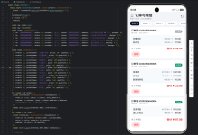
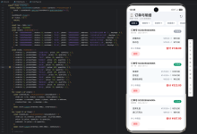
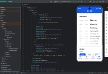
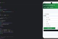
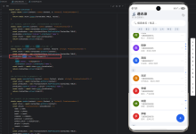
从最外层容器到每一张卡片,我们把布局一层层拆开看。

一、先看全貌
“首页"的整体结构是两个大区块纵向排列——顶部是"英雄卡”,下面是"仪表盘":
对应代码骨架:
if (this.currentTab === 0) {
this.buildHeroCard()
this.buildDashboard()
}
就这么简单。两个 @Builder 方法,一个负责"我现在该关注谁",一个负责"我还能做什么"。
二、最外层:Scroll + Column
Scroll() {
Column({ space: 18 }) {
if (this.currentTab === 0) {
this.buildHeroCard()
this.buildDashboard()
} else if (this.currentTab === 1) {
ContactListView({ … })
} else if (this.currentTab === 2) {
this.buildReminderView()
} else {
this.buildStatsView()
}
}
.padding({ left: 18, right: 18, top: this.currentTab === 0 ? 20 : 18, bottom: this.currentTab === 1 ? 100 : 80 })
.width('100%')
}
.align(Alignment.Top)
.scrollBar(BarState.Off)
.layoutWeight(1)
2.1 Column 的 space: 18
Column({ space: 18 })
HeroCard 和 Dashboard 之间自动有 18vp 的间距,不需要手动写 margin。这比在每个区块底部写 margin({ bottom: 18 }) 更干净——第一个区块顶部不需要间距,最后一个底部也不需要,space 自动处理了这个逻辑。
2.2 padding 统一管理
.padding({ left: 18, right: 18, top: this.currentTab === 0 ? 20 : 18, bottom: this.currentTab === 1 ? 100 : 80 })
左右 18vp 的内边距加在 Column 上,所有子组件自动继承相同的左右边距,不会出现对不齐的问题。
注意 top 值做了条件判断:首页给了 20vp,其他 Tab 给 18vp。因为首页顶部没有独立的标题行,需要多一点呼吸空间。
底部留白也做了区分:人物 Tab(currentTab === 1)给了 100vp,因为那个 Tab 有一个悬浮的 FAB 按钮;其他 Tab 给 80vp 就够了。
2.3 隐藏滚动条
.scrollBar(BarState.Off)
内容型页面,滚动条显得多余。关掉之后视觉更干净。
三、HeroCard:页面的视觉焦点
buildHeroCard() 是首页最核心的区块,包含两部分:三指标行和优先人物卡片。
@Builder
private buildHeroCard() {
Column({ space: 20 }) {
// 三指标行
Row({ space: 12 }) {
this.buildTopStat('总人物', this.totalContacts.toString(), Theme.primary)
this.buildTopStat('待问候', this.pendingCareCount.toString(), Theme.accent)
this.buildTopStat('待回馈', this.needReturnCount.toString(), Theme.success)
}
.width('100%')
// 今日优先维护
Column({ space: 14 }) {
Row() {
Text('今日优先维护')
Blank()
Text('查看全部 >')
}
.width('100%')
// 优先人物卡片
Row({ space: 14 }) { … }
.width('100%')
.padding(18)
.backgroundColor(Theme.getSurface(this.currentMode))
.borderRadius(20)
.shadow({ radius: 12, color: Theme.getShadow(this.currentMode), offsetX: 0, offsetY: 4 })
}
.width('100%')
}
.width('100%')
}
外层 Column({ space: 20 }),指标行和优先人物之间 20vp 间距。内层 Column({ space: 14 }),标题和卡片之间 14vp 间距。两个层级,两种间距,层次分明。
四、三指标行:等宽卡片 + 语义配色
Row({ space: 12 }) {
this.buildTopStat('总人物', this.totalContacts.toString(), Theme.primary)
this.buildTopStat('待问候', this.pendingCareCount.toString(), Theme.accent)
this.buildTopStat('待回馈', this.needReturnCount.toString(), Theme.success)
}
.width('100%')
三个指标水平排列,间距 12vp。每个指标用不同的语义色:
| 总人物 | Theme.primary | #2F80ED 蓝 | 中性统计 |
| 待问候 | Theme.accent | #FF8C66 橙 | 需要行动 |
| 待回馈 | Theme.success | #27B38A 绿 | 正向反馈 |
4.1 buildTopStat 组件
@Builder
private buildTopStat(label: string, value: string, valueColor: string) {
Column({ space: 6 }) {
Text(value)
.fontSize(22)
.fontWeight(FontWeight.Bold)
.fontColor(valueColor)
Text(label)
.fontSize(13)
.fontColor(Theme.getTextSecondary(this.currentMode))
}
.layoutWeight(1)
.padding({ top: 14, bottom: 14 })
.backgroundColor(Theme.getSurface(this.currentMode))
.borderRadius(16)
.shadow({ radius: 8, color: Theme.getShadow(this.currentMode), offsetX: 0, offsetY: 2 })
}
4.2 layoutWeight(1) 等宽
.layoutWeight(1)
三个指标都用 layoutWeight(1),各占 1/3 宽度。这是最简单的等宽三列布局——不需要算百分比,也不需要写固定宽度。
4.3 数值在上、标签在下
Column({ space: 6 }) {
Text(value) // 22 号加粗,彩色
Text(label) // 13 号常规,灰色
}
数值是视觉焦点,22 号字 + 语义色,一眼就能看到。标签是辅助信息,13 号字 + textSecondary 灰色,退到第二层。6vp 的间距让两个文字既不挤在一起,也不会显得太散。
4.4 上下 padding 不等
.padding({ top: 14, bottom: 14 })
只设了上下 padding,没有设左右。因为三个卡片之间已经有 Row({ space: 12 }) 的间距,左右 padding 会让卡片内部文字偏左,和卡片边缘距离不一致。
4.5 轻阴影
.shadow({ radius: 8, color: Theme.getShadow(this.currentMode), offsetX: 0, offsetY: 2 })
radius: 8 是整页最轻的阴影。指标卡片面积小、信息少,不需要太重的阴影。offsetX: 0 让阴影只在下方,模拟自然光从正上方照射的效果。
五、“今日优先维护”:区块标题 + 卡片
5.1 区块标题行
Row() {
Text('今日优先维护')
.fontSize(17)
.fontWeight(FontWeight.Bold)
.fontColor(Theme.getTextPrimary(this.currentMode))
Blank()
Text('查看全部 >')
.fontSize(13)
.fontColor(Theme.getTextSecondary(this.currentMode))
.onClick(() => { this.currentTab = 1; })
}
.width('100%')
经典的"左主右辅"布局:Row + Blank()。
左侧"今日优先维护"是 17 号加粗,右侧"查看全部 >"是 13 号常规灰色。Blank() 把右侧文字推到最右边,无论左侧标题多长,"查看全部"始终右对齐。
5.2 点击跳转
.onClick(() => { this.currentTab = 1; })
"查看全部 >“点击后切换到"人物"Tab。这种跨 Tab 跳转的设计,让首页成为一个"入口汇总”——用户在首页就能触达其他页面的核心功能。
六、优先人物卡片:左图右文 + 里程碑标签
这是首页信息密度最高的区域
Row({ space: 14 }) {
// 头像
Column() {
Text(this.priorityContact.name.substring(0, 1))
.fontSize(20)
.fontWeight(FontWeight.Bold)
.fontColor('#FFFFFF')
}
.width(52)
.height(52)
.backgroundColor(Theme.primary)
.borderRadius(26)
.justifyContent(FlexAlign.Center)
// 右侧信息
Column({ space: 6 }) {
Row({ space: 8 }) {
Text(this.priorityContact.name)
.fontSize(17)
.fontWeight(FontWeight.Bold)
.fontColor(Theme.getTextPrimary(this.currentMode))
.layoutWeight(1)
.maxLines(1)
.textOverflow({ overflow: TextOverflow.Ellipsis })
Text(this.priorityContact.milestone)
.fontSize(11)
.fontColor(Theme.accent)
.padding({ left: 6, right: 6, top: 2, bottom: 2 })
.border({ width: 1, color: Theme.accent })
.borderRadius(8)
}
.width('100%')
Text(this.priorityContact.nextAction)
.fontSize(13)
.fontColor(Theme.getTextSecondary(this.currentMode))
.maxLines(1)
.textOverflow({ overflow: TextOverflow.Ellipsis })
.width('100%')
Text('上次:' + this.priorityContact.lastContactText)
.fontSize(12)
.fontColor(Theme.getTextMuted(this.currentMode))
.maxLines(1)
.textOverflow({ overflow: TextOverflow.Ellipsis })
.width('100%')
}
.layoutWeight(1)
.alignItems(HorizontalAlign.Start)
}
.width('100%')
.padding(18)
.backgroundColor(Theme.getSurface(this.currentMode))
.borderRadius(20)
.shadow({ radius: 12, color: Theme.getShadow(this.currentMode), offsetX: 0, offsetY: 4 })
6.1 头像:52×52 正圆
.width(52)
.height(52)
.borderRadius(26)
52vp 的宽高,borderRadius 设为宽度的一半(26),形成正圆。头像内容取姓名首字:
Text(this.priorityContact.name.substring(0, 1))
这是最简单的"文字头像"方案——不需要图片资源,一个 substring(0, 1) 就能生成。
6.2 里程碑标签:描边药丸
Text(this.priorityContact.milestone)
.fontSize(11)
.fontColor(Theme.accent)
.padding({ left: 6, right: 6, top: 2, bottom: 2 })
.border({ width: 1, color: Theme.accent })
.borderRadius(8)
和常见的"填充药丸"不同,这里用的是描边药丸——文字和边框都是 Theme.accent(#FF8C66),背景是透明的。
描边药丸比填充药丸更轻量,不会抢夺姓名的视觉焦点。11 号字 + 上下 2、左右 6 的 padding,尺寸非常紧凑,刚好够放下"升职后的第一个月"这样的短文字。
6.3 三行文字,三种灰度
右侧信息是三行文字,字号和颜色逐层递减:
| 第一行 | 姓名 + 里程碑 | 17 / 11 | textPrimary / accent | 最强 |
| 第二行 | 下一步行动 | 13 | textSecondary | 中等 |
| 第三行 | 上次互动 | 12 | textMuted | 最弱 |
Theme.getTextPrimary(this.currentMode) // 亮色模式: #162033
Theme.getTextSecondary(this.currentMode) // 亮色模式: #5E6878
Theme.getTextMuted(this.currentMode) // 亮色模式: #98A1B2
三级灰度,用户扫一眼就能区分"这个人是谁"、“我该做什么”、“上次聊了什么”。
6.4 maxLines + textOverflow
.maxLines(1)
.textOverflow({ overflow: TextOverflow.Ellipsis })
三行文字都限制了单行显示,超出部分用省略号。因为这张卡片是"快速扫描"用的,不需要展示完整信息——用户想知道细节,可以点进人物详情页。
6.5 姓名用 layoutWeight(1)
Text(this.priorityContact.name)
.layoutWeight(1)
姓名占据剩余宽度,里程碑标签靠右。如果姓名很长,会被截断而不是把标签挤出去。
七、Dashboard:常用功能 + 近期待办
@Builder
private buildDashboard() {
Column({ space: 24 }) {
// 常用功能
Column({ space: 16 }) { … }
.width('100%')
// 近期待办
Column({ space: 16 }) { … }
.width('100%')
}
.width('100%')
}
外层 Column({ space: 24 }),两个区块之间 24vp 间距。比 HeroCard 内部的 20vp 稍大,因为 Dashboard 两个区块的功能完全不同,需要更明显的视觉分隔。
八、常用功能:4 个快捷入口
Column({ space: 16 }) {
Text('常用功能')
.fontSize(17)
.fontWeight(FontWeight.Bold)
.fontColor(Theme.getTextPrimary(this.currentMode))
.width('100%')
Row() {
this.buildQuickActionItem('人', '新增人物', Theme.getPrimarySoft(this.currentMode), Theme.primary, () => { this.showCreatePanel = true; })
this.buildQuickActionItem('记', '记录往来', Theme.getAccentSoft(this.currentMode), Theme.accent, () => {})
this.buildQuickActionItem('提', '提醒中心', Theme.getSuccessSoft(this.currentMode), Theme.success, () => { this.currentTab = 2; })
this.buildQuickActionItem('统', '关系复盘', Theme.getWarningSoft(this.currentMode), '#D68B00', () => { this.currentTab = 3; })
}
.width('100%')
.justifyContent(FlexAlign.SpaceBetween)
.padding({ left: 4, right: 4 })
}
.width('100%')
8.1 SpaceBetween 四等分
.justifyContent(FlexAlign.SpaceBetween)
4 个入口水平排列,SpaceBetween 让它们均匀分布。配合左右各 4vp 的微调 padding,让最左和最右的入口不会紧贴屏幕边缘。
8.2 buildQuickActionItem 组件
@Builder
private buildQuickActionItem(iconText: string, title: string, bgColor: string, accentColor: string, action: () => void) {
Column({ space: 8 }) {
Row() {
Text(iconText)
.fontSize(18)
.fontWeight(FontWeight.Bold)
.fontColor(accentColor)
}
.width(48)
.height(48)
.justifyContent(FlexAlign.Center)
.backgroundColor(bgColor)
.borderRadius(24)
Text(title)
.fontSize(13)
.fontColor(Theme.getTextPrimary(this.currentMode))
}
.onClick(() => { action(); })
}
8.3 图标区:48×48 圆形 + 浅底深字
.width(48)
.height(48)
.borderRadius(24)
48vp 的圆形,比优先人物的头像(52×52)稍小。因为快捷入口的图标是功能性的,不需要像人物头像那样醒目。
每个入口的配色方案是"浅底 + 深字":
| 新增人物 | primarySoft (#EAF2FD) | primary (#2F80ED) | 主操作 |
| 记录往来 | accentSoft (#FFF1EB) | accent (#FF8C66) | 活跃记录 |
| 提醒中心 | successSoft (#E8F8F2) | success (#27B38A) | 正向提醒 |
| 关系复盘 | warningSoft (#FFF7DF) | #D68B00 | 注意事项 |
浅底色和深文字是同一色系的不同明度,视觉上既统一又有区分。这种配色方案和三指标行的语义色一脉相承——整个首页的色彩体系是连贯的。
8.4 文字图标 vs SymbolGlyph
Text(iconText) // '人'、'记'、'提'、'统'
快捷入口用的是单字文字图标,而不是 SymbolGlyph 系统图标。原因很简单:这四个功能是应用特有的,系统图标库里没有完全对应的符号。用单字图标反而更直观——"人"就是新增人物,"记"就是记录往来,不需要用户去猜图标的含义。
九、近期待办:左侧色条 + 右侧信息
Column({ space: 16 }) {
Text('近期待办')
.fontSize(17)
.fontWeight(FontWeight.Bold)
.fontColor(Theme.getTextPrimary(this.currentMode))
.width('100%')
Column({ space: 12 }) {
ForEach(this.upcomingContacts, (item: ContactProfile) => {
Row({ space: 12 }) {
Column()
.width(4)
.height(40)
.backgroundColor(Theme.primary)
.borderRadius(2)
Column({ space: 6 }) {
Row() {
Text(item.name)
.fontSize(15)
.fontWeight(FontWeight.Bold)
.fontColor(Theme.getTextPrimary(this.currentMode))
Blank()
Text(item.relation)
.fontSize(12)
.fontColor(Theme.getTextSecondary(this.currentMode))
}
.width('100%')
Text(item.nextAction)
.fontSize(13)
.fontColor(Theme.getTextSecondary(this.currentMode))
.maxLines(1)
.textOverflow({ overflow: TextOverflow.Ellipsis })
.width('100%')
}
.layoutWeight(1)
}
.width('100%')
.padding(16)
.backgroundColor(Theme.getSurface(this.currentMode))
.borderRadius(16)
.shadow({ radius: 8, color: Theme.getShadow(this.currentMode), offsetX: 0, offsetY: 2 })
}, (item: ContactProfile) => item.id + '_' + item.name + '_' + item.relation + '_' + item.nextAction)
}
.width('100%')
}
.width('100%')
9.1 左侧色条:4×40 的竖线
Column()
.width(4)
.height(40)
.backgroundColor(Theme.primary)
.borderRadius(2)
这是整页最有设计感的一个细节。4vp 宽、40vp 高的蓝色竖条,borderRadius(2) 让两端微微圆角。
色条的作用是视觉锚点——当列表有多条待办时,用户的视线会自然沿着左侧色条从上往下扫,快速识别每条待办。
9.2 为什么不用 Divider 分隔
待办列表用的是 Column({ space: 12 }),卡片之间靠 12vp 的间距分隔,没有用 Divider。
因为每张卡片都有独立的白色背景和阴影,卡片之间已经有足够的视觉分隔。再加 Divider 反而会显得累赘。
9.3 ForEach 的 key 生成
(item: ContactProfile) => item.id + '_' + item.name + '_' + item.relation + '_' + item.nextAction
key 由多个字段拼接而成,确保列表更新时能正确复用组件。如果只用 item.id,当同一个人的关系或待办发生变化时,组件可能不会重新渲染。
9.4 卡片外壳
.padding(16)
.borderRadius(16)
.shadow({ radius: 8, color: Theme.getShadow(this.currentMode), offsetX: 0, offsetY: 2 })
待办卡片比优先人物卡片更轻:padding(16) vs padding(18),borderRadius(16) vs borderRadius(20),shadow radius: 8 vs shadow radius: 12。
因为待办列表通常有 3 条,卡片太重会让页面显得拥挤。轻一点的卡片让列表更透气。
十、暗色模式适配
整个首页没有一处硬编码颜色,全部通过 Theme 工具类获取:
Theme.getBackground(this.currentMode) // 亮: #F5F7FB 暗: #0F1218
Theme.getSurface(this.currentMode) // 亮: #FFFFFF 暗: #1A1D24
Theme.getTextPrimary(this.currentMode) // 亮: #162033 暗: #E5EAF5
Theme.getTextSecondary(this.currentMode) // 亮: #5E6878 暗: #98A1B2
Theme.getTextMuted(this.currentMode) // 亮: #98A1B2 暗: #748094
Theme.getPrimarySoft(this.currentMode) // 亮: #EAF2FD 暗: #1B2742
Theme.getShadow(this.currentMode) // 亮: #1E24304C 暗: #66000000
currentMode 来自:
@StorageProp('currentColorMode') currentMode: number = ConfigurationConstant.ColorMode.COLOR_MODE_LIGHT;
@StorageProp 让组件自动监听系统主题变化。用户切换暗色模式时,所有颜色自动更新,不需要手动刷新。
10.1 语义色不随主题变
注意 Theme.primary(#2F80ED)、Theme.accent(#FF8C66)、Theme.success(#27B38A)这些语义色是 static readonly,不随主题变化。
因为语义色代表的是"含义"而不是"外观"——蓝色永远是"主操作",橙色永远是"需要行动",无论亮色还是暗色模式,这些含义不应该改变。
十一、首页的布局模式总结
回顾整个首页,其实只用了三种布局模式:
11.1 纵向流式:Column + width(‘100%’)
页面整体、HeroCard、Dashboard,都是 Column 从上到下排列。间距靠 Column({ space: N }) 统一管理,不需要每个子组件单独写 margin。
这是最常用的模式,占页面布局的 80%。
11.2 左右对称:Row + Blank()
区块标题行(“今日优先维护” + “查看全部 >”)、待办卡片内部(姓名 + 关系),都用 Row + Blank() 实现左右分布。
左侧内容 ──── Blank() ──── 右侧内容
Blank() 比写 justifyContent(FlexAlign.SpaceBetween) 更灵活,因为左右两侧的宽度可以自适应。
11.3 等宽分布:layoutWeight(1) 或 SpaceBetween
三指标行用 layoutWeight(1) 实现三等分,快捷入口用 SpaceBetween 实现四等分。两种方案的选择依据:
- 子组件需要填满剩余空间 → layoutWeight(1)
- 子组件自适应宽度、均匀分布 → SpaceBetween
十二、总结
这篇我们纯从布局角度拆解了"首页"页面,核心要点:
布局不需要花哨,把这几个模式用好,大部分页面都能搭出来。