深色主题与样式系统
这是「从零搭建灌装监控系统」系列第4篇。上一篇搞定了导航,但界面还是默认白底蓝按钮,丑得像上个世纪的 WinForms。这篇用 ResourceDictionary 建一套深色主题系统,统一管理颜色画刷和控件样式,让整个应用一键换上工业上位机该有的深色专业风。
白底界面的灾难
我朋友把导航搞通之后,兴冲冲地给我看效果。功能没问题,但界面……白底黑字,按钮是 Windows 默认那种灰蓝色,TextBox 带个 3D 边框,DataGrid 交替行是浅蓝色。
我说你这界面放到工厂车间的大屏上,操作员得投诉。车间环境光线复杂,白底高亮刺眼,长时间盯着眼睛累。工业上位机基本都用深色主题——VS Code、各种 IDE、组态软件,清一色深色。不只是好看,是减少视觉疲劳 + 突出数据。
他开始改颜色。在 MainWindow.xaml 里给每个控件加 Background="#1E1E1E"、Foreground="White"。改完一个控件一个控件地改,改到第十个发现——颜色值散落在十几个文件里,想统一调整得一个个找。
更恶心的是,他想加个"选中高亮"效果,得给每个按钮单独写 Trigger。10 个按钮 10 套 Trigger,改一个颜色改 10 遍。
问题出在哪?颜色和样式硬编码在每个控件上,没有统一管理。 改一个颜色要改 N 个地方,加一个效果要重复 N 次。
正确做法是——把颜色、画刷、样式抽到 ResourceDictionary 里,全局引用,一处改全局生效。
ResourceDictionary:样式的"仓库"
ResourceDictionary 是 WPF 的资源字典,可以理解为样式的"仓库"。你把颜色、画刷、样式定义在里面,整个应用都能通过 key 引用。
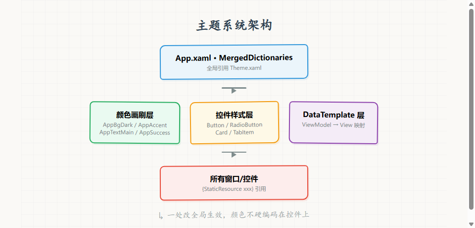
三层结构:
好处:
- 一处改全局生效 — 改 AppBgDark 画刷颜色,所有引用它的地方都变
- 统一视觉语言 — 所有按钮一个样式,不会出现"这个蓝那个绿"
- 换肤简单 — 想做亮色主题?新建一个 LightTheme.xaml,改一行引用就切
第一步:创建 Theme.xaml
在 Assests/Styles/ 下新建 Theme.xaml(注意这个项目目录拼成 Assests 是历史遗留,别改):
<ResourceDictionary xmlns="http://schemas.microsoft.com/winfx/2006/xaml/presentation"
xmlns:x="http://schemas.microsoft.com/winfx/2006/xaml"
xmlns:vm="clr-namespace:FillTrack.ViewModels"
xmlns:views="clr-namespace:FillTrack.Views">
<!– 颜色画刷定义 –>
</ResourceDictionary>
1.1 颜色画刷体系
工业上位机的深色主题,颜色分五类:
<!– === 背景色系(从深到浅)=== –>
<SolidColorBrush x:Key="AppBgDark" Color="#1E1E1E"/> <!– 主背景,最深 –>
<SolidColorBrush x:Key="AppBgPanel" Color="#252526"/> <!– 面板背景 –>
<SolidColorBrush x:Key="AppBgHeader" Color="#2D2D30"/> <!– 顶栏/表头背景 –>
<!– === 强调色 === –>
<SolidColorBrush x:Key="AppAccentColor" Color="#007ACC"/> <!– 主按钮、选中态 –>
<!– === 文本色系 === –>
<SolidColorBrush x:Key="AppTextMain" Color="#FFFFFF"/> <!– 主文本 –>
<SolidColorBrush x:Key="AppTextMuted" Color="#AAAAAA"/> <!– 次要文本 –>
<!– === 状态色 === –>
<SolidColorBrush x:Key="AppSuccess" Color="#4CAF50"/> <!– 正常/成功 –>
<SolidColorBrush x:Key="AppInfo" Color="#2196F3"/> <!– 信息/提示 –>
<SolidColorBrush x:Key="AppWarning" Color="#FF9800"/> <!– 警告 –>
<SolidColorBrush x:Key="AppDanger" Color="#d50000"/> <!– 错误/危险 –>
<!– === 通用边框 === –>
<SolidColorBrush x:Key="AppBorderBrush" Color="#3E3E42"/>
这套颜色不是随便选的,参考的是 VS Code 深色主题:
| AppBgDark | #1E1E1E | 主背景,大面积 |
| AppBgPanel | #252526 | 卡片、面板内部 |
| AppBgHeader | #2D2D30 | 顶栏、表头,比主背景稍亮 |
| AppAccentColor | #007ACC | 强调操作(主按钮、选中导航) |
| AppTextMain | #FFFFFF | 标题、重要数据 |
| AppTextMuted | #AAAAAA | 说明文字、次要信息 |
| AppSuccess/Warning/Danger | 绿/橙/红 | 状态指示灯、报警级别 |
层次感靠背景色深浅差异——主背景最深,面板稍亮,顶栏再亮一点。不用边框,靠明暗差区分区域。
1.2 在 App.xaml 引用
<Application.Resources>
<ResourceDictionary>
<ResourceDictionary.MergedDictionaries>
<ResourceDictionary Source="/Assests/Styles/Theme.xaml"/>
</ResourceDictionary.MergedDictionaries>
</ResourceDictionary>
</Application.Resources>
MergedDictionaries 把 Theme.xaml 合并到全局资源。之后任何 XAML 里用 {StaticResource AppBgDark} 都能取到。
第二步:按钮样式
WPF 默认按钮是灰底圆角,带 3D 凸起效果。深色主题里要改成扁平化——纯色背景、无 3D、hover 变透明度。
<Style TargetType="Button">
<Setter Property="Foreground" Value="White"/>
<Setter Property="Background" Value="{StaticResource AppAccentColor}"/>
<Setter Property="BorderThickness" Value="0"/>
<Setter Property="Padding" Value="12,8"/>
<Setter Property="Cursor" Value="Hand"/>
<Setter Property="FontSize" Value="14"/>
<Setter Property="Template">
<Setter.Value>
<ControlTemplate TargetType="Button">
<Border Background="{TemplateBinding Background}"
BorderBrush="{TemplateBinding BorderBrush}"
BorderThickness="{TemplateBinding BorderThickness}"
CornerRadius="2">
<ContentPresenter HorizontalAlignment="Center"
VerticalAlignment="Center"/>
</Border>
<ControlTemplate.Triggers>
<Trigger Property="IsMouseOver" Value="True">
<Setter Property="Opacity" Value="0.8"/>
</Trigger>
<Trigger Property="IsEnabled" Value="False">
<Setter Property="Opacity" Value="0.5"/>
</Trigger>
</ControlTemplate.Triggers>
</ControlTemplate>
</Setter.Value>
</Setter>
</Style>
关键点:
- TargetType="Button" 不加 x:Key — 这样所有 Button 默认用这个样式,不用每个按钮手动指定
- Template 重写 — 去掉默认 3D 效果,用 Border + ContentPresenter 实现扁平化
- CornerRadius="2" — 微圆角,比直角柔和,比大圆角硬朗
- Trigger — hover 时 Opacity=0.8(变暗),disabled 时 Opacity=0.5(半透明)
轮廓按钮样式
有时候需要次要按钮(如"取消"),用透明背景+边框:
<Style x:Key="OutlineButton" TargetType="Button" BasedOn="{StaticResource {x:Type Button}}">
<Setter Property="Background" Value="Transparent"/>
<Setter Property="BorderBrush" Value="{StaticResource AppBorderBrush}"/>
<Setter Property="BorderThickness" Value="1"/>
<Setter Property="Foreground" Value="{StaticResource AppTextMuted}"/>
</Style>
BasedOn 继承基础按钮样式,只改背景和边框。用的时候 Style="{StaticResource OutlineButton}"。
第三步:导航项样式
导航菜单的 RadioButton 要做成左边框高亮的选中效果:
<Style x:Key="NavItemStyle" TargetType="RadioButton">
<Setter Property="Foreground" Value="{StaticResource AppTextMuted}"/>
<Setter Property="Background" Value="Transparent"/>
<Setter Property="BorderBrush" Value="Transparent"/>
<Setter Property="BorderThickness" Value="3,0,0,0"/> <!– 左边框 3px –>
<Setter Property="Padding" Value="20,15"/>
<Setter Property="Cursor" Value="Hand"/>
<Setter Property="FontSize" Value="14"/>
<Setter Property="Template">
<Setter.Value>
<ControlTemplate TargetType="RadioButton">
<Border Background="{TemplateBinding Background}"
BorderBrush="{TemplateBinding BorderBrush}"
BorderThickness="{TemplateBinding BorderThickness}"
Padding="{TemplateBinding Padding}">
<ContentPresenter/>
</Border>
</ControlTemplate>
</Setter.Value>
</Setter>
<Style.Triggers>
<Trigger Property="IsChecked" Value="True">
<Setter Property="BorderBrush" Value="{StaticResource AppAccentColor}"/>
<Setter Property="Foreground" Value="{StaticResource AppTextMain}"/>
<Setter Property="Background" Value="#2A2A2D"/>
</Setter>
<Trigger Property="IsMouseOver" Value="True">
<Setter Property="Background" Value="#2A2A2D"/>
</Trigger>
</Style.Triggers>
</Style>
关键点:
- BorderThickness="3,0,0,0" — 只左边框 3px,其他边 0
- Style.Triggers — 选中时左边框变强调色、文字变白、背景变深
- hover 效果 — 未选中时 hover 也有背景变化,给用户反馈
第四步:卡片样式
数据展示区常用卡片,统一定义 CardStyle:
<Style x:Key="CardStyle" TargetType="Border">
<Setter Property="Background" Value="{StaticResource AppBgDark}"/>
<Setter Property="BorderBrush" Value="{StaticResource AppBorderBrush}"/>
<Setter Property="BorderThickness" Value="1"/>
<Setter Property="CornerRadius" Value="4"/>
<Setter Property="Padding" Value="15"/>
</Style>
用的时候:
<Border Style="{StaticResource CardStyle}">
<StackPanel>
<TextBlock Text="实际产量" Foreground="{StaticResource AppTextMuted}"/>
<TextBlock Text="{Binding ActualCount}" FontSize="36" FontWeight="Bold"
Foreground="{StaticResource AppTextMain}"/>
</StackPanel>
</Border>
第五步:DataTemplate 也放这里
上一篇的 ViewModel→View 映射 DataTemplate 也放在 Theme.xaml 里(因为需要全局可用):
<DataTemplate DataType="{x:Type vm:DashboardViewModel}">
<views:DashboardView/>
</DataTemplate>
<DataTemplate DataType="{x:Type vm:DataQueryViewModel}">
<views:DataQueryView/>
</DataTemplate>
<!– … 其他 ViewModel 映射 –>
Theme.xaml 顶部要加 ViewModel 和 View 的命名空间引用:
xmlns:vm="clr-namespace:FillTrack.ViewModels"
xmlns:views="clr-namespace:FillTrack.Views"
进阶:状态指示配色
工业上位机里状态颜色有行业标准,不能随便选:
| 绿色 | #4CAF50 | 运行正常 |
| 黄色 | #FF9800 | 警告/注意 |
| 红色 | #d50000 | 故障/危险 |
| 蓝色 | #2196F3 | 信息/通信 |
| 灰色 | #AAAAAA | 离线/未知 |
这套配色对应工业三色灯标准(红黄绿),操作员一看颜色就知道状态,不用读文字。后面第18篇自定义控件会用到这套颜色。
<!– 在 Theme.xaml 里定义好,后续控件直接引用 –>
<SolidColorBrush x:Key="AppSuccess" Color="#4CAF50"/> <!– 绿 –>
<SolidColorBrush x:Key="AppWarning" Color="#FF9800"/> <!– 黄 –>
<SolidColorBrush x:Key="AppDanger" Color="#d50000"/> <!– 红 –>
踩坑记录
| StaticResource 找不到 | 抛 XamlParseException “找不到 AppBgDark” | Theme.xaml 没在 App.xaml 里合并,或引用路径写错 | 检查 MergedDictionaries 的 Source 路径 |
| 样式不生效 | 按钮还是默认灰蓝色 | Style 加了 x:Key 但没在按钮上引用,或 TargetType 写错 | 全局样式不加 x:Key;要 x:Key 的必须手动 Style=“{StaticResource xxx}” |
| 颜色不跟随主题 | 改了画刷颜色但界面没变 | 控件硬编码了颜色值(如 Background=“#1E1E1E”)而不是引用画刷 | 全部改用 {StaticResource xxx} 引用 |
| BasedOn 报错 | “找不到成员 ‘BasedOn’” | BasedOn 的值写成了字符串而非 StaticResource | 用 BasedOn=“{StaticResource {x:Type Button}}” 继承默认样式 |
| DataTemplate 放错位置 | 导航不生效 | DataTemplate 写在 Window.Resources 里,作用域只限当前窗口 | 放在 App.xaml 全局资源或合并的 Theme.xaml 里 |
第三个坑最常见。我朋友一开始在按钮上写 Background="#007ACC",后来想改强调色,改了 AppAccentColor 画刷但按钮没变——因为按钮硬编码了颜色值,没引用画刷。一个个找出来改成 {StaticResource AppAccentColor} 才行。
规则:XAML 里不写裸颜色值,全部用画刷引用。 除非那个颜色只用一次且永远不会改。
本篇小结
| 资源字典 | <ResourceDictionary xmlns="…"> |
| 颜色画刷 | <SolidColorBrush x:Key="AppBgDark" Color="#1E1E1E"/> |
| 全局引用 | {StaticResource AppBgDark} |
| 全局按钮样式 | <Style TargetType="Button"> 不加 x:Key |
| 带 key 的样式 | <Style x:Key="OutlineButton" BasedOn="…"> |
| 导航项选中效果 | Style.Triggers + IsChecked Trigger |
| 卡片样式 | CardStyle Border 样式 |
| DataTemplate 映射 | <DataTemplate DataType="{x:Type vm:XxxVM}"> |
从颜色散落十几个文件,到统一收进 Theme.xaml——一处改全局生效,视觉语言统一,加新控件直接引用画刷。这就是样式系统的价值。
但到目前为止,我们的系统还只是个空壳——界面能切了,样式好看了,但没接 PLC,数据全是 0。下一篇开始讲 Modbus RTU 协议,搞清楚上位机怎么跟 PLC 通信,为后续接入真实设备打基础。
下期预告
第5篇:Modbus RTU 协议入门
我们将从零讲 Modbus RTU 协议——主从模型、四种寄存器、报文格式、CRC 校验。不背协议规范,用灌装线的实际数据(产量、温度、液位)讲清楚每个寄存器怎么映射,为下篇写 PlcService 做准备。