前言
Flutter是Google开发的开源UI工具包,支持用一套代码构建iOS、Android、Web、Windows、macOS和Linux六大平台应用,实现"一次编写,多处运行"。
OpenHarmony是由开放原子开源基金会运营的分布式操作系统,为全场景智能设备提供统一底座,具有多设备支持、模块化设计、分布式能力和开源开放等特性。
Flutter for OpenHarmony技术方案使开发者能够:
该集成方案结合了Flutter的高效开发优势和OpenHarmony的分布式特性,可显著提升跨平台应用开发效率。
本文详细解析了当前项目中的 Flutter 高性能长列表实现。该应用使用 5000 条模拟数据,通过 ListView.builder 式懒加载、固定高度(itemExtent)、cacheExtent 预加载、RepaintBoundary 重绘隔离等技巧,实现流畅滚动与较低内存占用。最终实现 固定头部 + CustomScrollView + SliverFixedExtentList,列表项抽离为独立组件并包裹 RepaintBoundary,数据采用 Iterable 懒生成,避免一次性占用大量内存。
先看效果
Flutte实现的 web端实时预览 完整效果 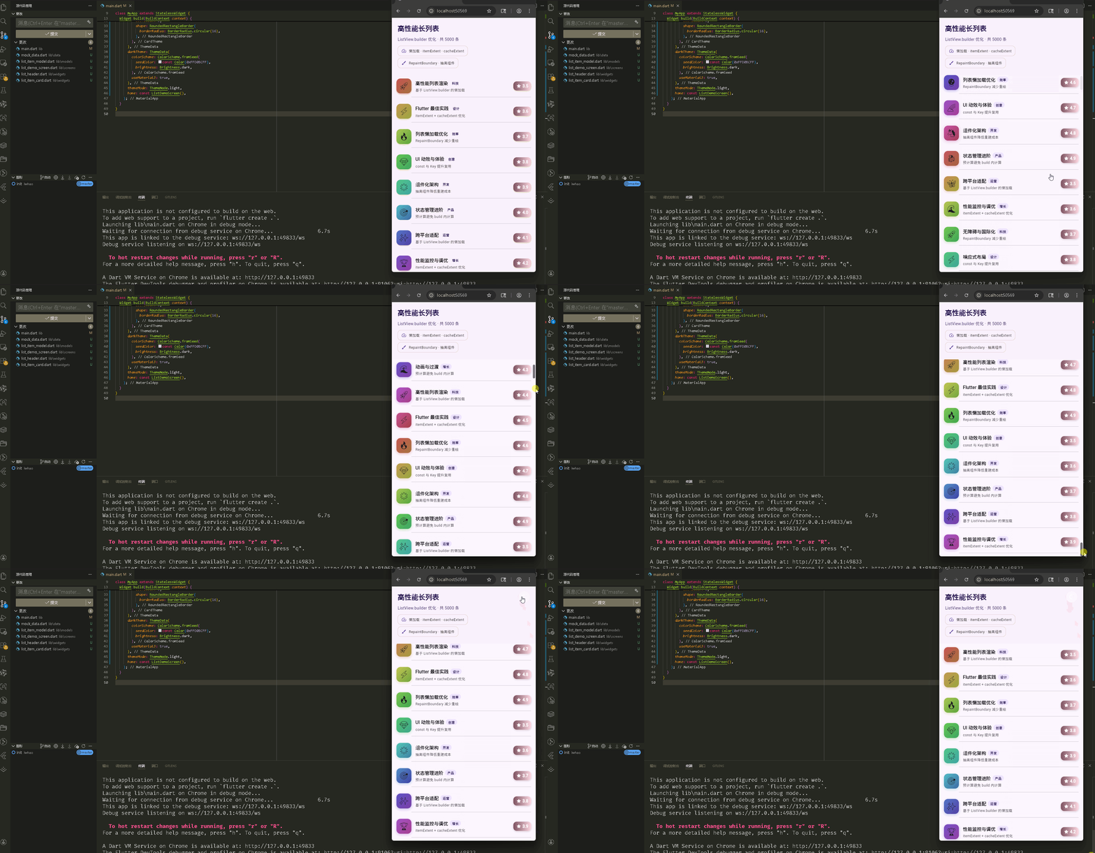
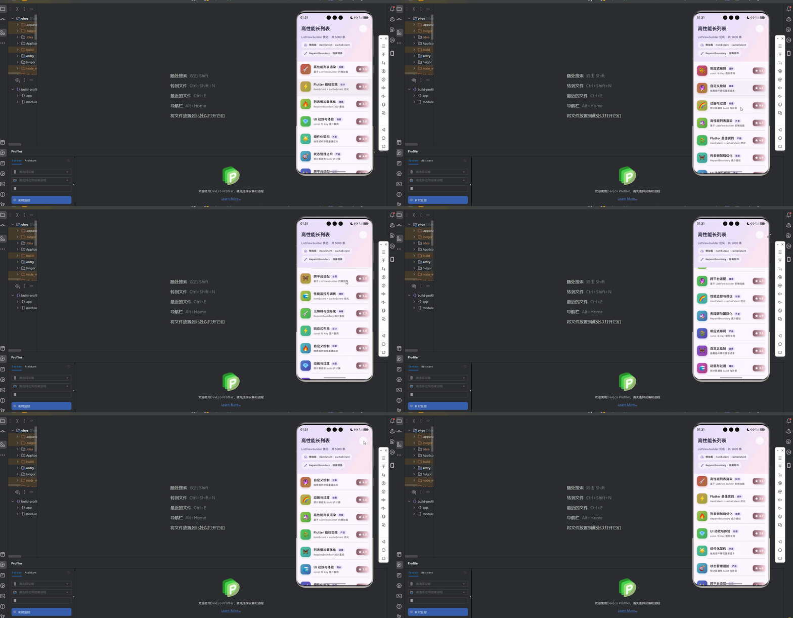
在meta70 pro 真机模拟器上成功运行后的效果
📋 目录
项目结构说明
- 文件目录结构
- 文件说明
- 组件依赖关系
- 数据流向
应用入口
- main() 函数
- MyApp 类 – 主题配置
列表页面 (ListDemoScreen)
- 类定义与数据
- 滚动与刷新
- 列表布局结构
- 列表项构建与点击
列表项组件 (ListItemCard)
- 固定高度与 RepaintBoundary
- 卡片布局与子组件
- 头像、内容、分类、评分
头部组件 (ListHeader)
- 组件定义与渐变背景
- 玻璃态标签 _GlassChip
数据模型与 Mock 数据
- ListItemModel 类
- generateListItems 懒生成
性能优化要点
- 固定高度 itemExtent
- 懒加载与 cacheExtent
- RepaintBoundary 与 addRepaintBoundaries
- addAutomaticKeepAlives
使用示例
📁 项目结构说明
文件目录结构
lib/
├── main.dart # 应用入口
├── data/
│ └── mock_data.dart # 模拟数据(懒生成 Iterable)
├── models/
│ └── list_item_model.dart # 列表项数据模型
├── screens/
│ └── list_demo_screen.dart # 长列表演示页
└── widgets/
├── list_header.dart # 列表顶部头部
└── list_item_card.dart # 单条列表项卡片
文件说明
| main.dart | 入口函数、MyApp、Material 主题(亮/暗)、home 为 ListDemoScreen |
| mock_data.dart | generateListItems(count) 返回 Iterable,懒生成列表项,避免一次性分配 5000 个对象 |
| list_item_model.dart | ListItemModel:id、title、subtitle、avatarEmoji、score、category;重写 == 和 hashCode |
| list_demo_screen.dart | ListDemoScreen:固定头部 + CustomScrollView + SliverFixedExtentList + SliverChildBuilderDelegate |
| list_header.dart | ListHeader:渐变背景、标题、条数、刷新按钮、玻璃态说明标签 |
| list_item_card.dart | ListItemCard:固定高度常量 kListItemHeight、RepaintBoundary、头像/内容/分类/评分子组件 |
组件依赖关系
main.dart
└── screens/list_demo_screen.dart
├── data/mock_data.dart
├── models/list_item_model.dart
├── widgets/list_header.dart
└── widgets/list_item_card.dart
└── models/list_item_model.dart
数据流向
应用入口
1. main() 函数
import 'package:flutter/material.dart';
import 'screens/list_demo_screen.dart';
void main() {
runApp(const MyApp());
}
应用入口,仅挂载 MyApp,首页为 ListDemoScreen。
2. MyApp 类 – 主题配置
class MyApp extends StatelessWidget {
const MyApp({super.key});
Widget build(BuildContext context) {
return MaterialApp(
title: '高性能长列表演示',
debugShowCheckedModeBanner: false,
theme: ThemeData(
colorScheme: ColorScheme.fromSeed(
seedColor: const Color(0xFF6750A4),
brightness: Brightness.light,
primary: const Color(0xFF6750A4),
secondary: const Color(0xFF625B71),
tertiary: const Color(0xFF7D5260),
),
useMaterial3: true,
fontFamily: 'Roboto',
appBarTheme: const AppBarTheme(centerTitle: true, elevation: 0),
cardTheme: CardTheme(
elevation: 2,
shape: RoundedRectangleBorder(
borderRadius: BorderRadius.circular(16),
),
),
),
darkTheme: ThemeData(
colorScheme: ColorScheme.fromSeed(
seedColor: const Color(0xFFD0BCFF),
brightness: Brightness.dark,
),
useMaterial3: true,
),
themeMode: ThemeMode.light,
home: const ListDemoScreen(),
);
}
}
配置亮色/暗色主题与卡片圆角,首页为 ListDemoScreen。
列表页面 (ListDemoScreen)
1. 类定义与数据
/// 高性能长列表演示页 – ListView.builder 优化技巧
class ListDemoScreen extends StatefulWidget {
const ListDemoScreen({super.key});
State<ListDemoScreen> createState() => _ListDemoScreenState();
}
class _ListDemoScreenState extends State<ListDemoScreen> {
/// 数据只构建一次,避免重复创建
late final List<ListItemModel> _items =
generateListItems(count: 5000).toList();
static const int _itemCount = 5000;
final ScrollController _scrollController = ScrollController();
_items 用 late final 且只在首次访问时通过 generateListItems(count: 5000).toList() 赋值,保证只构建一次。_itemCount 与列表长度一致,供 Sliver 的 childCount 使用。
2. 滚动与刷新
void dispose() {
_scrollController.dispose();
super.dispose();
}
void _onRefresh() {
_scrollController.animateTo(
0,
duration: const Duration(milliseconds: 400),
curve: Curves.easeOutCubic,
);
}
dispose 时释放 ScrollController。刷新时仅滚动回顶部(若需重新拉取数据,可在此处 setState 更新 _items)。
3. 列表布局结构
Widget build(BuildContext context) {
return Scaffold(
body: Column(
children: [
// 固定头部,滚动时始终可见
ListHeader(
itemCount: _itemCount,
onRefresh: _onRefresh,
),
Expanded(
child: CustomScrollView(
controller: _scrollController,
cacheExtent: 800, // 可视区域外预加载像素
slivers: [
SliverFixedExtentList(
itemExtent: kListItemHeight, // 固定高度,避免测量
delegate: SliverChildBuilderDelegate(
_buildItem,
childCount: _itemCount,
addRepaintBoundaries: true,
addAutomaticKeepAlives: false,
),
),
],
),
),
],
),
);
}
Column 上为固定 ListHeader,下为 Expanded + CustomScrollView。SliverFixedExtentList 配合固定 itemExtent,列表区只负责裁剪与滚动,不测量子项高度。
4. 列表项构建与点击
/// itemBuilder 抽离为方法,便于复用与维护;使用 ValueKey 提升复用
Widget _buildItem(BuildContext context, int index) {
final item = _items[index];
return ListItemCard(
key: ValueKey<int>(item.id),
item: item,
onTap: () => _onItemTap(item),
);
}
void _onItemTap(ListItemModel item) {
ScaffoldMessenger.of(context).showSnackBar(
SnackBar(
content: Text('${item.title} · ${item.score}'),
behavior: SnackBarBehavior.floating,
duration: const Duration(milliseconds: 1200),
),
);
}
使用 ValueKey<int>(item.id) 有利于 Flutter 复用 Element,减少不必要的重建。点击项时弹出 SnackBar 显示标题与分数。
列表项组件 (ListItemCard)
1. 固定高度与 RepaintBoundary
/// 列表项固定高度(用于 itemExtent 优化,避免动态测量)
const double kListItemHeight = 88.0;
/// 高性能列表项卡片 – 抽离组件,使用 RepaintBoundary 隔离重绘
class ListItemCard extends StatelessWidget {
const ListItemCard({
super.key,
required this.item,
this.onTap,
});
final ListItemModel item;
final VoidCallback? onTap;
Widget build(BuildContext context) {
return RepaintBoundary(
child: Material(
color: Colors.transparent,
child: InkWell(
onTap: onTap,
splashColor: Theme.of(context).colorScheme.primary.withValues(alpha: 0.2),
highlightColor: Theme.of(context).colorScheme.primary.withValues(alpha: 0.1),
child: Column(
mainAxisSize: MainAxisSize.min,
children: [
Padding(
padding: const EdgeInsets.symmetric(horizontal: 16, vertical: 12),
child: Row(
crossAxisAlignment: CrossAxisAlignment.center,
children: [
_Avatar(emoji: item.avatarEmoji, index: item.id),
const SizedBox(width: 14),
Expanded(
child: _Content(
title: item.title,
subtitle: item.subtitle,
category: item.category,
),
),
_ScoreBadge(score: item.score),
],
),
),
Divider(height: 1, indent: 68, endIndent: 16),
],
),
),
),
);
}
}
kListItemHeight 与 SliverFixedExtentList 的 itemExtent 一致,保证列表只做裁剪不做测量。RepaintBoundary 将本条与其它列表项重绘隔离,有利于滚动性能。
2. 卡片布局与子组件
同上代码:单行 Row 内从左到右为头像、内容(标题+副标题+分类)、评分徽章;底部一条 Divider。内容区用 Expanded 占满剩余宽度,避免溢出。
3. 头像、内容、分类、评分
/// 头像 – 独立 RepaintBoundary 可选,此处由父级统一包裹
class _Avatar extends StatelessWidget {
const _Avatar({required this.emoji, required this.index});
final String emoji;
final int index;
Widget build(BuildContext context) {
final hue = (index * 37) % 360.0;
return Container(
width: 52,
height: 52,
decoration: BoxDecoration(
gradient: LinearGradient(
begin: Alignment.topLeft,
end: Alignment.bottomRight,
colors: [
HSLColor.fromAHSL(1, hue, 0.5, 0.55).toColor(),
HSLColor.fromAHSL(1, (hue + 30) % 360, 0.45, 0.45).toColor(),
],
),
borderRadius: BorderRadius.circular(14),
boxShadow: [
BoxShadow(
color: HSLColor.fromAHSL(0.35, hue, 0.5, 0.5).toColor(),
blurRadius: 8,
offset: const Offset(0, 3),
),
],
),
alignment: Alignment.center,
child: Text(emoji, style: const TextStyle(fontSize: 26)),
);
}
}
头像根据 index 用 HSL 生成不同渐变色,避免重复颜色。_Content、_CategoryChip、_ScoreBadge 使用主题色与文字样式,此处不重复贴代码;逻辑均为:标题+分类芯片一行,副标题一行,右侧为星级评分徽章。
头部组件 (ListHeader)
1. 组件定义与渐变背景
/// 列表顶部炫酷头部 – 渐变 + 玻璃态
class ListHeader extends StatelessWidget {
const ListHeader({
super.key,
required this.itemCount,
this.onRefresh,
});
final int itemCount;
final VoidCallback? onRefresh;
Widget build(BuildContext context) {
final theme = Theme.of(context);
return Container(
padding: EdgeInsets.only(
left: 20,
right: 20,
top: MediaQuery.paddingOf(context).top + 16,
bottom: 24,
),
decoration: BoxDecoration(
gradient: LinearGradient(
begin: Alignment.topLeft,
end: Alignment.bottomRight,
colors: [
theme.colorScheme.primaryContainer,
theme.colorScheme.secondaryContainer.withValues(alpha: 0.8),
theme.colorScheme.tertiaryContainer.withValues(alpha: 0.6),
],
),
),
child: Column(
crossAxisAlignment: CrossAxisAlignment.start,
children: [
Row(
mainAxisAlignment: MainAxisAlignment.spaceBetween,
children: [
Text('高性能长列表', style: theme.textTheme.headlineSmall?.copyWith(...)),
if (onRefresh != null)
IconButton.filled(onPressed: onRefresh, icon: const Icon(Icons.refresh_rounded), ...),
],
),
const SizedBox(height: 8),
Text('ListView.builder 优化 · 共 $itemCount 条', style: ...),
const SizedBox(height: 12),
_GlassChip(icon: Icons.speed_rounded, label: '懒加载 · itemExtent · cacheExtent'),
const SizedBox(height: 6),
_GlassChip(icon: Icons.brush_rounded, label: 'RepaintBoundary · 抽离组件'),
],
),
);
}
}
头部使用主题的 primary/secondary/tertiary Container 做渐变,适配顶部安全区,并展示条数与两条玻璃态说明标签。
2. 玻璃态标签 _GlassChip
class _GlassChip extends StatelessWidget {
const _GlassChip({required this.icon, required this.label});
final IconData icon;
final String label;
Widget build(BuildContext context) {
final theme = Theme.of(context);
return Container(
padding: const EdgeInsets.symmetric(horizontal: 12, vertical: 8),
decoration: BoxDecoration(
color: theme.colorScheme.surface.withValues(alpha: 0.6),
borderRadius: BorderRadius.circular(12),
border: Border.all(
color: theme.colorScheme.outline.withValues(alpha: 0.2),
width: 1,
),
),
child: Row(
mainAxisSize: MainAxisSize.min,
children: [
Icon(icon, size: 18, color: theme.colorScheme.primary),
const SizedBox(width: 8),
Flexible(child: Text(label, style: ..., overflow: TextOverflow.ellipsis)),
],
),
);
}
}
半透明背景 + 细边框实现玻璃态,用于展示「懒加载·itemExtent·cacheExtent」和「RepaintBoundary·抽离组件」两条说明。
数据模型与 Mock 数据
1. ListItemModel 类
/// 列表项数据模型 – 用于高性能长列表
class ListItemModel {
const ListItemModel({
required this.id,
required this.title,
required this.subtitle,
required this.avatarEmoji,
required this.score,
required this.category,
});
final int id;
final String title;
final String subtitle;
final String avatarEmoji;
final double score;
final String category;
bool operator ==(Object other) =>
identical(this, other) ||
other is ListItemModel &&
runtimeType == other.runtimeType &&
id == other.id;
int get hashCode => id.hashCode;
}
id 为 int,用于 ValueKey 与列表唯一标识;重写 == 和 hashCode 便于比较与集合去重。
2. generateListItems 懒生成
const List<String> _emojis = [
'🚀', '⚡', '🔥', '💎', '🌟', '🎯', '✨', '🏆',
'💡', '🎨', '🔮', '🌈', '🦄', '🐉', '🦋', '🌊',
];
const List<String> _categories = [
'科技', '设计', '效率', '创意', '开发', '产品', '运营', '增长',
];
const List<String> _titles = [ ... ];
const List<String> _subtitles = [ ... ];
/// 生成大量模拟数据(懒加载,不一次性占用内存)
Iterable<ListItemModel> generateListItems({int count = 5000}) sync* {
final titles = _titles;
final subtitles = _subtitles;
for (var i = 0; i < count; i++) {
yield ListItemModel(
id: i,
title: titles[i % titles.length],
subtitle: subtitles[i % subtitles.length],
avatarEmoji: _emojis[i % _emojis.length],
score: 3.5 + (i % 15) / 10,
category: _categories[i % _categories.length],
);
}
}
使用 sync* 和 yield 返回 Iterable,只有在被迭代(如 .toList())时才逐个生成对象,适合「先声明 5000 条,再一次性转列表」的场景,避免在生成阶段就占用大量内存。
性能优化要点
1. 固定高度 itemExtent
- SliverFixedExtentList 的 itemExtent 与 ListItemCard 的 kListItemHeight 一致(88.0)。
- 列表不再对子项做高度测量,只按固定高度裁剪和定位,减少布局计算,提升滚动性能。
2. 懒加载与 cacheExtent
- 使用 SliverChildBuilderDelegate 的 builder,只对「可见 + cacheExtent 范围内」的 index 调用 _buildItem。
- cacheExtent: 800 表示在可视区域外多预构建约 800 像素高度的项,平衡流畅度与内存。
3. RepaintBoundary 与 addRepaintBoundaries
- 每个 ListItemCard 根节点包一层 RepaintBoundary,将单条重绘与其它项隔离。
- SliverChildBuilderDelegate 的 addRepaintBoundaries: true 为每个 child 添加重绘边界,进一步减少不必要的重绘范围。
4. addAutomaticKeepAlives
- addAutomaticKeepAlives: false 表示滑出视口的项不需要保持状态,可被回收,节省内存;适合无强状态依赖的列表项。
使用示例
在其它页面中复用「固定头部 + 长列表」结构时,可按下面方式组织:
// 1. 准备数据(懒生成或接口数据)
late final List<ListItemModel> _items = generateListItems(count: 5000).toList();
// 2. 使用 CustomScrollView + SliverFixedExtentList
CustomScrollView(
controller: _scrollController,
cacheExtent: 800,
slivers: [
SliverFixedExtentList(
itemExtent: kListItemHeight,
delegate: SliverChildBuilderDelegate(
(context, index) => ListItemCard(
key: ValueKey<int>(_items[index].id),
item: _items[index],
onTap: () => _onItemTap(_items[index]),
),
childCount: _items.length,
addRepaintBoundaries: true,
addAutomaticKeepAlives: false,
),
),
],
)
要点:固定 itemExtent、为每项设置 ValueKey、列表项根节点使用 RepaintBoundary(已在 ListItemCard 内)、按需设置 cacheExtent 与 addAutomaticKeepAlives。
欢迎加入开源鸿蒙跨平台社区: https://openharmonycrossplatform.csdn.net