「AI Python 系列」第 02 栏 · AI+数据可视化 全栏 15 篇 · 零成本跟完 🍃 作者:梅雅达编程笔记 首发:CSDN
摘要: 基础图表会画了,但默认样式总是差点意思——颜色刺眼、中文变方块、布局挤成一团。本篇解决 matplotlib 最让人头疼的四个问题:中文乱码的根本原因和永久解决方案;6 套拿来就用的配色方案;数据标注、箭头注释等让图表"会说话"的技巧;以及子图布局的间距控制。学会这些,图表质量直接上一个台阶。
上一篇画了四种基础图。能跑,但说实话,默认样式有点丑。
颜色不够协调、中文可能显示成方块、多个子图挤在一起……这些都不是你的代码有问题,是 matplotlib 的默认审美确实不太行。
这篇专门解决这些问题。
一、中文显示:永远的痛
问题根源
matplotlib 默认字体不支持中文。如果你看到图表里的中文全变成了 □□□,就是这个问题。
临时解决(每篇都要写)
import matplotlib
import matplotlib.pyplot as plt
from matplotlib.font_manager import _load_fontmanager, fontManager
import os
# 删除旧字体缓存,强制重建(首次运行或换字体后必加)
cache_dir = matplotlib.get_cachedir()
for f in os.listdir(cache_dir):
if f.startswith('fontlist'):
os.remove(os.path.join(cache_dir, f))
_load_fontmanager(try_read_cache=False)
# 稳健的中文字体配置
plt.rcParams['font.family'] = 'sans-serif'
plt.rcParams['font.sans-serif'] = ['Microsoft YaHei', 'SimHei', 'FangSong']
plt.rcParams['axes.unicode_minus'] = False # 解决负号显示问题
# 验证中文字体是否可用
available = {f.name for f in fontManager.ttflist}
for font in plt.rcParams['font.sans-serif']:
if font in available:
print(f'✅ 字体可用: {font}')
break
else:
print(f'❌ 字体不可用: {font}')
- Microsoft YaHei:微软雅黑,Windows 上最清晰的中文字体
- SimHei:黑体,兼容性最好
- FangSong:仿宋,备选
- 写三个是为了跨平台兼容,第一个不可用自动降级
永久解决(推荐)
每次都要加那一行确实烦。可以写成全局配置:
import matplotlib
import os
# 找到 matplotlib 的配置文件位置
print(matplotlib.matplotlib_fname())
打开这个文件(matplotlibrc),找到 font.sans-serif 那行,改成:
font.sans-serif: Microsoft YaHei, SimHei, FangSong, DejaVu Sans
找到 font.family 那行,改成:
font.family: sans-serif
保存后重启 Python,以后就不用每次手动设置了。
⚠️ 重要:plt.style.use() 会覆盖字体!
如果你用了 seaborn 或其他内置样式,必须在 style.use() 之后重新设置中文字体:
plt.style.use('seaborn-v0_8-whitegrid')
# style.use() 会重置所有 rcParams,包括字体!
# 所以必须重新设置:
plt.rcParams['font.family'] = 'sans-serif'
plt.rcParams['font.sans-serif'] = ['Microsoft YaHei', 'SimHei', 'FangSong']
plt.rcParams['axes.unicode_minus'] = False
这是很多人中文字体"莫名失效"的原因。
查看系统可用字体
from matplotlib.font_manager import fontManager
# 查看所有支持的中文字体
chinese_fonts = [f.name for f in fontManager.ttflist
if any(kw in f.name for kw in ['Hei', 'Song', 'Kai', 'Fang', 'Yuan', 'Ming'])]
print(sorted(set(chinese_fonts)))
二、配色方案:别再红绿蓝了
matplotlib 默认的颜色……怎么说呢,很有"2005 年 PPT"的感觉。
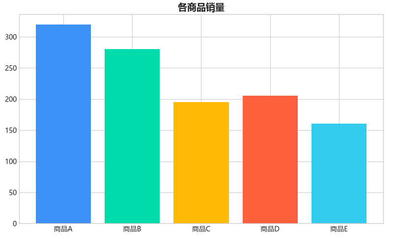
方案 1:直接使用十六进制色
最可控的方式,直接指定颜色:
# 我常用的几个配色组合
COLORFUL_SCHEME = ['#5B8FF9', '#5AD8A6', '#F6BD16', '#E8684A', '#6DC8EC'] # 多彩配色(推荐)
WARM_SCHEME = ['#FF5722', '#FF9800', '#FFC107', '#FFEB3B', '#FFF9C4']
NATURE_SCHEME = ['#4CAF50', '#8BC34A', '#CDDC39', '#FFC107', '#FF9800']
MUTED_SCHEME = ['#546E7A', '#78909C', '#90A4AE', '#B0BEC5', '#CFD8DC']
import matplotlib.pyplot as plt
products = ['商品A', '商品B', '商品C', '商品D', '商品E']
sales = [320, 280, 195, 205, 160]
colors = ['#5B8FF9', '#5AD8A6', '#F6BD16', '#E8684A', '#6DC8EC']
plt.figure(figsize=(8, 5))
plt.bar(products, sales, color=colors)
plt.title('各商品销量', fontsize=14, fontweight='bold')
plt.tight_layout()
plt.show()
方案 2:使用 matplotlib 内置主题
# 查看所有可用样式
print(plt.style.available)
# 用内置样式
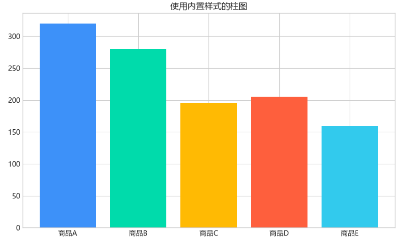
plt.style.use('seaborn-v0_8-whitegrid') # 推荐,背景干净有网格
plt.figure(figsize=(8, 5))
plt.bar(products, sales, color=['#5B8FF9', '#5AD8A6', '#F6BD16', '#E8684A', '#6DC8EC'])
plt.title('使用内置样式的柱图')
plt.tight_layout()
plt.show()
推荐几个好看的内置样式:
- seaborn-v0_8-whitegrid:白底+灰网格,干净专业
- fivethirtyeight:FiveThirtyEight 风格,偏媒体感
- ggplot:R 语言 ggplot2 风格
- bmh:贝叶斯风格,简洁
方案 3:渐变色
import numpy as np
n = 8
# 多彩渐变(tab10 色表,颜色丰富协调)
colors_gradient = plt.cm.tab10(np.linspace(0, 0.8, n))
plt.figure(figsize=(10, 5))
plt.bar(range(n), [x*10 for x in range(1, n+1)], color=colors_gradient)
plt.title('渐变色柱状图')
plt.tight_layout()
plt.show()
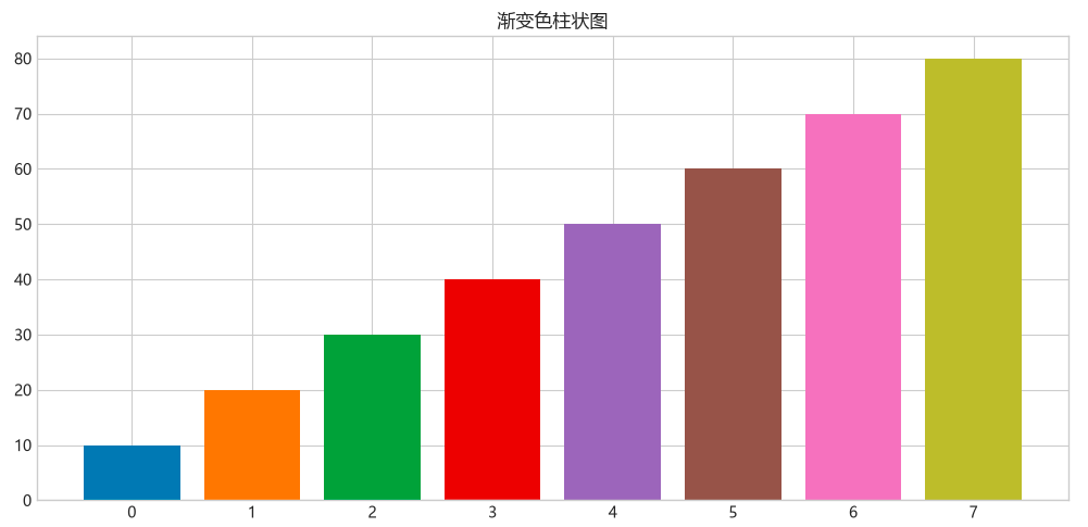
plt.cm.tab10 是 matplotlib 内置的多彩色表,每种颜色都不同。类似的还有 Set2、Paired、viridis 等,都比单色渐变好看。
三、标注:让图表"会说话"
一个没有标注的图表,别人可能看不懂重点在哪。
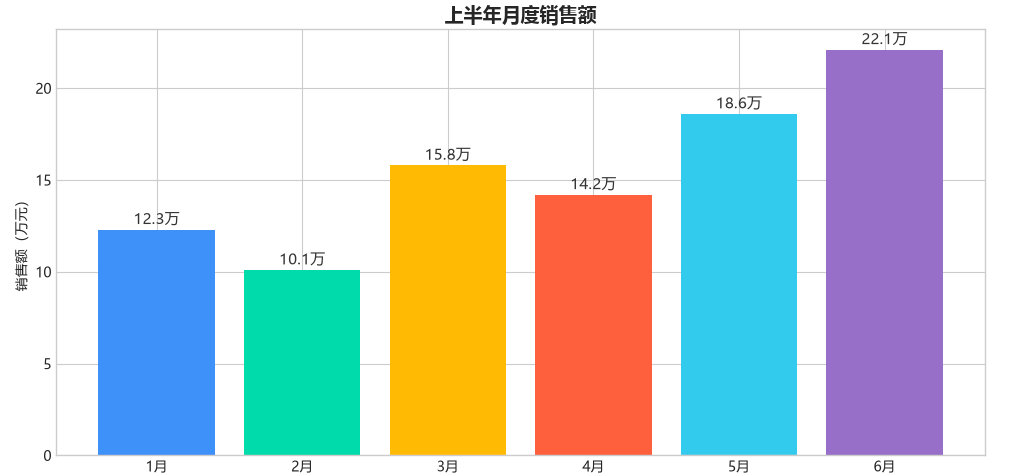
3.1 数据标签
months = ['1月', '2月', '3月', '4月', '5月', '6月']
sales = [12.3, 10.1, 15.8, 14.2, 18.6, 22.1]
plt.figure(figsize=(10, 5))
bars = plt.bar(months, sales, color=['#5B8FF9', '#5AD8A6', '#F6BD16', '#E8684A', '#6DC8EC', '#9270CA'])
# 在每个柱子顶部显示数值
for bar, val in zip(bars, sales):
plt.text(bar.get_x() + bar.get_width()/2, bar.get_height() + 0.3,
f'{val}万', ha='center', fontsize=11, color='#333')
plt.title('上半年月度销售额', fontsize=14, fontweight='bold')
plt.ylabel('销售额(万元)')
plt.tight_layout()
plt.show()
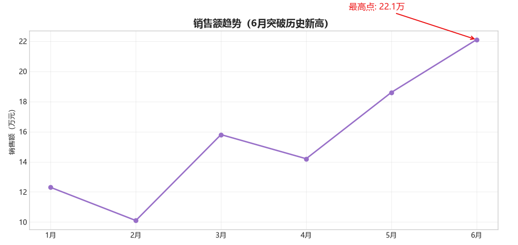
3.2 箭头注释
当你要特别指出某个数据点时:
plt.figure(figsize=(10, 5))
plt.plot(months, sales, marker='o', color='#9270CA', linewidth=2)
# 用箭头标注最高点
max_idx = sales.index(max(sales))
plt.annotate(f'最高点: {sales[max_idx]}万',
xy=(max_idx, sales[max_idx]), # 箭头指向
xytext=(max_idx – 1.5, sales[max_idx] + 2), # 文字位置
fontsize=12, color='#D32F2F',
arrowprops=dict(arrowstyle='->', color='#D32F2F', lw=1.5))
plt.title('销售额趋势(6月突破历史新高)', fontsize=14, fontweight='bold')
plt.ylabel('销售额(万元)')
plt.grid(True, alpha=0.3)
plt.tight_layout()
plt.show()
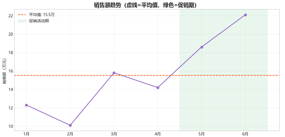
3.3 参考线和区域高亮
plt.figure(figsize=(10, 5))
plt.plot(months, sales, marker='o', color='#9270CA', linewidth=2)
# 平均值参考线
avg = sum(sales) / len(sales)
plt.axhline(y=avg, color='#FF5722', linestyle='–', linewidth=1.5,
label=f'平均值: {avg:.1f}万')
# 高亮某个区域
plt.axvspan(3.5, 5.5, alpha=0.1, color='#4CAF50', label='促销活动期')
plt.title('销售额趋势(虚线=平均值,绿色=促销期)', fontsize=14, fontweight='bold')
plt.ylabel('销售额(万元)')
plt.legend()
plt.grid(True, alpha=0.3)
plt.tight_layout()
plt.show()
四、子图布局:一图多用
4.1 基础子图
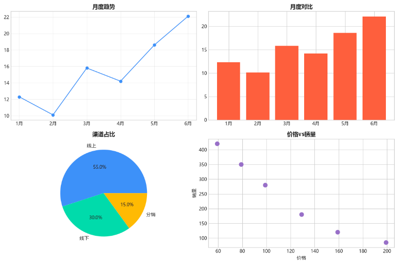
fig, axes = plt.subplots(2, 2, figsize=(12, 8))
# 左上:折线图
axes[0, 0].plot(months, sales, color='#5B8FF9', marker='o')
axes[0, 0].set_title('月度趋势', fontsize=12, fontweight='bold')
axes[0, 0].grid(True, alpha=0.3)
# 右上:柱状图
axes[0, 1].bar(months, sales, color='#E8684A')
axes[0, 1].set_title('月度对比', fontsize=12, fontweight='bold')
# 左下:饼图
axes[1, 0].pie([55, 30, 15], labels=['线上', '线下', '分销'],
autopct='%1.1f%%', colors=['#5B8FF9', '#5AD8A6', '#F6BD16'])
axes[1, 0].set_title('渠道占比', fontsize=12, fontweight='bold')
# 右下:散点图
prices = [59, 79, 99, 129, 159, 199]
volumes = [420, 350, 280, 180, 120, 85]
axes[1, 1].scatter(prices, volumes, color='#9270CA', s=80)
axes[1, 1].set_title('价格vs销量', fontsize=12, fontweight='bold')
axes[1, 1].set_xlabel('价格')
axes[1, 1].set_ylabel('销量')
plt.tight_layout()
plt.savefig('四图组合.png', dpi=150, bbox_inches='tight')
plt.show()
4.2 不规则布局
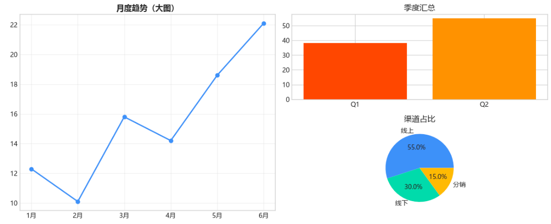
有时候你需要一个大图 + 两个小图:
fig = plt.figure(figsize=(12, 5))
# 左边大图
ax1 = fig.add_subplot(1, 2, 1)
ax1.plot(months, sales, color='#5B8FF9', marker='o', linewidth=2)
ax1.set_title('月度趋势(大图)', fontsize=12, fontweight='bold')
ax1.grid(True, alpha=0.3)
# 右边两个小图(上下排列)
ax2 = fig.add_subplot(2, 2, 2)
ax2.bar(['Q1', 'Q2'], [38.2, 54.9], color=['#FF5722', '#FF9800'])
ax2.set_title('季度汇总')
ax3 = fig.add_subplot(2, 2, 4)
ax3.pie([55, 30, 15], labels=['线上', '线下', '分销'],
autopct='%1.1f%%', colors=['#5B8FF9', '#5AD8A6', '#F6BD16'])
ax3.set_title('渠道占比')
plt.tight_layout()
plt.savefig('不规则布局.png', dpi=150, bbox_inches='tight')
plt.show()
4.3 间距控制
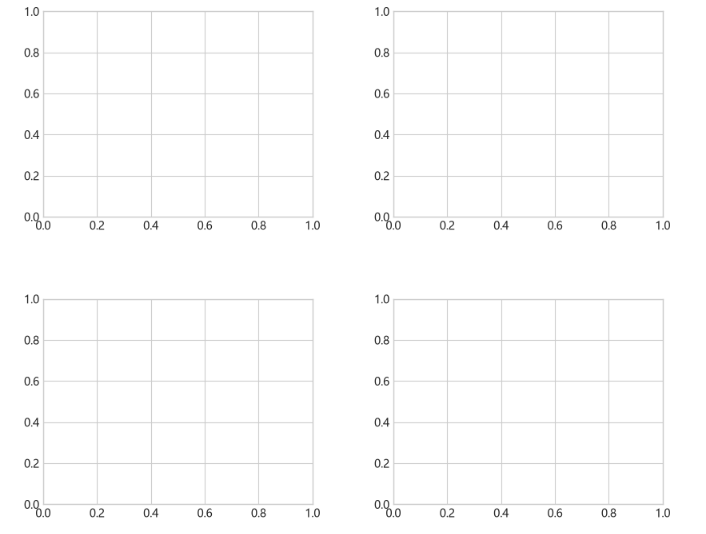
plt.tight_layout() 能解决大部分间距问题。但如果需要更精细的控制:
fig, axes = plt.subplots(2, 2, figsize=(10, 8))
# 手动调整间距
fig.subplots_adjust(hspace=0.4, wspace=0.3)
# hspace = 子图之间的垂直间距
# wspace = 子图之间的水平间距
五、图表样式速查表
| 标题 | fontsize, fontweight, color | fontsize=14, fontweight='bold' |
| 坐标轴标签 | fontsize, color | fontsize=12 |
| 刻度标签 | fontsize, rotation | rotation=45 旋转防重叠 |
| 网格线 | alpha, linestyle | alpha=0.3, linestyle='–' |
| 图例 | loc, fontsize, frameon | loc='upper right' |
| 保存图片 | dpi, bbox_inches | dpi=150, bbox_inches='tight' |
六、小结
让图表好看的关键就三件事:
记住一个原则:图表是给别人看的,不是给自己看的。你觉得"数据都在这了"不够,要让看的人三秒内就能 get 到你想说的。
往期回顾
Day 01 · 数据可视化到底在干啥?为什么 AI 让它变简单了
Day 02:环境搭建 Python 数据分析零成本工具包
Day 03 · Pandas 快速上手:读取、清洗、整理数据
Day 04 · 数据清洗:缺失值、异常值、重复值一站式处理
Day 05 · Matplotlib 基础:折线图、柱状图、饼图、散点图
下一篇讲 Seaborn——基于 matplotlib 的高级封装,很多复杂的统计图表,用它一行代码就能画出来。
下期预告: Day 07 Seaborn 进阶——用一行代码画出热力图、小提琴图、配对图等统计图表,比 matplotlib 更简单、更好看。
专栏
-「AI Python 系列」第 02 栏 ·AI+数据可视化(连载中) -「AI Python 系列」第 01 栏 · AI+自动化办公(连载中) -「AI Python 系列」第 03 栏 · Python 爬虫实战(连载中)
资源领取
- 关注作者获取本栏完整代码和数据集
原创声明:本文为梅雅达编程笔记原创作品,未经允许不得转载。