目录
前置:若依分离版本地部署全教程(从零开始做)_若依部署-CSDN博客
1. 若依分离版二次开发学习1(创建新菜单与移动菜单)-CSDN博客
2. 若依分离版二次开发学习2(通过组件实现数据可视化)-CSDN博客
3. 自定义化界面
3.1 修改登录界面
3.1.1 背景图
3.1.2 登录界面修改
3.2 修改主页界面
3.2.1 删除选项
3.2.2删除“若依官网”
3.3 布局设置
3.3.1 菜单导航栏
3.3.3 Header
3.4 修改loge
3.5 修改加载显示
前置:若依分离版本地部署全教程(从零开始做)_若依部署-CSDN博客
1. 若依分离版二次开发学习1(创建新菜单与移动菜单)-CSDN博客
2. 若依分离版二次开发学习2(通过组件实现数据可视化)-CSDN博客
3. 自定义化界面
3.1 修改登录界面
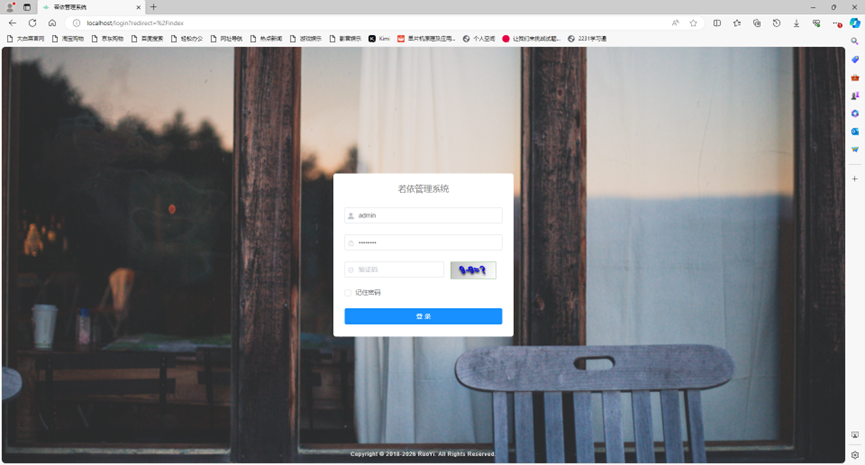
3.1.1 背景图
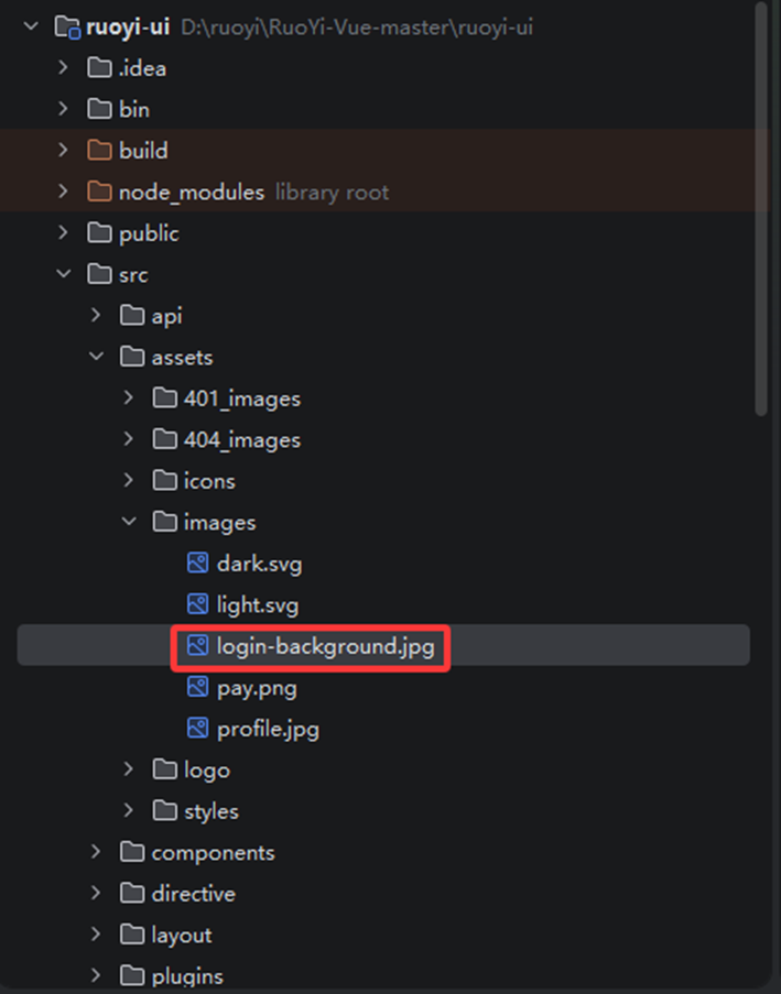
方案一:找到该位置下的.jpg,直接替换这个图片,但名字需要相同
D:\\ruoyi\\RuoYi-Vue-master\\ruoyi-ui\\src\\assets\\images\\login-background.jpg
方案二:将你想要替换的图片替换这个
地址:D:\\ruoyi\\RuoYi-Vue-master\\ruoyi-ui\\src\\views\\login.vue
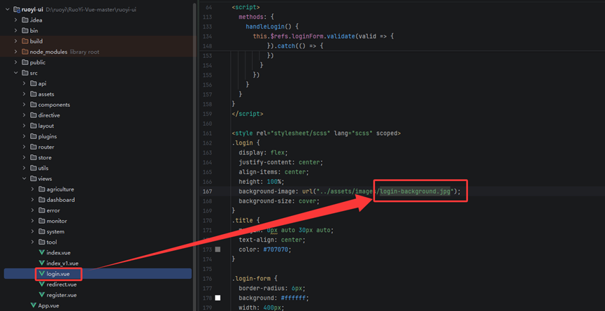
简单介绍一下这几段代码
.login {
/* 启用 Flexbox 弹性布局 */
display: flex;
/* 水平居中:让子元素在主轴(水平方向)上居中 */
justify-content: center;
/* 垂直居中:让子元素在交叉轴(垂直方向)上居中 */
align-items: center;
/* 高度设置为父容器的 100%(通常配合 html, body { height: 100% } 实现全屏) */
height: 100%;
/* 设置背景图片,路径是相对于当前 CSS 文件的位置 */
background-image: url("../assets/images/login-background.jpg");
/* 背景图片填充方式:保持比例覆盖整个容器,多出的部分裁剪 */
background-size: cover;
}
3.1.2 登录界面修改
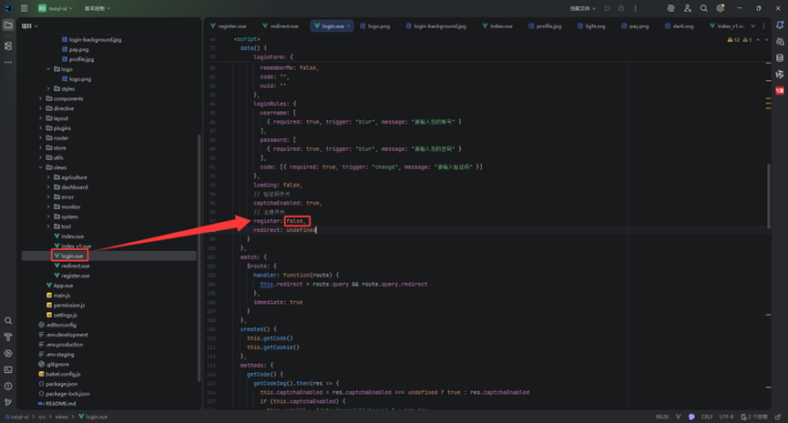
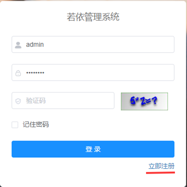
这里我们还可以添加一个注册,将97行的false替换为true,即可打开注册开关
显示如下
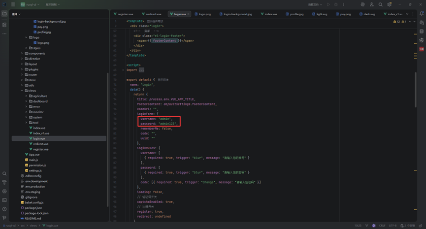
我们开始登录时账号密码会默认显示出来,这里我们可以将其关闭,将下图中的两个字符串转换为空字符串
显示如下
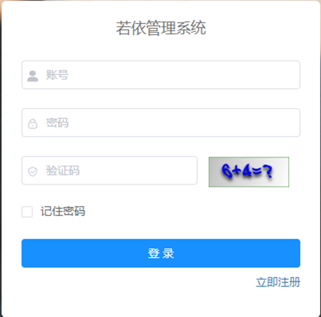
然后就是修改这个“若依管理系统”
在74行的这个位置的变量,复制,按下Ctrl + Shift + R 或通过下图中的方式来手动打开全局替换框。
当然,我们这里需要在整个项目中进行全局替换,我这里只打开了前端
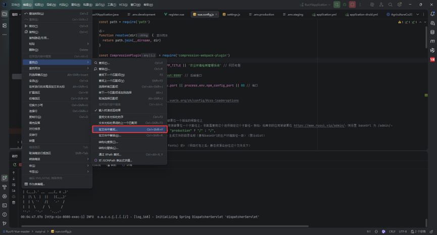
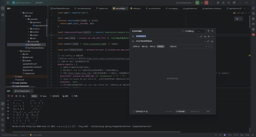
将里面的全部“若依管理系统”全部替换成你想要的名字,我这里改为“农业环境检测管理系统”,显示如下
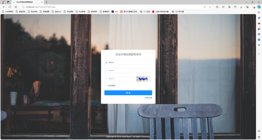
然后就会发现
解释一下代码:
.login-form {
border-radius: 6px;
background: #ffffff;
width: 400px;
padding: 25px 25px 5px 25px;
z-index: 1;
.el-input {
height: 38px;
input {
height: 38px;
}
}
.input-icon {
height: 39px;
width: 14px;
margin-left: 2px;
}
}
login-form 样式解析
主要样式属性
.login-form – 登录表单容器的样式定义
border-radius: 6px – 设置表单边框圆角,使外观更柔和
background: #ffffff – 设置白色背景,提高内容可读性
width: 400px – 固定表单宽度为400像素
padding: 25px 25px 5px 25px – 设置内边距,上下左右均为25px,底部为5px
z-index: 1 – 设置层级,确保表单位于合适层级
嵌套样式结构
输入框相关
.el-input – Element UI输入框样式
height: 38px – 设置输入框高度
input – 输入框内部input元素
height: 38px – 设置实际输入框高度
图标样式
.input-icon – 输入框前缀图标样式
height: 39px – 图标高度略高于输入框
width: 14px – 图标宽度
margin-left: 2px – 图标左边距
至此登录界面就修改到这里
3.2 修改主页界面
头像如何换里面有设置我就不细说了,打开个人中心即可
3.2.1 删除选项
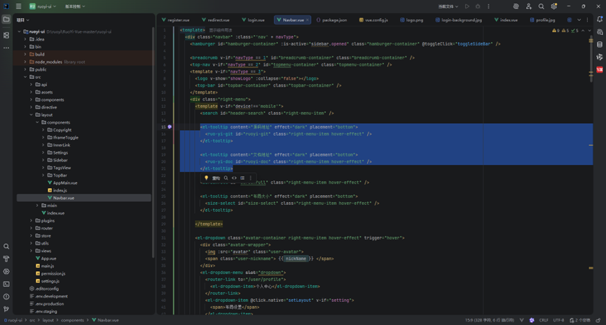
删除右上角的两个选项
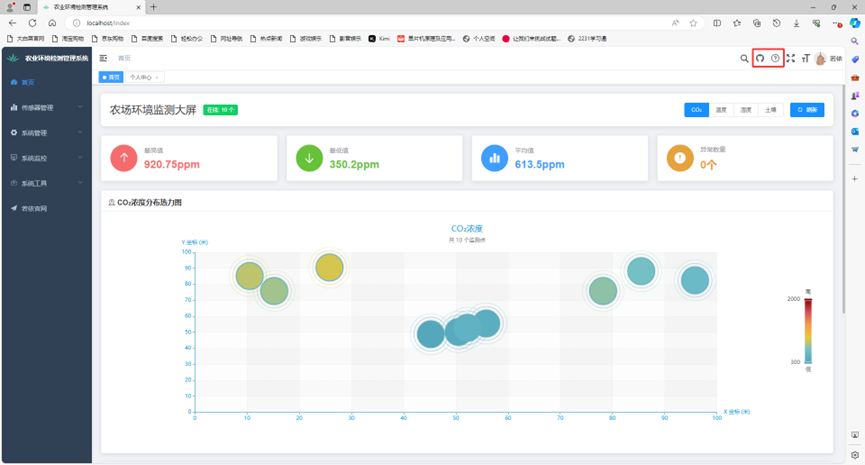
删除这两块代码
地址:D:\\ruoyi\\RuoYi-Vue-master\\ruoyi-ui\\src\\layout\\components\\Navbar.vue
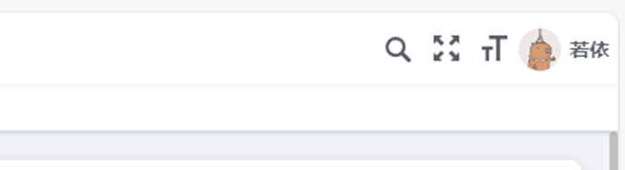
删除后显示如下
3.2.2删除“若依官网”
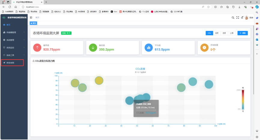
这里我们无法直接使用菜单管理删除这个菜单,只能通过数据库删除,打开MySQL数据库中的sys_menu表中的第四行数据
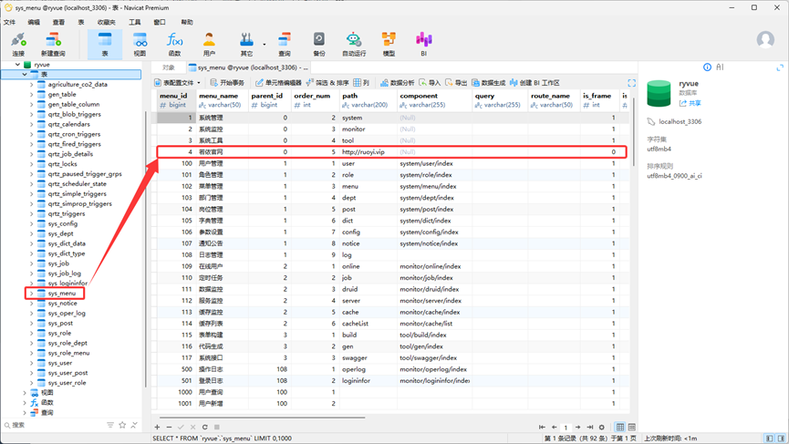
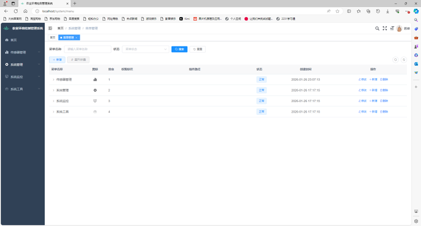
刷新一下界面,就会发现若依官网已经删除了,显示如下
3.3 布局设置
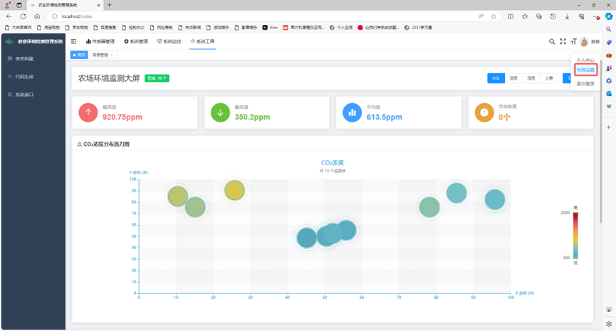
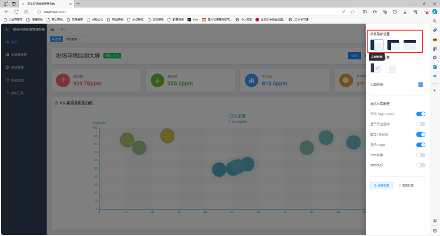
3.3.1 菜单导航栏
其中有三种菜单导航设置可以选择
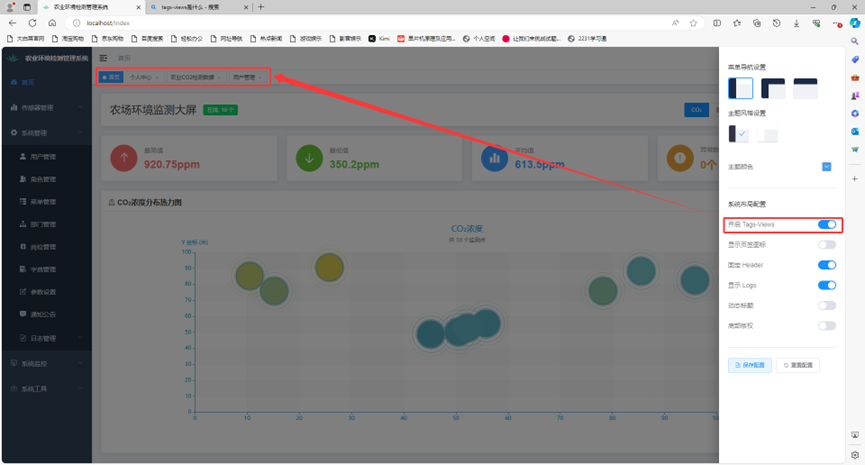
3.3.2 tags-views
TagsView 是一种基于 Vue.js 的标签导航功能组件,主要用于在单一界面中实现多页面或内容的快速切换。它通过标签的形式展示用户访问过的页面,允许用户在不同页面之间高效切换,提升操作效率和用户体验。
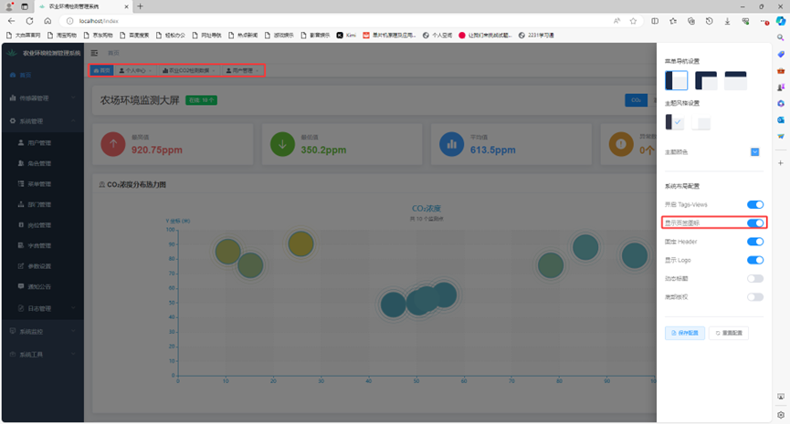
显示页签图标和上面相配合
3.3.3 Header
固定导航栏,使移动界面时导航栏不会跟着一起移动

后面三个配置就很好理解了,这里就不再详细讲解了
3.4 修改loge
地址:D:\\ruoyi\\RuoYi-Vue-master\\ruoyi-ui\\src\\assets\\logo\\logo.png
将上面地址内的图片替换,这里推荐替换图片,如果想要换一个图片,那就需要修改两处地方了,直接通过全文件查找替换即可

3.5 修改加载显示
修改下图中的内容
地址:D:\\ruoyi\\RuoYi-Vue-master\\ruoyi-ui\\public\\index.html
这里讲一个好玩的,大家感兴趣可以去查找一下赣青二课后台管理系统 (jxmediacenter.com)
你就会发现,这个也是若依二次开发的,他甚至连这个有点丑的加载界面都不愿意删除😂

这里我改成了下图这样

代码也放下面了,直接替换index.html这个界面即可
<!DOCTYPE html>
<html>
<head>
<meta charset="utf-8">
<meta http-equiv="X-UA-Compatible" content="IE=edge,chrome=1">
<meta name="renderer" content="webkit">
<meta name="viewport" content="width=device-width, initial-scale=1, maximum-scale=1, user-scalable=no">
<link rel="icon" href="<%= BASE_URL %>favicon.ico">
<title><%= webpackConfig.name %></title>
<!–[if lt IE 11]><script>window.location.href='/html/ie.html';</script><![endif]–>
<link href="https://fonts.googleapis.com/css2?family=Inter:wght@300;400;600&display=swap" rel="stylesheet">
<style>
html,
body,
#app {
height: 100%;
margin: 0px;
padding: 0px;
font-family: 'Inter', -apple-system, BlinkMacSystemFont, 'Segoe UI', sans-serif;
}
/* 渐变背景动画 */
#loader-wrapper {
position: fixed;
top: 0;
left: 0;
width: 100%;
height: 100%;
z-index: 999999;
background: linear-gradient(-45deg, #0f2027, #203a43, #2c5364, #1a3c28);
background-size: 400% 400%;
animation: gradientBG 15s ease infinite;
display: flex;
align-items: center;
justify-content: center;
flex-direction: column;
}
@keyframes gradientBG {
0% { background-position: 0% 50%; }
50% { background-position: 100% 50%; }
100% { background-position: 0% 50%; }
}
/* 玻璃拟态卡片 */
.loader-content {
text-align: center;
z-index: 1001;
padding: 60px;
border-radius: 30px;
background: rgba(255, 255, 255, 0.05);
backdrop-filter: blur(10px);
border: 1px solid rgba(255, 255, 255, 0.1);
box-shadow: 0 25px 50px -12px rgba(0, 0, 0, 0.25);
}
/* 现代加载动画 – 脉冲圆环 */
.loader-rings {
position: relative;
width: 120px;
height: 120px;
margin: 0 auto 40px;
}
.loader-ring {
position: absolute;
border: 2px solid transparent;
border-top-color: rgba(255, 255, 255, 0.8);
border-radius: 50%;
animation: spin 1.5s cubic-bezier(0.4, 0, 0.2, 1) infinite;
}
.loader-ring:nth-child(1) {
width: 120px;
height: 120px;
top: 0;
left: 0;
animation-delay: 0s;
border-top-color: #4ade80; /* 绿色 – 自然 */
}
.loader-ring:nth-child(2) {
width: 90px;
height: 90px;
top: 15px;
left: 15px;
animation-delay: 0.2s;
border-top-color: #60a5fa; /* 蓝色 – 科技 */
animation-direction: reverse;
}
.loader-ring:nth-child(3) {
width: 60px;
height: 60px;
top: 30px;
left: 30px;
animation-delay: 0.4s;
border-top-color: #fbbf24; /* 琥珀色 – 收获 */
}
/* 中心脉冲点 */
.loader-core {
position: absolute;
width: 20px;
height: 20px;
background: rgba(255, 255, 255, 0.9);
border-radius: 50%;
top: 50%;
left: 50%;
transform: translate(-50%, -50%);
animation: pulse 2s ease-in-out infinite;
box-shadow: 0 0 20px rgba(255, 255, 255, 0.5);
}
@keyframes spin {
0% { transform: rotate(0deg); }
100% { transform: rotate(360deg); }
}
@keyframes pulse {
0%, 100% {
transform: translate(-50%, -50%) scale(1);
opacity: 1;
}
50% {
transform: translate(-50%, -50%) scale(0.8);
opacity: 0.7;
}
}
/* 文字样式 */
.load_title {
color: rgba(255, 255, 255, 0.95);
font-size: 24px;
font-weight: 300;
letter-spacing: 0.05em;
margin-bottom: 12px;
text-transform: uppercase;
}
.load_subtitle {
color: rgba(255, 255, 255, 0.6);
font-size: 14px;
font-weight: 400;
letter-spacing: 0.1em;
animation: fadeInOut 2s ease-in-out infinite;
}
@keyframes fadeInOut {
0%, 100% { opacity: 0.4; }
50% { opacity: 1; }
}
/* 装饰性粒子 */
.particles {
position: absolute;
width: 100%;
height: 100%;
overflow: hidden;
pointer-events: none;
}
.particle {
position: absolute;
width: 4px;
height: 4px;
background: rgba(255, 255, 255, 0.3);
border-radius: 50%;
animation: float 20s infinite linear;
}
@keyframes float {
from {
transform: translateY(100vh) translateX(0);
opacity: 0;
}
10% { opacity: 1; }
90% { opacity: 1; }
to {
transform: translateY(-100vh) translateX(100px);
opacity: 0;
}
}
/* 加载完成动画 */
.loaded #loader-wrapper {
opacity: 0;
visibility: hidden;
transition: all 0.8s cubic-bezier(0.4, 0, 0.2, 1);
}
.loaded .loader-content {
transform: scale(0.9);
opacity: 0;
transition: all 0.5s ease-out;
}
/* 进度条 */
.progress-bar {
width: 200px;
height: 2px;
background: rgba(255, 255, 255, 0.1);
border-radius: 2px;
margin: 30px auto 0;
overflow: hidden;
position: relative;
}
.progress-fill {
height: 100%;
width: 30%;
background: linear-gradient(90deg, #4ade80, #60a5fa);
border-radius: 2px;
animation: loading 2s ease-in-out infinite;
box-shadow: 0 0 10px rgba(74, 222, 128, 0.5);
}
@keyframes loading {
0% { transform: translateX(-100%); }
100% { transform: translateX(350%); }
}
/* 响应式 */
@media (max-width: 480px) {
.loader-content {
padding: 40px 20px;
margin: 0 20px;
}
.load_title {
font-size: 20px;
}
}
</style>
</head>
<body>
<div id="app">
<div id="loader-wrapper">
<!– 背景粒子 –>
<div class="particles" id="particles"></div>
<div class="loader-content">
<!– 加载动画 –>
<div class="loader-rings">
<div class="loader-ring"></div>
<div class="loader-ring"></div>
<div class="loader-ring"></div>
<div class="loader-core"></div>
</div>
<!– 文字 –>
<div class="load_title">智能农场监测系统</div>
<div class="load_subtitle">正在初始化传感器网络…</div>
<!– 进度条 –>
<div class="progress-bar">
<div class="progress-fill"></div>
</div>
</div>
</div>
</div>
<script>
// 动态生成背景粒子
const particlesContainer = document.getElementById('particles');
for (let i = 0; i < 50; i++) {
const particle = document.createElement('div');
particle.className = 'particle';
particle.style.left = Math.random() * 100 + '%';
particle.style.animationDelay = Math.random() * 20 + 's';
particle.style.animationDuration = (15 + Math.random() * 10) + 's';
particlesContainer.appendChild(particle);
}
</script>
</body>
</html>